Massaro Week 5 Data Inventory

Zip Codes: Provides data on zip codes of Delaware and different roads and tax parcels within the zip codes

School Districts: separates the school districts in Delaware County and is updated monthly

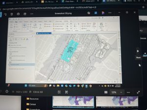
Building outline: Provides outlines of all the buildings in Delaware County

PLSS: Provides data on the Public Land Service System in the US and the Virginia Military Service District in Delaware County

Street Centerlines: Depicts the center of public and private streets in Delaware.

Address Points: Provides accurate placement of addresses within a parcel and is maintained by the auditor’s office. It aids in appraisal mapping, 911 Emergency Response, accident reporting, geocoding, and disaster management

Parcel: shows polygons that represent cadstral parcel lines in Delaware. They are updated daily and posted monthly.

Delaware County E911 Data: Is based on the address points data, and provides more accurate data to 911 agencies. This is used to determine the closest address to the 911 call.

Condo: Provides polygons that represent all of the condos in Delaware 

Subdivision: provides points that represent all of the subdivisions in Delaware. Data was created to help locate miscellaneous documents in Delaware County

Original Township: Shows the original boundaries of Delaware townships before Ohio tax districts influenced their shapes.

Precincts: Shows voting precincts in Delaware County and is controlled by the Delaware County Board of Elections

Dedicated ROW: Shows lines that are designated right of way in Delaware County.

Map Sheet: shows all map sheets in Delaware County

FarmLot: Shows all the farm lots and their boundaries within Delaware that are in the US Military and the Virginia Military Survey of Delaware.  

Annexation: Provides Delaware’s annexations and conforming boundaries from 1853 to the present.

Survey: represents surveys of land in Delaware County

Tax Districts: Consists of all the tax districts in Delaware County and is defined by the Delaware Auditor’s Real Estate Office. 

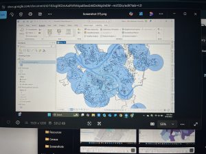
Hydrology: Shows all major waterways in Delaware County and is published monthly

GPS: shows all GPS monuments that were established in 1991and 1997 and is published monthly

Massaro Week 6

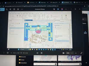
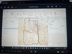
  1. Chapter 7: This chapter briefly went over how to modify and edit maps. While this chapter didn’t provide super important information, it was still very helpful. It gave me background on how to scale and move polygons within the map. Essentially, this chapter helped me design my maps to be more visually appealing. I only ran into a few problems within this chapter. One of them is my inability to split the buildings. I drew my shape around the building and double-clicked as instructed, but the two buildings in 7-1 didn’t split. It was interesting to apply polygons to not just buildings, but parking lots, and other features as well. This taught me how useful creating a digital version of it on the map can be. Another issue that I ran into was my inability to find the bus stop marker. I don’t think this is a big problem at all because I was able to use another symbol to mark the bus stop, but I thought I would note it. For future reference, it was good to learn that I have to import features from a downloaded building so that I can modify them.

Chapter 8: This chapter was a little bit confusing to me. While I understood sort of what I was doing, I don’t think I could replicate it on my own or really explain how it enhanced the map. Something that the chapter talked about that I thought was really interesting was the Soundex key. This makes it so that if information is input in the map incorrectly, the system can assume what the user meant by matching it with similar items that are pronounced the same. This makes it so much easier for the map maker and provides more accurate data. Something that I didn’t really understand was how rematchi addresses work. I understand that you can change the information to be correct zipcode-wise, but in one of the steps, the book had me pick a random place on the map to rematch an address, which didn’t make any sense to me. Something that was useful was learning how to organize the data using graduated symbols. Instead of having to input the symbols one by one, the system was able to connect the zip codes with each other and assign them a symbol on its own. Towards the end of the chapter, it does a better job of explaining how this can be used for marketing tactics. This makes it a little easier for me to understand how this can be used. However, I have a question of why it has to be so specific. Wouldn’t you be able to apply the same marketing tactics with the information that the system estimates? Also, wouldn’t you be more focused on zip codes than rectifying street names?

Chapter 9: This chapter provided insight into how to label areas based on how close they are to the things surrounding them. It provided how far certain people might be from an attraction and how that impacts whether they go to one attraction vs another one that might be a different distance away. You can do this by creating a buffer around the attraction and seeing how many people fall into the buffer. Something that I thought was super cool was that you can vary the size of the buffer and create multiple buffers with varying distances. I ran into a bit of a problem with the last part of 9-3. In this section, when using the spatial join tool, the author tells me that the information might not be available and that I have to lengthen the tool pane in order to see it and input it into the data. I looked around for a little bit, but was not able to find a way to lengthen the tool and select the data that I needed. The chapter went over how to create a spider graph out of specific locations. While I see how this can be useful when needing more accurate data, I prefer the buffer tool because it provides an image that is easier for the viewer to understand. In 9-5, it was super cool to see the patterns of people who commit crimes and where they commit them based on their age demographics.

Massaro Week 5

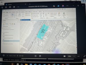
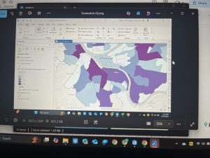
Chapter 4: This chapter was very helpful in learning how to label, organize, and combine data.I did have a few struggles within this chapter. My main struggles were in 4-1 and 4-2. In 4-1, the chapter told me to paste some of the data into a different folder so that it was available in multiple places. However, I was only able to paste one of the data sets into the correct folder. The other data set didn’t give me the option to paste it. Additionally, at the end of 4-1, the instructions told me to delete the tracts file from the geodatabase. This permanently deleted the information on that file. However, in 4-2, I needed the information on the file. I think that this is a part of the chapter that I might have to go back and redo to figure out if I messed that part up. Something that I thought was interesting was the use of parentheses to order attributes when selecting them. Another thing that I thought was interesting was the ability to select for specific attributes. While this can become a little confusing if it isn’t selected perfectly, it can be super useful when trying to narrow down the data on the map. I had some more struggles in 4-5. In this section, I struggled selecting the field in the attribute table for the neighborhoods in Pittsburgh. The book told me to select fields X and Y, but neither of those fields was an option, and I was not able to create them as an option. I also had struggles with the table in 4-6. In this table, the book wanted me to insert rows to assign categories to the crime types. However, the table wouldn’t allow me to insert any rows into it.

Chapter 5: While this chapter provided me with a lot of solid information, I ran into quite a few issues. In 5-1 to 5-3, it was super interesting learning about different coordinate systems and different easy-to-display maps. I never thought about how distorted a map may appear on a flat vs a rounded surface. The last part of 5-3 was where I began running into issues. The chapter didn’t provide any information on how to create your own map and add counties to it. I also ran into a few issues with displaying the libraries in 5-4; however, I was able to figure it out using a different method than the one the chapter explained in the book. In 5-5, I thought it was very interesting how many different websites held data that you could download and place onto a map in ArcGIS. In this section, I ran into quite a few problems. My first problem was that when using the Convert Table into Geodatabase tool, the BikeWorkData did not appear in my contents page. After about 30 minutes of trial and error, I eventually gave up and was not able to do any further work with the table since it would not appear. Additionally, in this section, the Light Grey Base didn’t have any valid data. I am wondering if this is connected with the table not appearing. I was also not able to figure out how to calculate the field tools. I entered the information that the book told me, but the tool said it wasn’t successful even after multiple attempts. Because of this, I wasn’t able to do any further work with this section. The last problem that I ran into was at the end of 5-6. When I searched transportation on the website linked in the chapter, bicycle count stations were not an option. There were only options for the bike paths.

Chapter 6: This chapter was very helpful in explaining specific examples of the many ways that GIS can be used by fire stations. I luckily didn’t have many struggles in this chapter. One of my struggles was that since I wasn’t able to create one of the tables in the previous chapter, I never learned how to combine tables. In this chapter, I tried to combine the tables, but a lot of the data ended up disappearing, so I’m not sure I did it correctly. I went back to the chapter to try to go over how to combine tables, but I am still quite confused about it. Additionally, I have completely forgotten how to select features on an attribute table. It would be more helpful if the chapter reviewed how to do this; however, I will have to return to previous chapters and review it myself. Something that intrigued me was how you could examine overlapping points of data to determine which streets, neighborhoods, and people were inside each fire zone. One of the most important things that I learned from this week’s chapter is not to work on this course at night. Staring at a computer and trying to problem solve when you are tired never ends well and just leads to you going to sleep frustrated.

Massaro Week 5

Chapter 1: This chapter was very helpful in learning how to navigate ArcGIS. Something that I thought was super cool was the different base maps that you can use around the individual map. This is super helpful when examining the larger map because it gives you more context on where the map is located in relation to the things. Another thing that I thought was super cool was the ability to layer things and move the layers on top of each other. This makes it easy to only focus on one layer, or layer things in order to display multiple things at once. The chapter also discusses how to display the map with a legend and save it to your computer. This can be used for presenting the information on the map, and can be useful because you can select exactly what you want displayed within the map. I was very surprised by how much information could be included in the map. For example, the chapter shows each specific clinic and provides information on the clinic as well as a link to the clinic’s website. This allows the map viewer to get as much information as possible. Viewing raster data on the map was very useful because it grouped some of the higher poverty areas together and gave me an overall view of the map. Something that I struggled with in this chapter was under the “Work with the fields view of an attribute table” section. I couldn’t figure out how to rename the Alais column in the chart. Another thing that I struggled with was selecting specific clinics and having them show up in the chart. I was not able to find the selection button that allowed me to select each clinic. Learning how to use the symbology was very helpful and definitely something that I will use in the future, especially if symbols start to come together, and I need them to stand out more.

Chapter 2: Overall, I think this chapter was very useful in learning the displays of maps. It aided me in learning how to label specific parts of a map. Something that I thought was interesting was being able to learn how to shut off specific information that I didn’t need when displaying pop-ups. Something that the chapter brought up that I hadn’t previously considered was that shapes and colors make the map easier to read for color blind people. Since this isn’t a problem that I personally have, I never thought about it. I struggled with a few different sections in this chapter. Specifically section 2-4. This section I wasn’t able to originally complete because the neighborhood section in the contents bar didn’t have valid data. Another section I struggled with was 2-8. In this section, I wasn’t able to set the visibility out beyond. Something else that confused me in this chapter was the differences between the different classification methods. While I understood that changing them made a difference, I didn’t understand why the difference was significant to analyzing the data. Something that I thought was super cool and useful was the swipe feature when comparing the male-headed households receiving food stamps and the female-headed households receiving food stamps. The swipe method provided a better way to compare the two maps than just switching back and forth between them.

Chapter 3: This chapter provided me with a lot of useful information. It took me quite a while since I was switching between GIS online and the app, but it provided me with some useful skills. I was able to learn how to format a chart based on certain maps as well as how to label and share that chart with other people. Additionally, I learned how to create a bar chart based on the map to display my data in many different ways. I ran into a few issues with the formatting, but they weren’t huge issues, so I was able to skip past them easily. It was super cool that I was able to access my maps through both online and the app, and that they both provided me with both editing and formatting options. Another useful skill was learning how to create my own story through GIS, which included the different charts and maps that I had previously downloaded. While I can acknowledge the different uses for online vs the app, I prefer the app more. This might be due to the fact that I’m a little bit more used to it, but also due to the number of edits I can make to the map through the app. Towards the end of the chapter, creating my dashboard got a little confusing. While I was able to add all the different elements to my map, they didn’t layer on top of the map like the chapter implied. Instead, they created their own tabs in the dashboard.

Massaro Week 3

Chapter 4: This chapter covers the different ways to map density, and how they might apply to certain map displays more than others. The chapter discusses how density maps can be used to find specific patterns within an area. It explains how mapping different features can completely change a map. For example, Mitchell talks about mapping workers rather than businesses and shows an example. I would have thought that the two maps would have been pretty much the same, but the difference in what was mapped completely shifted the map. Mitchell covers the difference between shaded vs dot density. While I can understand the importance of dot density when comparing specific locations, I prefer shaded density. It is a bit less overwhelming and still displays the data. I also think that dot density can be a little misleading because it doesn’t show the exact locations where the density is higher. The dots are just evenly placed within an area, which can make it a little more confusing.  Additionally, dot density can be hard to differentiate when displaying lines of different boundaries because the dots can get lost within the lines. Mitchell also talks about the difference between density surfaces and density areas. While I understand what each is used for, I am still a little confused about how they are different from each other. The author goes on to explain how to calculate density. I understand this to an extent, but I think that I’d have to practice it myself before it fully sticks in my brain. Something that I think is super cool with GIS is how it layers data in order to compare it and add it into one larger set of data. There are so many small things that I wouldn’t think about when presenting density on a map. For example, Mitchell explains the importance of cell size, search radius, calculation method, and units. He explains how these small details can influence how fast a map processes, how detailed the data is, and how difficult or easy the map is to read. Something that I am still confused about, however, is the difference between areal and cell units. In the chapter, he shows an example with two maps, but I don’t see much of a difference between the two.

Chapter 5: This chapter covers how to map small, specific areas and find what falls within those areas. To isolate an area, it is easiest to draw an area map on top of the feature that you have already mapped. This can aid in comparing different areas on a map. In this chapter, Mitchell discusses discrete and continuous features. Something that is a little confusing about continuous features is that they change. I’m wondering if you can only include continuous features at a specific time, or if you have to keep updating the map over an extensive amount of time to see the pattern. Something that I thought was interesting was the different ways you can mark a certain area on the map. Mitchell talks about how you can just include the parts of a parcel within the specific area, and that you can highlight the parcel as a whole. Something else that I found interesting was how much of the work GIS can do for you. Throughout the chapter, Mitchell talks about the many calculations that you might need to do when creating overlays for the map, but he also talks about how easy GIS makes it for you by completing a lot of the other calculations. Mitchell also discusses the different ways to layer the map in order to display the result you want. He goes over the differences and benefits of putting a specific area either under or over the set of boundaries on the map. Another thing Mitchell mentions is the use of frequency in data. He provides examples for different ways to display frequency using charts instead of just maps. He also shows how to display the data using both charts and maps together. Something that I found a little bit confusing when reading about how lines are represented in areas is how they are split up when they fall into multiple areas. Mitchell touches on this briefly, but doesn’t go into depth on it. He talks about the GIS creating a new dataset for the line, which doesn’t make sense to me.

Chapter 6: This chapter covers how to map features within a set distance of a point. This chapter discusses how you can map travel and travel costs in a certain area. This concept is something that I understand to an extent; however, it is still a bit confusing to me. The chapter further explains this concept towards the end of the chapter, but it gets very complex. There are so many little components that go into estimating travel costs. For example, Mitchell brings up how the map creator might estimate the time that a turn takes, or a stop sign, or a light. I understand all of the little components, but it seems like entering all of that data would be very tedious and annoying. Mitchell also brings up the use of turntables to display to data, but that is also confusing to me since he doesn’t go much into depth about it. Another thing that this chapter discusses is inclusive rings. Mitchell shows displays of three different maps with inclusive rings of different sizes. Something that I’m curious about with this is if you have to completely remake the map for each ring, or if there is a way to essentially copy and paste the map so that it is more efficient. A tool that I think is super useful is creating a buffer of features within a certain distance. This allows you to highlight features without creating a border around them. Another way Mitchell talks about displaying data is through a spider diagram. I think that this diagram looks super cool, but I think it could only be used on a small scale. When used on a bigger scale, like he does in the chapter, many of the points blend together and make the diagram confusing. Something that I think is super cool and useful is displaying places within a certain travel cost distance of an area. This can be helpful for owners who might establish a business within that area and want to know how long it takes for their customers to travel to them.

Massaro Week 2

Chapter 1: This chapter helped inform me on the basic principles of GIS. It opened my eyes to how specific and precise some data sets must be in order to achieve the expected outcome. Initially, when using GIS, the chapter discusses the importance of framing the question that you would like to answer. Mitchell discusses the different methods that you can use to achieve your results, as well as different ways the results can be presented to suit your needs. He discusses that data can be presented very specifically or on a broader scale. Mitchell goes over how continuous data may be processed differently from other data. This was something that intrigued me because it can be related to weather maps showing precipitation and wind patterns. It was also interesting to learn that this data is not as exact as other data presented by GIS because the data is processed as it varies on the landscape, and creates models using data that are similar to each other to create groupings on the map. Further in the chapter, Mitchell also discussed the differences between vector and raster models. While I can identify the use for each model, I personally prefer the vector models because they are more exact and are displayed both in a map and within a table. Raster models are used to process continuous data. However, I think the continuous data is a little more difficult to understand and process. For example, issues can be run into when presenting raster data because of the pixel size, which can impact how easy the data is to interpret. Mitchel also discusses the process of overlaying certain parts of a map and its difficulties. I never would have thought about the difficulties that you might run into based on the size of the area you are trying to examine and the curvature of the globe.

Chapter 2: This chapter helped me to understand visual displays of a map and how important these displays can be when using GIS. Mitchell talks about the importance of certain patterns in maps and how they can apply differently to each map. This let me know that when planning to map something out, I have to be specific and very conscious of how I represent different data points. This also let me know that mapping can be a process of trial and error. Sometimes, if symbols or colors on a map are too simple than it can be confusing for the audience viewing that map. Additionally, the chapter taught me the importance of breaking a map down into subsets. Using subsets can help me break down all of the data into smaller groups and notice patterns among the smaller groups of data, rather than all of the data at once. On the other hand, something that I also have to keep in mind when creating these maps is that I don’t want them to be too clustered, so I need to keep in mind the scale of the map. For example, if I have a larger map, I can create more categories and boundaries without them being too clustered. However, on a smaller-scale map, the same number of boundaries or categories might be too complex and make the map difficult to read and decipher. In order to avoid this, I can group the categories together in a table to differentiate between a general and a specific category. I think that this can be very useful because it allows me to see both the complex data and more specific categories if I need to. It also allows me to see the categories grouped together, which makes them easier to read on a map. I think one of the easiest ways to do this, however, is to group the data together by symbol rather than code. This way, there is a distinct visual difference that I can identify with having to read all of the codes in the data. 

Chapter 3: This chapter went further into depth about the different types of visual displays for maps and charts. The chapter discussed the different types of maps and ways to analyze data, and how they can be suited based on the way the data is skewed. While this chapter went into a lot of detail about counts, amounts, and ways to display data, it was a little overwhelming. I think that all the data provided by the chapter was very useful, and something that I can look back on to help me in the future. It was a lot to look at all at once. I think that after being able to apply the different methods that the chapter discussed, they will become more memorable. However, trying to differentiate between them after reading about them is a challenge for me. Mitchell discusses the importance of ranks, ratios, and densities and how they can be applied to certain maps. He goes further into this discussion by talking about how this data can be grouped into classes. This is something that I think is super important because it highly influences how the data is presented and how easy it is to understand. If the data is too exact, it can make it harder to read; however, by grouping it into classes, the data is simplified for the viewer. Additionally, Mitchel goes over the different ways that data can be displayed on a map. While I understand the importance of the variety of displays, I think that some of them make it confusing to analyze the data. For example, while I think the 3D models are cool, I also think that they make it difficult to label and analyze data.

Massaro Week 1

  1. I have completed the GEOG291 quiz
  2. My name is Elaina Massaro. I am currently a freshman and plan to double major in Environmental Science and Zoology. I enjoy working with animals, reading, and doing ceramics.
  3. While reading the first chapter about GIS, I was very intrigued to learn about the depth of the program. The chapter informed me on the progression of GIS and opened my eyes to how complex it has become over the years. It was interesting to follow the process of different people and scientists collaborating to create a huge program. Originally, going into this class, I did not have any prior knowledge of GIS or how it worked, so following the history of the program was something new for me. I thought that it was super cool to see how so many data sets can be overlapped and interact with each other. I think that GIS is an amazing tool that can be used to study interactions of both biotic and abiotic factors. Seeing the variety of ways that GIS is used was very eye-opening. Some of the applications are things that I would have never thought to use the program for. For example, Schuurman discusses how GIS can be used to predict future events such as city expansion. This is not something I would ever think to use this program for, nor would I think it to be possible. I also thought that it was interesting to see the data described by the author in the form of maps. This makes the data much easier to understand and allows me to comprehend the extent of the work that the program is doing and how many factors go into it. One of my sources talks about the application of GIS in animal rescues. It talks about how they use GIS to estimate where more animals are regularly dumped, and what they need to do in order to accommodate that. 

https://www.aspcapro.org/resource/using-geographic-information-systems-gis-map-animal-data

Another one of my sources uses GIS for animal tracking, specifically wolves. They use a variety of maps to show the wolves’ movements throughout the span of multiple days.

https://storymaps.arcgis.com/stories/32412cf13731440582fe051cd360b009Â