Shaw Week 6

Chapter 9

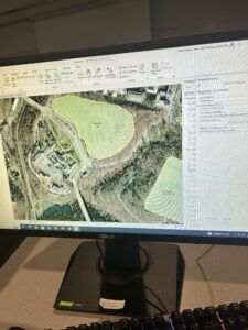
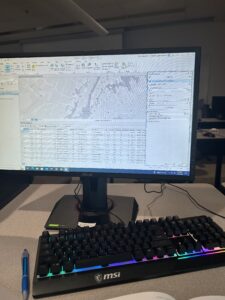
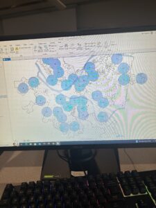
9.1: This was just using the clustering tool, very easy.

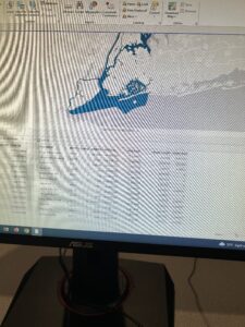
9.2: The first half of the tutorial was very straightforward and easy but when using the spatial tool I was having trouble using the output field.

9.3: I had the same issues as 9.2, the spatial tool was hard to navigate, I am not sure if updating the software will fix it or not.

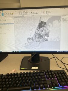
9.4: This part was very similar to the rest of the chapter with just changing the map to be able to read it better.

9.5: This part was very straight forward, just changing the symbols names and indicators.

Chapter 10

10.1: This was the longest tutorial of the chapter but it was very easy to follow after the first part which I had difficulty with. This section does involve a few new tools.

10.2: This tutorial was very easy, just introducing new tools to get familiar with. I am not super familiar with the singular tool or clustering tool yet but these sections have definitely helped.

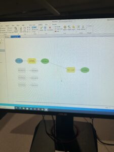
10.3: This section proved to be very long and gave me some difficulty with the coding. I could not figure out how to connect the raster calculator to everything else.

Chapter 11

11.1: This tutorial introduced the 3d view for the map, was very short and easy to follow. 

11.2: This tutorial is very easy to follow. It is very similar to 11.1. 

11.3: The use of the 3d features are very cool. The section was again very similar to the last two. 

11.4: This section was cool building things but my outcome did not look like the books so I am sure something went wrong.

11.5: The slider tool on this tutorial was very interesting, this was a very interesting tutorial to use. 

11.6: The street 3d view was very interesting and I enjoyed doing it.

11.7: This section tied the chapter together, it was definitely hard at first but I learned a lot. 
 

Shaw Week 5

Chapter 4:

4.1 – I do not have this section

4.2 – I do not have this section

4.3 –  Had a difficult time with this section, it kept saying invalid syntax and I am not sure what was wrong.

4.4 –  This tutorial was very short and made it incredibly easy to follow.

4.5 – Very easy to understand.

4.6 – Easiest tutorial to follow, the hierarchy table was interesting.


Chapter 5:

5.1 – This map was very interesting because it is different from what we have been making and is now a curved map.

5.2 – This section had many coordinates on the map. 

5.3 – This section is easy as I feel it is just to get used to the coordinates. 

5.4 – This section kept failing, and the tutorial was very confusing. 

5.5 – I had troubles with this section, the excel sheet was not working and downloading the tiger files gave me trouble.

5.6 – This section was easy,


Chapter 6:

6.1 – This section was very easy. It got me used to the attribute tables again.

6.2 – Had difficulty with the outlining part of the section and was unable to figure out how to get the rest of the blocks 

6.3 – Section was not difficult, all I had to do was search for the merge tool

6.4 -I am having an issue inserting the input dataset, I think the data in 6.2 I had trouble with was supposed to be saved and put into this section.

6.5 –  This section was very easy and I did not have any issues 

6.6 – I was having trouble with the tract layers.


Chapter 7:

7.1 –  This section was easy, selecting buildings was easy but splitting the last one posed a challenge.

7.2 – The tutorial was easy and had no issues.

7.3 –  This section was very easy as the only thing to do was the smooth polygon tool.

7.4 – This section was very lengthy but I was able to figure it out. 


Chapter 8:

8.1 – Was very simple to follow 

8.2 – My end result did not look like the photo in the book but it was very close.

Shaw Week 4

Chapter 1

1.1: It took me a long time to figure out how to get the program up and running.

1.2: I am still trying to figure out how to navigate the program but the book and slides are slowly helping.

1.3: The tutorial mainly focuses on how to use the attribute table and the summary statistics tool.

1.4: I was having issues with the 3d model and being able to see it but I believe other people were going through the same issue

Chapter 2

2.1: Still getting used to GIS and how it operates. Learning to display polygons. 

2.2: Learned how to use pop ups, remove duplicate labels, and label features.

2.3: This section was easy to understand, the street icons made it very crowded.

2.4: This section was corrupt and I was unable to display the contents for the neighborhood.

2.5: I was having trouble with this section and figuring out how to have the icons appear. 

2.6:  I was having an issue changing the percentages on this section by doing it manually, I must not be noticing something but I got it as close as I could.

2.7: Was easy to navigate.

2.8: I am not really sure what this section was asking me to do but I believe I completed it, it can also be due to the fact that navigating the west village and lower manhattan seemed like an issue.

Chapter 3

3.1: I was having issues with this one, the top map kept disappearing and I am not sure what I did wrong.

3.2: This section was the easiest one out of the chapter.

3.3: I do not have tutorial 3.3, I downloaded the folder twice and it did not appear. 

3.4: This was the hardest section to do

.

Shaw – Week 3

Chapter 4

  • Mapping the density of features lets you see the patterns of where things are concentrated.
  • Density maps are mostly used to look at patterns instead of the usual locations of features.
    • Mapping density is especially useful when mapping areas like counties.
  • GIS can be used to map the density of points or lines.
    • You can map the density of features 
  • There are two ways of mapping density, by defined area and by density surface 
    • Defined area is density mapped graphically by using a dot map or calculating a density value for each area 
    • Density surface is created in the GIS as a raster layer 
  • Density is calculated based on the areal extent of each polygon
  • Some GISsoftware allows you to calculate density instantaneously
    • When creating the map you specify the value you’re mapping density for and the attribute containing the area
  • A dot density map is a method where you map each area based on a total count or amount and specify how much each dot represents
    • Dot maps gives readers a quick sense of density in a place
    • A dot map simply represents density graphically 
  • GIS can be used to summarize features or feature values for each polygon 
  • There are many parameters that you specify affect how the gis calculates density surface like cell size, search radius, calculation method, and units.
    • Cell size determines how coarse or fine the patterns will appear. 


Chapter 5 

  • Mapping inside an area allows you to monitor what’s occurring inside it, or to compare several areas based on what’s inside each.
    • To find what’s inside you draw an area boundary on top of the features.
  • Finding what’s inside a single area lets you monitor activity or summarize information about the area.
    • Finding how much of something is inside each of the areas lets you compare the areas.
  • Discrete features are identifiable and unique.
    • Listing them or a numeric attribute with them would allow easier comparisons.
  • Continuous features represent seamless geographic phenomena.
  • Continuous values: are numeric values that can vary continuously across a surface.
  • GIS can be used to find out whether an individual feature is inside an area.
  • Linear Features and discrete areas might lie partially inside and outside an area.
  • Three ways of finding what’s inside 
    • Drawing areas: you create a map showing the boundary of the area and the features.
    • Selecting the features inside the area: you can specify the area and the layer containing the features, and the GIS selects a subset of the features inside the area.
    • Overlaying the areas and features: the GIS combines the area and the features to create a new layer with the attribute of both or compares the two layers to calculate summary statistics for each area.
  • Overlaying areas and features: this method lets you find which discrete features are inside which areas and summarize them.


Chapter 6 

  • Finding what’s nearby 
    • Lets you see what’s within a set distance or travel range of a feature.
    • To find what’s nearby, you can measure straight line distance, measure distance or cost over a network, or over a surface.
  • Distance is one way of defining and measuring how close something is.
    • If you are mapping what’s nearby based on travel, you can use distance or cost.
  • You can specify a single range or several ranges
    • If specifying more than one range, you can create either inclusive rings or distinct brands
  • Inclusive rings are useful for finding out how the total amount increases as the distance increases. 
    • Bands are useful if you want to compare distance to other characteristics.
  • Three ways of finding what’s nearby:
    • Straight-line distance: you can specify the source feature and the distance, and the GIS finds the area or the surrounding features within the distance.
    • Distance or cost over a network: You can specify the source locations and a distance or travel cost along each linear feature. 
    • Cost over a surface: You can specify the location of the source features and a travel cost. 
  • To create a buffer, you specify the source feature and the buffer distance.
    • Once you’ve created the buffer, you can display it to see what’s within the distance of the source, or you can use the buffer to select the features that fall within it.

Shaw Week 2

Shaw Week 

Chapter 1


  • GIS is an acronym for Geographic information systems
  • GIS has grown immensely since the creation of it, spatial scientists realized its potential and now helps analyze most world issues 
  • While spatial analysis has made great strides in advancement and accessibility learning the basics is still required to get a grasp on how to use tools
  • GIS analysis is a way of looking at data and geographical patterns and finding relationships between them. 
    • Starting each analysis by doing something as simple as forming a question and finding an area where you want to explore.
  • Types of features in GIS
    • Discrete Features: locations and lines, the actual location can be pinpointed 
    • Continuous phenomena: entire area between boundaries, no differences in soil, land,vegetation.
  • Geographic features can be represented in GIS using two models of the world vector and raster
    • Vector: Each feature is a row in table, and feature shapes defined by x, and y locations in space.
    • Raster : features are represented as a matrix of cells in continuous space, each layer represents one attribute.


  • Map projections and coordinate systems are all the data layers being used should be the same in map projection and coordinate systems. 


Chapter 2 

  • Mapping is used to see what, or where an individual feature is.
    • This can help show an individual where they need to take action/ what areas meet your criteria you are looking for
    • This map allows wildlife officers to track the behavior of bears and assign officers to spots of need.
  • There are many features for different layers.
    • Each feature on the map needs a location in geographic coordinates 
    • The GIS stores the coordinates that are saved and draws the features.
  • Using a subset of features allows you or the user to narrow down the the category value to something more specific or even make the range more broad
  • Mapping features by category can provide understanding on how a place functions
  • When showing categories on a map you want to only go up to 7 because most people can distinguish up to 7 categories on a map. 
  • In smaller areas that are being mapped, individual features are easier to distinguish, so more categories will also be easier to distinguish

Chapter 3 

  • People map where the most and least are to find places that meet their criteria and take action, or to see the relationships between places. 
  • To map the most and least you map features based on a quantity associated with each
    • Adds an additional level of info beyond mapping the locations of features
  • To map the most and least you assign symbols to features based on an attribute that contains a quantity.
  • Ratios show you the relationships between two quantities, and are created by dividing one quantity by another, for each feature. 
  • Proportions show you what part of a whole each quantity represents. 
    • To calculate a proportion, you divide quantities that use the same measure. 
  • Densities show you where features are concentrated.
    • To calculate density, you divide a value by the area 
  • Ranks put features in order, from high to low. 
    • Ranks are useful when direct measures are difficult or if the quantity represents a combination of factors

Shaw week 1

Hi, my name is Ethan Shaw and I am majoring in Economics with a minor in Accounting from Woodland Park, New Jersey. I am hoping to find a job in finance or consulting after I graduate this May. I have never used ArcGIS or any GIS software, this class seemed interesting to take. 


I never realized how much GIS is used outside of the environmental field of work. I was interested in taking this class because in the professional world especially in economics when looking at developing nations or areas in the US. I did not know there was a difference between mapping and spatial analysis and that there were different variations of mapping in GIS. I also never knew that GIS was a technology that has been around for over 50 years and always thought of it as a new technology that was just being discovered, it is also amazing to me that GIS started without using a computer and just handwriting code out. GIS is now being used in many different industries. I was completely unaware of just how much GIS is used in our day to day lives and what decisions are made by it.  GIS is used in many municipalities when determining crime rates and how these are affecting the areas. These maps are also able to tell you why areas see more crime than others and why there might be a spike in a certain crime. GIS is also used in many large companies to help with growth within the company. Large fast food companies use GIS to determine based on all sorts of factors where the best place would be for their restaurants or stores. 


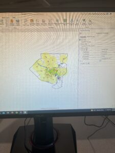
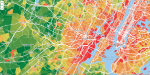
The map below is of the crime rates in Essex county NJ. Mapping this out allows officials and people to know generally what areas are seeing more problems than others and what type of crimes are prevalent in these areas.

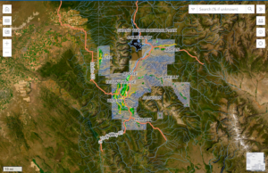
This map shows the urbanization of Teton county Wyoming. This is showing like most sought after vacation spots in the US how masses of people moving in are slowly taking over and leaving these places almost unrecognizable.