Here is my final exam! Thank you:)
Author: efrichar
Richardson – Week 6
Zip Code – this data set holds all of the Delaware county zip codes, and sections them into the land that is held under that specific zip code
Recorded Document- this data set shows all points that are recorded documents in the City of Delaware’s County Recorder’s Plat Books, Cabinet/Slides and Instrument Records – including things such as vacations, subdivisions, centerline surveys, surveys, annexations, and miscellaneous documents.
School Districts- this shows all of the various school districts that are within Delaware county. This includes all of Delaware city schools, sunbury schools, olentangy schools, and more.
Map Sheet- this is all map sheets within Delaware County
Farm Lot – this shows all of the farm lots in Delaware county that have been identified by the US Military and the Virginia Military Survey Districts
Township- this shows all 19 different townships that make up delaware county
Street Centerline- this data depicts all of the roads, both public and private, in the city of Delaware by showing the centerline of the roads.
Annexation- this shows the Delaware County annexation and boundaries of land from 1953 and the present, that has been recorded with the delaware county recorder’s office, updated monthly
Condo- this data shows polygons that represent all of the condominiums in Delaware county that have been recorded with the delaware county recorder’s office.
Subdivision- this data includes all of the subdivisions of condos that have been recorded with the delaware county recorder’s office
Survey- this data is a shapefile that represents all of the land within Delaware county. It is represented through a point coverage shape file.
Dedicated ROW- this data set is a display of all lines that are designated as “Right-of-Way” in Delaware County
Tax District- this shows all of the different tax districts within Delaware county, published by the Delaware county suitors real estate office.
GPS- this data set shows all GPS monuments that were established in 1991 and 1997
Original Township- this data shows all of the original boundaries of the townships in Delaware County, before tax district changes shifted the shapes of the townships
Hydrology- this dataset consists of all major waterways within Delaware County, and was enhanced in 2018 with LIDAR
Precinct- this data consists of Voting Precincts within Delaware County Ohio, under the direction of the Delaware County Board of Elections
Parcel- this consists of polygons that represent all parcel lines within Delaware County
PLSS- this data shows all of the PubliC Land Survey System polygons designated by both US Military and the Virginia Military Survey Districts of Delaware County
Address Point- this data set shows all of the certified address points within Delaware County. This includes all homes, businesses, schools, etc with official address in Delaware County
Building Outline- this shows all of the building outlines in Delaware Ohio. This is different from the address point data set because two buildings might have the same USPS address point, but be two different designated buildings, for example on college campuses.
Richardson – Week 5
Chapter 6
During this chapter, we went through how to map our own points on a graph, how to give them characteristics, and how to give them specific geographic coordinates. I thought it was really interesting using the app in order to add another point onto the map based on your current location, and then seeing this coordinate being replicated onto the ArcPro map.
One part of the exercise that gave me some trouble was when I was creating the symbols in the Status column. When I tried to create the other symbols, it often would only replace the first symbol instead of adding on to create the Dead, Unknown, and Ingrowth points. Once I figured out how to do it differently, the new points were in a new column. When I moved this graph to ArcOnline as well, it was missing the original point ‘Planted’ but had all of the other 3 points available to plot. I had to recreate the first point and redownload the graph to ArcOnline.
Chapter 7
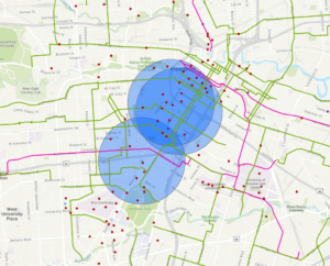
In this chapter, we examined data from the city of Houston, TX that looks at the local income of various neighborhoods, and the amount of roads, paths, bike friendly streets, etc for people to use. In 7b, we learned how to rematch correct locations with their addresses, that were originally mistakes in the data, and plot them on the map. In 7C, we mapped the bike lanes in the city, and created buffers for the paths within a 0.25 mile radius. We also mapped the number of bike stations in a given radius, to allow us to identify which areas of the city needed more accessibility to these resources.
I did not have any trouble with this chapter, and running the programs, which was very helpful.
Chapter 8
In 8a, the only issue that I ran into was that I could not make a separate layer for robbery_jan. I had the January data points showing up in my graph, but when I exported the features into a separate layer, it would not separate the regular robbery data from the January robbery data. I had to continue the rest of 8A just using the regular robbery data wherever it asked to input robbery_jan. Therefore, when I went to input the robbery density using Kernel Density, it shows up as a much larger density than what it is supposed to look like, if we were only using the january robbery data.
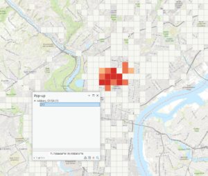
I also ran into issues in 8B. When i ran the hot spot analysis, there were only about 12 tiles that were colored in as hot spots. All of the other tiles that were supposed to be in the frame were depicted as “Not Significant”. When it was time to examine the pop-up, there was no SOUCE_ID, or Shape_Length, or any other descriptions of the popup file besides the OBJECTID listed. Therefore, I could not finish this chapter due to the issues it was causing me, and I moved onto chapter 9.
Chapter 9
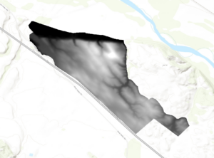
In 9A, we learned how to use the extract by mask tool to get the outline of a certain area to be the only one that was represented on the map. This is useful for when you are aiming to get the data on just one singular region only, and do not care about the data of the surrounding area, and do not want it distracting from the overall conclusion of your data.
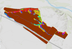
When using the Hillshade tool, there is no part of the area that is in complete shade at the first time.
When adding the vineyard blocks and planning sites, there are 3 planning sites that have a great majority of low slope (less than 14 percent) topology. There are 3 planning spots that include at least some land that faces south, southeast, or southwest. There are 2 planning sites that might have an optimal slope and shadow combination, and thus would be the best spot for the vineyard, and that would be the plot on the far left, and the plot on the far right, both about half way down the slope of the hill.
Chapter 10
In the first part of the exercise, we are asked to separate the 70 Terrestrial Fixed Wireless, and the 71 Terrestrial Fixed Wireless from the rest of the data. There are many areas starting at the south west corner of Utah, and going up the middle of the state where there is fixed wireless technology. We learned how to make the data fade in and out of the map in a specific region over time, to show the progression in one figure. In the second part of this chapter, we learned how to label specific location points on a map, and how to format these specific locations into names on the map.
I ran into some issues when it was time for 10C, to create a presentation of the figures. The map was giving me trouble when I wanted to copy the scale bar into the figure, and when I wanted to put the north arrow into the figure as well. Every box that needed to be checked was checked, but it would not show up on the figure like it was supposed to. The name of the legend also would not disappear, even though I altered it maybe 8 different times. Overall, I still think I recognized how to insert a legend and a scale bar, it just simply would not work out for me.
Richardson – Week 4
Getting to Know ArcGIS
Chapter 1
For some reason, a problem that I ran into during this exercise was that my color legend for school walking areas would disappear, even though it was a visible layer at that time. I turned the layer on and off again probably about 3 times before it stuck with my figure, and I was able to complete the exercise.
Chapter 2
Something I also struggled with, that I think others did too, was getting the World_Data.mxd into ArcGISPro. Once I did, the instructions were pretty easy to follow. This program was a little more familiar to be than ArcOnline, so I had an easier time following these steps
Step 5 Answer: On which continents are PM concentration highest?
There is a high quantity of urban PM concentration in Africa, the Middle East, and the majority of Asia.
Examine the contextual ribbon
Question 2: If you close your contents pane, how do you restore it? – go to the View tab in the top ribbon, then click on “contents” in the Windows ribbon
How do you find a geoprocessing tool? All geoprocessing tools are located in the Analysis ribbon, and within the tools tab that you can scroll through and find the specific geoprocessing tool.
Question 4: Which city has the largest population? Shanghai, China
Measuring Distances: The distance between Lima, Peru, and Rio de Janeiro, Brazil is approximately 2,328.61 miles.
Question 1: What is the height of the tallest building in this layer?
339.758
Chapter 3
Extract Part of a Data Set:
Question 5: What is the field name that indicates the state within which the county features are located? – STATE_NAME
How many residents of Wayne County are between the ages of 22 and 29 years old? – 10,575 people
3b
Question 3: How many years of data are represented in the table?
6 years – 2004 – 2010
3c
Question 3: What percentage of households has an income of less than $15,000 per year?
9.3%
3d
When I tried to import the IL_food_deserts.lyrx, there seemed to be an error in the import and there was a red ! next fo the IL_food_desert in the contents bar, and the data was not showing up on top of the 2010 percentages.
Chapter 4
4a
I was able to load the FireHydrant.shp file into the map, but when I tried to use the feature class to geodatabase tool, it would not load the WaterLines.shp, WaterPressureZones.shp, or Wells.shp. I had to use the Feature Class to Feature Class tool again for all of the shape files separately.
Question 8:
How many vertices does the selected line have? 4 vertices
4c – when i attempted to separate zone 2 using the select and split tool, the tool would not insert the line across the zone in order to split the zone. Therefore, I would not merge the zones with one another. Then of course, when it was time to draw the polygon around the figure, i could not do that because there was no area to select, because I was unable to separate the polygon
Chapter 5
 5a: question 4: can you name the types of conflict events that are recorded in this dataset?
Battle – no change of territory, strategic development, riots/protests, remote violence
Once I hit the section in 5a discussing ‘proceed through preconfigured tasks’, when i went to click on the task file, the file was empty, and there was no data. I could not select ‘create conflict maps’, and therefore, the rest of 5a was unachievable since this file was empty.
5b: since I was unable to complete section 5a, I had to import both of the maps of South Sudan and Rwanda into the file. However, when it was time for the model builder section, the same thing was happening to me as it was in the first section. The tool box was empty with no data, and therefore, the rest of the exercise could not be completed. Im not sure if this is a mis linkage between the data set and ArcGIS, because all of my data is in my own flash drive, and the maps are accessible and I can reach the shape files, but none of the tools in the catalog pane show any data in them.
Richardson – Week 3
Chapter 5
This Chapter of Mitchells, The ESRI Guide to GIS Analysis, focuses on “Finding What is Inside” of the image you are looking at. Sometimes, you only want to focus on a singular part of the image. Say for example, you have a map of types of agriculture in Ohio, but you only want to focus on Northeast Ohio. You can choose to only analyze a single area in order to get the full picture. You can also section your analysis based on things like county lines, and zip codes. You can also make this analysis discrete or continuous, like Mitchell discussed in earlier chapters. There are three ways of finding what’s inside. By 1, drawing areas and features, 2, selecting the features inside the area, and 3, overlaying the areas and features. Drawing areas and features is good for finding out whether features are inside or outside of the designated area. However, this method is not very specific, and often cannot provide the information needed for a full analysis of the map. Selecting the features within the area is good for summarizing the features inside, but it is only good for evaluating one single area, not a collection of larger areas. Overlaying the areas and features is good for finding out which features are inside, and how dense these features are. However, this process is quite extensive, and requires more processing. Mitchell also describes how it can be good for evaluating the data if layers are overlapped with discrete and continuous data. For example, you could have the discrete layers of land plots overlap with a floodplain. We can directly see which areas are being impacted. We can also do it inversely, by mapping continuous data of types of land, and over laying boundary lines over it. With these overlapping boundaries, you can then get a list of attributes of a given area within the image, whether its number of people, number of species, density of population, etc. We can overlay boundaries in GIS using either a vector or a raster model to ensure that all variables are both together in an image and sorted separately. The vector model is almost the overlaying of 3 separate images mapping different variables, and putting them all together. The raster model is the sort of “cookie cutter” image going into a figure to display the area of interest.
Chapter 6
This Chapter of Mitchells, The ESRI Guide to GIS Analysis, focuses on “Finding What’s Nearby”. This is useful for knowing what is in the general area of the location you are concerned with, and if surrounding areas could be impacted by what you are surveying. For example, we could look at nearby floodplains that are near a body of water that are at risk of floods, or houses near intersections of the highway that could be susceptible to effects of eminent domain. Measuring how near something is can be used in distance, or in cost, or “travel costs”. If something is very far away from the desired location, things like heavy traffic and gas prices could be a barrier of distance. For example, if you are mapping how close streets and homes are to a fire station, the streets that are within ¾ of a mile, and are within a 3 minute drive of the fire station represent very different parts of the town. You also need to account for the size of the area you are looking at. For smaller areas, you can look at this on a planar method. But if you are looking at something larger like a continent or the world, then you need to use a geodesic method, based on the curve of the earth. You are able to summarize what is within this nearby area and turn these variables into quantified data as well. You should use the straight line distance method “if you are defining an area of influence or want a quick estimate of travel range”. You should use the cost or distance method if you are “measuring travel over a fixed infrastructure to or from a source.” You should use the cost over a surface if you are measuring overland travel. It is also helpful to use color coding legends in the figure to depict the distance from the point you are evaluating.
Chapter 7
This final chapter of Mitchells, The ESRI Guide to GIS Analysis, focuses on “Mapping Change”. This section specifically focuses on how to represent data of change over time, and how the characteristics of the area change as time progresses. An example of this, could be a representation of sea level rise over time. The first image that you show might depict sea levels in the 1950s, and then sea levels today, and then where sea levels are expected to be in the coming decades. A large reason for this according to Mitchell is to “anticipate future needs” and to “gain insight on the behavior of a certain event or region”. You can also use mapping change to show how a certain object or thing is moving locations over time – an example of this might be a representation of how the migration patterns of certain bird species are evolving due to the changing climate and weather patterns. This might show us two completely different regions of the world, but is still mapping the change in some variables. You can represent a change in a figure through three different types of time patterns: a trend – a change between two (or more) dates and times, before and after – conditions preceding and following an event, or a cycle – change over a recurring time period such as a day, month, or year. However, you do not want to use too broad of a time frame, nor do you want to use too many data points of comparison, because the main difference between the change in figures might be lost, and the message of the data may not be as clear as you desired. Mapping the change in a set of data is very important in order to understand how we are evolving, and what the trends are for future expectations.
Richardson – Week 2
Eliza Richardson
27 January, 2023
ArcGIS Week 2 Blog Post
Chapter 1
Mitchell begins the first chapter with laying out some necessary information needed for GIS mapping, and how to decide the best way to represent your chosen data. You first need to understand the data, choose a method, process the data, and then contribute results. These results could either be discrete (location of businesses in the state of Ohio) or continuous (counties color coded by number of businesses). They would both display the same data, but with a different application and meaning of the data. Discrete data can be represented with a vector model, which is better for individual points, and continuous data can be represented with the raster model, which is better for widespread data. Mitchell then describes the types of attributes that you can describe your data with; categories, ranks, counts, amounts, or ratios. An example of categories could be types of employment in Franklin county. You could categorize each household on what kind of field they are employed in. Ranks may relate to things like the redlining maps; which neighborhoods are more likely to be accountable for a loan and pay a mortgage on time. Then be sorted into ranks of A – D. Counts and amounts refers to any measurable quantity, such as the amount of employees at various businesses. Ratios can be separated into proportions and densities. For example, you can map the average number of people per household by county to see which counties have the most people living in each home.
A lot of the information covered in this chapter are things that I have heard discussed and have used when doing GIS projects in other courses, but it is very helpful seeing them all spelled out in front of you so that you can maximize the efficiency of your data. In other courses, I felt like I wasn’t presenting my data in the most optimal scenario, and I could have used a better consensus of the way to maximize the presentation of it.
Chapter 2
GIS is so important in the development of so many different fields. Using GIS, “police can map where crimes occur each month, and whether similar crimes occur in the same place or move to other parts of the city.” and “wildlife biologists studying the behavior of bears may want to find areas relatively free of roads to minimize the influence of human activity.” (Mitchell 24) In order to create a map that represents your data, you first need to link your data to geographical coordinates. You can then link the subset of your desired data to the geographical coordinates in order to create the image you want to portray. However, if you don’t want to portray too much information to digest in your figure, then it will be too difficult for the reader to understand the purpose of the map. If you have a detailed description, you could categorize them into smaller portions in order to make the message of the figure clearer. Mitchell states that no more than 7 categories should be used on a map or else the message of the data will be lost. The fewer categories you can evaluate in one image, the easier it makes for the reader to understand and compare each subset. In addition, the scale of the map and the amount of categories can make the patterns difficult to see for the reader, and can get lost in the figure. Keep It Simple Stupid.
However, if you need to include all of the categories in order to portray the message of the data completely, one way to do this is to create multiple maps of the same geographical area, but with different data that it is showing. If you want to show 15 data points, you can subset them into categories, and then make another map for each category that you subset the data into. This makes it so that you can still provide all of the data necessary to reach a full conclusion, but still allow for the maps to be decipherable.
Chapter 3
When exploring data, it is important to keep in mind the purpose of the figure, and what the figure should be telling the reader. Are you evaluating the data? Or are you trying to find a pattern? Or an answer? Based on the goal of the data, then you can choose the way you want to graph your data. One way that you can evaluate one data point is through classes. This is very similar to rankings, but you can assign an upper and lower limit to which values fall within the rank, to represent the entirety of the region. For example, if you are trying to evaluate soil quality, you can assign a value of 8 to the top 15% of soil, and separate all soil regions based on the following 15% to show which areas have the best soil quality. You could also classify a region into percentiles, and represent the bottom 25th percentile, middle 25-75 percentile, and top 75th percentile separately. Mitchell goes through the various ways that you can section data. Keep in mind that not all of these sectioning strategies will be optimal with your data, and you must choose depending on the layout of your data. Natural breaks (jenks) which is when data is separated based on where there is a jump in values. Natural breaks are good for mapping a data set that is not evenly distributed and has clusters of information. Quantile contains an equal number of features. Quantile is good for comparing areas that are roughly the same size, and for data points that are relatively equally distributed. Equal interval is when the difference between the high number and the low number are the same for each section. Is good for data that does not have a large variance in value and for presenting nontechnical information like precipitation and temperature. Standard deviation is when “features are placed in classes based on how much their values vary from the mean.” (Mitchell 68) This is good for seeing which values are above and below the mean, and how far above and below they are.
Chapter 4
Mapping density is very important when trying to distinguish trends in the area. There are two ways to create a map by density: “based on features summarized by a defined area, or by creating a density surface.” (Mitchell 109) By using a defined area to create a density map, you can use predetermined boundaries, such as counties or countries, to determine the density of that area as a whole, compared to another section of the region. By using a density surface, you can see the variation in density across the area as a whole, not simply where boundary lines occur. You should use a density map if “you have data already summarized by the area, or lines or points you can summarize by the area”. This is easier than creating a density surface, but can cause some inaccuracy, especially if you are analyzing a large area. You should use a density surface if “you have individual locations, sample points, or lines.” This requires more data processing on the authors part, but is more precise in the long run. Another way you can add to a density map is to add a layer of the density points overtop of the map. That way you can see where the individual points are coming from, but also the overall trend for boundaries in the data. Another way to change the variability of the density map is to change the cell size. If it is hard to distinguish where the dense places are on the map, try making the cell sizes larger so that you get a closer look at parts of the data. To distinguish non dense areas between dense areas, you should use a color gradient to make a visual representation of how the density fades between geographical regions. However, if you have too many gradient points, it will be difficult to distinguish where the points are falling on the graph, and the difference between each region. Again, you don’t want to include too much information so that it is hard for the reader to comprehend.
Richardson – Week 1

Hi Everyone! My name is Eliza Richardson, and I am a senior majoring in Environmental Science and International Studies, from Lakewood, Ohio. I love to cook, workout, and spend time outdoors doing anything from hiking to sand volleyball to laying on the beach 🙂 I am excited for this class because I have always wanted to grow my GIS skills, and I think it would be very beneficial for me moving forward in my career after graduation. After graduation I plan on taking a gap year before attending a masters program for environmental policy and sustainable development!
Schuurmans Chapter 1- Introduction to GIS exemplified how versatile and important GIS can be in the academic, research, and professional world. One of the great things about GIS is that it can be used for such a wide array of topics, that it can serve almost any field of study. Schuurman points out that a significant distinction of GIS is that it is more about “spatial analysis” as opposed to simply “mapping”. Categorizing this kind of work as spatial analysis allows us to think more externally about how we want to be expressing certain kinds of information and data, and how to most effectively. However, Schuurman explains how GIS wasn’t always so interdisciplinary. At the beginning of its development, many people argued about what was the proper use of the technology – should it be used by those who are looking to analyze spatial data, or should it be used by those who are looking to print physical maps? I also thought it was interesting how Schuurman talks about how the development of GIS is important for both social and technological developments. With all of these varying views on the implication of GIS in the world, I think that this is one of the reasons why I am interested in learning more about GIS; it is so versatile in every field, and can be used in more ways than one would ever picture.
The concept of GIScience is really interesting to me. Often times, when I have struggled with creating material in GIS before, I feel as though the reason why I had struggled was because I didnt completely understand the concept of what each step was doing with my data, therefore I didnt comprehend how to connect it all together, and know what step to take next. I think that if GIScience was briefly touched on when learning about this system and the projects we will be doing, I think it would help people to better understand why they are performing the functions they are in GIS, and will help them apply their knowledge to future projects.
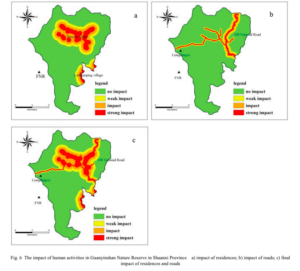
In looking at GIS applications, I looked at the correlation of giant panda populations and the amount of deforestation and human impact in areas of giant panda habitat in Central and Western China. I found that GIS can be used to map anything from the density of mammal populations, to the suitability of habitat for giant pandas, to the areas of the region that are experiencing the greatest effects of human activity such as the building of roads through dense forests. Figure 6 from GIS application in evaluating the potential habitat of giant pandas in Guanyinshan Nature Reserve, Shaanxi Province, shows the level of human impact from residence, to roads on a nature reserve for giant pandas in the Shaanxi Province.