Kocel, Week 6

Chapter 9 

The beginning of chapter 9 was pretty easy for me. It focused on the different uses of buffers. The first part was using buffers for proximity analysis. The second section expands on this by introducing how to use multiple-ring buffers. Buffers are really important for real world applications. I had some issues with 9-4 and had to move on from that section, but the rest of chapter 9 was straightforward.


Chapter 10

Chapter 10 focuses on the raster part of GIS. Until this point, most of the book was dedicated to vector feature classes. Raster layers are for things like topography and images of the earth, or continuous features. The first part of this chapter was importing a raster dataset into a file geodatabase. Tutorial 2 was making a kernel density map, which was the easiest part of the chapter for me. I had a little bit of trouble with 10-3, but eventually I got the hang of it.


Chapter 11

Chapter 11 was by far my favorite chapter. It was interesting and involved what I like the most, exploring maps from the 3D view. The first tutorial was getting used to the 3D view, and it was fun playing around with the keyboard and exploring the United States map with different basemaps. I was able to find my old high school with ease. The rest of the chapter was more work with 3D maps and buildings. For example, in tutorial 11-6 I added height to a building. In the same tutorial, I was introduced to a 3D layer that allowed me to see individual buildings on a street including textures and things like trashcans. It was cool and felt like an old videogame.

Kocel, Week 5

Chapter 4 

Chapter 4 was a lot of work with spatial databases and databases in general. The first part was straightforward and I got it pretty easy. However, tutorial 4-2 I ran into some problems. When trying to code GEOIDNum = !GEOID10! I kept getting error messages which took me to a webpage with a message from python saying the code was invalid. I’m not very tech savvy but I tried my best to figure it out. Eventually I had to move on from this section.  Moving on, section 4-3 was interesting. This section was about carrying out attribute queries. I was a little intimidated at first seeing what looked like lines of code in the book, but it was not that bad. Below is a picture from 4-3 with data from crime incidents.


Chapter 5 

This chapter was really interesting. I was happy to go back to working more with the shape of maps. The first section was fun. I was given a map of the world but with some distortions. Then I had to change the map projection to the Robinson projection, which is usually used when mapping the globe.  Below is a picture of that map in 5-1. Tutorial 5-2 was pretty straightforward. I ran into some trouble in 5-3. Everything was going smoothly, I added tracts and municipalities to the map, added tracts and layers and changed the outline color, so it was pretty basic stuff. Then I needed to change the coordinate system. There was no NAD 1983 so I could not finish this part of the tutorial. This chapter ends with working with real world data, which I thought was really cool. I like how I went to the actual US census website to use real data. However, I ran into yet another problem trying to finish this chapter. I could not figure out how to access the data to put into Microsoft excel. Downloading geospatial data seems like It will be important so I plan on going back to this part later.


Chapter 6 

This chapter was all about geoprocessing. 6-1 was pretty easy. I learned how to dissolve features to create neighborhoods and fire divisions and battalions. This is important for real world applications. I did not have the chapter 6 gdb so I could not export the selected features for part 6-2. I really liked 6-3 when I had to merge water features. Tutorial 6-4 was very simple and it was nice to have something easy. I simply imported two files and ran one of the tools. I will provide a picture of the data from 6-4 below. The last two sections were a little more tedious in my opinion. I am still not super confident when it comes to things like combining two sets of data.


Chapter 7 

I really liked this chapter. I appreciate any part of a chapter that does not require a lot of data input, and this first part was moving buildings to their correct locations. This was my favorite part, it was like a game being able to move all the buildings around. Below I will add a picture from 7-1 of moving the first building. The rest of the chapter had similar tasks using other cartography tools.


Chapter 8 

I was very pleased to see how short chapter 8 would be. This chapter is about geocoding. The first part is geocoding data using zip codes. I had to build a zip code locator, and then correct the unmatched zip codes. This part was challenging for me because at this point my brain was tired and ready to be done with GIS. But, I prevailed. The second part was really easy. 8-2 was about geocoding street addresses. I will provide a screenshot of the finished map from 8-2 below. First I built a street locator and set its geocoding option. Putting in all the data in the create locator pane was a little tedious, but very straightforward. Overall, I understood chapter 8 pretty well.

Kocel, Week 4

Chapter 1 

Getting started was a challenge for me. This was more time consuming than I thought, especially since I had trouble from the beginning opening the files. Once I got started it was relatively easy to get the hang of. Tutorial 1-3 was a bit more challenging, I had issues finding the attribute tables, then my entire computer froze and had to redo all of 1-3.

This is from the end of chapter one. This Chapter was about changing symbols of feature classes like the color and size. This screenshot of the 3D map is an interesting way to see the difference in population density in a city. It was fun to play around with. Chapter one helped me get familiar with the system.

Chapter 2

Chapter 2 is about designing and symbolizing thematic maps. This chapter was a lot more in depth than the previous chapter, so was a little bit more challenging.  For some reason, tutorials 2-2 and 2-3 were particularly frustrating. I could not figure out the labeling part of the section.  However it was satisfying to complete once I got the hang of it. I could not figure out how to get the 3D map in 2-4 to work, so unfortunately had to skip that part.  I will be coming back to it at some point though because I think it will be useful to know how to do that in the future. The image below is from tutorial 2-5 and is about displaying data using point symbols in the center in each polygon. Even though the purple is very vibrant and probably not the best shade for this map, I like the colors I chose. 


Chapter 3

This has been my favorite chapter so far as it was easiest for me to understand. This chapter was about sharing the maps created with people who don’t have ArcGIS. I really liked making the story on the website. The image below is from the first part of chapter 2 where I made a layout of the two maps in a way to make it easier to read for someone unfamiliar with GIS. I think that it is very important to know how to share the maps online, and I like how this section got me familiar with the web GIS and how to connect the two. I didn’t  know that the two would be as compatible as they are. 

Kocel, Week 3

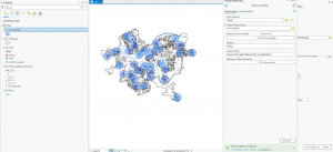
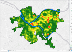
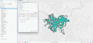
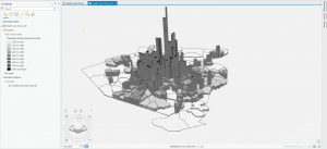
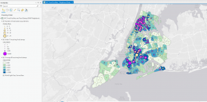
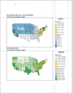
Chapter 4: Mapping density explores techniques used in GIS to visualize data concentration and distribution. Mapping density shows where the highest concentration of features are, making it useful for identifying patterns. Areas with many features may be difficult to analyze visually, so density maps allow measurement using units like hectares or square miles to better understand distribution. This is useful in mapping things like census tracts or counties. The chapter highlights two main ways for density mapping, by defined area and by density surface.  Defined area mapping uses dot density maps, where each dot represents a specified quantity of a feature. A shaded density map can also be used, where polygons are colored based on density values. Density surface mapping is created in the GIS as a raster layer. Each cell in the raster layer receives a density value based on the number of features within the radius. When deciding how to map density, it is important to consider the features being mapped and the information needed. Density mapping can focus on features or feature values, which can lead to different interpretations. Displaying density surfaces effectively requires careful classification of data values. Common classification methods include: Natural breaks, quantile, equal interval, and standard deviation. Choosing the right number of classes is important- too many can make patterns hard to distinguish, and too little may oversimplify. Density surfaces are typically displayed using a single color gradient, with darker shades representing higher density.  Contours can also be combined with shaded density surfaces. Overall, chapter 4 provided a good understanding of density mapping and its significance in GIS analysis. 


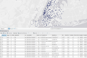
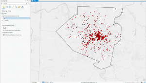
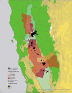
Chapter 5: Finding what’s inside discusses how GIS allows users to analyze what is inside a specific area, which is important for monitoring and comparing multiple regions. Mapping what is inside an area helps identify patterns, summarize key features, and support decision-making processes. The chapter introduces three primary methods for determining what is inside a given area: drawing areas and features, selecting features inside an area, and overlaying the areas and features. Drawing areas and features is the simplest method, allowing you to create a visual boundary around an area and examine what features are inside or outside. However, this method is purely observational and lacks quantitative data. Selecting features inside an area is a more detailed approach, because GIS can generate lists, counts, or summaries of the features within a defined boundary. The most comprehensive method is overlaying areas and features, where GIS combines the area and its features into a new layer with attributes from both. The chapter also talks about discrete and continuous features. Discrete features are individually countable items, such as businesses or crimes, while continuous features represent measurements that vary over space, such as elevation or weather.  The choice between vector and raster overlay also impacts the accuracy of the analysis. Vector overlay provides precise areal measurements but requires more processing, while raster overlay automatically calculates areal extents but may be less accurate.


Chapter 6: finding what’s nearby focuses on what is near a specific feature. This type of analysis is essential for monitoring surrounding areas, measuring distances between features, and understanding spatial relationships. GIS allows for finding what is nearby by using three main methods: straight-line distance, distance or cost over a network, and cost over a surface. Each of these methods has its own practical applications and limitations, making it important to choose the right approach based on the type of data and analysis being conducted.

Straight-line distance is the simplest method and is commonly used to create a boundary around a feature. This technique is useful when a fixed range is required, such as identifying all homes within a 500-foot radius of a proposed construction site. However, it does not account for real-world barriers like roads, rivers, or elevation changes, which can affect actual accessibility. Distance or cost over a network is a more advanced method that considers travel constraints such as road networks or transit systems. This is particularly useful for measuring travel time to a location, such as determining emergency response times for a fire station. Unlike straight-line distance, this approach provides a more accurate representation of accessibility since it factors in infrastructure. Cost over a surface takes analysis a step further by incorporating the effects of terrain and environmental conditions. Instead of following fixed pathways like roads, it measures travel costs based on real-world conditions, such as steep slopes, water bodies, or different land covers. This method is commonly used for overland travel analysis, such as identifying suitable areas for hiking trails or wildlife movement. Overall, Chapter 6 builds on previous GIS concepts by shifting the focus from what is inside an area to what is nearby. By using different proximity analysis methods, GIS provides valuable insights for decision-making in urban planning, emergency response, environmental monitoring, and transportation analysis. Understanding how to find what is nearby is important for making informed spatial decisions.

Kocel, Week 2

Chapter 1

The first chapter of the book by Andy Mitchell goes over the fundamentals of GIS analysis, emphasizing the importance of understanding geographic features and patterns which can be used to find relationships in the data on a map. The chapter defines key concepts like geographic patterns, which can be random, clustered, or evenly spaced, and spatial relationships such as proximity. These concepts are important when someone is looking at a map and is trying to decipher what they are looking at, where the map location is, and where it is in relation to other existing locations. He also defines key terms such as categories, ranks, counts, amounts, and ratios which are all continuous values and are used when making maps.  A key takeaway for me is how GIS transforms raw data into insights by combining statistical and visual analysis. I am not a very mathematical person, so this entire concept is foreign to me, but I am interested in learning more. For example, geographic features can be categories into discrete, continuous phenomena, or data summarized by area. Discrete features can vary immensely, one example being crime locations, and are best represented using vector models. Continuous data is more suited for raster models. This chapter also explores map projections and coordinate systems. It’s interesting how the curvature of the earth needs to be taken into account, as larger projections will distort geographic attributes unlike the smaller scaled maps. This makes me wonder how GIS professionals deal with challenges posed by inconsistencies in data quality when performing large-scale analyses.

Chapter 2 

Chapter two delves into why and how to map in order to make a map that makes sense. This chapter emphasizes why it is crucial to map the location of features to reveal patterns that inform decision making. An example of this is identifying areas with high crime concentrations and can affect urban planning. The chapter details the importance of clarity in map design and highlights how basic maps showing where features are can uncover important patterns. Symbols and classifications also play a key role. Mitchell states that a good rule of thumb is that no more than seven categories should be displayed on a map at once… however this can change depending on the size of the map. This chapter helped me appreciate even more how GIS has shaped everything around us. I like the real world examples provided. One important one is the police department examples. I wonder how much harder their job would be without GIS. What I thought was interesting was the importance of balancing detail and simplicity. The decision about what data to use and what background color all shape the narrative of the map.


Chapter 3 

This chapter explores the importance of mapping quantities to uncover relationships and support decision making. By using counts, amounts, ratios, or ranks, GIS can add depth to geographic analysis. This chapter was very interesting to me because it combined technical explanations with real world applications to things that are important to me such as resource distribution. Visualization methods like graduated symbols, color shading, and 3D perspectives were introduced as tools for effectively communicating data. I found the section on ratio mapping compelling, as it demonstrated how averages, proportions, and densities provide meaningful comparisons across diverse regions. One interesting observation was that larder areas should not solely rely on counts but also use ratios to present a fairer analysis.

This chapter’s explanation of classifications methods, such as natural breaks and quartiles was really interesting. I am a stranger to all of these and am excited to learn more. These methods group data into classes, allowing patterns to emerge. It was interesting to compare visual examples, as they revealed how different methods tell distinct stories using the same data. This reinforced the creative aspect of GIS. This chapter deepened my appreciation for GIS, but also made me feel a little more overwhelmed. There are so many different uses for GIS and I wonder what GIS professionals decide which classification methods to use depending on the audience or goals they have. I know that this will be a useful tool in the future.

Kocel, Week 1

Hi! My name is Emily and I am majoring in International studies and Environmental studies, with a minor in Spanish. I love traveling and just got back from studying abroad in Chile. I love animals and nature, I have three cats, two dogs and a turtle at home.


Before this reading, I had no idea what GIS was, or the importance it has. It was interesting that the history of GIS goes back to the 1960s, yet many people like myself are unaware of the significance of GIS analysis. It has become essential in many different fields from urban planning to public health. What I thought was most interesting was that GIS can be defined as both a system and a science. GISystems focused more on software and hardware, and GIScience is the more theoretical parts of spatial data and analysis. This introduction chapter peaked my interest in the applications of GIS and challenged me to think more critically about spatial data and how it influences real world outcomes.

For the first GIS application, I explored its use in water resource management. I am specifically interested in water depletion. GIS can be used to analyze and visualize water depletion by mapping various factors contributing to water scarcity such as groundwater levels, water usage patterns, land use, soil types and climate data. This provides information on where water depletion is more severe and why. 

I searched up “water depletion GIS California” and found  information on groundwater depletion in California’s central valley. Residents in this region rely on groundwater for agricultural growth, and this study found that 45 selected urban areas with a population average of 7 million people are at risk of Aquifer depletion.


Source: https://storymaps.arcgis.com/stories/0c1fce0700c4465180b3258c4751ecbb

For my second application, I searched “GIS application for animal shelters in Ohio” and I came across a website titled “Get started tracking at-risk animals using GIS data”.  This seems to be information on a project happening in northern Ohio. They use GIS to target at-risk animals in communities so shelters can understand where at-risk animals are coming from and determine where it makes sense to target planned interventions. GIS, in this case, is used to help animals.

Source: https://www.aspcapro.org/resource/get-started-tracking-risk-animals-using-gis-data