Flores Week 5

I came to some problems in Chapter 4-2. When I was getting the data for tracts from the field view, I only had 1 piece of data for the tracts information. I tried restarting the file since I hadn’t saved it and maybe deleted the data, but when I restarted it, it was still the same. I kept going back through my steps to figure out what was wrong but nothing would change the outcome of the data. I kept moving on and then when I tried to make a new field “popyouthunder20” it wouldn’t let me save, so then it wouldn’t add it to the Maricopa table. I had to skip the rest of 4-2 because I wasn’t able to do any of the steps because my file was all screwed up and probably corrupted. In 4-3 I would move the map and the colors would be dark red and green but as soon as I let go of the map it turns into a cyan blue. 

In chapter 5 I really enjoyed going back to the basics and just exploring the different map projections to learn them and get familiar with them. It was cool going to the National map website to input information into arcGIS. 

Chapter 6 was fairly simple, the tutorials were short and continued from the last tutorials helping you remember what you just did and using it for the next tutorial. 

The start of chapter 7 was really fun, I liked editing the map and changing where the building polygons were to match the buildings. My construction toolbar didn’t show up automatically so it was hard to find it. It was fun creating the perimeters to label the buildings, it reminded me of like the OWU map and how they created it. In the last tutorial of chapter 7 my HBH1 layer was slanted and not aligned with Hamburg Hall, but I went back and retraced my steps and was able to fix it which felt very rewarding. 

In chapter 8, when I tried to run the Collect Events tool it kept failing, so I had to skip it. Other than that, learning about the geocoding process was very smooth.

Flores week 4

In chapter 1 I had some difficulties learning how the program worked but when I figured it out it felt very rewarding. I found arcGIS to be very inaccessible, they use very technical language that someone who doesn’t normally work with computers won’t understand. The textbook tutorial is also very vague with its instructions at times, but they are also helpful at certain points. The instructions are also outdated and not the latest version of the program. I liked learning about how to navigate the maps, and it was really cool learning how to change the maps from 2D to 3D. In Step 2 of Use a pop-up window, There was no website hyperlink for me to click and explore, so I couldn’t open that. I also forgot to save tutorial 1-3, which doesn’t affect me but now I don’t know how to get that back. 

Chapter 2 I had an issue at the start of 2-2, the labeling and layer groups Weren’t working and wouldn’t show up on the map. Some of the instructions were telling you to do the same thing with different contents but explaining it in different ways which made it really confusing. I did like that it was New York and we used the same colors the New York City Planning department uses. It was interesting learning about choropleth maps and how they use color to represent numeric values, it makes it easier for a visual learner to understand the map and learn the information it is giving. This chapter really helped me understand how the maps work and helped me get more comfortable with the GIS application 

In chapter 3 we learn the really important skill of transferring our maps off GIS and sharing them with people who don’t have access to it. The 3-3 tutorial was really cool because it was basically teaching you how to create a website. I struggled to find out how to place the table and the map side by side. I also didn’t have the pie chart from one of the steps, but it didn’t affect the dashboard.

Flores week 3

Chapter 4

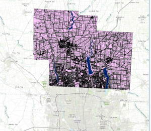
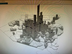
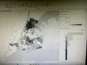
In chapter four we go over mapping density. This chapter teaches you how mapping density lets you see patterns of where things can be concentrated. Mapping density shows where the highest concentration of features is, the individual features, and areas of different sizes. A density map lets you measure the number of features using a uniform areal unit like square miles on a map, it can let you determine where to place what you might want in a dense area. When deciding what to map it is important to think of the features you’re mapping. You need information to go on the map to decide the density value on the map. This chapter goes over deciding if you want to map features or feature values. Density of features are like the amount of locations in a place, and feature values are like the number of people populating these locations. They can give very different results and shift the density of your map, and your results. There are two ways to define mapping density, by the defined area, or by density surface. When mapping density by the defined area you define it graphically using a dot on the map. When using a density surface you use the GIS raster layer and it usually requires more effort but it provides a more detailed map. I like the visual aspect of dot maps, it gives a quick sense of density on the map without really needing to look at the legend. This chapter teaches us about cell size, it determines how coarse or fine the patterns will appear. The smaller the cell size the smoother the surface, but the more cells when using a large cell size it will take longer to process and take more storage space. With units in GIS you need to choose a value for the units you’re mapping, and the results on your map will depend on how you created the density surface. 


Chapter 5

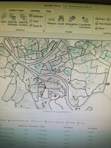
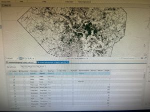
In chapter five we went over mapping what’s inside, drawing areas and features, overlaying areas and features, and defining our analysis. When mapping what’s inside the map you can compare and monitor what is going on inside each area and take action when needed. When mapping it is important to get the right data and collect the correct information in order to monitor the activity. When mapping multiple areas you have to make sure to identify each area uniquely using a name or numbers. The features can be discrete or continuous. When features are discrete they are unique and identifiable, they can be listed or counted. Continuous features represent seamless geographic phenomena, you can summarize the features for each area. When using GIS you can use lists, counts or summaries inside an area to find out information. There are three ways of finding what’s inside the area, drawing the area, selecting features inside the area, and overlapping areas and features. There are three ways of finding out what’s inside the map. You can draw the areas and features by creating a map and showing the boundary of the area and the features, it is good for a visual approach. Selecting features inside the area is good for getting a list or summary inside an area, it specifies the area and layer containing the features. The last way is overlaying the areas and features, it combines the area and the features to create a new layer comparing the two layers. It’s good for finding which features are in each of several areas. In order to choose the right method for your project you need to decide if you only need to see the features inside, if you want to see the summary of features fully or partially inside, or need a summary of continuous values. 


Chapter 6

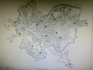
In chapter six we find out why we map what’s nearby, mapping what’s nearby can let you monitor events in an area, or the features affected by an activity. When using GIS you can find out what’s happening within a set distance of a feature, it helps you identify the features inside the area that are affected by an event or activity. Traveling range can be measured using distance, time, or cost. This can help define the area served by a facility. Knowing what’s within traveling range can help delineate areas that are suitable for specific use. In GIS you can also take into account the curvature of the earth when mapping larger areas, you can use output layers to correctly display the curved surface of the globe. You can get three things once you’ve identified which features are near your source, a list of features, a count, or a summary. The count can be a total or a count by category, a summary statistic can be a total amount, an amount by category, or a statistical summary. To find the range of what you want, you can choose a single range or several, when specifying more than one range you can create inclusive rings or distinct bands. Inclusive rings are useful for finding out how the total amount increases as the distance increases. Distinct bands are useful if you want to compare distance to other characteristics. To find out what’s nearby you can use straight-line distance, you specify the source feature and the distance, and GIS finds the area or surrounding features within the distance. This is good for creating a boundary or selecting features at a set distance around a source. When You can use two other methods, distance or cost over a network, and cost over a surface. Distance or cost over a network can help you specify the source locations and distance or travel cost along each linear feature, GIS is able to find which segments of the network are within the distance or cost. When using cost over a surface you specify the location of the source features and a travel cost. GIS creates a new layer showing the travel cost from each source feature 

Flores Week 2

Chapter 1

With GIS it is so fascinating that you are able to predict and prepare for future outcomes using any model you create. Mapping has come a long way, from inaccurate drawings when people would sail around and map the area, all the way to being able to create new maps and find patterns within these maps to more easily understand your surroundings. I like how simple and straightforward it is performing this analysis, just find the data and choose a method then see your results. It seems pretty straightforward with set rules you follow. The different types of features are simple to understand with clear directions of what they are and what they look like. The chapter explained how you can have different types of maps, like vector or raster, they can have harsh lines showing the barriers of different layers, but also soft layers blending them together. Although this can cause information to be lost because of the change in cell size and can affect results of the analysis. It’s important to have all the data layers in the same map projection and coordinate system to make sure you have accurate results. I wonder if there is a way to change the distortion you would get when mapping a larger area, if you can calculate for the curvature of the earth. The categories are good, there isn’t one word for everything but groups of words that mean the same thing and can help describe specific things to break it down or generalize it to see the bigger picture. There are also ranks, which put things in order from high to low. Counts and amounts show the actual number of features on the map, it lets you see the value to compare it to other features. Finally, ratios show the relationship between two quantities divided by one quantity, the map will be able to more accurately show the distribution of features.

Chapter 2 

In Chapter 2 we learn to map where things are, we decide what to map, and analyze geographic patterns. We were able to find what we’re looking for and where to take action. I can use a map to identify individual features or look for patterns in the distribution of the features, the maps are able to identify and help find patterns in any information you input into it. Mapping where things are can help one see a visual concentration of the data they are using and solve their problem, or find out if it was just random occurrences and then you would need either more information or change the method you are using. It is important for the map to be appropriate for the audience you are showing it to, if it is for someone who is just learning about this it should be short and not clouded with information that isn’t necessary to them. If it is someone who needs to know a lot of information in one spot it should be well organized with a good system to identify what they are looking for. The chapter talks about making sure to have geographic coordinates input and assign them to your data, you can put it into the GIS database, or it might already exist in another program or in the database. Basic maps can use the same symbol, this can help someone notice patterns easily and solve their problem or question. GIS can draw symbols to identify places or draw linear features that describe streets, rivers or sidewalks, it can also fill plots of land with color or patterns. When you map an area that is large in comparison to the size of the features, it’s best to not use more than 7 categories because it will make the patterns difficult to see, if there are less categories it will make the patterns clearer. The chapter states how it is important to use statistics to measure and find the relationships between your features. 

Chapter 3 

In chapter three, we learn about comparing places based on quantities so we can see which places meet our criteria. We learned what we need to map, understanding quantities, making a map, and looking for patterns. When we map based on quantities and add a level of information past mapping the locations and features, we will be able to see patterns much clearer and realize what we need to do. Learning how to map features it is important to know what they are called. Discrete features can be individual locations, linear features, or areas. Continuous phenomena can be defined areas or surface continuous values, like areas displayed using graduated colors. Data summarized by area is displayed by shading each area based on its value or using charts to show the amount of each category in each area. In this chapter they talk about the importance of making sure your map is intended for the audience in mind and how the information on your map should represent that. Changing the way the question is framed and how you present your data will help reveal specific patterns. It is also important to understand quantities, the amounts ratios or ranks on your map. Counts and amounts will show the total numbers. Ratios show the relationship between two quantities, and are created by dividing one quantity by another. The most common ratios are averages, proportions, and densities. Averages help compare places that have few features and many features, you can create an average by dividing quantities that use different measures. Proportions show what part of a whole each quantity represents, to create a proportion you divide quantities that use the same measure. It’s important to note that proportions are often presented as percentages. Finally, densities show where features are concentrated, to calculate a density you divide a value by the area of the feature to get a value per unit of area. You can create ratios by adding a new field to the layers data table and calculating new values by dividing two fields containing the counts or amounts. 

Flores week 1

Hi my name is Daniela Flores (she/her) I am a sophomore majoring in environmental science. I’m from Philadelphia PA, I love listening to music and going on walks.

Chapter 1

When people think of GIS, they believe it’s only software for geographers because of its ability to document and log locations. In reality, everyone uses it, and it is a helpful tool for anyone in any subject or job position. GIS can help with basically anything that is in any place that can be documented. 

With GIS we can visualize things we couldn’t when it was just with pen and paper. We can see the repercussions of potential construction in areas and how it can damage the environment without doing anything to the area. GIS reminds me of a layered cake, layering different layers of the land, soil, forest, housing/buildings to create one map that includes all the characteristics of one area. One thing I like about GIS that this chapter talked about was how when using GIS the facts and data don’t have to be as precise, there can be guesstimates to see how things would look while finalizing data or making hypotheses while mapping. GIS is also good for visual learners, they can see the separate layers of the area and learn about it in an easier format instead of reading long articles about data. With this visual format, it can be easier to solve problems as they are now imitating what someone is trying to hypothesize. With GIS we are not only able to address environmental concerns but also human concerns like crime, femicide, and social changes. GIS can help with anything you can think of, it is a powerful, and accessible tool that anyone can use. I wonder if GIS has been purposefully used to urbanize and gentrify certain areas because they seem like good areas to build businesses without identifying the places that were there before. 

Two GIS applications 

One GIS application I looked up was feminicide, I found one based in Antioquia, Colombia. This paper focuses on studying feminicide from a geographical perspective, and seeing how the relationship with drug trafficking in geographical locations impacts feminicides. 

Source: The spatial heterogeneity of factors of feminicide: The case of Antioquia Colombia

The second GIS application I looked up was Landslides in Colombia. They used GIS to estimate groundwater levels and compare them to rainfall events. They also compared it with earthquakes to see their relationship and how they could predict landslides. 

https://onlinelibrary.wiley.com/doi/epdf/10.1002/%28SICI%291096-9837%28199609%2921%3A9%3C853%3A%3AAID-ESP676%3E3.0.CO%3B2-C