Posted in Drive
Author: cnheumasse
Heumasse Week 7
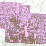
Address Point: Represents all certified addresses in Delaware County. These addresses are
updated daily, with updates published monthly.
Annexation: Tracks annexations and boundary changes in Delaware County since 1853. Here,
annexation simply refers to territorial adjustments.
Building Outline: Contains outlines and structures of all buildings in Delaware County. The
most recent update was in 2023.
Condo: Includes all condominium polygons within Delaware County.
Farm Lot: Identifies farm lots within both the U.S. Military and Virginia Military Survey
Districts.
GPS: Contains all GPS monuments established in 1991 and 1997.
MSAG (Master Street Address Guide): Used for defining political jurisdictions in townships,
cities, and villages throughout the county.
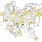
Map Sheet: Represents all map sheets within Delaware County.
Hydrology: Maps all major waterways, rivers, and streams within Delaware County, enhanced
using LiDAR data.
Municipality: Contains data on all municipalities within Delaware County.
Original Township: Displays the original township boundaries before tax districts altered their
shapes.
Precinct: Contains data on voting precincts within Delaware County, sourced from the Board of
Elections.
Recorded Document: Includes recorded documents from the Delaware County Recorder’s Plat
Books, Cabinet/Slides, and Instrument Records that are not represented by active subdivision
plats. Used for tracking miscellaneous records in the county.
School District: Shows the boundaries of school districts within Delaware County.
Street Centerline: Represents the center of pavement for public and private roads in Delaware
County. This dataset was developed using address information.
Subdivision: Contains subdivision and condominium records for Delaware County.
Survey: Includes shapefiles of point coverage representing land surveys within the county.
Tax District: Defines tax districts as determined by the Delaware County Auditor’s Real Estate
Office.
Heumasse Week 6
GIS Tutorial for ArcGIS Pro
Chapter 9: Spatial Analysis
This chapter introduces spatial analysis techniques used to examine geographic patterns and relationships. It covers essential tools like buffering, which creates zones around features, and overlay analysis, which helps combine multiple datasets to determine intersections. The tutorials walk through various spatial analysis applications, such as proximity analysis for service areas and clustering to identify data patterns. A major takeaway is that spatial analysis provides insights by identifying relationships between spatial elements. These techniques are useful in decision-making for urban planning, environmental assessments, and resource management. One challenge encountered was configuring buffer distances correctly to ensure accurate analysis.
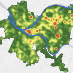
Chapter 10: Raster GIS
This chapter explores working with raster data, which is crucial for environmental and topographic analysis. The tutorials focus on processing raster datasets, performing raster calculations, and creating heat maps using kernel density analysis. Additionally, it introduces the concept of suitability modeling by combining multiple raster layers. Understanding how raster data represents continuous surfaces like elevation and temperature is essential for GIS applications. Challenges included managing large raster files and selecting appropriate classification methods for visualization.
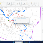
Chapter 11: 3D GIS
This chapter focuses on working with three-dimensional data to enhance spatial visualization. It covers tools for creating and manipulating 3D scenes, converting 2D features into 3D representations, and performing line-of-sight analysis. Tutorials include building elevation models and integrating LiDAR data for realistic 3D mapping. Unfortunately, the 3D feature is still not working on my side, which limited my ability to complete most of the exercises in this chapter. Since I couldn’t properly load or visualize the 3D elements, I continued reading through the material to understand the concepts.
Heumasse Week 5
Week 5: GIS Software II – GIS Tutorial for ArcGIS Pro
Chapter 4: File Geodatabases
This chapter covers the management and organization of spatial data using file geodatabases. The tutorials demonstrate how to create a new project, connect external folders, and convert shapefiles into feature classes. Attribute table modifications include renaming fields, deleting unnecessary columns, and performing SQL queries. Spatial joins allow the combination of data based on location, while central point calculations differentiate between centroids and central points. These techniques help in structuring and analyzing geographic data more efficiently.

Chapter 5: Spatial Data
This chapter focuses on projections, coordinate systems, and working with external geospatial data. It highlights the importance of selecting the correct coordinate system to ensure spatial accuracy. The tutorials explain how different projections affect data representation and how external datasets interact with ArcGIS Pro. Working with U.S. Census data and adjusting coordinate systems is emphasized to maintain consistency across datasets.

Chapter 6: Geoprocessing
This chapter introduces key geoprocessing tools that help automate spatial analysis. Tutorials include dissolving features, extracting study areas, and merging datasets to enhance organization and visualization. Symbolizing data using graduated colors makes population density patterns clearer. Labeling and adjusting map properties ensure the readability of spatial data, making geoprocessing essential for refining and structuring geographic information.

Chapter 7: Digitizing
This chapter covers the creation and modification of spatial features. Tutorials guide users through adding new features, editing existing ones, and transforming polygons. The Split tool is introduced for precision in dividing features while maintaining dataset integrity. Digitizing is essential for creating accurate and detailed maps, requiring careful manipulation of spatial data.

Chapter 8: Geocoding
Geocoding is the process of converting addresses into geographic coordinates. This chapter explains how to use address locators and refine match rates for accuracy. The tutorials explore batch geocoding and handling errors in address-based datasets. The ability to transform raw location data into meaningful spatial insights is a key application of GIS technology.
Heumasse Week 4
Chapter 1: Introduction to ArcGIS Pro
This chapter introduces ArcGIS Pro and its interface, including how to open projects, manage layers, and navigate maps. It explains vector and raster data, essential for working with spatial information. The tutorial covers file geodatabases, which organize data efficiently, and basic map functions like zooming, panning, and exploring attributes. A key takeaway is how GIS helps visualize spatial relationships by layering datasets like population and land use. However, the 3D map failed to open for some reason, which made it difficult to explore certain visualizations. Questions that came up: What’s the best way to manage multiple layers? How does ArcGIS Pro handle large datasets?
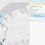
Chapter 2: Map Design and Symbology
This chapter focuses on making maps clear and visually effective. It covers symbology, which helps represent different data types, and definition queries, which filter datasets. The tutorial walks through adjusting colors, labeling features, and classifying data for better readability. However, symbology is not working the way the tutorial describes, making it challenging to match the expected results. This issue made it harder to properly classify and visualize the data as intended. A key lesson is that good map design balances clarity and information. Some questions: How does symbology impact data interpretation? What are best practices for making maps both useful and visually appealing?
Chapter 3: Sharing and Presenting Maps
This chapter covers how to create layouts and share GIS work. It explains adding legends, scale bars, and titles for clear presentations. The tutorial also introduces static and interactive maps, highlighting when to use each. However, the second map in the tutorial is showing blank for me, which prevented me from completing most of the exercises. Because of this, I continued reading through the chapter instead. A major takeaway is that maps should be designed for their audience, whether in print or online. Key questions: How can layouts be optimized for different users? How can interactive maps be made accessible to beginners?
Heumasse Week 3
Chapter 4:
Chapter 4 is all about understanding and managing data in GIS. It explains two main types of data: vector and raster. Vector data includes points, lines, and polygons, like roads or lakes, while raster data is made of a grid of cells, often used for things like elevation or temperature maps. Both types of data are essential for mapping and analysis. The chapter also talks about attribute tables, which store information about the features on a map. For example, you could have a table showing population numbers for each county. It explains how to clean and organize this data, like fixing errors, removing duplicates, and formatting it correctly. These steps are crucial for making sure your maps and analyses are accurate. Another important concept is data joins. This is when you combine outside data, like census statistics, with your map features using shared identifiers. This lets you add more detailed information to your maps. The chapter’s tutorials help show how these concepts work in practice. The big takeaway is that working with GIS data takes attention to detail because even small mistakes can lead to big problems in your analysis. Questions to think about: How can you best organize large datasets? And how do you make sure the data from different sources is accurate?
Chapter 5:
Chapter 5 focuses on using GIS to find patterns and relationships in data. It introduces tools like buffering, which creates zones around features, and overlay analysis, which combines layers to find overlapping areas. For example, you could use buffering to find homes within a certain distance of a school, or overlay analysis to see where flood zones and neighborhoods intersect. The chapter also explains spatial relationships like proximity (how close things are) and containment (what’s inside a boundary). These ideas help answer questions like “What’s nearby?” or “What areas are affected?” Geoprocessing tools make it easier to do things like merge datasets or select specific features based on criteria. The tutorials give examples of real-world uses, like analyzing public transit access by combining maps of bus routes and population density. This shows how GIS helps solve problems in urban planning, environmental studies, and more. Questions include: How can these tools be used for different scales of analysis? And what are some limits to what current GIS tools can do?
Chapter 6:
Chapter 6 gets into more advanced GIS topics like modeling and making predictions. It introduces suitability modeling, where you evaluate locations based on multiple factors. For instance, you might find the best spots for a solar farm by looking at sunlight, land use, and distance to power lines. Another method is interpolation, which estimates values in areas where you don’t have data by using nearby points. This is useful for predicting things like rainfall or pollution levels. The chapter also covers cost distance analysis, which calculates the difficulty of moving across a landscape. This is helpful for planning paths around obstacles like steep hills or rivers. The tutorials show how to use tools like weighted overlay, which lets you prioritize different factors in your analysis. These powerful methods require careful planning to avoid errors or bad assumptions. Key takeaways include the importance of checking your models for accuracy and thinking about the ethical implications of using GIS for predictions. Questions that come to mind: How can you test if your models are reliable? And what happens if people misuse predictive maps?
Heumasse Week 2
Chapter 1:
This chapter is about getting started with ArcGIS Pro, Esri’s tool for creating and analyzing maps. It introduces key terms like feature classes, which are groups of map elements like roads or parks; raster datasets, which are images made of pixels like satellite photos; file geodatabases, a format for storing spatial data; and project files, which organize all the resources in one place. The tutorials walk through basic tasks like navigating maps, turning layers on and off, and adding base maps. One important takeaway is the distinction between “figure” (the main data you’re focusing on) and “ground” (the background that provides context). For instance, you might layer population density data over health clinic locations to analyze if the clinics are in the right places. A key lesson here is that GIS makes it easier to see patterns and relationships in data. Although the concepts are fairly straightforward, using the software might take some hands-on practice to fully grasp how everything works together. The tutorials do a good job of introducing these ideas in a beginner-friendly way. Some questions that come to mind are: How do geodatabases compare to older formats like shapefiles? And what are some tips for keeping projects organized, especially for large datasets?
Chapter 2:
Chapter 2 dives into designing maps that are clear and effective. It focuses on thematic maps, which are used to answer specific questions, like identifying areas with limited access to resources. The chapter explains how to use colors, symbols, and other design tools to make maps that highlight important data without overwhelming the viewer. A major topic here is choropleth maps, which use colors to represent data like income levels or population density. The chapter introduces classification methods like Natural Breaks and Quantiles, which divide data into groups to make it easier to visualize patterns. Another important idea is balancing the map’s “figure” and “ground” elements so that the main data stands out while background details remain subtle. The chapter also emphasizes the importance of simplifying your map to avoid confusing the audience. For example, removing duplicate labels and using muted colors for less important layers can make a map much easier to read. This raises questions like: How can we use automation to make designing maps faster? And how do we ensure that maps are both accurate and visually appealing?
Chapter 3:
This chapter focuses on sharing maps with others in a way that’s easy to understand. It highlights tools like ArcGIS StoryMaps, which combine maps, text, and images to tell a story, and Dashboards, which display live data in a clear and interactive format. These tools make it possible to create engaging and informative visuals that cater to different audiences. The tutorials show how to design layouts that are user-friendly and visually striking. For instance, you can use bright colors and simple charts in a dashboard to make trends stand out. StoryMaps are ideal for presentations and reports because they provide context alongside the map data. One key takeaway is the importance of tailoring maps to your audience. Whether you’re creating a detailed dashboard for analysts or a simple StoryMap for the public, it’s crucial to think about what the end user needs to see. Questions to consider include: What are the limitations of StoryMaps for larger projects? And how do dashboards handle live data without lagging or crashing?
Heumasse Week 1
Hi! My name is Claire Heumasse, and I’m a Junior from Scarborough, ME. I am majoring in Biology at Ohio Wesleyan University and am involved in the Cheer team, Women in Science club, and Rock climbing club. In my free time, I enjoy ice skating and reading books.

In reading Schuurmans first chapter of GIS: A Short Introduction, I expected a boring, technical overview, but I was surprised by how easy it was to understand and how interesting it turned out to be. Schuurman highlights how GIS is not only a practical tool but also a lens to understand and analyze complex spatial data. I also found the historical development of GIS fascinating, particularly how overlay techniques evolved from physical maps to digital platforms. What stood out most was the discussion on GIS’s versatility. From urban planning to public health, the potential applications of GIS are seemingly endless. I was especially intrigued by how GIS is used to map crime patterns and analyze their spatial relationships—a tool that can influence public policy and improve safety.
For the first GIS application, I explored its use in Indonesia. GIS is employed to monitor deforestation in Kalimantan and Sumatra. By mapping forest cover changes over time, researchers can identify illegal logging hotspots and assess the impact of deforestation on biodiversity. This application is crucial for protecting endangered species, such as orangutans, that rely on these habitats.
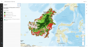
Source: https://www.arcgis.com/home/item.html?id=60e5dfae803c48ac932a9117f28c6694
For the second application, I searched “crime mapping GIS” and found an example in Houston, Texas. GIS is being used to analyze violent crime patterns in the city, helping law enforcement allocate resources effectively. By creating heatmaps of high-crime areas, officials can identify correlations between crime rates and urban features like poorly lit streets or abandoned buildings. For instance, GIS data has highlighted specific neighborhoods where targeted interventions, such as increased police presence and community programs, have led to measurable reductions in crime.
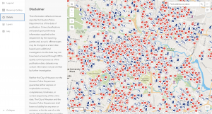
Source: https://www.arcgis.com/apps/instant/sidebar/index.html?appid=1427304b9e6048a488e0be90b3aa1cd7