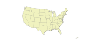
Nagel Week 6

Chapter 9

  • 9.1: Very short and straightforward, just learning to use the cluster tool
  • 9.2: Again very straightforward, didn’t have any issue with the spatial overlay.
  • 9.3: This one definitely took a while, at least longer than the others and was definitely more complicated. Did not have any technical issues that other classmates seemed to have experienced though.
  • 9.4: At the very end of analyzing for the optimal situation, using the summarize tool didn’t seem to work. Or at least, no change occurred that I noticed.
  • 9.5: Another straightforward section that just focused on changing symbols and labels.

Chapter 10

  • 10.1: Very interesting to see the 3D landscape overlaid on the 2D map beneath.
  • 10.2: Heat maps are among my favorite types of map… that sounds weird to say now that I think about it, but there is something about them that is inherently interesting so it’s fun to play around with.
  • 10.3: Was ultimately very disappointed in the end result with this part. Took me two hours to find and put everything together from the model to the codes, and on the last step to run the tool I was met with some unknown error so it felt like a waste of time.

Chapter 11

  • 11.1: Basically Google Earth but playing with exaggerated features and time based lighting.
  • 11.2: I mean I suppose it’s interesting to see the different layers in different colors contrasting. All came together at the end seeing the landscape reflected accurately.
  • 11.3: Shows how to add realistic objects to a map using z features and points.
  • 11.4: The drawing of the bridge arch using z points didn’t work, and neither did the line of sight analysis
  • 11.5: Very straightforward. Interesting to play around with the height of objects.
  • 11.6: Was initially concerned since nothing was happening, then the building finally showed after playing with the properties in a different step. Interesting to see a realistic-ish building model.
  • 11.7: I don’t think animation has ever been easier… I joke but its still cool to see an animation which is something like a 3D tour

Nagel Week 5

Chapter 4

  • 4.1-4.2: Incredibly confusing and frustrating, there were too many different instructions to browse to different folders that I didn’t even know existed or was extremely difficult to navigate this part Could not complete these parts as they all act as one part and towards the end of 4.1, the gdb files stopped displaying properly or were corrupted and I was unable to find the cause and didn’t want to restart after attempting to solve the problem for about three hours.
  • 4.3: Still long and too many things to keep track of, but I was able to get an idea of creating data ranges. This part of the chapter also broke around ž of the way through though and despite doing what the instructions said verbatim, the attributes table was not displaying the correct numbers.
  • 4.4: Short and to the point, a nice refresher from the other ones. I had forgotten how to make colored maps though so I had to relearn that part quickly.
  • 4.5: Easy to do, but I still don’t have a clue what a ‘centroid’ is given that the book doesn’t attempt to make any of the definitions in layman’s terms.
  • 4.6: Discusses joining different datasets for use in tables. Again not entirely sure what that entails but I got it done somehow.

Chapter 5:

  • 5.1: Discusses different coordinate systems used over time and how to change the appearance of a map based on the circumstances.
  • 5.2: Very short, not entirely sure what changed by switching to the Albers equal area projection.
  • 5.3: It is very interesting to see the opaque white layer over the actual map and watching where things such as roads and rivers intersect on the covering layer.
  • 5.4: Adding the X/Y data was almost impossible as it’s listed elsewhere from what it says in the book. Seeing the completed overlay was interesting though.
  • 5.5: Discusses adding US census data to a table. Unable to finish as some of the listed excel files in the book did not exist in the file.
  • 5.6: While using the raster data to create a legend of land use in the US was interesting, like several other chapter tutorials, this one also did not work as the Raster file was too large for the program to handle, even when extracting it from Living Atlas like the textbook instructed.

Chapter 6

  • 6.1: Not particularly interesting nor did I really understand what the section was trying to teach me.
  • 6.2: The select feature and seeing the outlined blue zones was interesting, but I did get stuck at the end when it wanted me to ‘select intersecting streets’.
  • 6.3: It is cool, if not somewhat satisfying, to be able to merge the individual water sections into one layer.
  • 6.4: Short and to the point, I understand adding data to the attributes data as shown.
  • 6.5: Another straightforward section in which I felt for the most part that I knew what was going on.
  • 6.6: Aside from a small issue when joining the table, this section went fairly smoothly.
  • 6.7: Very straight to the point, though I’m not entirely sure what changed or happened in this section.

Chapter 7

  • 7.1: Short, straightforward, and easy to understand. Cool to be able to pick up a ‘location’ and move/rotate its outline to match with the structure.
  • 7.2: Took a long time to figure out since there is no transparency slider but also making an outline isn’t as simple as connecting points as it creates an area for you so that required some trial and error. The snapping tool also did not match perfectly with the streets and only made straight lines.
  • 7.3: Very short and easy, not much else to say.
  • 7.4: Took me way too long to figure out what I was doing with the linking but I got there. Also side note but the shown building has an uncanny resemblance to Stuy Hall.

Chapter 8

  • 8.1: Had a couple of bumps getting to do what it wanted me to do but otherwise all was fairly straightforward. Interesting to see just how much data there actually is. Adding zip code dots to the map was also kinda cool as well as zooming out and seeing the overall map with all the red dots and clusters.
  • 8.2: Followed on and expanded on some of what was done in the previous section. Again, lots of data to work with that makes it a little confusing. Not entirely sure what I did as it all felt somewhat like a repeat of 8.1

Nagel Week 4

Chapter 1

  • 1.1: Took forever to get things up and running, granted I can barely work a calculator, let alone a computer. Once things did work though, the introduction was simple and didn’t take long to finish.
  • 1.2: Seeing the different variations and attributes are interesting, but it takes a long time to actually get there and get the different options selected or deselected.
  • 1.3: While I do like to be able to see where the data comes from, there’s a lot of information and it takes a considerable amount of time to navigate through everything to get to the right thing.
  • 1.4: The 3D view and different symbols/colors for different areas are interesting, though figuring out how to vertically rotate the 3D view was a challenge.   

Chapter 2

  • 2.1: Changing the colors and the different options on the palette are cool, although the end result did not entirely look like the picture in the book.
  • 2.2: Section teaches how to label features and change labels. I was not certain I did it right though as no name popped up over the West Village area.
  • 2.3: Slightly more time consuming than the others as changing from tab to tab to change color and symbol is fairly tedious
  • 2.4: Initially broken at first as the neighborhood content section was corrupted and had to be repaired. Was also unclear in asking to move the one tab above the 3D section and not on top of it instead.
  • 2.5: A short section but it did not work. There was no template section nor an area in which I could choose different shapes from as there was prior.
  • 2.6: I suppose learning how to import layers is going to be important at some point. Splitting between the two layers was interesting to see though.
  • 2.7: Short so not much to say for this one other than that there is something inherently satisfying about dot graphs.
  • 2.8: Short but a little confusing as I thought for a minute I had done the same thing twice in a row

Chapter 3


  • 3.1: This one was a struggle to get through. Trying to get parts of maps and labels to snap to an axis was difficult, and a lot of different tabs to navigate through.
  • 3.2: Now I’m even slightly more confused. Took me some time to figure out how to share it, but doing stuff on WebGIS rather than the actual program.
  • 3.3: Took an extremely long time to do, and I’m not very confident in having my work shared online for all to see.
  • 3.4: Shorter and a bit more clear in what it wanted, but halfway through I got stuck with the dashboard as I was unable to find the option to delete x and y value fields.

Nagel Week 3

Chapter 4

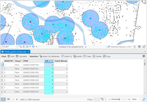
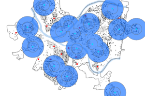
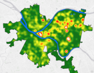
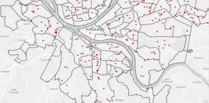
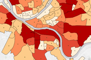
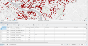
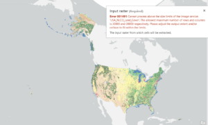
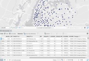
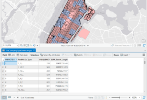
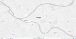
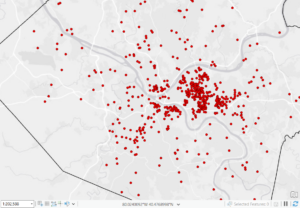
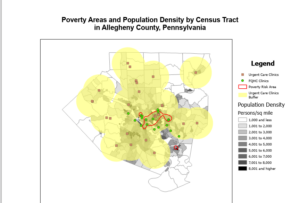
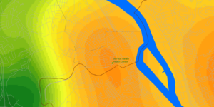
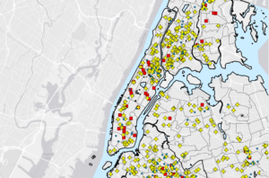
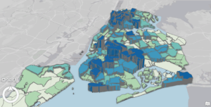
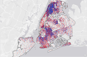
The main focus of chapter four is about ‘density’, and how to map the density of features. Other questions looked at are why map density is important, deciding what to map, different ways of mapping density, mapping density in a defined area, and creating a ‘defined’ surface. The higher the density of something, the higher the values are. For example, the correlation between density and high values can show areas of business, population centers, and areas of crime. The chapter also asks if you want to map explicitly features, or the values of said features, with the chapter using businesses in a given area vs employees in a given area, both on the same map. The chapter also lists two primary ways to map density. The first way is by ‘defined area’ or a dot map. Each dot on said map represents a specified number of features, and the closer the dots are together, the higher the density of features in that area. Then there is mapping by density surface, which is referred to as a ‘raster layer’ though what a raster is is not explained. In a density surface map, each cell gets a density value based on the number of features within the cell. As opposed to defined areas, density surface maps provide the most detailed information but also require the most effort to create. The chapter also details how to calculate the density values in defined areas depending on the type of map. Calculations can also show the features closest to the center of the cell. Chapter 4 also emphasizes the importance of the units used depending on the map type and what is measured.

Chapter 5

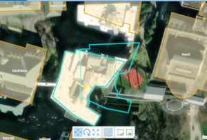
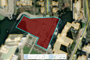
The main focus of the fifth chapter of Mitchell details what is on the inside of certain areas of map. The layout is the same as other chapters and like chapter three it seems to go on for a while, repeating a lot of information. Chapter 5 also focuses on defining the analysis of a map, different ways of finding what’s inside the map, how to draw areas and features, selecting features within a given area, and the overlaying of areas and features. One reason Mitchell gives to map inside is to know whether to ‘take action’ or not, giving examples of a district attorney monitoring drug related arrests in proximity to a school. The chapter also talks again about discrete and continuous features which I will admit I had forgotten existed until reading this part in the chapter. Mitchell details the information needed from an analysis, be it a list, count, or summary. In addition to the information needed, the chapter also goes over if you should include or exclude areas which are only partially included or excluded in the map. Key in the chapter are the three ways of “finding what’s inside”. By drawing areas and features you can see which features are in and outside of the area, and all that is needed is a dataset containing the boundary of the area and another dataset containing the features of the area. The second method is selecting key features in the area in order to obtain a summary or list of features in an area or group of areas, or for finding things within a certain distance of features. The final method is to overlay both the areas and features, which can be used to find which features are in different areas or finding out how much of said feature is in one or more areas.

Chapter 6

The main focus of the sixth chapter is “finding what’s nearby”, or as explained, letting you see what is within a set distance of a feature, allowing you to monitor events in an area. The chapter also focuses on reasons for mapping what’s nearby, using straight-line distance measuring, measuring distance over a network, and calculating costs over geographic surfaces. This is again where the book starts to lose me with mentions and examples of calculations given that I am not good with numbers in the slightest, but I digress. One reason Mitchell gives for mapping what’s nearby is for emergency situations, specifically using an example of a fire chief knowing the distance of streets within a three minute distance of a fire station. Mitchell also asks if you’re measuring what is nearby as distance or cost, which is another confusing aspect. Despite reading the section over again, it still doesn’t make sense how you can map cost over a geographical area. Another question of measuring is if you are measuring a flat plane using the ‘planar’ method  or are you taking the curvature of the earth into account. The second method is substantially more difficult given that the curvature of the earth is not only uneven, but distorts maps and how they are viewed. For example, looking at the sizes of countries on a globe compared to their actual size on a flat plane. Measuring “what’s nearby” is outlined in three different ways, those being straight line distance which is exactly what it sounds like and is good for creating boundaries. The second method is distance over a network which is good for finding things within travel distance. The third method is cost over a surface, which I again don’t fully understand so I won’t try to explain or summarize it. Overall while parts of the reading are still interesting, I feel it becomes repetitive and tends to drag on much longer than it needs to.

Nagel Week 2

Chapter 1:

I find these readings to be in a format that makes them much easier to read than the previous week’s readings. As I stated in the first blog post, it’s interesting to see how much GIS and the associated software have grown over the past two decades or so. Prior to college and maybe up until sophomore year, I had never heard of GIS until it was mentioned to me by academic advisors. Even then, I still had no clue what GIS entailed until last week. Chapter 1 is very useful in breaking down the basics of GIS into an easy to understand format, such as listing out the steps from making a question to getting results. As someone who does a lot of fishing, I like to think I’m quite familiar with maps and geographical formations and features as understanding these things play a large role in the activity. Chapter 1 also lists several common geographical tasks such as mapping the location of things, mapping density, and mapping change. The chapter then goes into different types of data, such as continuous data. While the explanation between ‘discrete’ and ‘continuous’ data does clear some things up, the explanation of what entails discrete data could definitely go a bit more into detail. Being that I’m also very ADHD, having pictures and charts to explain things rather than walls of text is also very useful in understanding the reading. Reading can only get me so far though and once it goes into things such as counts, ratios, values, and data tables it starts to lose me. While I understand what things such as ratios are of course, getting into the numerical and data aspect of things is a bit rough.

Chapter 2:

The second chapter goes into more detail about mapping and the process behind it. Given that when you’re analyzing data, you need to be able to see where things are, showing how mapping may be useful in the context of GIS. It also further highlights the usefulness of GIS as a tool and the many applications for it as outlined in the first blog post. Maps can also be broken down into various categories and groups such as assigning color and coordinates as a way of making the map easier to read and understand, along with how the map is intended to be used. Mitchell does also warn of adding too many categories to the map as the more categories there are the more difficult the map will be to read. Mitchell outlines a rule of seven, with seven being the most categories any map should have. The factors which play into the categories needed or desired generally stem back to the scale of the map in question and the features on it. For example, a large map with many features may need more categories of which the seven category rule may then restrain and make things more difficult. Then of course there are different types of maps depending on what and how much data needs to be visualized. For example, single type maps being the most basic maps display data using only a single symbol. The chapter ends with various ways of deciphering and analyzing maps just by looking at them, for example using symbols, landmarks, references, and patterns.

Chapter 3:

Chapter 3 is by far the longest chapter of the first three chapters and is incredibly intimidating. That’s not to say that chapter three isn’t interesting though. Each section presents a question to the reader that guides them through a sort of map making process. Chapter 3 also re-elaborates many of the ideas and concepts discussed in the previous two chapters, such as choosing which data points to use, counts and amounts, ratios, and ranks. By using certain data points, among other factors, you can get the most out of the relationships between the larger data sets and the smaller data sets. Maps are not limited to just data points but the other aforementioned concepts and factors such as rank can also be used. Another main idea from the chapter is if you are presenting a map to answer certain questions, or if you are creating a map to analyze data. Using classes on a map allows readers to more quickly compare areas and is useful in displaying data such as poverty rates. Regarding the making of the map itself, chapter 3 also goes over details such as graduated colors and symbols, charts, contour lines, and 3D perspectives. For example on page 83, a map outlining fish habitat is detailed using graduated colors to show the ideal habitat for fish compared to surrounding waterways. Contour lines are something that have always managed to confuse me somewhat. I understand how they work in terms of showing the rate of elevation change, but not the verticality of said change. Overall the data presented here is a mouthful, but it still manages to be interesting in some parts.

Nagel Week One

  • I am Christopher Nagel (just Chris is fine.) I am in my final semester of senior year and plan to graduate with an ENVS Major/Zoology Minor. Ohio native, from the capital of depression otherwise known as ‘Cleveland’.  I have three animals at home, a Russian Tortoise named ‘Shell’, a Saharan Uromastyx ‘Zil’, and a Jersey Wooly ‘Oreo’. In addition to animals, I also find aviation and some maritime history interesting. My biggest hobby is fishing in which I am very avid in.
  • Truth be told, I have very little, if any, knowledge of computer software. The only software I have used previously have been RStudio in a few BIO classes and CAD all the way back in Middle School, both with a great deal of difficulty. As to why I decided to join the GIS class, it was due more to the insistence from academic supervisors to take the class and that it would be a good skill set to have in my career than it was my own will and decision to take the class. I have a very loose idea of what GIS is, so I hope to learn more over the course of the class. That being said, the reading does explain it a bit, albeit a bit confusingly. There is no single meaning to GIS given that the applications for it are very extensive and diverse, but boiling it down it seems to be the analysis of spatial patterns using a layered geographical layout. It also appears that GIS has been in use since or before the 1960s, which is interesting as now GIS seems synonymous with computers and programming, but computers didn’t really become a thing until the 1970s, and more so personal computers in the late 70s and early 1980s. Given that, I’m not quite sure how it would’ve been used before then. Using the 1854 London Cholera Outbreak as an example of GIS is something I never would have considered. The famous discovery of the connection between the locations of contaminated water pumps and recorded cases did lead to an overall revolution in terms of sanitation and plumbing, so to see it be in use for so long is interesting. The various modern uses for GIS that Schuurman lists out, ranging from delivery logistics to taxes and the entire power grid, down to each circuit.
  • One application I found for GIS is estimating and mapping the spawning ground, habitat, and migration of Striped Bass on the Atlantic Coast, particularly in Chesapeake Bay. These models are made annually using a variety of data such as the size and quantity of prey, water oxygen levels, bioacoustics, and foraging models. https://www.gsmfc.org/publications/GSMFC%20Number%20043.pdf
  • Another application is for use in the aviation industry. Uses range from mapping flight plans, tracking aircraft, and controlling airspace. https://www.esri.com/content/dam/esrisites/sitecore-archive/Files/Pdfs/library/brochures/pdfs/aeronautical-info-management.pdf
  • Los Angeles International Airport Airspace