Hagans Week 6

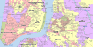
Chapter 9- This chapter went fairly quickly and I did not run into any problems during these tutorials. Overall, this chapter went more in-depth on using buffers to analyze proximity and to find whatā€™s near something. I donā€™t think weā€™ve had to use the buffers yet (unless Iā€™m forgetting an earlier tutorial), but I really enjoyed learning how to use them and discovering more about how to analyze what is around certain places and how you can utilize ArcGIS tools to find useful things about the data. Looking ahead to the final exam, I think this chapter will come in handy, as using buffers is one of the options for the final. In the first few tutorials, I learned how to use buffers to calculate the total number of kids near public swimming pools. I think this would be a very useful tool for businesses to ensure that they are in the optimal location for their target demographics. You can also use the buffers to set location parameters as being excellent, good, or poor in proximity to a certain location- which could influence certain policies and encourage new builds. This chapter also went over some more Python concepts, how to create scatterplots to discover linear relationships, and how to use the Multivariate Clustering tool to analyze and interpret cluster data. The chapter used those last few concepts with regard to serious crimes, but I think that this kind of analysis could be used for various other reasons.Ā 

MapCh9Crimes

MapCh9

MapBuffers2(Ch9)

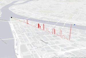
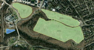
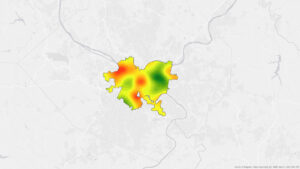
Chapter 10- This chapter was all about rasters, and it was fairly short and straightforward. This was the first time weā€™ve had to really use a raster dataset, so we started out by importing it and setting parameters for the raster analysis. The first tutorial showed us how to create a hillshade map to show elevation, and how you can symbolize it to better display elevation or land use. It also showed us another way to display elevation, which is to create elevation contours. I think one thing I am beginning to understand about ArcGIS is that there are many different methods to display the same thing, but it all depends on what you want to portray and how you want people to see it. The second tutorial was all about using the Kernel Density tool to make a density map, and then how to symbolize this in a way that makes the trends easy to visualize. Finally, the end of this chapter went into creating a model using the ModelBuilder feature. This section was a little challenging, but the book explained the process very well and I was able to get my model to run. This tutorial also incorporated some more coding, which I think added another layer of difficulty to it.Ā 


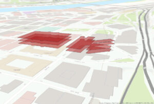
Chapter 11- The final chapter in the book was pretty short and incorporated things we havenā€™t learned about yet, but I actually really enjoyed some of the things this chapter covered. The first tutorial showed us how to navigate through a 3D scene. Then, the tutorial went over triangulated irregular networks (TINs). The book explained that TINs are very useful in some high-precision applications like engineering, which require lots of calculations. The third tutorial goes over to how make trees using z-enabled features, and I really liked this part. I didnā€™t realize that creating 3D features like this was an option, and how many options ArcGIS PRO has when it comes to symbolizing the features. The tutorial had us pick a certain kind of tree species, but there were so many options to choose from. Then the chapter went into LAS Datasets, which was a little confusing, but I was able to get it all done. I was mostly just confused about why you would need to visualize the data like this, but Iā€™m sure there are some very specific applications where this would be beneficial. The fifth tutorial went over more 3D features and had us create floors for buildings so you can view them in 3D using a range slider. Then, we had to create 3D buildings by increasing the Z height of a 2D feature. I did have a little trouble with tutorial 6, and my building wasnā€™t nearly as tall as the pictures in the book, but I was still able to symbolize the building correctly (it was just very short!). Finally, the last tutorial covered how to make an animation, and I got to make a little movie that moved through 3D frames!

Hagans Week 5

Chapter 4-Ā  This chapter dealt a lot with incorporating databases and data tables into ArcGIS Pro. This was the first chapter where we created our own map at the beginning instead of starting with one of the templates and preset data/feature classes. I think that creating the folder connections was slightly confusing and that I may have messed this part up slightly because my map did not look quite the same as the picture in the book. I think this part of the book is helpful because it teaches you how to import data sets and isolate variables to look at data easily. The first part of this chapter also showed me how to join a feature class attribute table with a data table. Once you join these two, you can then calculate the sums, and in the tutorial, I was able to calculate the percentage of the population that is less than 20 years old. Again, I think this is a really efficient way of isolating certain portions of the dataset that are more relevant to what you may be interested in. The ending of the second tutorial was slightly confusing, as it was coding in Python, which I have very little experience with, but I tried my best and followed the book closely to perform these actions. Some of the commands and buttons that the book mentioned were not in my Contents pane, so some of the tutorials were a little difficult. Also, this chapter went over how to make a date-range selection query and how to save it and use it later. This action selects certain points that fall within the date range specified. I also created a query for crime types, which selected only certain types of crime from the entire dataset. The queries can be used for a multitude of things, and the book even went over how to search for a specific person who committed a crime based on specific attributes. This chapter also built on knowledge from a previous tutorial and had me make a choropleth map, which I had to turn back a few chapters to remind myself how. I also reviewed how to make graduated symbols on a map.Ā 

Chapter 5- This chapter went over map projections and different coordinate systems. Some of the tutorials were pretty short and just went over basic actions like how to change the coordinate systems, so this chapter went by pretty fast. Also, many of these tutorials went over how to use government databases to download geospatial data into ArcGIS and then project the data on the map. I was able to extract the raster features for Hennepin County and display land use and water features (although I think my screenshot of this map may have been left behind on one of the computers in the lab). As many other people have mentioned, the 5-5 and 5-6 tutorials were a bit messed up, and I was actually able to locate the correct columns in the Excel spreadsheet, but for some reason, my spreadsheet would not import correctly and display in ArcGIS, so Iā€™m not sure what was going on. One thing I have noticed as Iā€™m moving through these tutorials is that ArcGIS Pro updates very frequently, but the textbooks are not able to keep up with these updates quick enough, so many times the directions do not entirely match the locations and names of commands on ArcGIS. Other than the hiccup with the database, I was able to move through chapter 5 well.Ā 

Chapter 6- Chapter 6 took a little time because I had to be really particular when manipulating the data to dissolve the block groups. Chapter 6 overall went a little more in-depth about the variety of tools available on ArcGIS Pro, like the Pairwise Dissolve tool, Clip, and some others to either combine or clip certain parts of the map to study them better. I was having trouble with some of the steps in Chapter 6-2, in the Your Turn section where we had to use the Select by Location tool to find where Manhattan Streets intersected with another layer. I think I played around with all of the options in the Select By Location section to the point where it at least looked like the picture in the book, and that was the closest I could get. Also, this chapter went over how to merge feature classes, and I was able to merge the bodies of water within New York City and all the waterfront parks in New York City. Another tool that I learned to use in this chapter was the Union tool, and I was able to calculate the total areas and acreage selected using this tool. Overall, I think this chapter was a little challenging, but it gave me a better understanding of some of the geoprocessing tools in ArcGIS Pro.Ā 

Chapter 7- I actually really enjoyed the content in chapter 7, so this chapter seemed to move by really fast for me. This chapter went over some cartography skills and how to edit polygon features so that they fit the basemap better. Sometimes, the building polygons are not quite in the right spot, so you have to manually select them and move them to be in the right spot. Other times, you have to add vertices or rotate the polygon so that it fits well. I was having a little bit of trouble with the vertex points when I had to cut out some of the polygons in a U-shaped building, and the points werenā€™t placing initially, but I got it after repetitively clicking for a while. Also, sometimes polygons can be in one big massive shape over 2 different buildings, so you have to manually split the polygon and go into the attribute tables to add in the two specific names of the buildings. This chapter let us practice creating a feature class again, then we got to actually create polygons over oddly shaped parking lots. Cartography tools like the Smoothing Tolerance were also used to smooth the edges of grassy areas and ponds/lakes when the edges are a bit harsher than they are in real life. I had a bit of trouble rotating the building in chapter 7-4, but I was able to do the rest of the tutorial where I classified the layers.

Chapter 8- This chapter was very short and only had two tutorials that were both pretty easy. This chapter mainly went over geocoding andĀ we were working with very large sets of data. Essentially, this chapter went over how to rematch addresses from a datasheet. I was surprised that it had data in Ohio too! Again, thereā€™s not much to write about in this chapter other than the tutorials were pretty easy to understand and we were able to work with some ZIP codes and manipulate the symbology again.

Hagans Week 4

Chapter 1- Overall, I think this first chapter was a very good introduction to ArcGIS and Iā€™m now more familiar and comfortable with GIS techniques. I like how the book is very explicit with what to do, but also explains how what itā€™s telling you to do will change the map. Also, I enjoyed the ā€œYour Turnā€ sections throughout the book so far, because as the book explained, it really helps with the muscle memory of performing these actions and forces you to learn to do things on your own. I also think these gave me a better understanding of where everything is located on ArcGIS Pro. The first few tutorials were focused on showing us how to move around and navigate a map using the Explore button and bookmarks. Additionally, Tutorial 3 showed me how to click on a data point and pull up the summary statistics. Tutorial 4 was very interesting because it taught me how to add, label, and remove a feature class. We also made 3D maps, which is a really interesting way to visualize the data. Below are 2 images comparing the map of 2D data to the map of 3D data. The end of this chapter focused heavily on symbology and assigning unique symbols that can help distinguish between feature classes. This section familiarized me with the Symbology pane and how to change the map’s visuals. Overall, I didnā€™t have any problems with this chapter and I enjoyed putting what weā€™ve been reading about into practice.Ā 

Chapter 2-Ā  The second chapter was still fairly easy, but I think it was a little more challenging than Chapter 1 and I did run into a few problems. Overall, the chapter went more into depth about symbolizing maps, using graduated symbols, scales, and dot density maps. I think the most confusing part of this chapter was choosing which methods to use in choropleth maps because it seems like you would need a pretty good understanding of statistical concepts like data distribution. I was just pressing whichever method the book told me to, but if I had my own set of data with a particular distribution, Iā€™m not sure I would know which scale or method to assign it that would display it the best. Another slightly confusing part of this chapter was the definition query because I think this part may be a little too computer science-ey for me. I learned how to remove duplicate labels, change font size and color, and more about 3D maps. Another cool thing this chapter taught me was how to change the Visibility Range of a feature layer so that it can appear or disappear when you zoom in or out. I think that this aspect of ArcGIS helps with navigating the map and reduces the cluster and busyness by only presenting data when youā€™re zoomed to the correct visibility range. Below is a picture of some of the feature layer labels when zoomed in. The other picture shows the colors of the map that are displayed as Unique Values with some cool colors.

Chapter 3-Ā  Chapter 3 was interesting because it incorporated the web version of ArcGIS. This chapter started out by teaching us how to make a map layout, add legends, use the ruler to line things up, and export a map. I liked learning how to make the map layouts because I think this would be important for using a map for an educational purpose and presenting it to people. This chapter also taught me how to create a chart based on the data from the map. I have a picture of one of the graphs below, and I thought it was cool how you could select certain data points within a feature layer to include in the graph. This graph only shows the employment of 10 states, rather than all 50. Once again, I think this is an important technique that allows you to visualize the data better and look at trends without being overwhelmed by an entire dataset. After this tutorial, they switched to ArcGIS Online, which I have some experience with, but not as much as with ArcGIS Pro, so there was a bit of a learning curve, but luckily it seems pretty intuitive. I think the web version is very user-friendly and easy to use, but seems to lack some of the more advanced features of ArcGIS Pro. This section taught me how to share a map on ArcGIS Online and how to create an ArcGIS StoryMap. Creating a StoryMap seems fun, but I think it would be even better if I werenā€™t copying and pasting random text into a box and I was using my own words, maps, and data. Nevertheless, it was a good way to introduce how to use ArcGIS Online to reach a broader audience because of its cool visuals. Below is a screenshot from the ArcGIS StoryMap it had us make, where we could upload a map from ArcGIS Pro that can be navigated online.

Hagans Week 3

Chapter 4-

This chapter starts by explaining the difference between mapping features and feature values as densities. Mapping a feature would show the density of a business in a particular area, whereas mapping a feature value might show the density of workers at the business. Itā€™s interesting how different these two maps look, even though the data seems fairly similar. The density maps are a little confusing right now, but I think it will make more sense when weā€™re creating them in the lab ourselves. The book does mention not to make dots too big when graphing density, otherwise, it is hard to pick out the patterns since they all mesh together. Also, this chapter mentions not to use too many classes when graphing density surfaces, otherwise the colors are hard to distinguish. I think itā€™s an interesting idea to make a map using light colors for high density because itā€™s usually the other way around. Although, the book mentions that the readerā€™s eye is drawn to the light color, and I think this is true. This chapter taught me that density maps are useful because they display patterns rather than features, which is very beneficial for real-world applications. The book mentions that crime analysts, transportation planners, and urban planners can all use density maps for their jobs. This chapter also emphasizes the idea that itā€™s important to decide what kind of data you have before choosing what kind of map to make and how to map it. The chapter presents many different ways to map densities, such as dots, graduated colors, or contours. There are many useful images that show common mistakes people make when mapping densities and how to fix them in order to create an effective map.Ā 

Chapter 5-

Chapter 5 is about mapping whatā€™s happening inside a certain area. When a map is made based on data occurring inside the area, trends can be tracked and policies or courses of action can be made based on the data. The book mentions that firefighters could use this method when there are toxic plumes so they know what areas are being affected. Also, mapping data inside an area can be done with one specific area or multiple areas. When mapping multiple areas, this would be used to compare certain trends or patterns. One thing I find interesting about all these methods is how much you can manipulate the map to display a very specific type of data in a way that is easy to understand. This chapter goes on to explain the three different ways of finding out what is inside an area: drawing areas/features, selecting certain features, or overlaying the area/features. These all have instances when they are most beneficial, so I think that you would just have to decide what kind of map you want to portray. This chapter has another chart comparing all of these methods that has pros and cons, which I think Iā€™ll look back on later! One thing I like about this chapter, and the others before, is how it builds on material from the other chapters. It incorporates terms and ideas that were introduced earlier, like discrete or continuous features, and almost forces you to learn what they mean. I think building the information up like this is a very effective way of teaching this subject. I think maps based on whatā€™s happening in an area have many diverse applications and it will be interesting to see how these are made in practice.Ā 

Chapter 6-

Chapter 6 seems similar to 5, but it explains how to map what is nearby rather than inside an area. These maps are useful because you can specify a distance and analyze data within that set amount, or you can even use them to calculate travel costs and mileage. I think itā€™s interesting how this method can be measured using either a set distance or a set cost. If you have a budget, you can determine how far you can travel based on that budget. You can also take into account the time it takes to travel somewhere based on heavy or light traffic. Like the last chapter, this chapter explains the three different methods of mapping whatā€™s nearby- straight-line distance, distance/cost over a network, and cost over a surface. These methods all vary in precision and uses, and it also depends on what type of data you have available to input. I think that mapping distance may seem like a fairly simple task or something that is just intuitive when looking at a map, but itā€™s interesting to see all the work that goes into creating maps like this. Also, the work that gets put in to make these maps means that people can look at them and read them easily. I like how each of the chapters goes into detail about what the GIS does when youā€™re making a map. Itā€™s interesting to know what is happening ā€œbehind the scenesā€. Itā€™s nice how this book talks about things that you can do to make maps and show data, while also explaining the way the computer helps you out. I think it explains these concepts in a way that isnā€™t overwhelming and gives you just enough information to understand the process.

Hagans Week 2

Chapter 1: I think itā€™s interesting how GIS has become more accessible over time with an increase in social media and tech use. Before coming into college as an ENVS major, I had honestly never even heard of GIS as a field. I like how this book begins with the basics of GIS and explains what it is and how to use it before getting into more of the actual map-building concepts. I think building up a base level of knowledge on GIS will come in handy later when we are presented with more complex topics. I also think itā€™s interesting how the book explains there are various ways to display the same data. Some methods are just more in-depth and are useful for certain scenarios whereas other methods may be more useful for quick looks at patterns. The explanation of the difference between discrete and continuous data was helpful, and I had not realized there was a distinction between these two kinds of data, but when the book presents the pictures, it makes sense that they are two different things. It is also very helpful that the book includes pictures next to the concepts being introduced so that once we begin map building, we can visually recognize these terms. Interestingly, single-point locations like businesses look very similar as both a vector and raster, but lines on a map, like highways, look much different as a vector compared to a raster. Areas appear to have the most loss of detail when expressed as a raster compared to a vector. The portion of the book explaining the various attribute values was slightly confusing at first because each type seems like they have similar functions (or at least the words all seem similar to me). However, once I went back through and read it a couple more times and studied the maps closer, it began to make more sense. I also suspect that once we begin making our own maps this will be a little more intuitive in practice.Ā 

Chapter 2: The first second chapter begins by explaining that you can either map things to identify individual features or to look for patterns in the distribution, though itā€™s interesting how when looking at the two different maps, they are actually the exact same. I also think itā€™s very cool that by identifying patterns on a map, a range of different professions from police officers to biologists can determine plans of action based on the data. It is slightly unfortunate that smaller maps cannot show as much information as large maps so they donā€™t become overcrowded, because sometimes maps may need to be in a small format. However, if there is too much information on the map to be able to read or identify anything, it would defeat the purpose of it entirely. I like how the book explains what the user does to input data for a map versus what GIS does when making the map. When I use R in my biology classes, we also use subsets a lot to uncover hidden patterns. Usually, weā€™re working with a very large dataset and itā€™s a lot easier to understand the data with subsets, and I like how that also translates to maps! Like the last chapter, I think a lot of information is being presented here and itā€™s a little confusing/overwhelming now, but in a couple of weeks when we begin implementing all of these terms, it will all come together. One interesting thing I did not know that this chapter said was that people can typically only distinguish up to 7 factors on a map, which does make sense. I think that itā€™s helpful that the book includes directions on what not to do- basically things that may make a map look confusing or hard to see data points. This part will be good to look back on when we make maps. It also brings up ways to make maps with lots of data less confusing, such as using text labels. I like that this chapter introduces ways to analyze the data. I think it will be important to discover the trends in the data being mapped and not just simply to make a map to look at for no reason.Ā 

Chapter 3: This chapter seemed slightly daunting at first because of its length, but luckily it was a lot of tables and pictures! I feel like the beginning of this chapter was slightly repetitive, as it introduced some of these concepts earlier. However, itā€™s nice that they go more in-depth with each of the ideas and show more examples of maps demonstrating certain concepts. I think Iā€™m slightly confused about classes and the four different schemes, but as Iā€™ve been saying Iā€™m sure it will make more sense in practice and I can come back and look at this part of the book for reference. I do like how the chapter compares the different classification schemes by listing the pros and cons for each and also giving a general explanation of how they work. I think displaying concepts like this in a textbook really helps me understand the material. I think this chapter will be extremely helpful to look back on later when choosing a map type. The 3D perspective maps are really interesting and I didnā€™t realize that GIS was capable of doing this! I donā€™t have as much analysis or reflection on this chapter since it was mainly maps, but again I think showing the maps is obviously a very good way of introducing ideas and comparing different terms.Ā 

Hagans Week 1

  • My name is Carsyn Hagans, and I am a sophomore majoring in biology and environmental science. Iā€™m from Archbold, OH- which is a tiny village up in northwest Ohio (nearly in Michigan and Indiana). I love to travel, hike, read, drink coffee, and work out!

  • Over the summer, I did a research internship where they introduced me to some basic GIS concepts and ideas. We used ArcGIS to make a few maps, but I was given a very brief background on the creation of GIS as a field and its many uses today. I know GIS is becoming an increasingly more important and widely used tool in many careers, especially in environmental science. This first chapter gave me a a really good idea of how GIS came to be and how there are many different definitions of ā€œGISā€. I had not really realized how many ways there are to utilize GIS, but the chapter brought up examples like soil chemistry, most successful stores, business routes, and crop blights all being represented through maps. When my family asks me what my GIS classes are, I usually just tell them that Iā€™ll be making maps on computers, but this reading talks about how thereā€™s more to it than that. GIS allows people to incorporate patterns and other trends into maps that give people a visual representation of the data. I truly think this is an important way to show data, and as the reading explains, peopleā€™s brains are much more equipped to interpret visual data. I am slightly confused about the ā€œtrueā€ definition of GIS, as the reading introduces several different ways that professionals have defined it in the past. However, I think that because the reading does go back and forth between these varying definitions, it does portray the complexity of GIS and potentially even represent how people who are unfamiliar with GIS may become confused by it. That being said, I think this first chapter did a great job at introducing how multifaceted GIS is and giving us ideas on how businesses and organizations incorporate it into our everyday lives. I am excited to continue to learn about the ways in which we can utilize GIS to display important information.
  • One interesting application for GIS I found on ChatGPT is crime mapping. It explained that law enforcement agencies can utilize GIS to map areas of high crime and then they are able to allocate more resources to these areas that would aid in crime prevention. This map is from ESRI/ArcGIS. It shows areas of high and low crime in the greater Chicago area. I think itā€™s interesting how they incorporated a confidence interval into the legend. (https://desktop.arcgis.com/en/analytics/case-studies/broken-bottles-3-pro-workflow.htm)
  • Another interesting application of GIS I found on Google is mapping animalsā€™ migration patterns or geographical boundaries. I think an application like this would be very useful in the kind of career I want to pursue. Research scientists can take advantage of GIS to understand patterns found in the natural world. This map from ESRI shows the abundance of the American Kestrel during different times of the year, such as breeding or non-breading seasons. I like how much information this single map provides, as well as how it explains what it is showing. (https://www.esri.com/arcgis-blog/products/arcgis-pro/mapping/how-to-make-this-migration-map-and-why/)