- PLSS: (Public Land Survey System) created to help identify PLSS boundaries in US Military and Virginia Military Survey Districts of Delaware County
- Township: Consists of the 19 townships that make up Delaware County
- 2024 Aerial Imagery: 3in aerial imagery of Delaware County from 2024
- Delaware County E911 Data: Consists of spatially accurate representation of all certified addresses within Delaware County with a point placed at the center of each address. This can be used by emergency services and appraisal mapping by sending in the coordinates of the address.
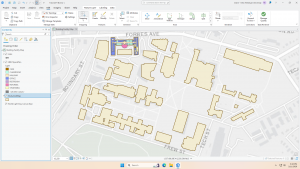
- Building Outline 2021: Satellite view showing outlines of Delaware County buildings from 2021
- Original Township: Original boundaries of Delaware townships before tax districts changed their shapes
- Zip Code: Consists of all zip codes in Delaware County as shown by the Census Bureau’s zip code file from the 2000 census, the United States Postal Service website, and tax mailing addresses from the treasurer’s office. Tax exempt parcels and dedicated roads without zip codes were positioned based on their location.
- School District: Consists of all school districts in Delaware county from Delaware County Auditor’s parcel records of the school districts.
- Building Outline 2023: Satellite view showing outlines of Delaware County buildings from 2023
- 2021 Imagery (SID File): 2021 Aerial Imagery of Delaware County
- Recorded Document: Points relating to recorded documents such as vacations, subdivisions, centerline surveys, surveys, annexations, and miscellaneous documents within Delaware County to more easily locate miscellaneous documents.
- Dedicated ROW: Line data that consists of all dedicated Right-of-Way within Delaware County
- Precincts: Consists of Voting Precincts in Delaware County and maintained by the Delaware County Auditor’s GIS Office.
- Delaware County Contours: 2 foot contours of Delaware County in File Geodatabase format.
- Building Outlines – DXF: Satellite view showing outlines of Delaware County buildings
- Address Points – DXF: Depicts spatially accurate placement of addresses within Delaware County. From the State of Ohio Location Based Response System. Points are placed at approximately the center of the building, and is intended for use for emergency services and appraisal mapping.
- Street Centerlines – DXF: Depicts the center of pavement of public and private roads within Delaware County. From the State of Ohio Location Based Response System. Address Range data taken from field observation and building permit information.
- Parcel: Consists of polygons that represent all cadastral parcel lines within Delaware County
- Street Centerline: Consists of spatially accurate topologically correct representation of the road system and center of pavement of public and private roads within Delaware County from the State of Ohio Location Based Response System. Address Range data taken from field observation and building permit information for use in emergency services.
- Condo: Consists of all condo polygons from the Delaware County Recorder’s Office.
- Subdivision: Consists of all subdivisions and condos from the Delaware County Recorder’s Office.
- Tax District: Contains all tax districts within Delaware County as defined by the Delaware County Auditor’s Real Estate Office.
- Address Point: Depicts spatially accurate placement of addresses within Delaware County. From the State of Ohio Location Based Response System. Points are placed at approximately the center of the building, and is intended for use for emergency services and appraisal mapping.
- Map Sheet: Consists of all map sheets within Delaware County
- Farm Lot: Consists of all the farm lots in the US Military and Virginia Military Survey Districts of Delaware County.
- Annexation: Consists of Delaware County’s annexations and conforming boundaries from 1853 to now.
- Survey: Points placed on surveys of land in Delaware County, not containing old survey volumes 1-11.
- 2022 Leaf-On Imagery (SID File): 2022 Imagery 12in Resolution
- Hydrology: Consists of all major waterways within Delaware County and was enhanced in 2018 with LIDAR based data.
- GPS: Consists of all GPS monuments that were established in 1991 and 1997 within Delaware County.
Author: cjevans
Evans Week 6
Altering the polygons in chapter 7 was simple because it was pretty intuitive. I’m curious about making CAD drawings. I wouldn’t think that a map of that size would want the interior usage of the buildings displayed. I assumed it would be a scenario where you would use separate maps, one for the full land area and individual floor plans for each building, since its so much information to have on a single map.
Chapter 8 was also easy, since it was a short chapter. It is interesting that setting the needed score lower can make so many mistakes, even if there is a perfectly matching address already. I would think that it would run through perfect matches first, then move on to anything else, but it looks like it runs them all at once.
In 9.3, I restarted at one point because the usage percentages didn’t match with what the book said they should be. They were over 100% for each section. I got the same numbers the second time though, and when I tried to mess with the equation a little, I was still unable to get it to match. The book says that the 11.3 in the equation is to calculate for having a partial sample of the population, but I think that number might be what is causing the difference in percentage usage.
In “Select by Attributes” you can either hit “apply” or “okay.” Is the difference just that “apply” doesn’t close the pop-up, but “okay” does? It seems to do the same thing.
Evans Week 5
Chapter 4 notes
Tutorial 4-2 had some trial and error for me to understand the directions, since I know nothing about coding. It turns out, it’s kind of similar to some of the ways you can create equations in Excel; the connection made it easier for me to understand after realizing it.
Chapter 5 notes
I’m excited to work with map projections, though I’m worried it will be difficult. In Tutorial 5-5, I accidentally made GEIOD equal to GEIODNUM rather than the other way around and could not figure out how to fix it without going back and restarting the tutorial. I struggled quite a bit with this chapter because I messed up a couple of things that I didn’t know how to fix and had to restart a couple tutorials. This is definitely the most difficult chapter so far; I might go through it again to make sure I understand it.
Chapter 6 notes
There are multiple types of merge tools that show up when you search merge. I had to just cycle through them to see which one would work for what I’m doing with it. It’s interesting that the symbol next to the tool doesn’t seem to make a difference in what the textbook refers to it as when you search for a tool. A hammer icon and scroll icon are both referred to as “tool” in the textbook. This isn’t a big deal, but can make similarly names tools with different symbols hard to pick through since I don’t know which it is asking for. It could also be a small discrepancy between the book and the software.
Delaware GIS Data Project
Evans Week 4
Tutorial 1-2 (Use Bookmarks), steps 4-8 undone: On the Map tab, in the Navigate group, click Bookmarks > New Bookmark. –> cannot create new bookmark, cannot manage bookmarks either
Learning the names of the different parts of the software has been a little difficult (i.e: pane, tab, group.) I’ve worked in Excel before, so I’ve used similarly laid out software, but I didn’t know what each sub-group was called. These tutorials are very rewarding since they give enough information to gently guide you through each step the first time, and then give less instruction so that you can internalize it and puzzle pieces out if you forget where something is. It’s very satisfying to see things work how they’re supposed to. The visibility range for labels has been the most fascinating tool for me. I like how simple, yet useful it is. Chapter 3 was interesting because I recently saw a dashboard that must have been built the same way, and it was interesting to see it in action. It isn’t something I would have recognized before. Typing more on the PCs was also neat because I have worked almost entirely on laptops in the past, meaning the keyboard was kind of foreign to me; I’m used to flatter keys. I’m not sure why my screenshots are so blurry; they look fine on my computer, so maybe it’s something to do with WordPress.
Evans Week 3
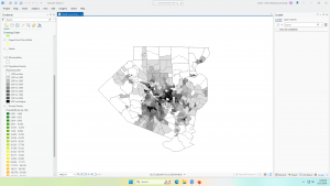
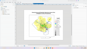
Chapter 4: Mapping Density
- Why map density?
- Mapping density shows distribution with uniform units
- Larger tracts may have a larger number of people, but be more spread out
- Mapping density shows distribution with uniform units
- Deciding what to map
- Features: density of features such as number of houses
- Feature values: density of values relating to features such as number of people per house
- Two ways of mapping density
- By defined area: use if data is already summarized by area
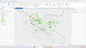
- Dot map
- Each dot represents a specified number of features
- Distributed evenly throughout area rather than clustering
- Make sure that dots are large enough to convey information, but small enough to not obscure information
- Shaded
- Each area is shaded based on density, but it doesn’t show centers of density in large areas
- Calculating a density value for defined areas
- Add a new field to feature data table, assign density values by dividing the value by area of plot
- Dot map
- By density surface: use if you have individual locations and need precise views
-
- Created in GIS as a raster layer – each cell gets density value
- Provides the most detailed information, but takes the most effort
- Creation
- Cell size: units per cell, larger cells process faster but are less specific, smaller cells take more time but show a smoother surface
- Display
- Graduated colors: different shades of the same color, don’t use too many shades
- Contours: lines such as that on a topography map, too few lines shows little detail, too many lines make it hard to read
-
- By defined area: use if data is already summarized by area
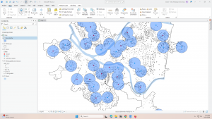
I personally don’t like dot maps where the specific density is not shown and points are scattered across the area. I much prefer other types of density maps since, as a viewer, I am used to dots being used when there is a precise location shown and average values being shown with graduated colors. Dot maps that don’t show precise location are not as visibly appealing as graduated color maps showing the same thing, and I feel that they are more confusing to read.
Chapter 5: Finding What’s Inside
- Data features to consider:
- How many areas?
- Single area: monitor activity and summarize information such as service area around a facility
- Multiple areas:
- Contiguous: bordering each other
- Disjunct: not connect to each other
- Nested: area within an area
- Are the features discrete or continuous?
- Discrete: unique features
- Continuous: seamless, must be summarized
- Information needed from analysis
- List, count, or summary
- Completely or partially
- Finding what’s inside
- Drawing areas and features
- Map shows boundary of area and features
- Quick and easy, visual only, doesn’t give information about features inside
- Making:
- Discrete areas
- Area shaded with light color and boundaries drawn on top emphasizes features
- Area on top of boundaries emphasizes area
- Outer boarder of area drawn with thick line, boundaries drawn in different colors shows discrete areas by category
- Continuous features
- Boundary drawn on top, details drawn in separate colors
- Discrete areas
- Selecting the features inside an area
- GIS selects a subset of features within the area
- Tells information about features inside a single area, but doesn’t tell several areas as separate
- Making:
- You specify features and areas, GIS checks where each feature is and displays whether it is inside the area
- Data table can be used to get information about features within specified area
- Overlaying areas and features
- Combines area and features into new layer or compares the two layers to get statistics
- Displays information about features within several areas, but requires more effort
- Making:
- GIS tags each feature with a code for which area it is in, list of features or summary of attribute can be accessed
- Attributes are stored permanently in the feature data table, so this can lend to deeper analysis
- Drawing areas and features
- How many areas?
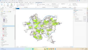
“Overlaying areas and features” maps seem the most interesting to me, but are clearly difficult to make as well. I hope I get to work on that during this course. I find interactive maps like that very cool, since they provide the most information in a shorter amount of time once set up.
Chapter 6: Finding What’s Nearby
- Defining Analysis
- Defining near: is near measured by general area (100ft radius) or travel time?
- Distance or cost: travel costs are costs such as money, time, and effort
- Flat plane or using earth’s curves – smaller scale can operate on a flat plane, but larger needs curvature
- How many cost ranges?
- Inclusive rings: nested cost ranges
- Distinct bands: 1-100ft, 100-200ft, 200-300ft ect
- Defining near: is near measured by general area (100ft radius) or travel time?
- Finding what’s nearby
- Straight-line distance: within a circle around the area
- Quick and easy, but gives approximation
- Seems most helpful for less precise work like figuring out the general coverage of a store
- Distance or cost over a network: actual travel times or cost along features like roads
- Gives more precise cost over network, but requires accurate network layer
- Most helpful for more precise work over roads or other transit lines, shows the actual time that it takes and can show traffic too
- Cost over a surface: actual travel times or cost over an area not defined by lines like roads
- Combines several layers to measure “open-world” travel cost, but requires data preparation
- Most helpful for non-constrained travel such as walking in a forest rather than following side walks
- Straight-line distance: within a circle around the area
This chapter is really cool since they’re not really maps all showing the same information in different ways like previous chapters, but showing really different information; they’re not really interchangeable because of the different uses. It’s also interesting how much information is needed to complete some of these; to create a cost over a surface map for travel in a forest, you would have to have data about the surface cover of the forest. To make a distance over a network map, you need an accurate network layer, and if accounting for traffic, you have to have information about traffic patterns in each place. While these are widely available to us now, it’s wild to think about how much information gathering has gone into that and is ready to be build upon.
Evans Week 2
Chapter 1:
What is GIS analysis? – Finding patterns in your data based on their geographical locations and finding relationships between features.
Understanding geographical features
| Discrete: As any point, the feature is either present or not; an actual location can be pinpointed. |
| Continuous phenomena: Can be found and measured anywhere. |
| Summarized by area: Data that applies to a certain defined area, but not any specific point within it. |
Representing geographical features
| Vector: Each feature is a row on a table, and areas are defined by x, y locations. | Typically discrete and summarized by area are displayed this way. Vector can also be used for continuous. |
| Raster: Features are represented as a matrix of cells. | Continuous often displayed this way. |
Understanding geographical attributes
| Categories | Groups of similar things |
| Ranks | Put features in order, from high to low |
| Counts | Total number of features on a map |
| Amounts | Any measurable quantity associated with a feature |
| Ratios | Relationship between two quantities shown by division of on by another |
Chapters 2 & 3:
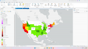
Chapters 2 and 3 surprised me because they overlap heavily with statistics, expected, and art, unexpected. While I was aware that visual qualities would come into this because GIS can make maps, I didn’t expect so much, so early just about aesthetically and intuitively displaying data. The chapters explain how to make it most clear and obvious what your data means to your audience, even talking about how you might display differently for different groups depending on priority and familiarity, and these explanations make it clear how maps can be used to confuse viewers as well. During elections, I often see voter maps where most of the individual blocks are red but it is still a blue state; these maps are used by people wondering how that could be because the map doesn’t show the number of people in each block, leading to a perceived over-importance of large areas with small amounts of people.
Displaying too many categories at once can make a map difficult to use and understand because there is too much information being presented, but too few categories leads to an oversimplification of data that doesn’t give the full picture. The GIS user must decide on a case-by-case basis what on appropriate way to display the information is.
Evans Week 1

My name is Claire Evans, and I am a second year Environmental Science and Art History student.
Something within the chapter that caught my eye is the idea of data within GIS being biased due to human biases and choices that must be made to convert data into something usable within GIS. Uncertain data being difficult to represent and share is true regardless of what a person is using, visual or verbal, GIS or physical papers. The chapter mentioning that GIS can’t work well with uncertain data is then interesting in that it is not a fault only of GISystems. Because it doesn’t have a large impact on how the systems are used, the inclusion of the arguments pertaining to the origins of GIS in an introduction chapter to the systems surprised me. I’m currently taking Urban Geography, and the point made about how a neighborhood looks on a map and how a route may not actually be the most effective based on the data given being incomplete or in favor of a certain area reminded me of the idea that a city looks very different from a map view to a street level view. Dr. John Snow having both mapped out the cases of cholera, but also having to get extra information via speaking to people who lived in the area in order to figure out what wells were causing the cholera outbreaks reminds me of this as well. It’s also similar to looking at a piece of art in a setting other than where it was intended to be; you lose context and surrounding features, such as lighting and sound, when looking at a piece in a museum rather than where it is from, just as you lose some information when looking at a map of data rather than being in the area and community that you are examining.
MSF (Doctors Without Borders) uses MSF to create maps of common needs in communities they are stationed in, and they use a simple form of GIS through MissingMaps to make maps of constantly changing refugee camps that volunteers can help create.

This study used GIS to examine the number, size, and make-up of Buddhist organizations in the 4 corner states. They examined factors such as race, age, and political leaning to see if there was a potential correlation between these things and the practice of Buddhism in the 4 corner states.