Address Point: A dataset of all certified addresses in Delaware County, updated daily and published monthly.
Annexation: A record of annexations and boundary changes within Delaware County since 1853, reflecting territorial adjustments. Updated monthly.
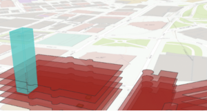
Building Outline: A collection of structure outlines throughout Delaware County, with the latest update in 2023.
Condo: A dataset of all condominium-style housing units within Delaware County.
Dedicated Right-of-Way (ROW): Identifies all designated road right-of-way areas within Delaware County.
Delaware County Contours: Displays two-foot elevation contours based on 2018 topographic data, providing a detailed terrain map.
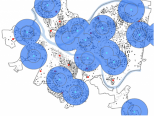
Delaware County E911 Data: Uses address point data for reverse geocoding to determine the closest emergency services location. Updated daily and published monthly to enhance 911 response accuracy.
Farm Lot: A dataset marking farm lot locations within Delaware County.
GPS Monuments: Includes all established GPS monuments in Delaware County, last updated in 2021.
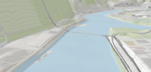
Hydrology: Highlights major waterways, including lakes and rivers, within Delaware County. Updated monthly using LiDAR data.
MSAG (Master Street Address Guide): Contains all street addresses within Delaware County along with their respective jurisdictions (townships, cities, and villages). Updated as necessary.
Map Sheet: A dataset featuring all official map sheets for Delaware County.
Municipality: Defines the boundaries of all municipalities within Delaware County.
Original Township: Displays historical township boundaries prior to modifications caused by tax district changes. This dataset remains static and is not actively updated.
Public Land Survey System (PLSS): Represents the public land survey system used to define land divisions in Delaware County. Updated as needed.
Parcel Data: A dataset containing all parcel lines within Delaware County, maintained by the Delaware County Auditor’s GIS Office. Updated daily and published monthly.
Voting Precincts: Shows the boundaries of all voting precincts within Delaware County, managed by the Board of Elections.
Recorded Documents: A collection of property-related recorded documents for Delaware County.
School Districts: Outlines the boundaries of all school districts within Delaware County.
Street Centerline: Represents the central axis of all public and private roads in Delaware County, used primarily for transportation planning, accident reporting, and emergency response. Updated daily.
Subdivision: Tracks all subdivision and condominium developments in Delaware County. Updated monthly.
Survey Data: A collection of survey results across Delaware County, maintained by the Map Department. Updated daily and published monthly.
Tax Districts: Defines the boundaries of tax districts within Delaware County, managed by the Real Estate Office. Updated as necessary.
Township Boundaries: Depicts the 19 current townships in Delaware County. Updated as needed and published monthly.
Zip Code Data: A dataset of all ZIP codes within Delaware County.