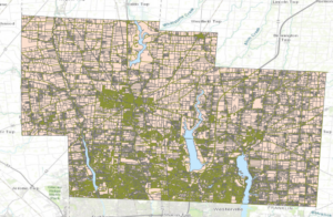
Delaware Data Inventory
– Parcel
This data shows all the parcels that are within Delaware County, Ohio.
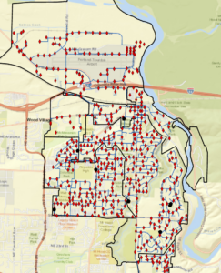
– Street Centerline
Shows all the centerlines on all public or private roads within Delaware County, Ohio. This helps 911 emergency response systems and other systems that need this data.
– Hydrology
Shows all the waterways within Delaware County, Ohio based on a 2018 LIDAR scan.
– Zip Code
Shows the zip code boundaries within the county.
– Recorded Document
Consist of recorded documents found in the Delaware County Recorder’s Plat Book, which include; vacations, subdivisions, centerline surveys, annexations, and miscellaneous documents.
– School District
Shows the school district boundaries within Delaware County.
– Map Sheet
(No Description)
– Farm Lot
The data set contains all the farmlots and their boundaries within Delaware County.
– Township
Shows the boundaries of all the townships within Delaware County.
– Annexation
Shows all of the annexations related to municipalities within Delaware County.
– Condo
Shows that sites of all of the condominiums within Delaware County.
– Subdivision
Shows all thew subdivision boundaries within Delaware County.
– Survey
Shows all the locations where surveys have been done within Delaware County.
– Dedicated ROW
Shows all of the locations where Right-of-Way is designated within Delaware County
– Tax District
Shows the boundary of the tax districts within Delaware County.
– GPS
Shows all the GPS monuments established between 1991 – 1997 within Delaware County.
– Original Township
Shows the original township boundaries within Delaware County.
– Precinct
Shows the boundaries of the voting precincts within Delaware County.
– PLSS
Shows all the Public Land Survey System within Delaware County.
– Address Point
Shows all the data points of certified addresses within Delaware County.
– Building Outline
Shows all the building outlines or boundaries within Delaware County.