Chapter 7
Chapter 8
Chapter 9
Geography 291: Geospatial Analysis with Desktop GIS
Module 1: 1/14/2026 to 3/3/2026, OWU Environment & Sustainability
Chapter 7
Chapter 8
Chapter 9
Chapter 1
Chapter 2
Chapter 3
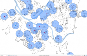
Chapter 4 talks about mapping density. Mapping density shows you where the highest concentration of features are. It can be useful for looking at patterns rather than at the locations of individual features, and for mapping areas of different sizes. In order to map density you can shade areas based on density value. You can use GIS to map the density of points or lines. For lines. The density is usually based on length per unit area. There are different types of methods you can use. You can map density by area which is useful if you have data already summarized by area, or lines or points you can summarize. You can also create a density surface which is useful if you have individual locations, sample points or lines. Which method you want to use depends on what you have. In order to calculate density values you need cell size, search radius, calculation method and units. Cell size determines how smooth the surface is. If the cell size is smaller the surface will be smoother. If the cell size is large the surface will be more coarse. Search radius is also very important. The larger the search radius the more generalized the patterns in the density surface will be. There are two different
Chapter 5 talks about finding what’s inside. People map what’s inside an area to monitor what’s occurring inside or to compare several areas. You can draw an area boundary on top of the features to find what is inside. Geographic selection is also a quick way to see what features are within a given distance of another feature. If you have data that is already summarized by area you can only summarize it using boundaries that fully enclose the areas. You can also use GIS to create a report of selected features. You can also use GIS to create statistical summaries using the tools that are available with GIS. Statistics include average or mean, median, and standard deviation. You also want to create a map to see which features are inside in addition to statistics.
Chapter 6 talks about finding what’s nearby. You can use GIS to find out what is happening within a certain distance of a feature. Traveling range is measured using distance, time or cost which can help define the area served by a facility. Distance is one way of defining and measuring how close something is. But nearness doesn’t have to be measured using distance. You can also use cost to measure what’s nearby. You can use distance or cost to map what is nearby based on travel. For some analyses you can calculate the distance either assuming the earth is flat or taking into account the curvature of the earth. Once you have identified which features are near a source, you can get a list of features, a count, or summary statistic based on a feature attribute. An example of a list is the parcel ID and address of each lot within 300 feet of a road repair project. An example of count would be the total number of calls to 911 within a mile of a fire station. A summary statistic can either be a total amount such as the number of acres of land within a stream buffer, an amount by category or a statistical summary. To create a buffer you specify the source feature and the buffer distance. Once you create the buffer you can display it to see what’s within the distance of the source.
Chapter one gives a general overview of GIS. According to the book “GIS analysis is a process for looking at geographic patterns in your data and at relationships between features.” GIS does tasks including, mapping where things are, mapping the most and least, mapping density, finding what’s inside, finding what’s nearby, and mapping change. There are different types of methods for getting the information that you need. The type of data that you work with can determine what kind of method you will want to use. Results are shown on a map, values in a table, or a chart. When you look at the results it can help you decide whether the information is valid or useful. The type of geographic features will affect the analysis process. It is important to be aware of the different types of geographic features. GIS also can measure continuous phenomena such as temperature or precipitation. Continuous data often starts out as a series of sample points. It is also important to understand different types of geographic attributes. The different types of geographic attribute values include categories, ranks, counts, amounts, and ratio. Categories help with organizing your data. Everything with the same category are alike in some way. Category values can be represented using numeric codes or texts. Ranks order the different features from high to low. Ranks are used when it is hard to use direct measurement to quantify certain things. Counts and amounts show you total numbers. They can let you see the actual value of each feature. Ratios show the relationship between two different values. For example, dividing the number of people in each tract by the number of households gives you the average number of people per household. Categories and ranks are not continuous values whereas counts, amounts, and ratios are.
Chapter two talks specifically about mapping with GIS. It is important to use maps to see where things are. When you map out where things are it can show you where action needs to be taken. For example police can use GIS to map where crimes occur each month. In order to look for geographic patterns in your data you map the features in a layer using different kinds of symbols. It is important that the map is appropriate for the audience and the issue being addressed. Maps should display detailed categorical values. Many categories are divided into subtypes. In order to create your map you need to tell the GIS which features you want displayed. You can also show them as category values. To map features as a single type you need to draw using the same symbol which might suggest differences in the features you could explore further. You can also map by using categories by using different symbols for each category value which can provide an understanding of how a place functions. For example mapping crimes by type shows you which types of crimes occur where. If you have more than seven categories you will want to group them in order to make it easier to see the patterns. Another important thing to know is that if you reassign something from one category to another it can create two different maps.
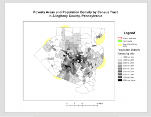
Chapter three talks about mapping the most and least. People map where the most and least are to find places that meet their criteria. Mapping features based on quantities adds an additional level of information. To map the most and least it needs to contain a quantity. You can map quantities associated with discrete features, continuous phenomena, or data summarized by area. Ratios show the relationship between two quantities and are created by dividing one quantity by another. The most common ratios are averages, proportions, and densities. Proportions show you what part of a whole each quantity represents. They are often presented as percentages. You create ratios by adding a new field to the layer’s data table and calculating the new values by dividing the two fields containing counts or amounts. There are also statistics used with GIS, specifically standard deviation. The GIS first finds the mean value by adding all data values and dividing by the number of features. It then subtracts the mean from each value to calculate the standard deviation. When making a map you’ll want to make sure it is presented as clearly as possible. You’ll want to present information that is necessary to show patterns in the data. There are advantages and disadvantages for different types of values. Contour lines can be used to show the rate of change.
Hello. My name is Ben Lindley and I am a sophomore. Unfortunately I don’t really have any good pictures of me so this is the best I could do.

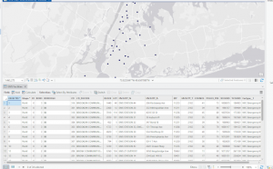
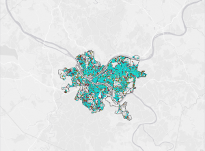
One thing I found interesting about the reading is that GIS is used in everyday life. It affects millions of people in a number of ways. What we eat and where it comes from as well as how we get to certain places all rely on GIS. GIS is also very important with urban life. I also found it interesting that GIS is not only rooted in computer labs in the mid twentieth century. There have been attempts made in the nineteenth century to automate calculations for example in the 1890 census. The reading also gives a good visual about the cholera outbreak in London in 1854. Because of this Dr John Snow was able to make the connection between water pumps and the spread of cholera. I googled GIS applications on navigation and found out that GIS enhances navigation in many ways. One big example of GIS in navigation is Google Maps. It helps with mapping and visualization. GIS excels at creating interactive maps. It also helps with urban planning and management to analyze traffic patterns, identify congestion points, and optimize transportation infrastructure. This contributes to smoother traffic flow and improved public transportation efficiency. One thing that surprised me the most was that GIS is used in drone navigation. I also googled GIS Applications in Cleveland and found that GIS is used in neighborhood planning and zoning. Here is a map on clevelandohio.gov website.
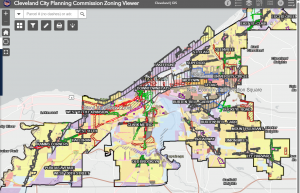
https://data.clevelandohio.gov/apps/f15dec13ee6648bcb218d4f5c8290691/explore