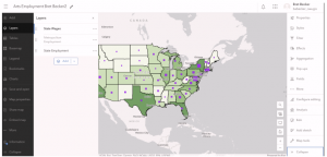
Chapter 7
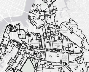
- this chapter introduces tools to do manual digitization by tracing
- creating vector map features
Tutorial 7-1
- used the move button to update a polygon’s position
- rotated a polygon to fit a feature
- added vertices to a polygon to change its shape
- cut a polygon into two separate ones
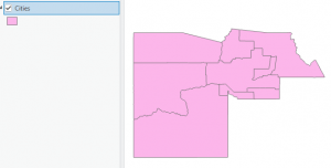
Tutorial 7-2
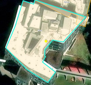
- created a feature class to add to the geodatabase
- added a polygon for a parking lot to the feature
- deleted polygons
- added polygon via trace
Tutorial 7-3
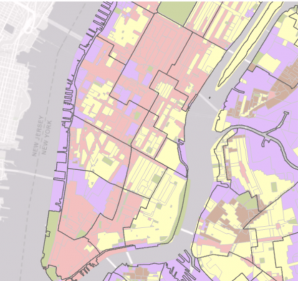
- can modify GIS using cartography tools
- learned how to smooth out polygons
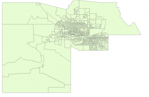
Tutorial 7-4
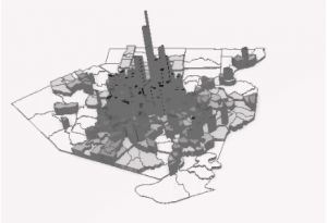
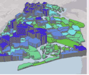
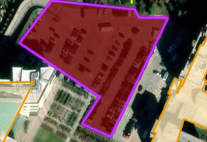
- learned how to cover a building with features
- added features over an area and rescaled them
Chapter 8
- Geocoding- GIS process that matches location fields in tabular data to corresponding fields in existing feature classes to map the tabular data
- problem with geocoding is inconsistencies with data entries from data suppliers
- ArcGIS has a rule-based expert system
- source table
- reference data
- geocoding tool
- locator
- Soundex Key used to identify spelling mistakes
Tutorial 8-1
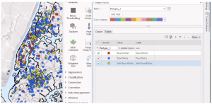
- created a locator
- created datapoints based on the locator I created
- fixed messed up data
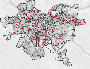
Tutorial 8-2
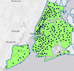
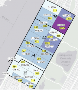
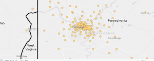
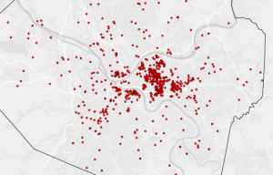
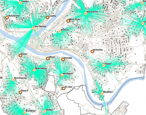
- geocode by street address to place unique points on map for attendees in the county
Chapter 9
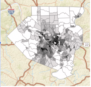
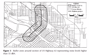
- covering four spatial analytical methods: buffers, service areas, facility location models, and clustering
- network dataset- used for estimating travel distance or time on a street network
Tutorial 9-1
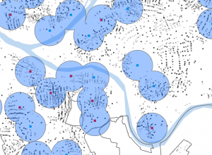
- buffer- polygon surrounding map features of a feature class
Tutorial 9-2
- multiple-ring buffer looks like bull’s eye target
Tutorial 9-3
- service areas are like buffer areas, but extent based on travel over a network
Tutorial 9-4
- location-allocation model in Network Analyst collection of models handles facility location issues
Tutorial 9-5
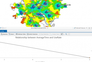
- goal of data mining is to find hidden structure in large and complex datasets
- limitation: no way of knowing true clusters in real data to compare with an algorithm
- k-means clustering- partitions dataset with n observations and p variables into k<n clusters