Njoroge Week 4

Chapter 1:

The first chapter of the ArcGIS Pro Tutorial textbook went over the basics of using the application. I found the chapter easy to understand and extremely helpful, as it was the foundation that helped me better understand the rest of the textbook. I was able to understand the layout of the app, as well as how to navigate maps within the app. One of the more useful sections to me was the one on working with tables on attribute data and how to manipulate said data from within the application. I also found the section on working with 3D maps, because I didn’t think we would be covering that material in this chapter. Overall the chapter had a lot of good foundational knowledge, and it prepared me for covering the rest of the assigned chapters.


Chapter 2:

This chapter was more content-heavy than the first, and focused more on how data can be manipulated within ArcGIS. I did enjoy it, and found it easy to understand. I found it easy to grasp the use of definition queries to make a subset of map features, creating 3D scenes and dot densities. It did make me wonder if there is a maximum number of queries that can be applied on an attribute at one time. We also covered the use and creation of bookmarks, and I wondered if there was a maximum number of bookmarks that could be applied to a map.


Chapter 3:

This chapter went over how information processed in ArcGIS can be presented and shared to those who do not have the application. It also allowed me to get acquainted with the ArcGIS website and how to share data there under your account name. It also covered how to create and customize legends, charts and graphs within GIS as well as how to share them in a way that is viewer friendly and easy to understand. My favorite section was the one that covered the creation and customization of dashboards. One question about the different ways we will be using the ArcGIS website in the future, and if 3D data could be shared on the site.

Njoroge Week 3

Chapter 4:

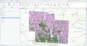
This chapter shows us how to map densities using the GIS, and why this can be useful to many people, from business owners to the average person looking to find out what’s within 1,000 feet of them. To put it simply, mapping densities shows you exactly how values vary across a region as well as where the highest/lowest concentration of a feature is. It is very useful in analyzing patterns and measuring the number of features using a uniform area unit such as square miles or hectares. A common use for density mapping is census tracking of population densities. Other common uses include locations of different businesses, and the number of employees in each business.

There are 2 common ways of mapping densities;

By defined area: This method is typically used if you want to compare areas with defined borders. It can be done with geographic mapping, dot mapping or by calculating a density value for each location. Dot maps are usually used to represent individual locations (eg. trees) and density values can be calculated by dividing the total number of features by the area of the polygon.

By density surface: A density surface is typically created by the GIS as a raster layer. Each cell in the layer is a density value (eg. no. of businesses within a square mile) based on the number of features within the radius of the cell. This provides very detailed information, but requires a lot of time, effort and storage. This method can be useful if you have individual locations, sample points or lines. One practical bit of advice in regards to this method was that you can use the GIS to change the sizes of the dots based on their densities in a map.

The chapter also goes over how you can use the GIS to create a density surface; convert density units into cell units, divide this value by the number of cells and take the square root of this value to get the cell size. It also gives more information about different data categories (eg. natural breaks, standard deviation) and gives advice on how best to use colors and contours to display your data. Overall, I think the chapter explained the process and intricacies of mapping densities in GIS very well. It did make me wonder if the mapping process changes when you are mapping over different surfaces, eg. land and water.


Chapter 5:

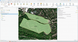
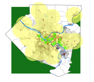
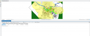
This chapter focuses on mapping what is within a certain region or border. People can want to do this for many reasons, but one of the more common ones is to compare different areas based on what is within them, eg. monitoring drug arrests within 1,000 feet from a school.

One of the key steps in this process is defining your analysis. To do this with the GIS, you must draw an area boundary on top of the features and use the boundary to select the features within it and list/summarize them. The area boundary and feature data can also be combined to create summarized data. In order to effectively carry this out in GIS, you need to consider 1) how many areas you have at your disposal and 2) what types of features are inside the area. One type of area boundary is a single area. Types of service areas include;

  • A service area around a central facility (eg. a library district)
  • A buffer that defines a distance around some features (eg. a stream off limits to logging)
  • An administrative/natural boundary

You could also choose to work with multiple areas. Types of these include;

  • Contiguous (eg. zip codes, watersheds)
  • Disjuncts (eg. state parks)
  • Nested (eg. 50- and 100- year floodplains)

Similarly to previous chapters, chapter 5 also briefly touches on the different kinds of features; discrete features (unique, identifiable features such as student addresses or locations of eagle nests) and continuous features (features that represent seamless geographic phenomena). I found this section to be very useful because it reminded me of the different feature types you can deal with in GIS, and encouraged me to do my own research into how they can appear and be displayed in GIS.

Finally, the chapter covers the three ways of finding what is inside:

  • Drawing areas and features: You can use the GIS to create maps to see whether one or a few features are inside or outside a boundary
  • Selecting the features within the area: Specifying the area and layer containing the features you want can help you get a list of features within one or multiple groups.
  • Overlaying the areas and features: Combining the area and features to create a new layer with attributes of both can help you find out how much of a specific feature is in one or more area

Chapter 6:

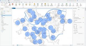
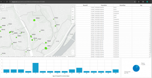
This chapter went over how you can utilize GIS to find out what is nearby you or another location altogether. Finding what is within a set distance can help identify an area, as well as the features inside the area that have been affected by an event or activity. One example of the GIS being used in this way is notifying residents within 1,000 feet of an accident. It can also be used to define the area served by a facility (eg. a library) and delineate areas suitable for a specific purpose. One example of this would be a wildlife biologist mapping an area within a half mile of a stream.

The textbook states that in order to find what is inside a set distance, we need to define and measure the concept of “near”. It can be defined by a set distance or the travel to/from a feature. And it can be measured by distance and cost. When analyzing the surface of the earth, we can either look at it with the flat plane method (typically used with small areas of interest) or the geodesic method (normally used with larger areas of interest such as continents). We also got an explanation of the 2 ways we can specify a range; inclusive rings (useful in finding out how total amounts increase as distances increase) and distinct bands (useful in comparing distances to other characteristics, such as the number of customers within a 1000 vs 2000 year range).

And finally, in the section I thought was the most interesting, the textbook covers the 3 ways of finding out what is nearby;

  • Straight-line distance: By specifying the source feature and the distance, the GIS can find the area or the surrounding features within the distance. This method can be good for creating a boundary.
  • Distance/cost over a network: Specifying the source locations and a distance/travel cost along a linear feature can help you find what is within a travel distance/cost of a certain location.
  • Cost over a surface: Specifies locations of source features and a travel cost.

Overall I thought this chapter was intriguing because of how relatable it is to the lives of many people. The average person on most days most likely uses GPS technology everyday to find locations nearby them (eg. supermarkets, restaurants) to learn more about what is in their area. The information in this chapter can also be useful to those who wish to conduct scientific research and analyze data (eg. a wildlife conservationists who want to look at residential areas near a riverbank). This chapter also made me anticipate working with the GIS software later in the semester and doing my own investigations with the data provided.

Njoroge Week 2

Chapter 1: 

I enjoyed reading this chapter because it helped me fully grasp just how GIS is able to turn data into information that can be understood in a visual format. It also helped me understand the importance of GIS Analysis as a whole, which looks for geographic patterns in data and relationships between features.
I was also able to grasp the different kinds of data GIS is able to present and process, such as continuous phenomena (values that vary across a space, such as precipitation or temperature). This chapter was extremely helpful for me to understand the 2 ways GIS represents features; vector (features are represented in a row in a table by an x,y coordinate, where features like streams are represented as a series of coordinate pairs) and raster (features are represented by a matrix of cells in continuous space where each layer represents an attribute and layers can be combined to make new ones).
Of the 3 chapters in this week’s reading, I think this chapter was the best in helping me prepare for the work we will be doing with the software later in the semester. This chapter had a lot of information about the different kinds of attribute values:

  • Categories: Group of similar things
  • Ranks: Put features in order
  • Counts + amounts: Show measurable quantities associated with certain features
  • Ratios: Show the relationships between quantities
  • Continuous + noncontinuous values

While reading the chapter, I did start to wonder if any new kinds of attribute values would arise as modern technology develops and improves, and if this would affect the efficiency of GIS and its ability to present and analyze information.


Chapter 2: 

As covered in Chapter 1, GIS works by storing the exact location of each feature as a coordinate. The symbols used to represent these coordinates can come in different forms based on the size of the map being used or the context in which the information is being presented. For example, mapping subsets of features is more common for individual locations, but mapping subsets of continuous data (eg. temperature) leaves the data without context.

Chapter 2 of Mitchell also covered the different types of pattern analysis that are used based on different situations, as well as the steps involved in map analysis. These include;

  • Assigning geographic coordinates in terms of longitude and latitude.
  • Assigning category values (each feature on the map having a code that identifies its type)

For the most part, Chapter 2 covered actual data presentation, and how minor details like the colors used to represent distributions of data points should be considered when a map is being compiled and designed. For example, when using categories to represent the different kinds of trees in a forest, using no more than 7 categories is considered ideal, because it would make it easier for the average viewer to understand. This is especially true for smaller maps, due to the fact that too many categories could be overwhelming or make the map itself more difficult to perceive. Using color categories with a legend is advised, but other methods such as text labels can be used in conjunction with them.
The chapter also goes over processes, such as how to actually create categories in GIS software using a table, which will be extremely helpful when it comes to working with actual raw data later in the semester.
And finally, the chapter covers how to find and analyze patterns in geographic data, as well as how exactly these patterns can come to be. This section of the textbooks focuses more on the theory aspect of GIS, which I personally found interesting as someone who is interested in IT as a whole. It made me think about how map representation could eventually change and evolve over time as technology improves over the coming decades.


Chapter 3:

Chapter 3 of Mitchell explains the importance of how geographic information is mapped, and focuses on the concept of “most and least”. People map most and least in order to find places that meet certain criteria, or to find relationships between places. In order to map most and least, features must be mapped based on a quantity associated with each (eg. a catalog company searching for zip codes with many young families with relatively high incomes).

Geographic mapping based on quantity adds an additional level of information, increasing its value. However, this also increases the amount of software that must be processed, and this can take more time than having less detailed information. With GIS, you can map quantities associated with discrete features (individual locations, linear features or areas), continuous phenomena (defined areas/surface of continuous values) or data summarized by area.

Quantities can be categorized by ratios (eg. 0-10%, 11-30%). They can also be categorized by;

  • Averages: mainly used in comparing places that have few places to those that have many
  • Proportions: used to show which part of a whole each quantity represents, usually presented as percentages
  • Densities: show where certain features are concentrated or ranks
  • Ranks: put features in order, mainly high concentration to no concentration

The chapter also covers different classification schemes, such as natural breaks, quantities, equal intervals, and standard deviation. When choosing a classification scheme, we need to know how the data values are distributed across their range. GIS can help find this through the use of tables and charts. For example, if data values are unevenly distributed, it is advisable to use natural breaks.
Overall, this chapter focuses on the more data focused aspect of GIS, which I found interesting because it made me think of how experience in mathematical or IT fields would make using and understanding GIS much easier for anyone who wants a career in GIS. It made me wonder what other fields or concepts may be related to GIS that haven’t been fully explored in the textbook, such as economics or architecture.

Njoroge Week 1

Introduction: 

Name: Ariana Njoroge

Hometown: Nairobi, Kenya

Major: Environmental Studies

Minor: Psychology

Interests: Drawing,  Reading, Photography, Music, Dance, Crochet, Psychology


Schuurman Chpt. 1:

Schuurman ch.1 covers the basics and origins of GIS (Geographic Information Systems)  as a science and a discipline, and talks about how it has become so prevalent in the daily lives of millions of people world wide. From GPS to disease control, GIS is used in hundreds of fields, from commercial/industrial to agricultural work. I find this interesting because it means that based on the nature of the issue you’re dealing with using GIS, it influences the way GIS can be defined.  GIS at its core is concerned with data input, analysis, mapping and output of spatial data. The origins of the concept of GIS can be traced back to researcher Ian McHarg, a landscape architect, wanted to examine the effects of the construction of a new highway on a suburban area. To accomplish this he placed multiple pieces of tracing paper on a light table, using each piece to represent a layer. This was one of the earliest development stages of GIS; the use of tracing paper to represent layers is a metaphor of the overlay function.

Two of the main concepts of GIS is the analysis and display of spatial data. However, technology did not develop enough to accomplish this until the early 1960s by researchers in the US. The combination of aerial photography and the development of computer systems that could categorize land zones into layers (eg. wildlife, recreational areas) created the foundation for future GIS technology to build from. In the 1980s, a more efficient method of computerized overlay came to be. This involved the utilization of polygonal/vector boundaries, and added an entirely new dimension to how GIS could be utilized in a more user-friendly way. Visualization can help us give data meaning, and the development of polygonal imagery allowed geographers to see and understand spatial patterns in any given region. This allows GIS programs to be utilized in a multitude of differing fields, and is exactly what makes it so interesting as a discipline. It has come a very long way over the decades and will slowly but surely become one of the most vital technologies in the modern day. Overall I thought the chapter was a great introduction into GIS. I found it’s origins very intriguing, and look forward to see how I learn to interpret and use GIS through this course.


GIS Applications

1. Agriculture: GIS provides accurate, comprehensive data that aids decision making and planning. An example of this would be sensors placed in the soil that record temperature and moisture levels to ensure crop health.  It can help farmers determine whether some crops will grow better than others in certain seasons, or determining how climate changes could affect crop health. This can be especially helpful for smaller-scale farmers who are particularly vulnerable to climate issues. 

2. Enterprise decision-making: GIS software enables companies to make decisions regarding customer segmentation, real estate management, as well as transport and delivery management. GIS also allows companies to secure and allocate resources, as well as ensure efficient field service management. This will allow business operations to run smoothly, in that customer issues and complaints can be resolved. In the long run, it reduces downtime and costs while increasing customer satisfaction.


Applications of (GIS) Geoinformatics in Agriculture - GeoPard Agriculture

Source:

Mathenge, M., Sonneveld, B. G. J. S., & Broerse, J. E. W. (2022). Application of GIS in Agriculture in Promoting Evidence-Informed Decision Making for Improving Agriculture Sustainability: A Systematic Review. Sustainability, 14(16), 9974. https://doi.org/10.3390/su14169974