Pichardo – Week 3

Chapter 4: Mapping Density

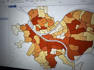
This chapter focuses on density mapping and the different ways it can be used to show where features are most concentrated. Density mapping is important because it helps reveal patterns that are not always clear when looking at raw totals alone. Examples discussed in the chapter include mapping workers in a business district or households with children within a specific ZIP code, which helps highlight areas of higher intensity or activity.

The chapter describes two main approaches to mapping density: defined areas and density surfaces. Defined area maps, such as dot maps, are often used with structured data like census information because the boundaries and values are already established. Density surface maps use raster layers or contour maps to create a smoother and more detailed representation of density. Although density surface maps require more effort to create, they are especially useful when identifying subtle spatial patterns that might be missed with defined areas.

Later in the chapter, Mitchell explains how density maps are created by adjusting factors such as cell size, search radius, and units of measurement. The chapter also emphasizes the importance of color gradients and thoughtful design choices to prevent misleading interpretations. Overall, this chapter showed that density mapping is a powerful analytical tool, but its effectiveness depends heavily on the choices made by the analyst.

Key Concepts: Density mapping, defined areas, density surfaces, cell size, search radius, normalization

Questions: How do analysts decide which type of density map is most appropriate for a dataset? How can map design choices unintentionally influence how density patterns are interpreted?

Chapter 5: Finding What’s Inside

Chapter 5 focuses on determining what features are located within specific areas, which is a central function of spatial analysis. The chapter begins by explaining how this approach can be used to identify patterns such as crime hotspots or areas of high conservation value. By analyzing which features fall within defined boundaries, GIS allows for more meaningful comparisons between regions.

The chapter outlines several methods for finding what is inside an area, including drawing areas manually, selecting features within boundaries, and overlapping multiple layers. These techniques allow analysts to examine how different features relate to one another spatially. I found the conservation example especially effective in showing how GIS can be used to prioritize areas based on the features they contain.

Another important idea in this chapter is how areas are visually represented on maps. Showing only an area’s boundary emphasizes borders, while shading or screening an area highlights the space as a whole. These visual decisions can significantly affect interpretation and should match the goal of the analysis. This chapter emphasized how containment analysis supports real-world decision-making.

Key Concepts: Containment, overlay, selection, spatial analysis, boundaries

Questions: How precise do boundaries need to be for containment analysis to be reliable? How can analysts communicate uncertainty when boundaries affect real-world decisions?

Chapter 6: What’s Nearby

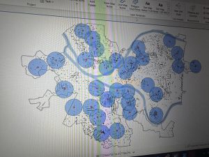
Chapter 6 explores how GIS can be used to analyze proximity and determine what is located near a specific feature. The chapter introduces three main methods for measuring proximity: straight-line distance, distance or cost over a network, and cost over a surface. Each method serves a different purpose depending on whether the focus is simple distance, travel time, or accessibility.

One concept that stood out to me was the use of distinct distance bands to show areas of influence around a feature. This reminded me of the Chicago School model of urban structure, which also uses distance to explain spatial organization. While the comparison is not exact, both approaches rely on distance as a way to interpret spatial patterns.

The chapter also discusses spider diagrams, which visually connect a single feature to multiple locations. This makes it easier to see whether a feature is within range of several important points. Toward the end of the chapter, Mitchell explains the importance of limiting the number of mapped features or using clear symbolization to avoid confusion. Overall, this chapter showed how proximity analysis helps turn spatial data into practical insights for planning and analysis.

Key Concepts: Proximity analysis, straight-line distance, network distance, cost surface, spider diagrams

Questions: When is straight-line distance insufficient for proximity analysis? How do analysts decide which proximity method best fits a real-world problem?

Pichardo – Week 2

Chapter 1: Geographic Thinking and GIS Analysis

Chapter 1 really opened my eyes to the bigger picture of GIS. I had always thought of GIS as just software for making maps, but Mitchell emphasizes that it’s really a way of thinking about the world spatially. The chapter introduces geographic thinking, which is about considering location, proximity, and spatial relationships when analyzing any data. It made me realize that the “where” is often just as important as the “what.” GIS is not just a tool; it’s a framework for asking meaningful questions, and the software is just one way to explore the answers.

Another key point was the idea of scale and how it affects patterns. What looks like a cluster at one scale can appear completely different at another. This made me reflect on how careful we need to be when interpreting maps—seeing a pattern doesn’t automatically mean something significant is happening. I also appreciated the discussion on vector and raster models, even though raster still feels a little tricky to wrap my head around. Vector models, using points, lines, and polygons, felt more intuitive, especially for plotting discrete events like crime locations or schools.

Overall, this chapter helped me see GIS as more than just technical steps; it’s a mindset. Thinking geographically forces me to consider relationships I might otherwise ignore, like how environmental factors relate to population density or how distance influences access to resources. I’m curious to see how this perspective will shape the way we approach actual map creation in class, and I wonder how geographic thinking can help tackle complex problems when data is incomplete or messy.

Key Concepts: Geographic thinking, GIS analysis, spatial patterns, scale

Questions: How do analysts avoid bias in interpreting spatial patterns? How does scale influence the conclusions drawn from GIS data?

Chapter 2: Understanding Geographic Data

Chapter 2 shifted my focus from thinking about GIS conceptually to thinking about the actual data that feeds it. Mitchell explains that understanding data is just as important as knowing the software because poor data choices lead to misleading results. The distinction between vector and raster data was useful. Vector data feels more tangible—points, lines, and polygons that represent features like roads or buildings—while raster data is more abstract, representing continuous surfaces like elevation or temperature. I think I’ll need to practice with raster more to feel comfortable using it in analysis.

Attribute data also stood out to me because it shows that location alone isn’t enough. For example, plotting all the schools in a city is informative, but adding enrollment numbers or funding data allows for meaningful comparisons. I was surprised at how many factors affect data quality—accuracy, resolution, completeness—and how each one can influence the results. It made me appreciate how critical it is to assess the data before running any analysis.

I also liked the practical examples in this chapter about choosing the right data for a map’s purpose. A city council zoning map needs different detail than a map showing air pollution trends, and understanding these differences is key to making effective, useful maps. This chapter made me think more critically about the data we’ll use in GIS assignments and how important it is to know both the strengths and limitations of each dataset.

Key Concepts: Vector data, raster data, attribute data, data quality

Questions: How do analysts decide which data model works best for a project? How can low-quality or incomplete data be handled responsibly in analysis?

Chapter 3: Exploring Geographic Patterns

Chapter 3 felt the most practical and immediately applicable of the three. Mitchell dives into identifying and interpreting geographic patterns, like clustering, dispersion, and trends. What really stood out to me was the idea of “most and least”—using maps to show where the most or least of something occurs. This seems simple, but I can see how it would be incredibly powerful in fields like public health, urban planning, or environmental monitoring. I was also struck by how often statistics are intertwined with map-making, which reminded me of my high school stats class and the maps we used to analyze datasets.

A major takeaway was the difference between maps designed for analysis versus maps designed for communication. Analytical maps might include more detail for exploring data, while presentation maps should simplify the information to prevent overload. I thought this was a helpful reminder that GIS isn’t just about plotting data; it’s about thinking critically about your audience and how information is presented. The chapter also emphasized the importance of revising maps and being selective about what to include, which makes me realize how iterative the map-making process really is.

I found myself reflecting on the ethical implications of maps. Since patterns can suggest relationships that aren’t necessarily causal, it’s important to be honest about what a map can and cannot show. This chapter made me excited to start creating our own maps while keeping in mind both accuracy and clarity.

Key Concepts: Clustering, dispersion, trends, exploratory spatial analysis

Questions: How can uncertainty be effectively communicated on maps? What ethical responsibilities should map creators consider when visualizing sensitive data?

Pichardo – Week 1

1. Introduction

Hello, my name is Andrea Pichardo, and I am an ENVS student interested in understanding how geography and technology intersect to explain real-world issues. I am especially interested in how spatial data can be used to analyze social and environmental patterns, such as access to resources, environmental impacts, and community-level change. I am new to Geographic Information Systems, but I am excited to learn how GIS tools are used across different fields and how they influence decision-making in everyday life.

2. Comments on Schuurman:

In Chapter 1, Schuurman explains that GIS is much more than a tool for making maps. One idea that stood out to me is that GIS does not have a single, fixed identity. Instead, its meaning changes depending on who is using it and for what purpose. For some people, GIS is mainly software that helps organize spatial data, while for others it represents a scientific way of thinking about space and spatial relationships. This made me realize that GIS is not just technical, but also conceptual and interpretive.

I also found the distinction between GIS as a system and GIS as a science especially interesting. GISystems focus on practical tasks such as urban planning, transportation routing, or managing infrastructure. GIScience, on the other hand, asks deeper questions about how spatial data is created, categorized, and analyzed. Schuurman emphasizes that decisions like where boundaries are drawn or which data is included can significantly affect results. This challenged my assumption that GIS outputs are always neutral or objective, and it made me more aware of the role human choices play in shaping geographic information.

Another important theme in the chapter is visualization. Schuurman explains that maps and spatial images allow people to see patterns that might not be obvious in tables or written descriptions. The example of John Snow’s cholera map shows how visualizing data spatially can lead to meaningful insights and real-world change. At the same time, she points out that visualizations can oversimplify complex situations if users do not critically examine the data behind them.

Overall, this chapter helped me see GIS as a powerful tool that influences how we understand space, make decisions, and interpret the world, rather than just a technical mapping skill.

3. GIS Application Areas

Application 1: Crime Mapping and Public Safety

GIS is widely used in crime analysis to map crime incidents, identify hotspots, and allocate police resources more effectively. Law enforcement agencies use GIS to analyze spatial patterns of crime over time, helping them predict where crimes are more likely to occur and develop targeted prevention strategies. Crime maps also allow communities and policymakers to better understand safety concerns and evaluate the effectiveness of interventions.

Map/Image:

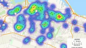
Kernel density crime map showing areas of higher incident concentrations — a common GIS technique used by law enforcement to identify hotspots.

Sources:

•National Institute of Justice, GIS and Crime Mapping

•Chainey & Ratcliffe (2005), GIS and Crime Mapping

Application 2: Environmental Monitoring and Conservation

GIS plays a crucial role in environmental science by helping researchers monitor ecosystems, track land-use change, and manage conservation efforts. For example, GIS is used to map wildlife habitats, analyze deforestation, and assess the impacts of climate change. By layering environmental data such as vegetation, elevation, and human activity, GIS allows scientists to make informed decisions about conservation planning and resource management.

Map/Image:

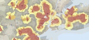
Environmental justice screening map that combines environmental and demographic data to highlight areas with higher cumulative burdens.

Sources:

•ESRI, GIS for Environmental Management

•Turner et al. (2001), Landscape Ecology in Theory and Practice

4. Was the quiz completed?

Yes.