Bahrey Week 6

GIS Tutorial for ArcGIS Pro

Chapter 9

Tutorial 9-4

I didn’t have too much trouble with this chapter, but I wasn’t able to figure out how to adjust the Output Fields upon expanding Fields parameter of the Spatial Join tool in Tutorial 9-3 so I had to call it quits on that tutorial. Also, not sure why, but I didn’t see the option to select Weight in the drop down for Field Mappings after clicking Import Demand Points in Tutorial 9-4, but I still ended up with something similar to the image in the book.

Chapter 10

Tutorial 10-3

Tutorial 10-3

Everything was fairly seamless for this chapter. I couldn’t find the Green to Yellow to Red color scheme so I picked my own fun colors. I routinely forgot to save my model so my Poverty Index Tool didn’t show parameters at first in Tutorial 10-3, but I quickly realized my silly error and got things to work.

Chapter 11

Tutorial 11-4

Tutorial 11-4

I ran into a couple issues in this chapter. I got a little lost in the sauce when digitizing the approximate location of the bridge in Tutorial 11-4, but I moved on and got to conduct a line of sight at the end of the tutorial. I also had some problems with the Summary Statistic tool earlier in Tutorial 11-4, which is weird because I feel pretty familiar with the tool, but I eventually got it to work. I wasn’t able to figure out how to create the movie at the end of Tutorial 11-7 either but, overall, not too painful of a chapter.

Bahrey Week 5

GIS Tutorial for ArcGIS Pro

Chapter 4

Tutorial 4-3

It took me quite a while to get the ball rolling for this chapter. I feel like the second part of the book seems to hold your hand a little less. Kelsea and I did a lot of trouble shooting and problem solving together. Lots of creating and editing of queries but, overall, not too painful.

Chapter 5

Tutorial 5-4

I was not super put out by this chapter until Tutorial 5-5. There were a couple work-arounds in the earlier tutorials that didn’t require an incredible amount of patience, but I do not think I downloaded the data files from the public agency hub correctly and that may have set me up for failure for Tutorials 5-5 and 5-6. Still, it felt good to figure out how to add x,y data by systematically poking around because it is slightly different that the instructions in the book.

Chapter 6

Tutorial 6-6

The tutorials for this chapter felt pretty quick and I didn’t really have any hiccups. I imagine I will need to extract and merge features in a similar manner in the future.

Chapter 7

Tutorial 7-2

Maybe I was just getting a little more comfortable but this chapter felt fast too. Plenty of cool things with making, deleting, moving, and rotating polygons in this chapter. For some reason, the study area buildings disappeared when I ran the export features tool in Tutorial 7-4 but, to be honest, I didn’t find a solution and I ended up moving on.

Chapter 8

Tutorial 8-2

Not to sound like a broken record but this was the briefest of the brief. No issues in this chapter!

Bahrey Week 4

GIS Tutorial for ArcGIS Pro

Chapter 1

Tutorial 1-1

Tutorial 1-4

I really appreciate how explicitly detailed the instructions are for each tutorial. Once I got familiar with how things are saved and such it was pretty smooth sails. I think the only hiccup I had was accessing the hyperlinks for individual urgent care clinics. I tried to poke around figure out why they weren’t showing up in my pop-up window but I ended up just moving on.

Chapter 2

Tutorial 2-4

Tutorial 2-5

Things went well for this chapter too. I wasn’t able to drag the Over Age 60 Receiving Food Stamps layer above the 3D layer heading in Tutorial 2-4 despite my efforts to trouble shoot, but I still ended up with something that looks similar to the map in the book. For Tutorial 2-8, I couldn’t find “Out Beyond” in the Visibility Range group of the Labeling tab, so I selected <Current> as the maximum scale and the minimum scale because I speculated that doing so would also cause the ZoningLandUse labels to disappear when I zoom in or out. I repeated this with the Lower Manhattan bookmark and it seemed to also achieve the goal of removing the school points and borough labels when zooming in and out.

Chapter 3

Tutorial 3-1

I had a pretty easy time following along with the instructions for this chapter as well. I wasn’t able to find how to enable the pie chart in the map configurations for Tutorial 3-4, but I was able to enable the serial chart and table. Overall, minimal bumps in the road and I feel somewhat comfortable navigating the program and ArcGIS web maps.

Bahrey Week 3

The ESRI Guide to GIS Analysis, vol. 1  (second edition, 2020) by Andy Mitchell

Chapter 4

Density maps show where the highest concentration of features is and are particularly useful when looking for patterns in areas that vary in size, such as census tracts and counties. Before creating a map, the kind of data being used and whether the density of features or feature values will be mapped should be considered. Density can either be mapped graphically (calculating density values for each area or dot mapping) or by density surface. If the data have already been summarized by area or the objective of the map is to compare administrative or natural areas with defined borders, density should be mapped by defined area. If the objective of the map is to see the concentration of point or line features, a density surface should be created. When mapping density for defined areas, calculating a density value for each area involves dividing the total number of features/total value of the features by the area of each polygon while creating a dot density map involves specifying how many features each dot represents and how big the dots are. Density surfaces, however, are created in GIS using raster layers. The specified cell size, search radius, calculation method, and units affect how the GIS calculates the density surface and, ultimately, what the patterns will look like. Density surfaces can either be displayed using graduated colors (usually displayed using shades of a single color with common classification schemes including natural breaks, quantile, equal interval, or standard deviation) or contours (connecting points of equal density). While the patterns on a density map are partially dependent on how the density surface was created, it is important to remember that there may not actually be any features where the highest density is. To see a better picture of what is going in a place, the locations of features from which the density surface was calculated should also be mapped with the density surface or on a separate map.

Chapter 5

Mapping what is inside an area allows for the monitoring of what is occurring inside it or the comparison of several areas based on what is inside each. Depending on the number of areas, what type of features are inside the areas (discrete or continuous), and the information needed from the analysis (list, count, or summary), an area boundary can be drawn on top of the features, the features inside can be selected using a area boundary, or the area boundary and features can be combined to create summary data in order to find what’s inside. A map that shows the boundary of the area and the features is good for seeing whether one or a few features are inside or outside a single area. This method requires a dataset containing the boundary of the area or areas and a dataset containing the features. Creating a map by selecting the features inside an area is good for getting a list or summary of features inside a single area or group of areas being treated as one. A dataset containing the areas and a dataset with the features are needed for this method which involves specifying the area and the layer containing the features so that the GIS may select a subset of the features inside the area. To overlay the areas and features, the GIS either combines the area and the features to create a new layer with the attributes of both or compares the two layers to calculate summary statistics for each. Overlaying the areas and features is good for finding the features that are in each of several areas or finding out how much of something is in one or more areas. Data containing the areas and a dataset with the features are needed for this method. When selecting features inside an area, GIS can be used to create a report of the selected features (count, frequency, sum, average, median, standard deviation). There are also key differences between overlaying areas with discrete features, continuous categories or classes, and continuous values.

Chapter 6

What is occurring within a set distance or traveling range of a feature is understood through finding what is nearby. There are also three methods to find what is nearby: measuring straight-line distance, measuring distance or cost over a network, or measuring cost over a surface. Selecting a method entails determining the information needed from the analysis (list, count, or summary) and defining and measuring “near” which can be based on a set distance or on travel to or from a feature. Using straight-line distance means specifying the source feature and the distance before the GIS finds the area or surrounding features within the distance. This method is good for creating a boundary or selecting features at a set distance around the source. A layer containing the source feature and a layer containing the surrounding features are required to find what is nearby using straight-line distance. Using the area covered by segments of the network  within the distance or cost to find the surrounding features near each source is known as measuring distance or cost over a network. If the objective is to find what is within a travel distance or cost of a location using the locations of the source features, a network layer, and a layer containing the surrounding features, this is a suitable method. Measuring cost over a surface begins by specifying the location of the source features and a travel cost. Then, the GIS creates a new layer showing the travel cost from each source feature. This approach is good for calculating overland travel cost and it requires a layer containing the source features and a raster layer representing the cost surface. When calculating cost over a geographic surface, it is important to acknowledge that cost refers not only to monetary value but also to factors like time, effort, or resource expenditure required to traverse a landscape.

Bahrey Week 2

The ESRI Guide to GIS Analysis, vol. 1  (second edition, 2020) by Andy Mitchell

Chapter 1

GIS analysis is defined as a process for looking at geographic patterns in data and at relationships between features. When performing an analysis, the first step is to frame the question or figure out what information is needed. Understanding the data by evaluating its features and attributes helps to determine what needs to be acquired or created. In conjunction with consideration for the initial question and how the results of the analysis will be used, the type of data informs the specific method to select. After choosing a method, the data is processed by performing the necessary steps in a GIS and the results of the analysis may be displayed as a map, values in a table, or a chart.

It is crucial to be cognizant of the types of geographic features and how they are represented as the geographic features of the data impact every aspect of the analysis process.
3 Types of Geographic Features:
1. Discrete Features – Discontinuous and have definite feature boundaries (Esri definition I found online)
2. Continuous Phenomena – Can be found or measured anywhere – blanket the entire area mapped.
3. Features Summarized by Area – Represents the counts or density of individual features within area boundaries.

Vector (feature shapes are defined by x,y locations) and raster (features are represented as a matrix of cells) are the two models of the world that represent geographic features in a GIS. Discrete features and data summarized by area are usually represented using the vector model while continuous numeric values are represented using the raster model.

All data layers should be in the same map projection (translates locations on a globe onto the flat map) and coordinate system (specifies the units used to locate features in two-dimensional space and their origin).

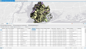
Geographic features have one or more attributes. Attribute values include categories (groups of similar things), ranks (order features from high to low), counts (actual number of features) and amounts (measurable quantity associated with a feature), and ratios (relationship between two quantities). Working with tables that contain attribute values and summary statistics is a vital component of GIS analysis. Selecting features to work with a subset or to assign attribute values to just those features, calculating attribute values to assign new values to features in the data table, and summarizing the values for specific attributes to get statistics are all common operations performed on features and values within tables.


Chapter 2

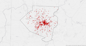
Maps are often used to see where or what an individual feature is. However, looking at the distribution of features on a map can reveal patterns about the area being mapped, informing where action should be taken or potential causes for observed patterns. Before looking for geographic patterns in a data set, the features to display and how to display them must be decided based on the information needed and how the map will be used. The features being mapped must also have geographic coordinates assigned and a category attribute with values before map creation begins.

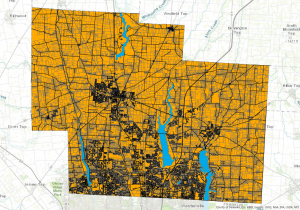
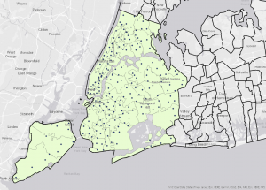
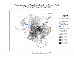
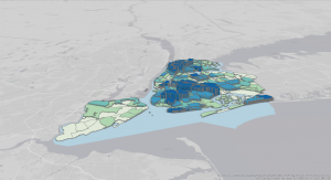
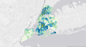
Telling the GIS which features to display and what symbols to use to draw them is the first step to creating a map. All features can be mapped in a layer as a single type (drawing all features using the same symbol) or displayed by category values (drawing features using a different symbol for each category value). When mapping by category, including different categories may reveal different patterns because features may belong to more than one category. Often, no more than seven categories are shown on the same map but, if the patterns are complex or the features are close together, separate maps for each category map be created. Grouping categories by assigning each record in the database to two codes (detailed or general), creating a table containing one record for each detailed code, or assigning the same symbol to the various detailed categories that comprise each general category are methods of grouping categories to make patterns easier to see when there are more than seven initial categories. The symbols used to display categories can also help reveal patterns in the data. It is important to remember that colors are easier to distinguish than shapes and using similar colors for related categories rather than randomly assigned colors can make patterns more obvious. A map that presents information clearly will display evident patterns in a dataset.


Chapter 3

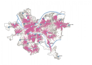
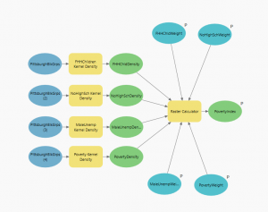
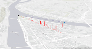
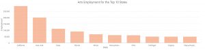
Mapping the most and the least means to map features based on the quantity associated with each to see which places meet the criteria or understand the relationship between places. Determining the type of features being mapped and the purpose of the map will assist in deciding how to best present the quantities and see patterns on the map. Symbols must be assigned to features based on an attribute that contains a quantity (counts or amounts, ratios, or ranks) to map the most and the least. After determining the type of quantities in the data, the quantities must be represented on the map either by assigning each individual value to its own symbol or grouping values into classes. To look for patterns in the data, a standard classification scheme (natural breaks/jenks, quantile, equal interval, or standard deviation) should be used to group similar values. Creating a bar chart with attribute values on the horizontal axis shows how the data are distributed across their range, informing classification scheme selection. Once the data values are classified, a map type should be chosen based on the type of features and the data values being mapped.

Graduated Symbols – Used to map discrete locations, lines, or areas.
Graduated Colors – Used to map discrete areas, data summarized by area, or continuous phenomena.
Charts – Used to map data summarized by area, or discrete locations or areas.
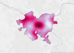
Contour Lines – Used to show the rate of change in values across an area for spatially continuous phenomena.

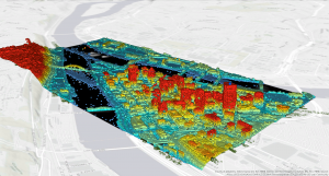
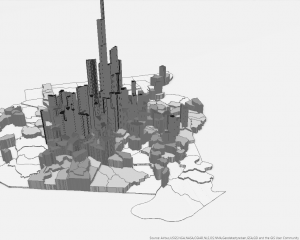
To visualize the surface of continuous phenomena, three-dimensional (3D) perspective views are utilized. When creating a 3D view, the viewer’s location, z-factor (specified value to increase the variation in the surface), and location of the light source are manipulated to determine what the view will look like. A map that presents information clearly will display where the highest and lowest values are.

Bahrey Week 1

Hello! My name is Ashley Bahrey and I am a junior Zoology, Environmental Science, and Geography major. I am from Bristolville, Ohio and I like to make jewelry and crochet in my spare time. I also have three cats that I love and adore!!!

I am one of the people that Nadine Schuurman is talking about in chapter 1 of GIS: A Short Introduction that previously did not know many of the core ways in which GIS is integrated in my daily life. The discussion around how GIS does not have a rigid identity because it is used to ask both where spatial entities are and how spatial entities may be encoded made me begin to consider just how interdisciplinary the use of GIS must be. I found Schuurman’s way of differentiating between spatial analysis and mapping by pointing out that mapping does not create more information than was originally provided to be very helpful in understanding these concepts. While Canada was credited for developing one of the earliest computer cartography systems, I thought it was interesting that GIS roots emerged somewhat simultaneously around the world in the 1960s. I really appreciate the lengths that Schuurman goes to make the content of this chapter straightforward and accessible. Her comparison of GIS to a calculator nicely set up the conversation she creates around GIS as a tool that can be used to visualize spatial data and “utilize fuzzy data”. Thinking of the visual aspect of GIS as a means of increasing the accessibility of spatial analysis is intuitive to me and definitely underscores the importance of GIS as a method of communicating big ideas in ways that can be digested by people with varying backgrounds. I also found the discussion surrounding the differences between GISystems and GIScience to be very informative, providing context for a new focus on researching the technical and theoretical problems associated with GIS. Additionally, the point that Schuurman raises about how map readers may interpret symbols and map representation differently seems paramount to visualizing spatial data in a way that can be accurately and efficiently utilized. Detailing some of the many ways that we rely on GIS in our everyday lives sets the stage for Schuurman’s overarching point that the intellectual and disciplinary ties of GIS must be studied in tandem with the technology itself to understand how modern society is organized and influenced by the digital realm. 


Search 1:GIS Application Eastern Bluebird Population Monitoring

This is a species distribution map for eastern bluebirds (Sialia sialis). While eastern bluebirds are categorized as of least concern (LC) on the IUCN Red List of Threatened Species, it is important to understand the range and habitat use of this species because these birds experienced serious population declines beginning in the early 20th century due to competition with invasive species and pesticide use. As low-aggression secondary cavity nesters, bluebirds were left with fewer places to nest. The installation of cavity nesting boxes designed to keep the larger birds like the invasive European Starling and bluebirds trails caused populations to rebound in the 1960s. Now, the population trend for eastern bluebirds is increasing. 

BirdLife International (2025) Species factsheet: Eastern Bluebird Sialia sialis. Downloaded from https://datazone.birdlife.org/species/factsheet/eastern-bluebird-sialia-sialis on 16/01/2025.

Search 2: “GIS Socioeconomic Status and Environmental Contaminants

Figure 1

This is a map of three ranges of critical health code violations (CHV) in 10,859 retail food service facilities overlaid on a map of poverty levels by census tracts in the city of Philadelphia, PA. The large number and close proximity of food service facilities make visual interpretations of mapping difficult, but this study found that food service facilities in higher poverty areas had a greater number of facilities with at least one CHV and underwent more frequent inspections compared to those in lower poverty areas. Additionally, the results of this study showed that facilities in census tracts with high concentrations of Hispanic populations had more CHVs than those in other demographic areas (Darcey & Quinlan 2011).

Darcey, V. L., Quinlan, J. J. (2011). Use of Geographic Information Systems Technology to Track Critical Health Code Violations in Retail Facilities Available to Populations of Different Socioeconomic Status and Demographic. Journal of Food Protection 74(9): 1524-1530. https://doi.org/10.1016/j.ygcen.2008.05.017