Moore Week 7

Final Project Data Summary- 

Zip Code: Data set containing all zip codes within Delaware County, Ohio. Data is published monthly. 

School District: A data set that consists of all School Districts within Delaware County, Ohio. It is updated on an as-needed basis and is published monthly.

Building Outline (2021, 2023, 2024): Data sets consisting of all building outlines in Delaware County. These are separate datasets corresponding to each year provided. 

PLSS: Data set consisting of all the Public Land Survey System (PLSS) polygons in both the US Military and the Virginia Military Survey Districts of Delaware County.  This dataset is maintained on an as-needed basis, where new surveys have been recorded, and is published monthly.

Township:  A data set consisting of 19 different townships that make up Delaware County, Ohio. The dataset is updated on an as-needed basis and is published monthly.

2024 Aerial Imagery: Collection of images. 3in Aerial Imagery, Flown Spring 2024. Publish date is  September 25, 2024, 7:45 pm. 

Delaware County E911 Data:  Address Points data set that is a spatially accurate representation of all certified addresses within Delaware County, Ohio. In particular, the State of Ohio Location-Based Response System (LBRS) Address Points. Used to do appraisal mapping, geocoding, report accidents, and manage disasters.

2121 Imagery (SID File): File used to summarize images of Delaware County from 2021.

Original Township: A dataset that consists of the original boundaries of the townships in Delaware County, Ohio, before tax district changes affected their shapes.

Recorded Document: A dataset that consists of points that represent items that do not match up with the subdivisions that are currently active on the Delaware County map. Documents such as vacations, subdivisions, centerline surveys, surveys, annexations, and other miscellaneous documents within Delaware County, Ohio. 

Precincts: A dataset that consists of Voting Precincts within Delaware County, Ohio. It is updated on an as-needed basis and is published by the Delaware County Board of Elections.

Dedicated ROW: A data set that consists of all lines that are designated Right-of-Way within Delaware County, Ohio.  line data that is created through daily updates of Delaware County’s Parcel data.

Delaware County Contours: 2018 Two Foot Contours for Delaware County Ohio in File Geodatabase format. Published April 9, 2020 at 9:51 AM. last updated on October 12, 2021 at 10:43 AM. 

Building Outlines – DXF:  Data consists of an image of specific building outlines in Delaware County using CAD drawings. Last updated on May 15, 2023, 7:04 PM. 

Address Points – DXF: Dataset that uses LBRS to show a spatially accurate placement of addresses within a given parcel in Delaware County, or registered addresses in a shapefile. With Address Points indicating the location of the building centroid. 

Street Centerlines – DXF:  The LBRS Street Centerlines depict the center of pavement of public and private roads within Delaware County. Data was developed from data collected by field observation of existing address locations

Parcel: This dataset consists of polygons that represent all cadastral parcel lines within Delaware County, Ohio. It contains information like current owner, sale history,  address, and number of rooms.

Street Centerline: Dataset that uses LBRS to depict center of pavement of public and private roads within Delaware County. Data was developed from data collected by field observation of existing address locations. 

Condo: A dataset that consists of all condominium polygons within Delaware County, Ohio that have been recorded with the Delaware County Recorder’s Office.

Subdivision: A data set that consists of all subdivisions and condos recorded in the Delaware County Recorder’s office. Is updated on a daily basis and is published monthly.

Tax District:  A data set that consists of all tax districts within Delaware County, Ohio. Defined by the Delaware County Auditor’s Real Estate Office, and is dissolved on the Tax District code. Data is updated on an as-needed basis and published monthly.

Address Point: A dataset that uses LBRS to provide a spatially accurate representation of all the certified addresses within Delaware County. Is updated as-needed daily and published monthly. 

Map Sheet: A dataset that consists of all map sheets within Delaware County, Ohio

Farm Lot: A data set that consists of all the farmlots in both the US Military and the Virginia Military Survey Districts of Delaware County. Created to facilitate in identifying all of the farmlots and their boundaries in both the US Military and the Virginia Military Survey Districts of Delaware County. 

Annexation: A data set that contains Delaware County’s annexations and conforming boundaries from 1853 to the present. Is updated on an as-needed basis once an annexation has been recorded at the Delaware County Recorder’s office.

Survey: (A shapefile) point coverage that represents surveys of land within Delaware County, Ohio. These surveys are found in documents in the Recorder’s office and the Map Department. 

2022 Leaf-On Imagery (SID file):  2022 Imagery 12in Resolution. Published on September 14, 2022, 1:42 PM 

Hydrology: A dataset that consists of all major waterways within Delaware County, Ohio. Was enhanced in 2018 with LIDAR-based data. Is updated on an as-needed basis and is published monthly.

GPS:  A dataset that identifies all GPS monuments that were established in 1991 and 1997. Is updated on an as-needed basis and is published monthly.
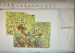
 

Moore Week 6

7:

     In chapter seven, we learned how to edit polygon features as well as how to use specific tools to directly depict these features. I really enjoyed chapter 7 as it reminded me of working with vectors in Adobe Illustrator, where you can adjust shapes using various tools and vertex points. When creating polygon features, I found the trace tool very satisfying to use. Learning how to smooth out the edges of the polygon was also very satisfying. I also found it interesting that when the chapter was teaching us how to transform features, it used an AutoCAD drawing as a base to transform. Until now, I had no clue that AutoCAD could be utilized by ArcGIS, as I am semi-familiar with AutoCAD software. In chapter 7, it also says we can click and hold the wheel button on our mouse in order to pan around the map when in editing mode. This was helpful information that I wish the book had told us when making feature edits earlier. 

8:

        Chapter eight was more confusing than the previous chapter for me. It has to do with geocoding, which is the ability to convert various geographic data descriptions/addresses into geographic coordinates that can be displayed on a map. To be specific to chapter 8, it taught us to geocode using zip codes and street centerlines. These actions that allow for geocoding are done mostly through the use of specific tools found in the Geoprocessing pane. Throughout the later tutorials, sometimes they dont actually say “run tool” when that step needs to be conducted. I guess it can be assumed that the tool needs to be run, but I prefer tutorials that are very detailed and explicit in their instructions. This was a small detail, but it made the workflow feel slightly less clear and more frustrating at times. It also doesn’t help that you don’t get a visual on what you’re imputing until the very end of the imput.


9:

        I ended up understanding the concepts from chapter nine much better than in chapter eight. With the concept being how to work with/display spatial data, which is (to my understanding) the area surrounding a data point that can be utilized to answer specific questions. For example, we created service areas to help compare how often a pool is used by youths depending on the travel time to said pool. The travel time is visualized by the service areas as ring boundaries around the pool data point. As expected, the use rate of the pool was decided as travel time went up. I also may have found this chapter easier because, unlike the previous chapter, you could visually see the map changing as you performed each little step. 

Moore Week 5


Chapter 4:

         For Chapter 4 (and chapters throughout the manual in this section) It doesn’t show you many examples of what the map is supposed to look like throughout the text; it just simply walls you through a wall of confusing explanation. This makes it very difficult to check if you are doing the right thing, as there is little visual comparison. I made many mistakes because of the exclamation leaving out small but important details with almost nothing to compare it to visually. Chapter 4 was dedicated to file geodatabases, as we created and managed file geodatabases and then edited said data in specific ways using various methods. For example, we modified attribute tables, carried out attribute queries, aggregated the data with spatial joins, used central point features for polygons, and lastly created a new table to join to another table. A new thing about chapter 4 is that the data is not already loaded in on a pre-existing template. We had to be the ones to create it this time, which was a difficult hurdle for me. Especially when I feel the instructions would lead me to a dead end on multiple occasions. 


Chapter 5:

        Chapter 5 introduced more advanced geoprocessing tools and focused the reader on spatial data. The focus was on solving spatial problems by combining multiple tools and methodologies. Unlike earlier chapters, where the tasks felt somewhat guided, this one required a lot more attention to detail and understanding of what each tool was actually doing behind the scenes. This caused me to make several errors. For example, in tutorial 5-6, there was an error stating “010819: The input path contains spaces” despite the input being selected from a predetermined dropdown box. There were no instructions to fix this issue. Little errors like this occurred often that stopped me in my tracks because of the detailed nature of chapter 5. 

Chapter 6:

      Chapter 6 felt more focused on selecting and analyzing data rather than creating new feature classes. This is becuase chaoter 6 focused on Geoprocessing, which is a framework and set of tools for processing geographic data. I became accustomed to searching for specific tools in the geoprocessing tab, specifically within this chapter, as almost every tutorial section has you using a specific tool you must look up in order to complete the task. This can be tedious, as being introduced to a new tool almost every single section became overwhelming. This, combined with the previous issues of instructions still being very dense and not very visual, as well as not providing workarounds to errors, led to an overall stressful experience for me. 


Moore Week 4

Chapter 1:

       The previous book we read through by Mitchell did a decent job at preparing students for the actual GIS system tutorial manual. However, doing things hands-on has enabled me to better understand certain aspects of GIS. I’m not very tech-oriented, so I knew that adjusting to things like saving files correctly and typing on the new keyboard would be a hurdle for me. However, following the instructions laid out within the manual was not as difficult as I thought it would be. Each chapter is separated into different tutorial sections that teach different aspects of ArcGIS. Each section also has a designated file you work on. In Chapter 1, these different sections are as listed: Tutorial 1-1 Getting an overview of ArcGIS Pro, Tutorial 1-2 Navigating ArcGIS Pro, Tutorial 1-3 Working with attribute data, and Tutorial 1-4 Symbolizing maps. For Tutorial 1-1, we learned how to open an ArcGIS Pro project and navigate the ArcGIS Pro interface, including understanding basic GIS concepts along with navigating the map and its layers. For example, this section introduced bookmarks, which were helpful to understand for future chapters. It also showed us how to turn layers on and off, as well as re-order layers within the contents pane. Tutorial 1-2 taught us how to correctly use a pop-up window, as well as how to search for a feature. Tutorial 1-3 was also helpful as it showed us how to work with attribute data through editing the data within the fields view of the table, and how to use tools to obtain summary statistics. Lastly, Tutorial 1-4 delves into how to interact with feature classes through adding/ removing them, giving them symbols, and giving them labels. Question: Which skills from Chapter 1 will be used most frequently throughout the rest of my learning how to use ArcGIS Pro?

Picture: Tutorial 1-1

Picture: Tutorial 1-3

Chapter 2:

        Throughout the various tutorials, I liked how for more precise sets of instructions, they gave us “your turn” assignments where we repeated the previous task again, but in a different way. It allowed me to better remember and understand what I had done previously. As stated previously, each chapter is separated into different tutorial sections that teach different aspects of ArcGIS. Chapter two is focused on map design, with it being separated into the following sections: Tutorial 2-1 Symbolizing qualitative attributes, Tutorial 2-2 Labeling features and configuring pop-ups, Tutorial 2-3 Filtering with definition queries,  Tutorial 2-4 Creating choropleth maps for quantitative attributes, Tutorial 2-5 Displaying data using graduated and proportional point symbols, Tutorial 2-6 Normalizing population maps with custom scales, Tutorial 2-7 Creating a dot density map, and finally Tutorial 2-8 Setting visibility ranges. I won’t go into too much detail of every individual tutorial section, as the titles are somewhat self-explanatory. However, I will share some experiences. In Tutorial 2-5, I remember accidentally renaming the wrong layer and editing on top of features that should’ve been displayed alongside my edits. I understood what mistake I made in order not to repeat it in the future. Also, changing the symbology of a layer/feature is something that was done in almost every section of Chapter 2. It really familiarized me with how to change the color and size of a symbol. The same occurred with renaming layers within the contents pane, as I now feel familiar with the action. I also became much faster at opening and naming files in chapter 2 as I had repeated the action many times over. Question: How do we decide which symbology method to choose? I did not understand the different methods in relation to the numbers they visually display. 

Photo: Tutorial 2-4

Photo: Tutorial 2-8

Chapter 3:

           Chapter 3 is less focused on how to make the maps and more focused on how to share these maps with individuals who don’t have ArcGIS Pro or any GIS skills. It also takes you off the ArcGIS programming platform and onto the ArcGIS Online website to show various methods of sharing maps on ArcGIS Online. Because of this, chapter 3 is not structured like chapters 1 and 2, with each tutorial section correlating with a designated ArcGIS file. Instead, it has ArcGIS file tutorials for within the program and outside the program. With the tutorials that were within the program being Tutorial 3-1 Building layouts and charts, and Tutorial 3-2 Sharing maps online. Sections that described how to perform actions within ArcGIS online were sections Tutorial 3-3 Creating a story and a briefing in ArcGIS StoryMaps, and Tutorial 3-4 Creating a dashboard in ArcGIS Dashboards. I struggled the most with this chapter because the instructions for what actions to perform for the ArcGIS online sections seemed to be outdated, with instruction names sometimes not correlating with the names on my screen. I also just struggled in general with jumping to a semi-new platform after being on ArcGIS Pro for two introductory chapters. I feel they could have introduced ArcGIS Online in later chapters. In the Tutorial 3-1 section, we were taught how to build a layout for our maps and charts. It reminded me of doing graphic design, with having to place images within select measured areas using various tools. The Tutorial 3-2 section was fairly simplistic, with it teaching how to properly adjust settings in order to publicly share a map within ArcGIS Pro. This is when the chapter introduced ArcGIS online, as we adjusted this shared map within the online program. Tutorial section 3-3 showed how to create a story and a briefing within ArcGIS online, both of which are streamlined ways for others to view and interact with your GIS map/data. Tutorial section 3-4 taught something similar, showing us how to create a Dashboard, creating another way to clearly outline and visualize our data within the platform. Question: When using ArcGIS online, what is the purpose of sharing/creating a story vs a briefing? What purposes do each hold? 

Picture: Tutorial 3-1

Moore Week 3

Chapter 4: 

       Chapter 4 focuses on mapping density through various methods, including defining why you should map density, deciding what kind of density to map, and how to actually map density. In terms of GIS mapping, density refers to the concentration of features or values within a given unit of area/distance. A density map lets you measure designated features by concentration using a uniform aerial unit like hectares or square miles, so the concentration distribution can clearly be observed. A hectare is a metric unit of area equal to 10,000 square meters.

        When discussing why it’s important to map density, Michell gives a multitude of reasons. One being that density maps can help show you where the highest concentration of features/data is located. This makes density maps useful for observing patterns as opposed to observing individual features/locations. These maps are also useful for mapping areas that have a wide variety of sizes. For example, when mapping the number of trees within separate forests, the larger forests may appear to have more trees due to the larger area they take up. However, when mapping for the density of the trees within the forests, you may see more concentrated areas of trees within the smaller forests that are represented through density mapping. 

    As stated in previous chapters, it’s important to consider what information you want to get from the map before creating it. This will help you decide what methodology to use when creating the map. When mapping density, consider whether you want to map direct features or feature values, as the resulting maps can look very different from each other. There are two ways you can map density: mapping the density by area, or creating a density surface. You should map by defined area if you already have data that is summarized by area, or for comparing certain areas with defined borders. On the contrary, you should create a density surface if you want to see the specific analytical concentration of point/line features. Question: What do you do when a data point falls exactly on an existing defined boundary line?

Chapter 5:

         Chapter 5 discusses map/data analysis through the lens of mapping what’s inside. But what does the book mean when it says “finding what’s inside”? It is trying to say that we can identify which geographic features fall within the boundaries of other features using spatial relationships for the purpose of analysis. When in practice using real-life data, this means determining whether points, lines, and polygons are contained within a specific area. This map analysis involves monitoring what’s occurring inside a designated area, or even comparing different areas based on what they contain. In simple words, we are summarizing what’s inside an area using GIS. 

        According to the book, this can be achieved in a multitude of ways. For one, you can draw an area boundary on top of the existing features. Or you can use an existing area boundary to select and analyze the features inside it. You can even combine the area boundary and its features to create a summary of the area. Just like in previous chapters, the method you choose to use for creating your map depends on the data that is available to you and the information you are looking to gain from creating the map. When taking this into account, the type of data you have matters. For example, finding what’s inside a single area vs what’s inside multiple areas can result in different analytical findings, as you can compare multiple areas to each other for deeper data analysis.

         There are three ways of “finding what’s inside” that the book highlights, as I listed previously. In order to draw an area boundary on top of the existing features, all you really need is datasets that show the boundary of the area and the features it contains. To select for and summarize features within an area, you also need datasets that show the boundary and the features it contains, but you will also need the attributes of the features you wish to summarize available. You will need this same set of things in order to perform an overlay of areas and features.  Question: Why does it matter whether you’re working with points, lines, or polygons when figuring out what’s inside an area?

Chapter 6:

      Chapter 6 discusses how GIS mapping can be used as a tool to analyze what is nearby to an existing feature, allowing you to find out what may be occurring within a specific distance from a feature as well as monitor events within that particular feature’s range. This can be useful for various purposes. For example, finding out what’s within the traveling range of a feature can help the observer define the area that can be served by a facility. An ambulance station can do this to find out how far away possible incoming neighborhood calls are to the specific station. Being aware of what is in the traveling range of a feature can also help with designating areas for a specific use relating to the feature being observed. For example, mapping the traveling range around a lake could allow scientists to identify surrounding wetland areas suitable for conducting environmental protection.

     According to the book, you can conduct what was previously described using various methods. One being straight-line distance, in which you specify the feature being analyzed by GIS to measure the direct distance outward from that feature, thus creating an area of surrounding features within that distance. This approach is recommended when you need to create a boundary/select for features around a specific source. To perform this method, you need a layer for the source feature and a separate layer for the surrounding features. Another method you can use is measuring distance/cost over a network. This means to determine the distance or travel cost from a specific source location along a linear feature. This approach is recommended for finding what’s possible within a travel distance/cost of an area located on a fixed network like a road. To perform this method, you need the source feature location, a layer containing surrounding features, and a network layer. Please consider that each part of the network needs an attribute providing its length or cost value. These can either be created manually or chosen from a provided network. Question: Could barriers like rivers or highways affect the analysis of what is nearby to an existing feature?


Moore Week 2

Chapter 1:

 Rather than jumping straight into the intricacies of mapping and data analysis, Chapter 1 stresses the importance of understanding and clearly defining the topic at hand. I believe that this is an effective way to introduce new students to the basics of GIS, as it eases you into it. One major takeaway I noted is that Mitchell highlights how GIS analysis conducted with intent tends to begin with asking the right questions related to the information you need, with more specific questions helping guide your analysis. I had not realized this prior, as I just saw GIS as simply plotting data. I realized we can use GIS to address important problems by asking pressing questions that are specific to the area of interest. It’s also important to note that Mitchell presents GIS systems as accessible, inviting us to ask our own questions and come to our own conclusions and discoveries. This is an exciting revelation for me.

Chapter 1 also introduced me to the basics, like understanding and identifying geographic features as how they are presented within a GIS. My takeaway is that there are many different ways to visualize data as features, depending on what kind of data it is and the purpose of creating a visual for said data. For example, vector vs raster modeling. Vector modeling represents features as points and lines often using coordinate-based data, making it good for plotting things like roads, boundaries, and buildings. Raster modeling represents the features as a grid of cells using continuous data, which is good for plotting things like elevation, temperature, weather patterns, and land types. I found it interesting how these two forms of modeling could technically be used interchangeably for the same purpose, but they are used for whatever they are visually better suited for. 

I feel that explaining how we can all use GIS as an effective tool is the premise and the author’s main goal after reading chapter 1. It introduces GIS analysis as a system that is capable of examining and visualizing geographic data to understand specific spatial patterns, relationships, and trends in a way that I found understandable. It takes this information and directly ties it to visual features within a GIS mapping system. Question: Would reading printed park maps be considered a form of GIS analysis? Where is the line drawn for maps being purely for visualization or analysis?

Chapter 2:

Chapter 2 starts off by building on the foundation that Chapter 1 created by highlighting the importance of visualizing data using mapping. Honestly, I found this redundant. The benefits of mapping data already seemed clear to me. For example, Mitchell discusses how visualising data on maps can help us look for patterns in the distribution of the features, and make decisions based on these patterns. I thought that was obvious, but I appreciate that Mitchell is making things very understandable for new students like myself. Some things that I was unfamiliar with that chapter 2 discusses is deciding what to map, and preparing my data for said map. I learned that when deciding what to map, you need to consider the information you want to analyze and how the map containing this information will be used. This made me realize that it’s important to take into consideration the specific audience the map will be presented to. For example, a highly detailed and overly complicated map is ineffective if it was intended to be made for the purpose of sharing basic information with the general public. As for preparing data, I was highly unfamiliar with the topic. I learned that a crucial first step is to assign geographic coordinates to the feature you wish to plot. Another important thing I learnt is that you need to assign category values to features if there are differing features, or features sorted by type. The category value is a code/tag that identifies the feature type. I often see these categorizations of features when looking at maps, but I’m now realizing that this feature identification can be used for various applications, such as distinguishing areas for city planning. Chapter 2 does a good job at answering basic questions about mapping and how to create a map, as well as explaining how to proficiently analyze these maps.    Question: How can we effectively and critically evaluate data sources to identify biases/untrustworthy information before incorporating it into our GIS analysis?

Chapter 3:

When I first read the title of chapter 3, it being called “Mapping the Most and Least”, I was confused. Unlike the previous titles, what it was trying to convey wasn’t immediately clear to me. However, Mitchell explained it in an understandable fashion. Mapping the most and least means to identify where values relating to your data/criteria are highest or lowest to analyze certain aspects about the data, most often through patterns. If I were to think of an example, I would say that analyzing a low income area for care facilities scarcity is an example of analyzing where values are the least. This is something that I had not previously considered, as I was focused on the idea of mapping where things might be located, not where things might be missing or lacking. It showed me how presenting the quantities of data in different ways is an important thing to consider when deciding what I want the purpose of my map to be. This is just one method of GIS analysis that is presented in chapter 3. Other methods are given.

For example, there are different types of quantities that you can use. According to Mitchell, being aware of the quantity type your mapping can help with deciding how to present your data in the best way. Once the type is determined, a decision must be made about how to represent it on a map. This can be done either through grouping the values into classes or by assigning each value its own individual symbol. I learnt that each choice has its merits, and I now know how to apply them to my own maps. For example, grouping the values into classes is useful for maps with a large range of values to present the data in an easily readable manner. Showing overall patterns is favored over exact data using this type. This would be good for maps about concentration levels of rain or air pollution. On the other hand, assigning each value its own individual symbol is useful for maps where precision matters, and exact values are important due to the specificity of the data. This would be good for maps geared towards recording specific sampling sites, or showing how specific geographic locations may present differently from each other.     Question: What if the data is in a middle ground where it isn’t clear if I should present my data with simplicity or complexity? 

Moore Week 1

Intro: Hello, my name is Alayna Moore. I’m a Sophomore, and I transferred to OWU at the end of my freshman year.  Delaware Ohio is my hometown, so I always wanted to go to OWU. I plan on double-majoring in Biology (B.A) and Environmental Science (B.A). As for a career, I want to spend time in the field doing surveying. I’m interested in working as an environmental consultant or working for a national park. I also have a deep interest in fungi and have written many amateur scientific papers about them. I’m very new to GIS, but I hope it will help me succeed in these fields of work. In addition to this, I enjoy knitting clothing and doing graphic design when I have the spare time.

Chapter Reflection: After reading the GIS textbook chapter, I learnt a lot of new and interesting information that I was previously confused about. I was largely unfamiliar with the concept of GIS as a whole. I knew it involved mapping and was used in the environmental science field, but that was the extent of my knowledge. Through reading the chapter, I learned that GIS can be applied to various fields and topics. For example, a city planner, a police officer, and a research scientist may all use GIS within their work for different purposes. As a result, GIS can have a massive effect on our societal function from its pervasiveness across multiple important disciplines. I also learned that Spacial analysis is one of the core functions of GIS. Spatial analysis represents more than just geographical data in a visual form, as seen with basic maps. It allows us to gain knowledgeable insights on the data being explored through using a Geographic Information System (GIS) as a tool.  One part of the chapter I found interesting was when early forms of geographic information systems were being discussed, specifically the formation of the Canada Geographical Information System (CGIS). This was one of the earliest operational computer cartography systems as it was created in the 1960’s. I found it interesting because it was created out of a want to gather data on the Canadian forests for the purpose of land management by overlaying the land data with other relevant structures like soil layers and urban areas. This was a wanted concept because this creation would allow for analysis of large amounts of data to determine how one might efficiently manage Canadas forests. As someone who is interested in the surveying and management of land as a potential career path, it was insightful to learn that one of the earliest computer cartography systems was created for that express purpose.

GIS Applications 1:  As previously mentioned, I am deeply interested in fungi and their environments. This led me to discover a scientific report on the topic of mapping soil fungi within a specific region. The researchers decided on mapping the fungi species located in Wielka Żuława island in northern Poland in order to provide a baseline for a new approach towards mapping landscape-scale fungi distribution patterns. The researchers succeeded in their venture of depicting large-scale landscape mapping of the distribution of specific soil fungi within the region, as depicted below.

Source 1:  https://doi.org/10.1038/s41598-023-37538-7

GIS Applications 2: Another topic I am interested in is Invasive species. I find their rippling impacts they have on the environments they are introduced to extremely interesting. Because of this interest, I found a paper published by the U.S. Department of Agriculture relating to the control of a invasive plant species. More specifically, the paper highlights the potential of handled GIS technology in monitoring the control of the species. The paper acknowledges that within Arizona, there are many different invasive species of weed that are impacting the function of Arizonas ecosystems. One solution that is highlighted is implementing the use of handled GIS systems for landowners and managers within Arizona to operate, allowing them to gather and plot data on the invasive weeds. This ability to digitally gather data may allow for more efficient and accurate information on the location and spread of the invasive weed.

Source 2: https://www.fs.usda.gov/rm/pubs/rmrs_p036/rmrs_p036_298_301.pdf