Gregory Week 5

Chapter 4

Chapter 4 honestly made me realize how easy it would be to mess up a GIS project if you are not organized from the beginning. Before this, I didn’t really think about where data was stored as long as it showed up on the map. But working inside a file geodatabase made everything feel more structured and intentional (and a lot more difficult). Creating the geodatabase and importing feature classes felt simple at first, almost like a puzzle in a way. However, once I started looking at attribute tables, I noticed how technical it actually is. The difference between text and numeric fields seems minor until you try to join something and it doesn’t work. Then it suddenly matters a lot. Editing fields also made me think about how permanent some changes are. Once you delete a field or change a format, that affects everything connected to it. I say this because I sadly had to learn it the hard way. It definitely made me more careful about clicking through steps too fast.

Chapter 5

This chapter was probably the one that made me stop and think the most. I’ve heard of coordinate systems before, but actually switching between them and seeing how the map responds made it all real. When the map adopted the State Plane coordinate system automatically, I didn’t realize at first why it changed. Once I understood that the first layer sets the coordinate system for the map, it became more real. I will have to admit that the Census portion took more effort than expected. Cleaning the CSV file, formatting GEOID fields, and making sure everything matched before joining it to the shapefile showed how much preparation happens before visualization. Sometimes, I wish the system would read my mind and all I have to do is click a button when I want it to do something. 

Chapter 6

This last chapter felt more active compared to the others. Instead of just organizing or displaying data, I was actually changing it. I found the summing of  the housing unit fields during the dissolve process interesting. It showed how powerful these tools truly are. The totals carried over automatically, which is efficient, but it also made me wonder how often people double-check those outputs. Could the computers even get it wrong? Geoprocessing tools feel powerful but also slightly intimidating. If you run a tool with the wrong settings, you could create misleading results without realizing it. That part stood out to me — GIS requires attention to detail the entire time. I can see where mistakes happen though, especially with looking at the complex bright screen for a long time. These tutorials specifically made me realize how easy it would be to misinterpret data if you don’t understand what’s happening behind the scenes. A map might look convincing, but small technical decisions can completely change what it’s showing. These couple chapters most certainly made GIS a whole lot more serious. 

Gregory Week 4

Chapter 1 

I went into Chapter 1 thinking ArcGIS Pro was just going to be pretty difficult considering I am not a big tech-person. I was wrong, the clear directions made it much easier and the only thing that overwhelmed me was the number of buttons! ArcGIS Pro is less of a “map maker” and more of a massive logic puzzle. What started as a simple view of health clinics in Allegheny County turned into a lesson on how data is actually constructed. It truly did help me understand that a map is simply just data, just in visual form.  Seeing population density break down into individual pixels was a reminder that GIS isn’t a perfect mirror of the world, it is an estimate. This statement brought me back to earlier discussions about how GIS users may have too much power, knowing that it can’t be as precise as we thought it could be makes me feel better. When I look at a map now, I think about how we are just looking at a decision someone made about where one pixel ends and another begins. Navigating the interface was also a bit of a learning curve. Features would disappear when I zoomed out, which felt like a bug at first. I eventually realized it’s a design choice to keep the map from looking like a cluttered mess. By the time I had the FQHC clinics layered over the poverty data, the patterns jumped out: specialized care is where the people are, but access to that care is a much more complicated story than just placing a dot on a screen.


Chapter 2

Chapter 2 forced me to rethink my sense of what is truthful in data. I used to think a map was just a factual representation, but this chapter proved that you could take the exact same dataset and tell three different stories just by changing the classification method. In saying that, I take back my statement of a map being a visual representation of data; in a way it is, though in another it is not. I spent way too much time toggling between Quantile and Natural Breaks. It’s mind-boggling how a Quantile map can make a neighborhood look like it’s in a state of emergency, while a Defined Interval map makes that same neighborhood looks perfectly fine. There isn’t always a right way to symbolize data, which is actually kind of terrifying when you think about how these maps influence policy. I am going back to my belief of GIS users having too much power, and this power is definitely being overlooked.


Chapter 3

In this last chapter, I learned how easy it is to get lost in the data and forget that someone who doesn’t know GIS will have to look at this. The shift from the “Analysis” view to the “Layout” view was surprisingly stressful. Suddenly, I’m worried about legend alignment and especially the font sizes (I spent a little too much time messing with that). Working on the layouts showed me that a map is only as good as its delivery. It’s a reminder that GIS is as much about translation as it is about geography. Though, the most interesting part was moving into Story Maps and Dashboards. That’s where the data actually starts to make total sense. Instead of a static PDF, you’re giving the user the power to click around and find their own answers. However, that also feels like losing control. If I set up a pop-up poorly or the zoom level is off, the user might miss the entire point of my work. In a way, it is a semi-risky choice of sharing information, but it definitely feels like the future of how we’ll consume spatial data.

Gregory Week 3

Chapter 4

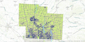
This chapter really made me think about how much more there is to GIS than just putting points on a map. One of the main things I took away was that it’s not enough to just know where something is—you also need to know what’s inside an area and how it’s distributed. At first, this seems simple, but the chapter made it clear that summarizing data can be tricky depending on whether it’s discrete or continuous. For example, counting animal nests is different from summarizing rainfall across a region. That distinction really stood out because it made me realize that even small details about the type of data change the approach entirely. I also liked the part about percentages and densities. Mapping totals can be misleading if areas are different sizes, which reminded me of what we talked about in the last chapter. If you don’t standardize the data, the map can exaggerate or hide patterns. I didn’t think about it much before, but even a small change in how data is summarized can completely change the story a map tells. Another thing that stuck with me was how tables, charts, and maps work together. A table can give exact numbers, but a map shows patterns more visually. Deciding which one to use really depends on the question you’re asking, which goes back to the idea that GIS is as much about thinking as it is about tools. Overall, this chapter made me see GIS as a way to organize complexity. It’s not just about showing locations—it’s about understanding patterns and relationships.

Chapter 5

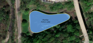
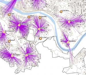
The reading for chapter 5 got me thinking about how “near” isn’t always as simple as it sounds. Distance can mean so many things—straight-line, travel distance, or even time—and choosing the wrong one can totally change your results. I never really thought about that before. The chapter explained that defining nearness is one of the first decisions you have to make in a GIS analysis, and that really stuck with me. I liked the discussion on buffers because it’s simple but powerful. Creating a zone around a river or road seems easy, but choices like how big the buffer should be or whether overlapping buffers merge can make a big difference. It reminded me again that GIS isn’t automatic—every step involves interpretation. Another part that stood out was straight-line distance versus network distance. Straight-line is faster, but it doesn’t always reflect reality. For example, animals or people usually can’t move in a perfect straight line, so network distance gives a better picture. This made me realize that picking the wrong method can give misleading answers, even if the calculations are correct. Overall, this chapter showed that proximity analysis is about understanding relationships, not just measuring space. It made me think about how this could apply to endangered species or habitat studies, where knowing what’s nearby can inform decisions about conservation. This chapter took the idea of distance further by showing that distance isn’t always about how far apart two points are—it’s also about cost. I thought this was really interesting because two places could be physically close but take a long time to get between because of terrain or obstacles. That idea made me think about animal movement, human travel, or even conservation planning. The concept of a cost surface really stood out. By assigning different “costs” to different areas, GIS can figure out the easiest path or total effort needed to get somewhere. I liked this because it’s like GIS is simulating the real world, not just showing it. It also made me realize that cell size matters—a smaller cell gives more detail but takes more computing power, so there’s always a trade-off. Another thing I noticed was how important it is to set limits on distance or cost. Without boundaries, the analysis could cover the whole area and give way too much information, which can get overwhelming. It reminded me again that GIS isn’t just about making maps—it’s about asking the right questions and making decisions that matter. Overall, this chapter made me see GIS as more than mapping. It’s a tool for modeling real-world problems and thinking about movement, accessibility, and patterns. It made me wonder how I could apply this to tracking wildlife or studying how roads affect habitats.
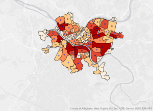
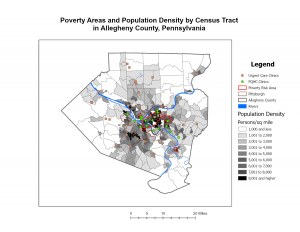
Chapter 6

The last section emphasized how mapping quantities adds another layer of meaning beyond simply showing locations. One of the most important points this chapter made was explaining the difference between mapping raw totals versus using ratios or densities. In the beginning, mapping totals may seem straightforward; though, the chapter explained how this can be misleading. This scenario is especially common when areas vary in size. Larger areas can appear more important simply because they contain more, not because they are more concentrated. Given this context, it made me realize just how easily patterns can be exaggerated or minimized depending on how data is presented. Moving along the reading, I found the discussion on classification particularly interesting. The fact that the same data can look completely different depending on how classes are created made me think about how much influence the mapper has over interpretation (once again). Choosing natural breaks, equal intervals, or quantiles is not just a technical decision. This decision is interpretive and made from that of a human individual. Once more, these decisions reinforce the idea that GIS analysis involves judgment, not just calculation. Another aspect that stood out to me was how outliers can distort a map if they are not handled carefully. One unusually high or low value can change how all other data appears, which again highlights the importance of understanding the data before mapping it. Reading through this chapter made me more aware that maps showing “the most and least” are powerful, yet also risky if created without careful thought. In other words, the users of GIS are responsible for creating maps with intention and meticulous work. It reinforced that GIS is not about producing visually appealing maps, but about presenting information in a way that is accurate and intentional. 


Gregory Week 2

Chapter 1 

This chapter introduced me to the simple breakdown of GIS. At first glance, the Geographic information system can seem quite puzzling and often can intimidate others because of the thought of it being solely high-tech. This is a common misconception when it comes to GIS analysis, it is actually less about the software and more about the way you think through a problem. Something that I related was the concept of framing a question and thinking through the process before touching any tools. I compared this to the common saying of “thinking before you speak”, something I try to do whenever I talk. I am someone who doesn’t talk unless needed to, which lets me choose my words carefully and observe the situation around me before I speak. There is also the other half of society who does not think before they speak. These people are similar to those who jump into GIS and map something that they aren’t entirely knowledgeable about, leading to results that mean little to nothing. As I previously mentioned before in my Week 1 post, GIS appears to have a lot of ‘invisible power’ because it is simply everywhere and is constantly influencing our decisions. Through this chapter, I noticed that this power is apparent in the users of GIS, especially when results are shared publicly. Geographic information system analysis can be used in courtrooms and even for policy decisions. This made me realize that the smallest of choices (data sources and parameters) can create serious consequences. With the mention of the realness of GIS analysis, it comes to show how much responsibility and leverage the users of it have. The excerpt not only introduced GIS analysis but also explained that good analysis is dependent on judgment and intentionality rather than technical skill alone. 

Chapter 2

This chapter focused on the importance of mapping where things are before attempting to analyze why they are there. When picking out a book, you look at the cover and almost create a story in your head as to what the story is about. You don’t actually know what the story is about until you read it. Similar to mapping, you can’t know why things are where they are until you put it on a map first and analyze the map. At first, this idea seemed almost too simple and was something I thought to be common sense. However, further into the reading I realized how often people overlook this step. Mapping locations alone can already reveal patterns such as clustering, spacing, or absence, which can raise questions that might not be obvious through data tables alone. This reminded me of how observing a situation quietly can sometimes tell you more than immediately asking questions. It is all in the name – GIS analysis: analyze the situation you are going to use GIS for! One idea that stood out to me was how scale can completely change what a map appears to show. Patterns that look significant when viewed from far away can disappear when zoomed in, and vice versa. This made me think about how easy it is to misinterpret information when only one perspective is shown. It also made me more aware of how maps can unintentionally mislead if the scale is not carefully considered or explained. The chapter also made it clear that mapping is not as objective as it may appear. Choices such as what data to include and how much detail to show influence how the map is understood and perceived. The idea that maps simply present facts is challenged in saying this because it simply isn’t just facts. Instead, they tell a story, and the mapper has control over how that story is told. Overall, this chapter reinforced the idea that even basic maps require thought and intention, and that understanding “where” something is located is often the first step toward understanding much larger patterns.

Chapter 3 

The last reading emphasized how mapping quantities adds another layer of meaning beyond simply showing locations. One of the most important key concepts this chapter made was discussing the difference between mapping raw totals in comparison to using ratios or densities. In the beginning, mapping totals may seem straightforward; though, the chapter explained how this can be misleading. This scenario is especially common when areas vary in size. Larger areas can appear more important simply because they contain more, not because they are more concentrated. Given this context, it made me realize just how easily patterns can be exaggerated or minimized depending on how data is presented. Moving along the reading, I found the discussion on classification particularly interesting. The fact that the same data can look completely different depending on how classes are created made me think about how much influence the mapper has over interpretation (once again). Choosing natural breaks, equal intervals, or quantiles is not just a technical decision. This decision is interpretive and made from that of a human individual. Once more, these decisions reinforce the idea that GIS analysis involves judgment, not just calculation. Another aspect that stood out to me was how outliers can distort a map if they are not handled carefully. One unusually high or low value can change how all other data appears, which again highlights the importance of understanding the data before mapping it. Reading through this chapter made me more aware that maps showing “the most and least” are powerful, yet also risky if created without careful thought. In other words, the users of GIS are responsible for creating maps with intention and meticulous work. It reinforced that GIS is not about producing visually appealing maps, but about presenting information in a way that is accurate and intentional.  

Gregory Week 1


Hello everyone! I am Alyssa Gregory and I come from northeast Ohio, around the Youngstown area. This is my first year here at OWU, though I am actually a sophomore. My major is a B.S in Zoology and a minor in Environmental Science. A little more about me is I love everything outdoors – going on hikes, drives, and experiencing any weather that comes my way. I am hoping to become a wildlife biologist later in the future, so this course will be of great use to me. 

This chapter introduced me to the complexities of GIS. Having no prior knowledge of GIS, this was very shocking – especially considering the fact that GIS is interconnected with almost everything around us in many different ways. The chapter explained how GIS is constantly influencing our decisions about food production, city infrastructure, environmental management, etc.. Since these decisions on GIS are often not made publicly aware, there are some concerns that should be brought up in regards to the political aspect. How much power is actually behind spatial data and who controls this ‘invisible’ power. Is this possible scenario of a corrupt system something us people should look more into? I think this is something I will most definitely research later on in the course once I gain more knowledge about GIS itself. Moving to the explanation of classifications and boundaries with GIS, I found this quite fascinating. I was trying to wrap my head around the idea of natural features and social features having almost no clear edge – which creates a difficulty in translating the real world into technology. The excerpt described how mountains, habitats, and communities do not end at precise lines. GIS forces these variables into rigid categories for the following reasons: funding influences, conservation priorities, land management, and habitat loss. The results of GIS clearly show how they are shaped by not only technology, but also human choices. I am excited to learn more about this perspective of the world. I am someone who cares to see all sides of a story, so taking this class will help me grow that attribute of myself. Since I am going to major in Zoology, having knowledge of GIS and all of its properties will be beneficial because populations and ecosystems are constantly fluctuating. In addition to aiding me in an introduction as to what GIS is, it also provided me with a sense of curiosity and eagerness.

Application 1: Critical Habitat | NOAA Fisheries

For my first application I decided to research something I am passionate about – endangered animals. I was surprised to find that the main ways GIS is used within the field of endangered animals is GPS tracking and habitat mapping. With concern to habitat mapping, there is a further step when species are listed under the ESA (Endangered Species Act), which is Critical Habitat Designation. A Critical Habitat Designation is a specific area within the geographical area occupied by a species listed under ESA that may require special management considerations or protection. GIS maps out this area and creates Critical Habitat spatial data. I decided to use a map of the Atlantic Sturgeon Critical Habitat, as some of them have been listed under the ESA since 2012. 

Application 2: A GIS-based framework for routing decisions to reduce livestock disease 

As a zoology major I wanted to keep seeing the different GIS applications that are used for animals. An interesting idea that I came upon is still in the works it seems; however, everything is set up, it just needs to be implicated and used. GIS creates maps that contain cattle population densities and route characteristics (exposure to disease, distance, and fastest/shortest) for the reason of transporting livestock, cattle specifically. 

Lastly, I completed the GEOG 291 Quiz!