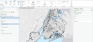
Dondero Week 4

Chapter 1:

-After installing the software and downloading the tutorial files, I imported the first file and began completing the lessons.

-I learned how to go to a bookmark as well as turn on and off layers by selecting them in the contents page. 

-Switching basemaps allows you to overlay the data onto a variety of map backgrounds which can be useful for focusing on specific features.

-By Changing the layer order in the content pane, you can change which layers appear on top of which others

-You can create, save and export specific layouts for your maps in a variety of formats and settings.

-You can see all the attributes for a data type by using the attributes table, and sort the table by ascending or descending values.

-You can select data using the attributes table and generate summaries using different statistical tools.

-I learned how to change and add symbols signifying the location of various data points, as well as how to label data points.

-I also learned how to view and navigate the 3D map projection, and how to switch between map types using the catalog pane.


Chapter 2:

-I learned how to set the color and fill for various features, as well as how to set them based on specific attributes, such as zoning attribute

-By labeling specific features, you can add additional information, in conjunction with using fill colors and borders

-You can also remove these labels for certain features only, or remove those of them that are redundant. 

-By performing a search query, you can narrow down the range of a certain data set based on attribute, and using boolean operators add or reduce the selection using other attributes to select only the desired data.

-I learned how to make choropleth maps to summarize numerical data and display the results as easier to understand heatmaps, as well as how to extrude them using the 3D view.

-Using graduated data points can help show the proportional differences in quantities or sizes between different features of the same type on a map.

-Choropleth maps can also be normalized by using percentages, which can more accurately display certain types of data, and by using dot density maps, multiple attributes can be displayed on one map at the same time, using different color dots for each attribute.

-Finally, visibility ranges can be useful for hiding certain features at different zoom amounts, and altering the detail level based on how much of the map is in view.

Chapter 3:

  • I learned how to create custom layouts that can be exported to be used in other softwares, or shown to non GIS users.
  • Many arrangements, sizes and styles exist for the layouts, and multiple maps, along with legends and other text can be combined in a single layout.
  • Various types of charts can be created as well, to illustrate trends in the data in ways that a map could not.
  • Maps can also be shared online to be viewed on a different device or by others.
  • I learned about making interactive maps using the storymaps feature, and how you can create dashboards, which allows you to interact with the data in a predetermined way, and build toolkits for specific use cases. (Such as the city debris collection one from the tutorial.)

Dondero – Week 3

Chapter 4:

This chapter deals with mapping density, which allows you to see the concentration of certain features, rather than individual data points for each feature, which can make observing trends in distribution easier. Generally, density is displayed using a gradient of colors, with different shades representing different concentrations of the feature in question. Alternatively, dot density mapping can be used, where each dot represents a certain quantity of a feature in a general area, rather than the location of any one specific feature. Since density is calculated by taking the total number of a feature in some area, and dividing it by the area of the region it is found, it can be useful in showing things like population densities across counties, even if the size of the counties vary. Another factor in making density maps is cell size and search radius. As cell size and search radius increase, patterns become more generalized, making trends easier to pick out, but if the radius becomes too large, the pattern may become too general and no longer accurately represent the data. When calculating the cell values for the density map, there is also the option to use a weighted average, rather than a simple averaging of all the points within the search radius of the cell, and by using a weighted average, an easier to interpret, albeit more general map is produced. Rather than using a gradient of colors to represent the different density values, contour lines can be used to represent regions of equal density, with areas having more rapidly changing density having a higher concentration of lines close together. Often, using two methods in conjunction, such as a dot map overlaid on top of a gradient map will most accurately represent the data, allowing you to visualize both general trends in the data, as well as specific data points that would be lost if only a gradient map was used.


Chapter 5:

Mapping what’s inside an area is a useful tool for making determinations about actions that should be taken and to find trends or make comparisons between areas. Finding what is inside an area usually begins with determining whether the data you are looking at is inside a single area, or within several disconnected areas, along with whether the features are discrete, like store locations, or continuous, like soil type or rainfall amounts. Depending on the research you are conducting, you can also make decisions about whether to include features that are partially within your area, or within a certain distance of the feature you are focusing on. Multiple methods exist for finding what’s inside an area, those being drawing the area and the features, selecting the features that are within the area, and finally by overlaying the area and its features on top of each other, then calculating the stats for the areas where they overlap. When overlaying discrete features like house locations with your area, you are able to create summaries regarding quantities, densities and any other data you have available for these points. Meanwhile, if you are working with already summarized data, or continuous data like rainfall amounts, you must make sure that your summarized data falls completely within the area you are researching, since you cannot subdivide already summarized data further. Additionally, when overlaying areas on top of each other, sometimes slivers may occur, where small areas of overlap are formed due to boundary mismatches. In order to determine which areas are, or are not slivers, there are multiple methods that can be used, including comparing the potential sliver size to the smallest area input, since areas smaller than that value may not be accurate, or by comparing the sliver dimensions to the accuracy of your collected data, and removing areas smaller than this threshold.


Chapter 6:

GIS can be used to find out what is within a distance, travel range along roads, or travel range in terms of time, of a feature or region. Defining distance by straight line distance is often used when determining area of influence, such as all properties within 1 mile of a power station, while using a cost, such as travel time or distance, can be more useful when finding precisely how many of something are within some distance along roads, such as all bus stations within 3 minutes of walking from a store. By creating a buffer around objects, you can find which features are within a distance of the object, and by selecting multiple objects, you can find which features are near a set of objects, like which houses are within a quarter mile of a fire hydrant. Similarly, by computing statistics for multiple distance ranges around a single or set of objects, you can find differences in the ranges of features effected at each distance, such as houses within 3 vs 5 vs 10 minutes of a fire station. Another way to visualize distance data is by using a distance surface, which superimposes a gradient onto the map to help show how distance or cost changes as you get farther away from your object. By selecting multiple objects, you can even highlight the regions that fall within or outside a distance range for both objects, like houses in a city within 4 minutes of two or more fire stations. Measuring distance by cost, be that travel time or distance, allows you to set specified time and distances costs for each road segment, turn, and other factors along the path, allowing you to accurately estimate boundaries based on travel factors. Cost distances can also be calculated for surfaces or continuous features like terrain, allowing assessment to be made, for example, for the maximum distance a road could be built through a hilly region, or all forested areas within some cost distance of a house in the wilderness.

Dondero – Week 2

Chapter 1: 

Chapter 1 begins with a brief introduction which describes how the GIS industry has grown and evolved since the original edition of the book was published in 1999. Additionally, there is a short section on the structure of the book and what one can hope to learn by reading it. The author then describes what GIS analysis is and how each analysis begins with a question that you are hoping to answer, and is influenced by factors like how your research will be used and who will use it. These questions, along with the format and form of your data, the methods by which you process it, and how precisely you are attempting to answer your questions all have additional effects on your analysis methods, and ultimately how your results are created. After this, the next section deals with the various geographical features and how they can be displayed. There is then a comparison of discrete vs continuous features and a description of what data summarization is, with examples on where it can be applied, such as number of features or average altitude for some region. Following this, the author compares 2 ways of representing features on the map, that being raster graphics, which displays features as sets of cells in a grid, and vector graphics that defines objects by sets of points making up its border. Finally, the chapter concludes with a description of various attributes that features can have, including rank, which can be used to categorize objects from highest to lowest value, and ratios between attributes, like population and land area that objects also have, followed by a brief section about summarizing and working with data tables.

Key Concepts:

Discrete Features: Features that either are or are not present at any given location, such as property lines, roads or county lines. 

Continuous Phenomena: Factors that are found across an entire region and can exist at any value in some range, such as amount of rain, altitude, or soil type.

Raster Graphics: Displays objects as cells in a grid which displays features as sets of cells in a grid

Vector Graphics: Features are formed by sets of points in specific points on the map.


Chapter 2:

Chapter 2 begins with a section outlining the purposes of mapping, and how to choose what features you would like to map. By mapping the locations of events or features, the text explains, you can find trends in where they occur. For each feature on the map, it must have a location and any additional information associated with it, such as speed limit if the feature was a road, or median housing price if the feature was a certain region of zip codes. Within each category a feature may fit in, like houses in a city, additional subcategories can be added, such as single vs multiresidence housing. Categories can also be grouped to simplify the map and make overarching patterns easier to understand. However, grouping categories must be done with care, as depending on the groupings chosen, trends may vary greatly.  Symbols also play an important role in the representation of objects with a specific location, like the locations of houses, or traffic lights. Shading can be used to represent features like zoning districts, while lines can represent features such as rivers or roads, with attributes such as color and width being used to further show differences between features. By analyzing the patterns formed by the features we map, we can find patterns that ultimately allow us to draw conclusions about the data we represent. For example, by mapping soil types and rainfall patterns, we could make determinations about which land in an area would be most suitable for farming, or by mapping house fires in a town, we could determine which areas would most benefit from the construction of a new fire station.

Key Concepts:

Category: A specific value representing a characteristic that some data object has, usually out of a set of possible values.

Grouping categories: The practice of grouping a set of objects with similar characteristics to make visualization easier

Symbol: A marker used to denote the location of individual objects of some specific feature, often with different symbols used to represent different feature types


Chapter 3:

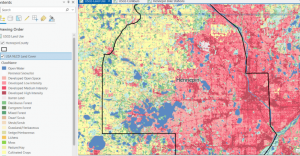
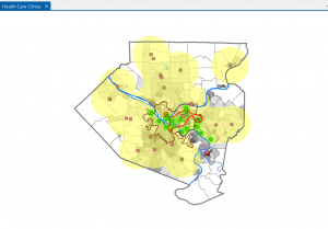
Mapping the most and least gives us information about where features are and are not found, allowing us to understand the relationships between location and feature distribution. Shading, varying feature size and color can all be used to show how quantities of features vary across maps, with some methods, like shading being more applicable to areas, while others like size are better applied to individual objects like markers. While it is important to keep in mind the distinction between exploring the data and presenting a map to display a specific pattern, you often begin with exploring the data, followed by mapping to show the patterns you find. Ratios can also be a useful feature for summarizing data, since they can often display patterns better than raw numbers allow for. For example, the ratio between housing and businesses for a city can give a more accurate representation of land use than simple counts would. Ranking is also a process used for displaying relationships between features, in which a set of objects is listed from highest to lowest, such as ranking regions from greatest to least rainfall, or ranking streets from highest to lowest traffic flows. Classes can also be used to generalize data, and are usually formed by grouping features by the value of some attribute, like household income or soil type. Classes can be manually determined to best fit the data, or in some cases by using standard classification schemes, the 3 most common being standard deviation, equal intervals, quantile, and natural breaks, each of which has its specific advantages and disadvantages. In the process of making a map, the goal is to display the patterns as accurately and clearly as is possible, which can be done by focusing on the patterns you are trying to convey information about and by choosing a map styling that fits the data you are displaying. There exists a variety of map stylings, each applicable to a different scenario. Graduated symbols easily show the rank or relative size of features, while graduated colors can be applied to maps showing data by area, like population by township, or forested land in each census tract. Charts can be used to show ratios between a set of features in each area on the map, but can become cluttered if too many are used too close together, or if too many categories are used. Contour lines show the rate of change for continuous features, like showing changes in elevation for a mountain range, or clay content in soil for a county. A 3D view can be used to show continuous phenomena, with height usually representing the magnitude of the value at that point. Ultimately, if the map is made correctly, it should be able to convey the data it is trying to display in a clear and understandable way, allowing its audience to understand and gain insight into the trends that are present.


Key Concepts:

Ratios: Using averages, proportions and densities to better understand and display patterns, showing the relationship between two different quantities

Ranks: Putting features in order from greatest to least, showing quality relationships rather than quantitative values.

Classes: Groupings of features based on values in order to make generalizations to data.

Dondero – Week 1

Hi, I’m Aestelle Dondero and I am a junior. I am an Astrophysics and Computer Science double major. I am really excited to learn more about GIS because I have a interest in the outdoors and history, and from what I have heard, GIS can be a really powerful tool in relation to both those subjects.

I started off with doing the quiz, and after completing that, began to read the assigned chapter. The chapter begins by discussing the recent growth in use of GIS, both inside and outside academia. From there, the author explores how GIS is a much more complex and fuzzily defined field than it may appear from an outside perspective, and gives examples of how different disciplines may use GIS differently. Following this, the author explains the origins of GIS, beginning with Ian McHarg’s use of layers of tracing paper and a light table to find the optimal path for a new highway. Despite the widespread usage of GIS and Spatial Analysis today, there was significant resistance to the use of technology for these purposes when compared to traditional cartography, especially in the early years, due to the limitations imposed by computers of the time. As the technology continued to develop, two subfields of GIS emerged, those being GIScience and GISystems. The author explains how GISystems is focused on the applications of GIS software to solve real world problems, while GIScience takes a more technical approach that is concerned with the underlying methods and models that allow that problem solving to take place. In reading this chapter, I thought that this analysis of the overlap and differences between GIScience and GISystems was really interesting, especially since I don’t think I had ever really considered that the GIScience side of the discipline would be a semi separate entity from the GISystems side. Finally, the chapter ends with a discussion of the many uses of GIS technologies, and how it effects many facets of our lives, including tax and governmental systems, along with farming and ecommerce. Ecommerce really surprised me as a GIS use case, although after reading the description of how it is used, it makes a lot of sense.

One of the ways that I have interacted with GIS before taking this class has been in researching the local history of my hometown. Where I’m from is fairly rural, with a lot of pre 1900 farms scattered across the county. The research paper I found discusses the subject of farmland abandonment, which is a common sight throughout most of Ohio.  There analysis includes a comparison of different factors in correlation to farmland abandonment, which I think could be an incredibly useful tool for understanding long term land use.

A map from the paper showing the area focused on in their research.

Another use case for GIS that I found was in a spatial analysis of round barn distribution throughout the United States. Old, timber framed barns are a really interesting subject to me, and since the round barn is such a unique and generally uncommon form of barn, this seems like a great utilization of GIS for better understanding trends regarding why and when they were built. Unfortunately, the article was behind a paywall, so I was unable to access it, but the abstract certainly was interesting!


B. Zaragozí, A. Rabasa, J.J. Rodríguez-Sala, J.T. Navarro, A. Belda, A. Ramón, Modelling farmland abandonment: A study combining GIS and data mining techniques,
Agriculture, Ecosystems & Environment, Volume 155, 2012, Pages 124-132, ISSN 0167-8809, https://doi.org/10.1016/j.agee.2012.03.019.
(https://www.sciencedirect.com/science/article/pii/S0167880912001375)

Cornelis J. van der Veen “Spatial and Temporal Distribution of Locations of Round Barns in the United States,” Transactions of the Kansas Academy of Science 128(1-2), 13-38, (26 May 2025). https://bioone.org/journals/transactions-of-the-kansas-academy-of-science/volume-128/issue-1-2/062.128.0102/Spatial-and-Temporal-Distribution-of-Locations-of-Round-Barns-in/10.1660/062.128.0102.short