Abby Charlton – Week 5 and Delaware Data Inventory

Here is Chapters 6-10 and the Delaware Data Inventory. The second PDF is a series of maps from the chapters (I do not remember which ones they belong to), and the last maps are from the Delaware Data inventory. Tried to put them into a pdf but the files were all more than 20 mg–click on them or they will be blurry…

Chapter 6-10 and Delaware Data Chapter 6-10 and Delaware Data

Abby Charlton – Week 4 (Second try Posting…Wifi hates me)

  1. Chapter 1
    1. This chapter is all about introducing the beginning aspects of ArcGIS, including reintroducing the vocabulary, concepts, and theories that were introduced in the Mitchell readings. 
    2. Vector data is made from point, line, and polygon data
    3. Features are the aspects of data that you want to highlight, and then the features that you want to group together will be put into a map layer
    4. Features have locational data and attributes, which are the data behind the locations. An example of a feature and its attributes is mapping where trees are in an arboretum, and then including height, species, and bark depth with each tree. 
    5. Vector data works best with boundaries, such as city mapping, buildings, etc. Raster data works the best with things that do not have boundaries, such as natural phenomena. These natural phenomena include wind speeds, elevation, temperature, and precipitation. 
    6. Raster data is the created through a series of cells 
    7. In this chapter, we learned how to open data and familiarize ourselves with map viewer on ArcOnline. We learned skills such as changing symbology, managing clusters, and messing. 
    8. DCPublicSchoolMap
  2. Chapter 2 
    1. This chapter teaches the basic technical elements of ArcPro–the desktop version of ArcGIS. These basic technical elements include introducing us to the top ribbon tools and the sections that make it up (map, analysis, view, insert, etc), as well as how to connect a folder to the project and changing the basemap and labels of a map. 
    2. The third exercise kind of branched off of the basics and starting working with more data in order to create a 3D scene. We also learn here how to mess with the set-up of the screen and where to move content panels, catalog planes, and the map plane, which was useful when setting up the dual screen between the 3D city map and the 2D one. 
    3. For some reason, a few of my files didn’t appear when I first connected the folder, so I had to reconnect. I am not sure why, but this problem continued to happen in the following chapters. 
    4. Map1_3D
  3. Chapter 3
    1. This chapter was showing us how to make different maps and how to create and use layers. 
    2. In the beginning, the downloaded data from ESRI did not have the .aprx file, so I had to manually add each file by using the Add Data function in the Map panel. This took more time than planned due to the error (I do not know why the .aprx file was missing), but I was able to configure it so that I could use it for the geodatabase skills. 
    3. Next, we learned how to make choropleth maps that represent obesity in the state of Illinois. In particular, we continued practicing with attribute tables and started with the “join” function. 
    4. Question: in what circumstances would I need to package the map for sharing?
    5. Illinois2
  4. Chapter 4
    1. In this chapter, we continued with geodatabases, except this time, we learned how to actually make one. Again, the .abrx was missing, so I had to manually include the data once more.
    2.  We also learned how to establish an attribute domain, which limits which attributes are shown in the table. This is an interesting tool because it simplifies the data to what features I actually wanted to focus on. 
    3. We also created line features, which I found to be quite difficult at first. I think this difficulty came most from the little steps that are necessary, and I am mostly new to the software, so it was difficult to locate where each task or icon was. 
    4. Creating and editing the polygons is another skill practiced a lot in this chapter. A note for me in this case is to zoom in (this is common sense really) because I accidentally connected the wrong vertices, and then later on my sketches were a bit off. I believe these will also get better with practice, as these are my first attempts at doing either of those tasks. 
    5. What is the significance behind the titles/names of functions? Map2
  5. Chapter 5
    1. In this chapter we learned about different types of commands within ArcPro, and while I was hesitant in the beginning about the difficulty, I was surprised to find it was much easier (not easy though) than I expected. 
    2. Tasks are interesting–With their semi automated nature, they decrease user error, which I think is useful. There are lots of little mistakes that can be made when running this type of software, and when repeating tasks yourself, it can be easy to make one of these mistakes. However, you should carefully look over each segment in building queries within the task because they rely on specific characters or details to actually run. 
    3. *I forgot to export my map from this chapter, but I will add it soon*

Abby Charlton – Week Three

  1. Chapter five 
    1. This chapter focuses on locating different aspects and patterns within the features of your map and how to analyze them. One important aspect to search through is your data, and there, you should start with the areas that you are mapping. If it’s a single area, you can figure out what information or patterns are specific to that area, but if you have multiple areas, you can compare them for your information. Additionally, you should recognize what types of data you have (continuous? discrete?) and if you need a count or a summary of an area. These can help you focus on certain types of information that are specific to your guiding question. Also within the area, you could analyze how features of your map interact with areas–do certain features only take place in certain areas, do they cross into multiple areas, etc. 
    2. There are three ways of finding information from inside your map. First, drawing your areas and features can provide you with very direct, visual ways of displaying and locating patterns. This type is also good for seeing patterns in or outside of a single area. Next, you can select certain features inside an area in order to find information. This is much better for finding lists or summaries of information. Finally, overlaying the areas and features with different layers requires more processing, but it can be very useful for determining which features are in several of your areas or how prevalent some feature is. 
    3. Frequency – the number of features with a given value or within a range of value, inside the area, and displayed at a table. 
    4. The most common summary of numeric attributes:
      1. Sum. – the overall total number of something (like the total number of workers at businesses within a neighborhood)
      2. Average/mean – the total of a numeric attribute divided by the number of features
      3. Media – the middle value in the of a range of values
      4. Standard deviation – the average amount of values away from the mean. This gives insight into how tight or loose the values are grouped. 
  2. Chapter Six
    1. This chapter is all about maps that focus on places that are located close to the map’s subject, audience, or creator. It covers how to define what you need and how to actually find it before discussing how to add realities to what you are mapping, such as cost or time. 
    2. You are able to map categorical data such as cost or time, but most of the time, you’ll likely just need distance. It all depends on the information that you end up needing. 
    3. There are three ways of finding what you need–straight line distance, distance over a network, and cost over a surface. Straight line distance is the calculation of area within a features of your choosing, and it’s great for the creation of boundaries. Distance or cost over a network connects a source location to an aspect of the network within a chosen distance or cost. This is best for finding a location that matches distance or cost parameters (like, cannot travel for more than 20 minutes). Finally, cost over surface is where you take both aspects and specify the location as well as the travel cost. 
    4. If you want to find actual locations from your chosen feature’s source, you need GIS to calculate the actual distance between each location and the closest source. 
    5. When working with distance, it’s often recommended that you set a maximum distance, as without it, you can end up with extraneous data that does not realistically apply to your reason for mapping.  
    6. When measuring distance over a network, you should set travel parameters. This could include specifying cost for particular segments, turns, or junctions. 
    7.  When finally getting information in your mapping that supports your question, you can further identify the area within a specific distance or summarize your data that is within the chosen distance parameter. 
  3. Chapter Seven
    1. This chapter is all about celebrating the fluidity of society by mapping how certain phenomena change and grow over time, and using these changes to design a better future. 
    2. Change is important–it shows the trends of a time period, or what society deems to be relevant at the time. Change can come in several different forms, such as changes in location, in magnitude, or in character. 
    3. Your chosen features for your map is the best way to determine which area of change you should focus on. Yet, these features can also be categorized: features that move include discrete features and events, and features that change in character or magnitude include discrete features, data summarized by area, continuous categories, and continuous values. 
    4. When measuring change, you should also focus on the time period that you are using. What type of pattern are you using? Before and afters, trends over time (multiple events) or cyclical patterns are all good choices. Intervals are also important, as these can skew your data and/or presentation of data towards a different conclusion. 
    5. Another aspect to focus on is how much change actually occurs. Percent change is a common way to display how much occurred. How fast it changed is also good information to know. 
    6. There are three ways of mapping change: creating a time series, creating a tracking map, or measuring change. A time series is equivalent to mapping where the most or least are, but this time you are replacing it with certain dates. You will need to consider how many maps you’ll create. Tracking maps shows a certain feature at various points in time, and they are pretty useful for tracking discrete features. When measuring and mapping change, which is when you calculate the difference in value of a feature between two dates, you can calculate the change for discrete features, data summarized by area, continuous categories or continuous numeric values. 


Abby Charlton – Week Two

Apologies in advance for the formatting of this blog post. Questions, definitions, etc are all written into the same sections. 

  1. Chapter 1
    1. This chapter gives the very basics on making maps with ArcGIS and includes a step-by-step process on how to plan your map. First, it is mentioned that when getting your data,  you should create a specific question to guide your project. The more vague of a question, the more possible ways you could go about your research; therefore. The more specific your guiding question is, the more efficient your research will be. After that you need to understand your data, so you should identify features, attributes, and categories, and then, if needed, calculate different data based on what you already have. Then, based on your first question and guiding questions of what your map will be used for and who will see it, you will choose a method of map that works the best. Finally, you should process the actual data in GIS and analyze the results. 
    2. There are also many definitions that are important as well. Here are what I deemed the most confusing/most important. 
    3. Discrete vs. Continuous data: Discrete are data points of location that do not change. This point is an x,y coordinate, and it either exists or it doesn’t. However, continuous phenomena are measured anywhere and everywhere in an area, and they have no gaps. If there are gaps in the data, they use interpolation–the act of assigning values to these blank spaces in order to keep the map continuous. 
    4. Raster vs vector data: Raster data uses cells to represent locations, while Vector data uses points and lines to represent locations. 
      1. Question though: When is it the best time to use raster data vs vector data? What situations require each one? 
    5. Counts vs amounts: counts are the actual number of features on a map, while amounts are any measure of quantity associated with said features. One example would be how many trees there are in one section of a mapped national park. 
  2. Chapter 2
    1. Chapter two is similar to chapter one in which it goes over the basics, except in this case, it goes deeper into each section about making the map. For generating questions, it describes how you should generate your questions based on what information you’re going to need from the final analysis and how you will be using the map. One example of the “how” would be determining if categories would be a good idea for the final project, or if they would just convolute the point. When preparing the data, you should start with assigning coordinates to places (either latitude/longitude or street address)  and giving them categories based on their features.  If available, it’s good to have a category attribute with a value for these.
    2. The next section is all about actually making the maps on ArcGIS. The first step here is to determine what features you want to display and what symbols you want to represent them. When mapping by category, you may have these different categories in a different map layer or subset, but the subset should mostly be used when mapping individual locations. You should make sure to check what you are making a subset out of because it may lead to confusion and incomplete data. An example of this confusion would be mapping certain roads, which then makes it look like infrastructure doesn’t connect. With categories, using multiple can reveal patterns about the data that may have been hidden before–just make sure to have individual maps for each category so that you have the ability to see simple data too. Yet, even with individual categories, you should avoid having more than seven, otherwise it gets confusing. If you end up needing more than seven, grouping the categories may be an option, but note that you may lose good information by doing this. 
    3. Put good thought into the shapes/color that you use to symbolize your data, as they may have underlying meanings, or they may be hard to distinguish from others. 
  3. Chapter 3
    1. This chapter focuses primarily on mapping “the most” and “the least” information, ranking information with quantities. Mapping by these qualities introduces an additional level of information other than just the straight locations of each phenomena. In some maps, this information may be more valuable than other mapping goals. For example, if a city wanted to put in a daycare center and wanted to be the most centralized location for all workers, it would be best to map the places of business and by how many people work at each location. Additionally, you can map quantities with most data, meaning that discrete, continuous, and data summarized by area can be mapped with their associated quantities. However, they are mapped mostly in different ways. Discrete data is typically represented by graduated symbols or shaded areas; continuous phenomena  are represented with graduated colors or contours or maybe a 3-d view; finally, data summarized by area is usually displayed by shading each area based on its value. These representations may change with the objective of the map. Again, what is the purpose of the map–when creating a map for presentation, you’ll want to choose representations that make patterns easier to see, which might force you to sacrifice other parts of your data that you would keep if only using the map for pattern recognition. 
    2. Quantities can be counts, amounts, ratios, or ranks, and knowing which one your data is will help you decide which map you should be using. Counts and amounts can be used with both discrete and continuous data, but ratios are best for summarizing by data, as counts and amounts could potentially skew the data towards another conclusion. Typical ratio data are averages, proportions, and densities. Finally, ranks put features in order from highest to lowest.
    3. After determining your quantities, you’ll likely transfer into building classes. Classes are ranges of data that encapsulate several data entries, and they are typically used with counts, amounts, and ratios. You should make classes with group features that have similar values, and how you define each class (how you choose the range) depends on your data set.
      1. How do we choose which class type to do? I understand that if there is a wide range we should just make our own scheme, but when do I choose to use natural breaks vs quantile or equal intervals?
      2.  
  4. Chapter four
    1. This chapter is all about map density, which is another useful subset of mapping. Although unlike other kinds, density maps are more useful with pattern recognition than mapping locations, as its way easier to see concentrations of data. You can map both the density of features or the density of feature values. Then, you can map these densities with graphs, dot maps, or simply the values of each area, and these are typically done with raster data. Dot maps are best for individual locations. 
    2. Since density maps are made with raster data, you will need to determine cell size. The bigger the cell size, the rougher the map will look, and the smaller the size the smoother the map will look. Yet, the smaller the cell size, the more storage you’ll need to store it, so there are advantages and disadvantages for each kind of cell. Next, when planning the search radius (the area which surrounds a point), you’ll need to decide if it’s a large or small radius that you need. Larger radii have more generalized patterns and consider more features, while smaller radii will show more variation and intricate patterns. 
    3. Getting the values in the cells can come from multiple ways. 
      1. Simple Calculation – only counting those features found within the search radius of each cell
      2. Weighted calculation – uses mathematical function to give more importance to features closer to the center of the cell. This type of calculation often results in smoother maps with patterns that are generally much easier to distinguish. 
    4. When displaying density, you should use either graduated colors or contours. With graduated colors, you should classify the data and then assign colors to each class. This should let you sense a pattern. With contours, GIS will automatically create the map from the surface without many other steps. 


Abby Charlton – Week One

I’m Abby. I am a sophomore, and I am majoring in geography and environmental studies. I hail from Granville, Ohio, which is about an hour straight east of Delaware, but on campus I live in the treehouse! For some fun facts, I love animals, and I will talk about my pets endlessly if given the opportunity, and I love to bake, so if you need bread recipes, you can come find me. I also help run Ohio Wesleyan’s chapter of the Food Recovery Network, so if you want to join, let me know 🙂

The Schuurman article was interesting. I had no idea that the basics of GIS were such a hot debate. I knew from prior classes the application of GIS software has its controversies, but I didn’t realize that professionals still debate whether or not it is simply a way to visualize data or if it’s actually more than this. Furthermore, I also didn’t know that GISystems and GIScience were separate areas. While my knowledge of GIS is limited, I assumed that when geographers used GIS software, they were analyzing the data as well. It’s interesting that systems only focuses on the technical aspects of mapping.

The article is also interesting because it shows just how prevalent GIS is in every field now. Schuurman mentioned disease tracking and predicting, traffic problems, farming techniques, and public resources, all of which are remarkably different fields.

In my own research, I focused on the impact that GIS could have on natural disaster response. With the population increasing, an increasing urban density, and an increase in climate-changed caused storms, it is more important than ever to have precautionary efforts to mitigate these disasters. One such plan is run by civil engineers in Chittagong, Bangladesh, in which they mapped out locations of hospitals and other shelters in the city and implemented them into a map in order to help citizens find the nearest help/safety during earthquakes and floods.

http://103.99.128.19:8080/xmlui/bitstream/handle/123456789/252/A%20GIS-BASED%20ANALYSIS%20ON%20%e2%80%9cEMERGENCY%20DISASTER%20RESPONSE%e2%80%9d.pdf?sequence=1&isAllowed=y

Another article I found is about tornado risk in Mexico. It was stated that tornadoes are a relatively common phenomenon in Mexico, yet this danger was not studied or really reported. In the article, scientists gathered information on the locations of inclement weather and compared it to social aspects of the same areas, such as structural characteristics, healthcare of the area,  and age and mobility. Together, scientists used these comparisons to make a hazard index for the territories of Mexico. In this case, GIS was used to better understand the impact that tornadoes could have on different areas of Mexico.

figure 5

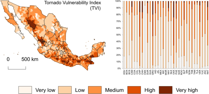
https://link.springer.com/article/10.1007/s11069-022-05438-0