Walz – Week 4

Preface:

The preface went over what this tutorial/book is about. It briefly talked about what the chapters are over and what applications you will be using GIS for. It went over the software and different websites of ArcGIS to expand upon your map. It talked about the different tutorial sets along with this content being a learning system of 25 years of experience.

Chapter 1:

Chapter 1 had us exploring a map and getting familiar with a lot of the tools and things you change on a map. It went over navigation of a map, symbology, working with the attribute tables along with labeling maps and using keys.

Chapter 2:

Chapter 2 took a look at map design and how to visually look at qualitative attributes. Things like dot density, symbolizing these values and changing their color, doing a definition query to look at a specific set of the attributes visually, and a choropleth map.

Chapter 3:

This chapter dealt with building map layouts, presenting your maps, and sharing them. Made a map key for the 3-1 tutorial map, fooled around a bit with the sizes and colors. I learned to share a map to ArcGIS online along with writing a summary and putting tags. When I tried sharing, it looked like the OWU wifi was too slow (?) and wouldn’t let me upload, because of this I couldn’t do the 3-3 tutorial but I read through the steps and got the gist of creating a story. I was able to upload 3-4 map and went into ArcGIS online dashboard.

Walz – Week 3

Chapter 4:

Concepts & Definitions

  • Mapping density: shows where the highest concentration of features is
  • Defined area: mapping density graphically, using a dot map, or calculating a density value for each area
  • Density surface: Created in GIS as a raster layer, each cell in layer has a density value
  • Cell size: how coarse or fine patterns will appear, smaller cell size = smoother surface but more cells which will require more processing and storage space; larger cell size faster but more coarser surface and subtle patterns may not be noticed
  • Search radius: larger search radius = more generalized patterns in the density surface
  • Contour lines: connect points of equal density value on the surface

Notes

  • Density maps are useful for looking at patterns more than locations of single features
  • Density map shows the measure of number of features using a uniform aerial unit to clearly see distribution
  • Mapping density useful for mapping areas like counties
  • Dot maps can be an easy way to read a map if they are distributed throughout a defined area
  • Density surface requires a lot of effort but gives the most detailed
  • Density by a defined area is usually a shaded map, using multiple color shades
  • Dot maps can give a quicker sense of density in a place
  • Dots can be any amount of value 1 vs 100 vs 1000 units
  • When creating a density surface, GIS will define a neighborhood around each cell center and then will automatically total the number of features that fall within it and assign that value to the cell
  • Cells are square
  • Converting density units to cell units: 1 sq. km = 1000m * 1000m = 1 million sq. m: 1 million sq. meters / 100 cells = 10,000 sq. meters per cell; sqrt 10,000 m = 100 m (one side of cell)
  • GIS lets you specify the areal units for density values calculated, like square meters for wildlife animals
  • Can display a density surface using graduated colors


Chapter 5:

Concepts & Definitions

  • Single Area: A defined singular area to monitor activity/summarize information in it
  • Multiple Areas: Like single area but looking at several of them to compare them
  • Continuous values: numeric values that vary across a surface; temp, elevation, etc..
  • Count: Total number of features inside an area; number of fast food in a county
  • Frequency: Number of features with a given value/range of values, inside an area and displayed as a table, bar chart, or pie chart
  • Sum: Overall total
  • Average/Mean: Total numeric attribute divided by number of features
  • Median: Value in middle of a range of values of an attribute
  • Standard Deviation: Average amount values away from the mean

Notes

  • Data should consider how many areas you have, and type of features inside them
  • Discrete features unique and identifiable (like locations or crimes)
  • Continuous features represent geographic phenomena
  • Can use GIS to find out whether a feature is within an area
  • Can create a boundary for linear features and discrete areas that may fall outside of a chosen area
  • Can create a map showing the boundary of an area and features, good for seeing a few features inside/outside a single area; would just need data
  • GIS can combine area and features to create a new layer with attributes to compare two layers
  • Can symbolize locations or linear features with a single symbol or by category/quantity
  • If mapping continuous data (soils or elevation), draw areas by category/quantity and then draw a boundary to highlight it
  • Geographic selection is a way to find out which features are within a certain distance of another feature
  • Overlaying areas and features can let you find which discrete features are within areas and summarize them
  • GIS splits category/class boundaries where they cross areas and creates a new dataset within the areas that result
  • Can use GIS to summarize the values and create a map/table of summary stats for each area


Chapter 6:

Concepts & Definitions

  • Geodesic Method: Measuring distance using curvature of the earth
  • Inclusive RIngs: Useful for finding how the total amount increases as the distance increases; like the total number of chicken diners within 1 mile versus 2 miles versus 10! Miles
  • Distinct Bands: Used to compare distance to other characteristics, kind of like a range; number of beef stew shops between 1 miles and 2 miles
  • Straight line distance: Can specify the source feature and distance and GIS will find the area/surrounding features within that distance
  • Spider Diagram: GIS draws a line between each location and nearest source; useful for comparing patterns between multiple sources
  • Graduated Symbols: Symbols used for comparing course features based on quantity; symbols = number of locations near a source feature

Notes

  • Using GIS can tell you what’s occurring in a set distance of a feature and traveling range
  • To find stuffy nearby, can measure using a straight line distance
  • To define ‘nearby’, can be based on a set distance specified or travel to from feature to another; can also include travel cost
  • Time would be an example of a cost, like going from a heavy traffic area to a store
  • Effort could also be a type of travel cost; effort for a fish to swim upstream
  • For measuring distance, have to consider if it’s a flat plane or use the curvature of the earth; small areas distances should be flat plane, larger should be done using the geodesic method
  • Can specify the source locations and distance along a linear feature
  • To create a buffer, specify source feature and then the buffer distance, GIS will draw a line and circle around the desired distance; can have different sizes of buffers around different features
  • Can create distance ranges, each cell can have that unique value and can then display that value using colors
  • Can create a boundary manually by drawing a line around selected segments or have GIS create the boundary; manually drawing boundaries give more flexibility but may take more time

Walz – Week 2

Chapter 1:

Concepts & Definitions

  • GIS Analysis: looking at spatial data to identify patterns and relationships
  • Geographic Features: Discrete feature = exact (roads); Continuous phenomena = measurable everywhere (temp); Summarized by area = counts or an aggregation (population per country)
  • Data Models: Vector = points, lines, x,y coords in tables; Raster = grid/cells, each has a value (continuous data)
  • Map projections & coord systems: projection = going from curved surface to flat map; coord system = defines measurement units and origin for locations
  • Geographic Attributes = descriptive info tied to features; Categories = groups features (crime type); Ranks = order features by value; Counts = number of features; Amounts = measurable quantity; Ratios = relationships between quantities
  • Continuous and Noncontinuous values: noncontinuous = fixed set values; continuous = any value in a range
  • For Data tables: Select by using queries to filter data; use =,<,>; calculating by adding new fields or computing values; summarizing by getting totals, averages, and frequencies

Notes

  • GIS can be used for data exploration and is not just cartography
  • Framing the right questions is highly important, along with the analysis
  • Data tables seem to be the backbone of GIS analysis
  • How specific you need to be depends on what data you are trying to collect
  • Reading this text, while illuminating, doesn’t fully give me an idea of how to map, sadly
  • Chapter lays the foundations: features, attributes, models, projections
  • Need good questions, data, and choices for a good GIS map
  • Fundamentals of GIS have remained the same despite technology advancing rapidly
  • Knowing your audience is important, casual versus scientific versus legal contexts
  • Two similar maps can answer completely different questions depending on the data used
  • GIS can be used for infrastructure planning

Questions

  • What does GIS actually look like?
  • How do you factor error into your data on GIS?
  • How many layers can you add to a map?
  • How friendly are the tools to a newcomer?


Chapter 2:

Concepts & Definitions

  • Category values = feature that has a code that identifies its type, like whether a crime is a homicide or theft
  • General code for attributes is the major type and detailed code is the sub type
  • Single type map = all features use same symbol (very basic)
  • Grouping categories = multiple categories grouped together to make patterns easier to view; instead of 1. Heavy industrial, 2. Light industrial, 3. Medium industrial, group to just Industrial

Notes

  • Maps used to see where or what an individual feature is
  • Patterns help to better understand an area while mapping
  • Locations and features can allow you to see patterns
  • For geographic patterns in data, mapping features in a layer using different kinds of symbols is ideal
  • If an audience is unfamiliar with an area/data shown on map, use information that will provide reference locations, like roads or lakes
  • GIS reads location information or latitude and longitude values and assigns geographic coordinates
  • Many categories are hierarchical, state highways into how heavy traffic is on them
  • GIS can use coordinate pairs to define the location of an address (4 points of a square)
  • GIS can be used to map a subset of the data; all crimes into just selecting only jaywalking, which can reveal patterns
  • Mapping subsets most common for individual locations
  • Map showing only subsets of features could be incomplete
  • Can change the color and symbols/characteristics of categories
  • Features might belong to more than one category
  • If patterns complex or features close together, creating a separate map for each category can make patterns easier to view
  • If showing several categories on one map, display no more than seven categories
  • When smaller areas mapped, individual features easier to see so using not enough categories can leave information out
  • The way categories grouped or changed influence the perception of information
  • Can group categories by using a general code to ‘combine’ them or by using two tables with the detailed codes corresponding to a general code
  • Text labels can help identify categories
  • Landmarks always helpful for people
  • Zooming in and out can reveal patterns, like clusters
  • Patterns may be the result of a multitude of factors, so statistics to measure the relationship between these features is important

Questions

  • Can you use any shape or symbol for categories?
  • How hard is it to specify a location using points?


Chapter 3:

Concepts & Definitions

  • Continuous phenomena = defined areas or a surface of continuous values
  • Data summarized = amount of category in each area
  • Counts = actual number of features on the map
  • Amount = total value associated with each feature
  • Ratios = relationship between two quantities; averages, proportions (%), densities
  • Densities = where features concentrated; ex: population of a city / land area (Sq Mi), people per square mile
  • Ranks = putting features in order from highest to lowest
  • Classification schemes = grouping similar values to look for patterns in data; may want map to focus more on highest income households or focus more on the number of classes; four common schemes = natural breaks, quantile, equal interval, and standard deviation
  • Z-factor =  a value that increases variation in the surface for 3D

Notes

  • Mapping features based on quantities can add additional levels of information beyond just a location, like amount of customers at a shop instead of shops with customers
  • Make sure to keep the purpose of your map and audience in mind; exploring data versus showing a map
  • Knowing the type of quantities being mapped is the best way to showcase the data
  • Counts and amounts can skew patterns if areas vary in size, using ratios or percentages can be more accurate to represent features
  • Proportions great to show what part of a whole you want a quantity to represent
  • Ratio = 1/10 versus percent = 1/10 * 100
  • Can create ratios by adding an extra field in the layer’s data table
  • ArcGIS lets you create them by setting up the calculation
  • Ranks useful for direct measurement; may rank suitability for growing crops; 1-10
  • Block groups can show off data values using shades
  • Mapping individual values may give an accurate showcase of the data but is more time consuming, so ranks may be better for your sanity
  • Each classification scheme has pro’s and con’s, just depending on what you want the map to showcase, creating a bar chart can help
  • If outliers, using natural breaks can help isolate them
  • If trying to use shades to showcase different percent’s, use up to seven colors on a map
  • Page 93 of chapter 3 good resource for what map you wanna make
  • Can create pie charts on graduate symbols

Walz – 1

My name is Aiden Walz. I am a junior who just transferred from Columbus State Community College. I am from Blacklick, Ohio. I am majoring in biochemistry with a minor in environmental science. 

Picture of me after getting injected with lidocaine at the dentist.

After I took the syllabus quiz I started to read the first chapter of Nadine Schuurman GIS: A Short Introduction. This first chapter provides a wonderful introduction and insight of how GIS has impacted our lives along with providing a brief history of how GIS came to be. With Canada creating the first true operational system, drawing inspiration from people like Ian McHarg who manually mapped multiple map layers of a suburban development so he could find the most optimal route for a highway. However GIS is more than just a program to find the best routes for highways. GIS has allowed users a better means of spatial analysis especially with geographical visualizations of areas which can be highly important to not just local counties trying to lay infrastructure down but also allowing users to visualize complex data into a visual representation. GIS is also wonderful in that it’s hard to just list a single overall use as GIS is such a versatile tool that has allowed humanity to visualize these spatial entities that would be hard to view otherwise. Schuurman also does a wonderful job of showing how GIS uses quantitative data and spatial visualization to make the data more accessible and impactful in people’s everyday lives. This chapter does however leave the reader with one question; what area isn’t GIS useful for? Throughout this chapter it becomes abundantly clear that GIS is useful for a multitude of areas, ranging from agriculture to waste management, climate change to infrastructure, and even as a tool for sociologists to understand humanity itself better. In the end, this chapter showcases that GIS is not just a tool to look at land a little bit differently, but a piece of revolutionary technology that has and will continue to help humanity answer questions, solve problems, and change humanity’s outlook on the world.

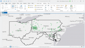
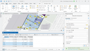
Application 1: The first application I looked at was how GIS was used to map Bigfoot sightings across the United States. This map was set up mainly for visual purposes and less for analytical purposes. However it could be used to filter these sightings by geography or other variables in order to focus on one aspect of these sightings or to limit the amount of possible ‘credible sightings’. Interestingly enough, there are quite a few sightings in Florida, which is quite interesting as I don’t know how a giant beast with fur would be able to survive in the heat, and also while still remaining elusive.

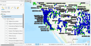
Source: Geospatial Training Services, Introduction to GIS Analysis using Sasquatch Sightings

https://geospatialtraining.com/introduction-to-gis-analysis-using-sasquatch-sightings/ 

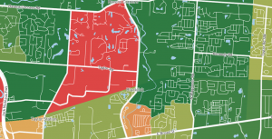
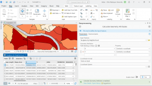
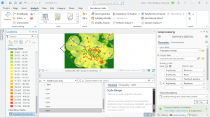
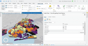
Application 2: The next application I looked at was crime per capita in Blacklick, Ohio. This map showcases the crime rate in the areas surrounding Blacklick, with more red colors indicating a higher percent of crime committed in that area. This GIS map helps illustrate the safety of the area and surrounding areas which can be helpful to home buyers, residents, and even law enforcement. This application can also further help by raising awareness of crimes and alerting the public to address safety concerns. Overall Blacklick got a B+ for safety and ranked in the 76th percentile for safety. 

Source: Crime Grade, Violent Crime in Blacklick

https://crimegrade.org/violent-crime-black-lick-oh/Â