O’Neill Week 6

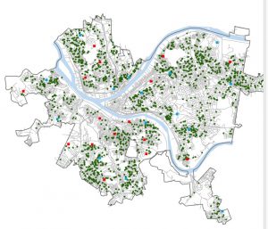
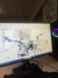
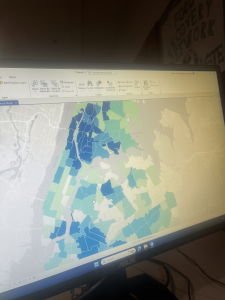
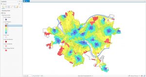
Chapter 9 went into “Spatial Analysis”. We started with buffers, which are basically zones around features. You set a distance (like, say, a half-mile radius around all the schools), and ArcGIS draws a polygon. It’s useful for seeing what’s “nearby.” I played around with creating buffers around pools in Pittsburgh, which was a case study that was built on throughout the chapter, to see how many kids lived within a reasonable distance. Then we got into multiple-ring buffers, which are like bullseyes – multiple buffers at different distances, all around the same feature. This allows you to see, for instance, not just who’s within a mile, but who’s within a half-mile, a quarter-mile, and so on. You can get pretty granular with it. The part that got my head spinning a bit was service areas. These are like buffers, but instead of straight-line distance, they measure distance along a network, like roads. This makes way more sense for real-world situations! If you want to know how long it really takes to get somewhere, you need to consider streets, not just draw a circle on a map. I found myself getting a little lost during the section on setting the parameters. The last thing the chapter covered was cluster analysis, which is finding patterns in data points. The example was looking at crime data and trying to find clusters of, say, crimes committed by a certain age group, or a certain type of crime.
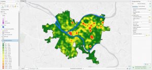
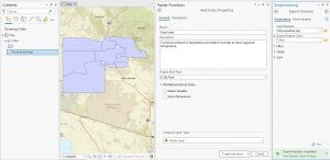
Chapter 10 was a shift from the previous ones because it focused on raster data, not vector data. Each pixel has a value, and that value can represent all sorts of things – elevation, land use, temperature, you name it. We started by exploring some existing raster datasets, like elevation data for Pittsburgh. The “hillshade” tool was particularly cool; it’s like shining a virtual light on the elevation data to create a 3D effect to help visualize the terrain. Next, we looked at kernel density maps. It was interesting to see how we could estimate and visualize that distribution using the kernel density tool. A big part of the chapter was about building a model. This was a new concept for me. Basically, you’re creating a set of instructions for ArcGIS to follow, step-by-step. The example was building a “poverty index” by combining different raster layers, like population density and income levels. I got a little confused with the “in-line variable substitution” part, where you use variables to represent values in your model.  The chapter wrapped up with running the model and seeing the results, which was pretty satisfying!
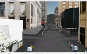
Chapter 11 was visually the most exciting! It’s all about working with data in three dimensions, which opens up a whole new way of looking at things. We started by exploring a global scene of Pittsburgh, which uses the earth’s curvature. I learned how to navigate around (pan, zoom, tilt) using the mouse and keyboard shortcuts. Then we switched to a local scene, which is better for smaller areas where the earth’s curvature isn’t as important. We created a TIN surface, which is a way of representing terrain using triangles. It’s like connecting a bunch of points with lines to create a 3D model of the ground. The book reads that you can use it to create the surface on which features like buildings will be rendered. The coolest part was working with lidar data. Lidar is like radar, but with lasers, and it creates incredibly detailed 3D point clouds. We used it to visualize buildings and even to estimate the height of a bridge, measuring the distance between the top and bottom of the bridge’s span. We also looked at procedural rules to make 3D buildings automatically. You can set parameters like building height and roof type, and the software generates the building for you. This seems like it would be incredibly useful for creating large-scale city models. I did run into an issue where I was using the incorrect view, but I think I got that sorted out. At the end, I made an animation, which was a fun way to end the chapter. It’s like creating a fly-through of your 3D scene. I’m still a bit confused about all the different options for exporting the animation, but I managed to create a basic movie.
O’Neill Week 5

Chapter 4 was about file geodatabases. I had no idea what these even were before (perhaps I wasn’t paying enough attention in GEOG 292), but now I get that they’re basically Esri’s way of organizing spatial data. I learned that you store all your feature classes, raster datasets, and other related files in a geodatabase. I guess it’s more efficient that way. The chapter showed how to import data into these geodatabases, modify tables (like adding and deleting columns – which I’m always a little nervous about, making sure I don’t delete something vital!), and even how to write little expressions to calculate fields. That was a cool connection back to some basic coding stuff. Joins were also covered, which is about linking tables together based on a common field. It’s like saying, “These two tables have a column in common, so stick them together!”

Chapter 5 was a lot. It was about different types of spatial data, and where to find them. It started with map projections, which are ways to show a round earth on a flat map. There are a bunch of different map projections for representing different things, all with trade offs, so you gotta choose the correct one. Then it went into projected coordinate systems, which are like grids laid over the map to make measuring distances easier. The chapter also talked about vector data formats (like shapefiles, which I’ve seen before) and, most importantly, where to get all this data. It turns out there are tons of sources, like the US Census Bureau. I never realized how much data the government collects and makes available. There was also a section on exploring sources of spatial data like ArcGIS Living Atlas.

Chapter 6 was about doing stuff with data, which is where it gets fun (and sometimes frustrating!). It’s called “geoprocessing,” which is a fancy word for manipulating spatial data. The chapter covered a bunch of tools that let you extract parts of your data, combine layers, and do all sorts of useful things. One tool that stood out was “Dissolve,” which lets you merge polygons together based on a common attribute. For example if you have a map of city blocks, and you want to group them into neighborhoods – Dissolve can do that. Another tool was “Intersect,” which finds where features overlap. So, if you have streets and fire company zones, you can find which streets are covered by each company. I had a little trouble with some of the parameters, especially making sure I had the input and output layers right. Sometimes I felt like I was just clicking buttons and hoping for the best! But I eventually got it to work.

Chapter 7 was about creating your own spatial data, which is called “digitizing.” It’s basically tracing things on a map to create points, lines, or polygons. I was surprised at how much you could do with this. The chapter showed how to edit existing features, like moving buildings around or changing their shapes. You can even add and delete vertices (those little points that make up a polygon). There was also a section on using something called “procedural rules” to create 3D models, which looked really cool but also a bit intimidating. One thing that I got stuck on was the snapping. I kept forgetting to turn it on, and my lines weren’t connecting properly.


Chapter 8 was about geocoding, which is turning addresses into points on a map. It’s basically giving spatial context to location data. I learned that you need two things: a table with addresses (the “source table”) and a map with streets (the “reference data”). ArcGIS Pro then tries to match the addresses to the streets. The chapter went through the steps of building a “locator,” which is like a set of rules for geocoding. You have to tell it which fields in your table correspond to the address, city, state, and zip code. Then you run the geocoding tool, and it tries to find a match for each address. One thing that was emphasized was that geocoding is not perfect. It uses “fuzzy matching” because addresses can be messy (misspellings, abbreviations, etc.). So, you get a “match score” for each address, and you can set a threshold for what you consider a good match. I thought that was pretty smart, but it also means you have to double-check the results, especially if accuracy is super important.

O’Neill Week 4

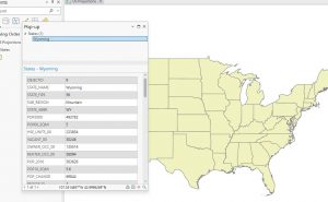
Chapter 1: This chapter was like a basic “GIS for Dummies” intro. It introduced the main concepts and vocabulary, which was helpful. I learned the difference between a feature class (like a layer on a map, showing things like streets or buildings) and a raster dataset (images made up of pixels, like satellite photos). It’s the difference between drawing lines and coloring in squares, I think. The tutorials were pretty straightforward. Tutorial 1-1 was just about opening a project and messing around with the interface. Turning layers on and off, zooming in and out, that kind of thing. The book told me to add a basemap (the “Streets” one), then told me it was getting in the way, so I should remove it. I also played around with the order of the layers in the Contents pane. Tutorial 1-2 focused on navigating the map. Panning, zooming, using bookmarks (which are like saved views and are super useful). I even learned how to use the “Explore” tool to click on features and get info about them in a pop-up. I clicked on a random urgent care clinic and saw its address and website. Tutorial 1-3 got into attribute data – the information behind the map features. Every feature (like a point representing a clinic) has a table with details about it. I learned how to open the attribute table, sort the data, and even mess with the columns (like rearranging them). I also started to get a glimpse of how powerful this can be – you can search for specific features based on their attributes. Tutorial 1-4 was about symbolizing maps. I changed the FQHC clinics to green circles and made them a bit smaller.I also played with labeling, so that, the name of things appeared, the names of the municipalities.


Chapter 2:
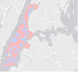
The main idea of this chapter is thematic maps – maps that focus on a specific topic or theme. Like, in Chapter 1, we were looking at the locations of health clinics relative to poverty areas. That’s a theme. The chapter stressed the importance of making the subject of your map (the “figure”) stand out, while the background information (the “ground”) should be less prominent. It’s about visual hierarchy. The tutorials were all about symbolizing different kinds of data. Tutorial 2-1 dealt with qualitative attributes – things like categories or types (e.g. land use types: residential, commercial, industrial). I learned how to use “unique values” symbology to give each land use type a different color. Tutorial 2-2 was about labels and pop-ups. I learned how to customize labels (font, size, color) and how to configure pop-ups to show specific information. Tutorials 2-4 and 2-5 were about mapping quantitative attributes – numbers. 2-4 was doing Choropleth maps that is how you use different shades of a color to represent different values (like population density). 2-5 did the same, but with dots. There were different ways to classify the data (like “quantiles” and “natural breaks”), I found this a bit confusing. The way the data is divided up can change how the map looks. 2-6 was about “normalizing” data. This is where it got a bit more mathematical. Basically, you’re adjusting the data to make it comparable. Like, instead of just showing the number of people in poverty, you might show the percentage of people in poverty. This is way more meaningful because areas have differing total number of people. Tutorial 2-7 was about dot density maps. It shows the number of people under 18 who are on food stamps in each neighborhood using dots. Tutorial 2-8 got me adding visibility ranges, I could make things appear and disappear based on how far you zoom in.


Chapter 3:
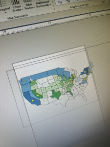
This chapter was all about sharing maps. Tutorial 3-1 was about creating layouts. A layout is like a page where you can arrange your map, add a title, a legend, a scale bar, and other stuff. It’s like putting together a poster. I made a layout with two maps showing arts employment in different states. I also created a chart showing the number of arts jobs. Tutorial 3-2 was about sharing maps online using ArcGIS Online. This was pretty cool, and I already have some experience with this from GEOG 292. You can publish your maps so that other people can view them in a web browser. Tutorial 3-3 introduced ArcGIS StoryMaps, another thing introduced to me by GEOG 292. These are like interactive reports or presentations that combine maps with text, images, and videos. It’s a way to tell a story with your data. Tutorial 3-4 was about ArcGIS Dashboards. In them, you can see maps, charts, and other information all in one place. These would be useful for monitoring things that change quickly, like traffic or weather.

I’m starting to see how powerful GIS can be, but it’s also a bit overwhelming. There are so many tools and options! I feel I’m going to need to keep practicing, else I’m going to forget.

O’Neill Week 3

Chapter 4, “Mapping Density,” got me thinking about how we present information, especially when you’re dealing with varying areas. It’s not enough to just count things up, sometimes we need a bit more context, like how spread out something is. I think that’s why the book dives into density mapping, the distribution of features or values per unit area. There’s a difference between saying “there are 100 houses in this neighborhood” and “there are 100 houses per square mile in this neighborhood.” What I found particularly interesting was how you can map density in a few different ways. The book highlights two methods: mapping density for defined areas, like census tracts, which is where you calculate density within existing boundaries. Then, there’s creating a density surface, which involves creating a continuous surface that shows how density changes across an entire area, even without defined boundaries. It’s like taking something that’s usually summarized by area, and making it a landscape you can view. It seems to me that these two methods would be used for different purposes and I’m wondering which gets used for what application and why? Mapping density is about more than just visualizing data. It’s about taking into account the context of the data and how it’s distributed. It’s a really valuable tool to see the patterns that might be hidden at first glance. I wonder if density mapping could be applied to research in neuroscience, since it deals with location based data sometimes.

Chapter 5 seems to build off the idea that location matters, but in a different way. Now instead of looking at where things are, we’re looking at what things are contained by. The book’s main question here is, Why map what’s inside? and, in my understanding, it’s because it allows us to explore relationships between features. The book outlines three approaches for this: drawing areas and features (where we manually create areas to select features), selecting features inside an area (where we use existing boundaries), and overlaying areas and features, which sounds like the most complex one. The overlay method, as I understand it, combines two layers of features to see how they interact spatially. I’m starting to think this is where GIS really shines because it creates new relationships between features that wouldn’t exist in the real world otherwise. I’m curious how you all go about choosing which of these three methods to use? I imagine that using drawn areas is more appropriate when you need to be more precise with your selection, and that using existing boundaries is better for broader analysis. How do you decide which features to overlay, if that makes sense?

Chapter 6 seems to add a layer of complexity to our spatial analysis by focusing on closeness. I think the main idea is that we can learn a lot from the distance and relationships between features. The book asks, Why map what’s nearby?, and the answer I think is that it allows us to explore how features interact, or how they might influence one another. Three ways of exploring this include using straight line distance, measuring distance or cost over a network, and calculating cost over a geographic surface. It seems like the first one is the most basic, just measuring distance as the crow flies, so to speak, while the second one takes into account that movement is often confined to networks, like roads. The last one, where you calculate cost over a geographic surface, is a bit more abstract, where you take into account the “cost” of travel, which is interesting. I’m realizing that “cost” doesn’t always mean money, and that different types of cost can be included in research. It seems to me that GIS is very useful for understanding and calculating all these different types of distance. I’m also thinking about the different applications for these analyses. It seems that you could use straight line distance to do quick analyses, or when the network isn’t important. You could use network analyses to find optimal routes, and surface analysis to calculate the cost of travelling across different topographies. I am wondering if there are times when you would use a network analysis to find straight line distance, or is that redundant?

O’Neill Week 2

Chapter One: The first chapter begins by sharing a few interesting advancements in Geographic Information Systems in recent years, including the fact that spatial data is more abundant and accessible than ever before. Spatial data scientists are discovering that they can use GIS for far more than just making maps and analyzing geographic phenomena. They can use it to address many of the world’s problems, which interests me because I’m not and don’t plan on being a geographer and it’s comforting to know that I can apply the skills I learn in this course to my field(s) of interest. 

The chapter then moves on to more practical facts about GIS analysis, including what it is: the process of collecting and interpreting spatial data to inform decision-making. It draws on many types of data, such as satellite imagery or sociodemographic statistics (among many, many other things). One thing it discusses is data interpolation. GIS uses interpolation to predict values from a series of sample points to represent continuous data more accurately. 

The chapter also talks about the types of attribute values. The book reads, “Each geographic feature has one or more attributes that identify what the feature is, describe it, or represent some magnitude associated with the feature.” An attribute value is just an amount or description that relates to an attribute, and they come in the following forms: categories, ranks, counts, amounts, and ratios. The book goes deeper into what each of these forms means and what they are used to represent. Pretty cool, reminds me of when I took AP Computer Science and Statistics when we talked about the different forms of data.

Chapter 2: Chapter 2 touches on the “whys” and “whats” of GIS, as well as on some technical details about GIS. Why map where things are in the first place? Mapping things out gives us insight and information about communities and areas that we would not have otherwise. By looking at the distribution of features on a map, you can pick up on patterns that will help you better understand the area you’re mapping. For example, Planned Parenthood could use GIS to map out where the most low-income people having unplanned pregnancies are in a city to learn what the best location could be for establishing a clinic.

The chapter also provides an explanation of how the GIS uses geographic coordinates to display features. It’s fascinating how the software translates location information into visual representations on a map. The distinction between mapping a single type and mapping by category was also enlightening. Mapping by category allows us to see how different types of features are distributed and whether they tend to occur in the same places. The chapter also highlights the importance of including reference features, such as roads or boundaries, to provide context and make the map more meaningful to the audience.


Chapter 3: This chapter explores how to map quantities to identify areas that meet specific criteria or to understand relationships between places. I found the distinction between mapping locations and mapping quantities to be important. Mapping locations shows where things are, while mapping quantities shows how much is at each location. I appreciated the breakdown of different types of quantities: counts, amounts, ratios, and ranks. Understanding the nuances of each type is essential for choosing the appropriate mapping method. The discussion on continuous and noncontinuous values also helped clarify how to group values for presentation. Classifying continuous values into discrete categories allows us to visualize patterns more easily.

The section on creating classes was particularly informative. The different classification schemes—natural breaks, quantile, equal interval, and standard deviation—each have their strengths and weaknesses. Choosing the right scheme depends on the distribution of the data and the message you want to convey. I also found the discussion on dealing with outliers to be relevant. Outliers can significantly skew the data and affect the map’s patterns. The suggestions for handling outliers, such as putting them in their own class or grouping them, provide practical solutions for dealing with this issue. The section on choosing symbols for graduated symbols and graduated colors provided valuable guidance for creating visually effective maps representing the underlying data. The distinction between using color alone and using a combination of color, width, and pattern to distinguish categories is very helpful.

O’Neill Week 1

Hey, my name is Adam, I’m a freshman majoring in Neuroscience(maybe) and Pre-med(maybe). I love to read and my girlfriend. I took 292 last semester so I’m taking the courses in reverse!

Schuurman’s introduction is primarily concerning the history and applications of GIS. The former half, history, was so so so boring to me because I don’t really care about how GIS came to be. Regardless, I did learn some new terms that I find worth mentioning. First, it’s worth mentioning that GIS can stand for two different things: “Geographic Information Science” and “Geographic Information Systems.” To me, it seems that these terms can be used interchangeably, but it can be helpful to differentiate between the two. GISystems generally refers to the hardware and software that is used to represent geographic data, while GIScience refers to the study of how the systems work, are used, and impact society. The latter half was a bit more interesting to me. It was an interesting exploration of how pervasive GIS is in so many fields. In health fields, for example, we can use GIS to model the spread of diseases or analyze the access communities have to care.

Searches:

Search 1: First, because I like reading, I decided to look up “GIS libraries” and stumbled across an article by American Libraries Magazine. The article details how librarians are increasingly using GIS to enhance their services and provide resources. It speaks to how librarians have created digestible interactive maps to make complex information easier to understand for readers.

https://americanlibrariesmagazine.org/2021/09/01/on-the-map-gis-software/

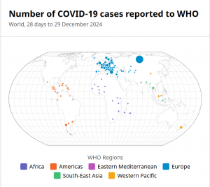
Search 2: In my second search, I decided to go in the direction of its use in disease control and awareness. I came across the World Health Organization’s website and found some of their data on COVID-19. On this page, there is a map that shows reported cases of COVID-19 globally.

https://data.who.int/dashboards/covid19/cases?n=c