Katterhenrich Week 6

Chapter 9

In this chapter, four spatial analytical methods were covered including buffers, service areas, facility location models, and clustering. The tutorials helped me understand how to use buffers for proximity analysis by running the pairwise buffer tool and multiple ring buffers. I was able to create service areas of facilities for calibrating a gravity model and locate facilities using ArcGIS Network Analyst. This chapter also taught me how to perform cluster analysis to explore multidimensional data.

Chapter 10

The tutorials had users process raster datasets to extract and symbolize maps and create hillshade maps. I learned how to make a kernel density map, or a heat map, as well as how to build a raster-based risk index model. It also required me to build a model for automatically creating risk indices. Throughout this chapter, I learned a lot about raster layers compared to vector features which we had been using previously. I found it useful when it taught me how to transform vector feature classes into raster datasets that could be visualized.

Chapter 11

In this chapter I found it useful that the tutorial had us explore global scenes and taught me how to design, visualize communicate, and analyze them. The tutorials also had me create local scenes, TIN surfaces, and z_enabled features from this I learned the difference between global and local scenes. It allowed me to create 3D buildings from the lidar data so that I could work with the 3D features. I also used procedural rules and multipatch models but the parts I found most interesting, useful, and fun were creating the trees and the animation.

Katterhenrich Week 5

Chapter 4: This chapter was informative in describing what databases are as well as what they are useful for. It taught me how to import data into file geodatabases into new projects, how to modify attribute tables, and use the field tool. I found it useful how it walked me through how to join tables, carry out attribute queries, and aggregate point data to polygon summary data. I like how there were some parts where I could use creativity in the presentation of the data/map using symbology.

Chapter 5: This chapter was beneficial when it came to understanding how to work with world map projections and even us map projections. I now know how to set a projected coordinate system and how to work with vector data and examine their different formats. It was interesting to see how US Census Bureau spatial and tabular data (map layers and data tables) could be used in Arc and the book aided in navigating how to work with this data. The only problem I had was with the spreadsheet!

Chapter 6: This chapter showed me how to dissolve block group polygons to create neighborhoods and fire battalions and divisions meaning the interior lines from the block groups are removed but the outer boundary lines are preserved. It also showed me how to form a study area through the extraction and clipping of a neighborhood using its attributes. I learned how to create a single water map by merging several water features as well as how to create one layer of fire and police stations by appending their separate layers. It was helpful to gain practice and understanding in using Union, intersect, and Tabulate tools to combine features and tables for geoprocessing.

Chapter 7: This chapter introduced GIS tools that helped me gain an understanding of editing, creating, and deleting polygon features and creating and digitizing point features. With the tutorials, I was able to spatially adjust features and use cartography tools to smooth features. It also had me work with CAD drawings, or computer-aided design drawings, changing their features to align them with GIS maps. I don’t think I did the aligning properly but I found the process to be really interesting and useful.

Chapter 8: In the tutorials in this chapter I learned about the geocoding process and geocoding using zip codes and addresses using streets. I learned that you can use geocoded survey data for many things like marketing, philanthropy, or just forms of communication with users.

Katterhenrich Week 4

Chapter 1

This chapter of tutorials helped me understand the foundational concepts needed to use ArcPro easily. I found the information I learned in this chapter useful in establishing the basics for navigating ArcPro for the upcoming chapters. Overall I gained a solid introduction to ArcGIS, learned how to navigate maps, worked with tables of attribute data, got an introduction to symbolizing and labeling maps, and worked with 2D and 3D maps. My favorite part was the 3D map.

Chapter 2 

This chapter had a lot of tutorials but I liked how quick they were. Here, I learned how to symbolize maps using qualitative attributes and then add labels to them, as well as how to use definition queries to create a subset of map features. The chapter also taught me how to symbolize maps using quantitative attributes, understand 3D scenes, and symbolize maps using graduated and proportional point symbols. It was also interesting to see how normalized maps are created with custom scales, how dot density maps are created, and how to add visibility ranges for interactive map use.  The only hard part about this chapter was finding the bookmarks it told the user to zoom in on in some steps. I had to keep googling parts of New York because the book just assumed I knew where West Village and Lower Manhattan were. I also really liked how colorful the maps were.

Chapter 3 

Although this felt like the longest chapter, I found this one interesting because of how it used ArcGIS online. Making the interactive reports and maps was fun. This chapter taught me how to build map layouts and charts, as well as how to share, use Map Viewer, and create and use Storymaps and Dashboards all in ArcGIS Online. 

Katterhenrich Week 3

Chapter 4 talked about map density and its variables and when it is important to use it. I found it helpful the way it broke down what to map using density, the two ways of mapping density, mapping density concerning defined areas, and creating a density surface. The book talks about how density maps are useful when looking at patterns rather than locations of individual features and gives you a measurement of density per area, so comparing areas is done more accurately. Deciding what to map can be tricky though because density maps may not be useful in certain situations. I liked how the reading brought up that you should think about the features you are mapping and the information you need from the map before making the map itself. A concept I thought was interesting was the difference between map features and feature values. A map feature could be an example of locations of businesses where feature values could be the number of employees at each business. This distinction was helpful when thinking about the purpose of the map you are making. Mapping density by area is useful when you have data or lines or points that can be summarized by area resulting in a shaded fill map or dot density map. This is an easy process but is not as precise especially for large areas. Creating a density surface is useful when you have individual locations, sample points, or lines resulting in a shaded density surface or a contour map. This requires more data processing but can give a more accurate view of the centers of density. It was interesting to see how GIS plays a role in creating a density surface to make a running average of features per area resulting in a smoothed surface.

Chapter 5 discussed mapping what is inside an area to see what is happening there compared to other areas in order to see where there is more or less of something. The book goes into explaining the three ways of finding data for the inside of an area; drawing areas and features, selecting the features inside an area, and overlaying areas and features. Drawing areas and features create maps showing boundaries that can be used to see which features are inside and outside a specific area. This approach can show and use locations, lines, areas, and surfaces. Another way to find data is by selecting the features inside that area to get a list or summary of features inside an area or within a given distance of a feature. This approach shows locations, lines, and areas to get information about what is inside a single area rather than information about what is in each of several areas. The last way of finding data for the inside of an area is overlaying the areas and features to find out which features are in which areas, to give a summary of how many by area. Areas and features are combined through GIS to create a new layer showing attributes of both where they can be compared to calculate summary statistics for each area. This approach uses locations, lines, areas, and surfaces making this way good for displaying what is in each of the areas, but it does require more processing. 

Chapter 6 discusses mapping data within a set distance to identify the area and features inside that area that are affected by an event or activity. This approach is effective in finding what is within a set distance to monitor activity in the area. Throughout the reading of this book, I have noticed how helpful the examples are that it gives. One example was a state forester monitoring logging that could use this method to make sure logging does not occur within a 100-meter distance from streams. This chapter also goes into detail about how to define your analysis, the three approaches to this method, using a straight-line distance, measuring distance or cost over a network, and calculating cost over a geographic area. To define your analysis there are three ways to get an accurate measure of what is nearby. This includes using straight-line distance to create a boundary or selecting features within the distance around a source. This is a pretty quick and easy approach but it can only give a rough estimate of travel distance. Measuring travel distance or cost of a location over a fixed infrastructure is achieved through GIS finding segments of the network that are within the distance or cost. This approach gives a more precise measurement over a network but requires an accurate network layer. Looking at costs over a surface is another method that can measure overland travel and calculate how much is within the travel distance. This allows for combining several layers to measure over-land travel costs but requires more data preparation to build the cost surface. 

Katterhenrich Week 2

Chapter 1

Introducing GIS Analysis

This chapter is informative when it comes to understanding GIS analysis, along with geographic features and attributes. It described the process of GIS analysis as looking at geographic patterns in data and the relationships between features. There are various methods to this which can look simple or more complex. I like how the reading broke up the different parts of the analysis process including; framing the question, understanding your data, choosing a method, processing the data, and then looking at the results. It was also interesting how the book pointed out that when it comes to geographic features, it is important to note that the type of feature you are working with will affect all the steps of the analysis process previously mentioned. These types of features can look like discrete features, continuous phenomena, or even features summarized by area. These are important to break down because I can see how foundational these features are to GIS analysis in enabling understanding and supporting applications. Finally, geographic attributes identify what the feature is and either describe or represent some magnitude associated with it. Some attribute values can look like categories, ranks, counts, amounts, and ratios, and it is crucial to know which one you are working with because this changes the type of analysis you are doing with GIS. 


Chapter 2

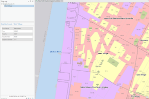
Mapping Where Things Are

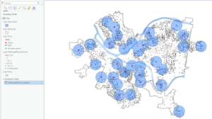
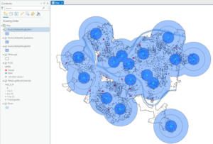
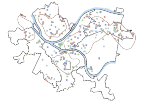
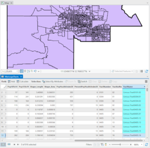
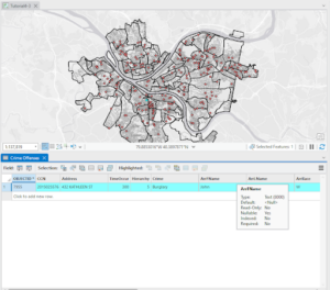
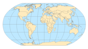
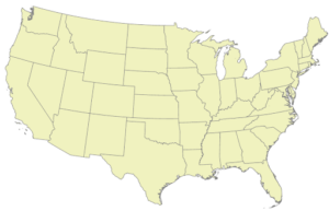
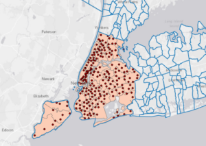
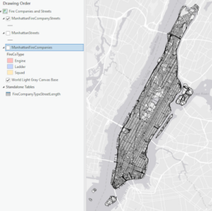
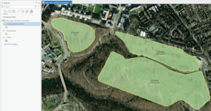
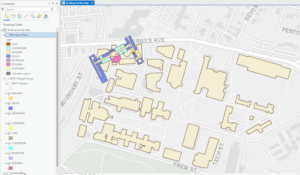
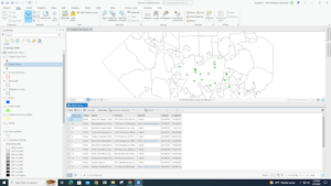
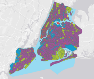
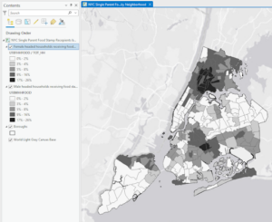
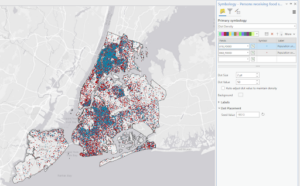
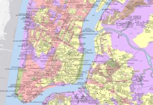
This chapter was helpful in understanding the purpose of mapping where things are, deciding what to map, how to prepare your data, how to make the map, and analyzing geographic patterns. It was unique to me that the reading specifically pointed out the purpose of mapping where things are. You do not typically think about this broad of an idea but it makes sense now why it would be important to remember why people use maps so you can explore causes for the patterns you see. Deciding what features to display and how to display them can be done by reflecting on the information you need and what the map will be used for. It is interesting how the level of detail needed to be displayed can change depending on the purpose of the map. Preparing the data for the map can be done by assigning geographic coordinates and category values. One thing I noticed is how tedious it must be if your data is not already in the GIS database. Entering it by hand and giving location information like street addresses, or latitude-longitude values would take up a lot of time. When the reading discussed how to make the map itself and all the types that can be used, I appreciated all of the examples and pictures that were included. It helped me gain a better understanding of what the results might and probably should look like when using GIS. Finally, analyzing the geographic patterns that are presented is allowed by distinctly given information. 
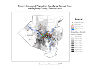
 

Chapter 3

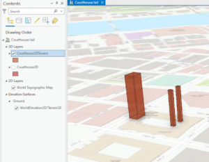
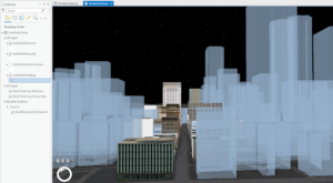
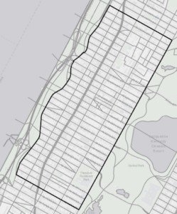
Mapping the Most and Least

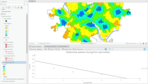
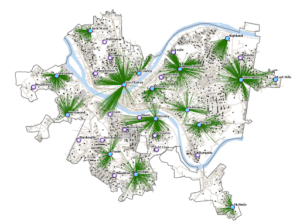
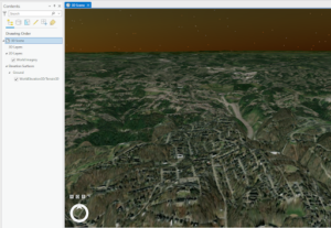
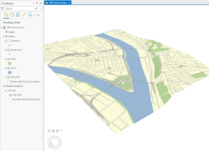
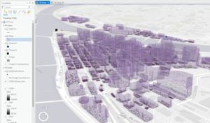
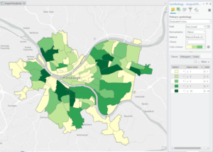
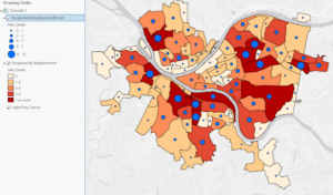
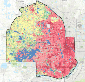
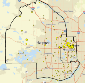
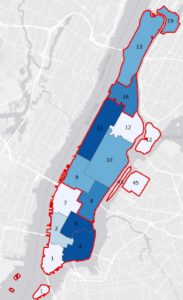
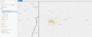
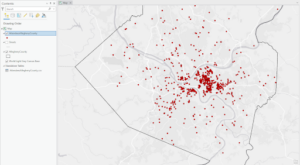
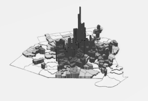
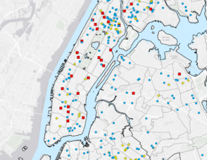
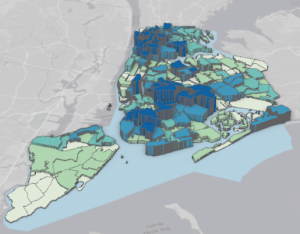
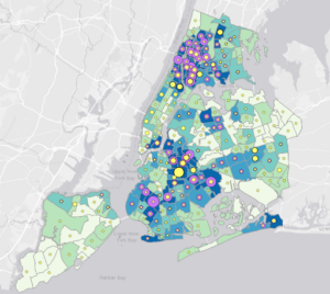
Chapter 3 talks about the use of mapping the “most and the least” and why you should do this. It gives readers a better understanding of what you need to map, quantities, how to create classes, and how to make a map while looking at the patterns it displays. This chapter went into more detail about things previously mentioned and learned in the first two chapters which I appreciated. Mapping the most and the least was a concept I had never heard of before. From the text, I understand this as the process of mapping features based on quantities which is described as adding an additional level of information more than just mapping location and features. Again, the features you are mapping are important as well as understanding the quantities you are mapping. The reading says quantities can be counts or amounts, ratios, or ranks, these reminded me of the attribute values explained in the first chapter. This helps you decide on the best way to present your data. Creating classes was the next section that stood out to me, deciding whether to assign each specific value its own symbol or to group the values into classes. Finally, the author’s explanation of making a map was again supported by a good amount of example maps that presented various ideas and approaches and this was helpful for me. It was really cool to see the 3D maps and all the factors to consider such as viewer location, z-factor, and the light source. Overall, I felt like this chapter covered a lot of things that were already discussed in the first two chapters, but in some ways, it was a good overview and in other ways, it was helpful to see the topic or idea explained more in-depth. 

Katterhenrich Week 1

My name is Auzlynd Katterhenrich, I am a junior, studying environmental science and biology. I love to do outdoorsy stuff so hiking, camping, and gardening. The picture below is me and my sister, Piper!


I thought the reading as an introduction to GIS was beneficial, It explained GIS as a useful tool to visualize data, conveying a more easily interpreted feel for a landscape as opposed to a data table. It was helpful to see how the text distinguished GISystems and GIScience, which was new to me. It explained GISystems as the use of processes like classification, digital encoding, spatial analysis, and output into software which is different from GIScience which gives theoretical bases and justifies the way the process is executed. I also thought it was interesting when the issue of categorization of spatial data was brought up. That is a good point because depending on what boundaries one is trying to create between objects or even resources, there are always grey areas or “fuzzy boundaries” that need to be represented visually. In the final pages of the reading, I found that learning about all the different ways GIS can be used and who uses it was valuable. Specifically, a concept that stood out to me was “precision farming”. This farming management concept is based on improving crop yields by responding to the crops’ variability. I think an effective way to accomplish this is through the use of GIS to visualize ideal locations for future farming through various layers like soil type, soil chemistry, wheat variety, pesticide load, and irrigation information. The use of GIS in this area can model the various factors that play a role in crop yield. Overall I found it helpful to know exactly what GIS is, how it began, what it does, and how it is used today. 

I first wanted to see how GIS could be applied in missionary work and outreach and I was able to find an article called, Geographic information systems and the spiritual dimension of health: a short position paper, by Maged N Kamel Boulos. This article stated that “GIS are ideal tools for improving and coordinating the integration of the health (physical), social, and spiritual/ pastoral dimensions of individual and community care”. 

Secondly, I was curious about how GIS could be applied in mapping soil erosion. I found that it could be used in erosion risk mapping to create maps that identify areas prone to soil erosion based on various factors. I found an article that looked at soil erosion in Africa that gave this map showing the Grid surface of the Keiskamma catchment showing the spatial distribution of the rainfall erosivity factor.