I completely forgot to include this in my first week 7 post, so I made a part 2:
Geography 291: Geospatial Analysis with Desktop GIS
Module 1: 1/14/2026 to 3/3/2026, OWU Environment & Sustainability
I completely forgot to include this in my first week 7 post, so I made a part 2:
Address Point: A representation of all certified addresses that are in Delaware Ohio. Address points indicate the location of the building centroid and are indicated to support appraisal mapping, 911 emergency response, accident reporting, geocoding, and disaster management. It is also able to help 911 service agencies by giving information. It’s updated on a daily basis and published monthly.
Annexation: Delaware County’s annexations and conforming boundaries from 1853 to today. It’s updated on an as needed basis after an annexation has been recorded by that Delaware County Records office, published monthly.
Building Outline: outlines for all of the structures in Delaware County, Ohio. updated in 2024 and changes on an as-needed basis.
Condo: All of the condominium polygons that are within Delaware County, Ohio that have been reported to the Delaware County Records office.
Delaware County E911 Data: spatially accurate representation of all certified addresses that are within Delaware County Ohio, maintained by Delaware County Auditor’s GIS Office. Same information as the Address Point.
GPS: identifies all GPS monuments that were established in 1991 and 1997, it is updated on an as-needed basis and published monthly.
MSAG: Polygon feature set of the 28 different political jurisdictions like townships, cities, and villages that make up Delaware County. This dataset is updated on an as-needed basis and is published monthly.
Municipality: A data set containing all of the municipalities in Delaware County, Ohio
Parcel: A data set of polygons representing all of the cadastral parcel lines that are within Delaware County Ohio, maintained by the Delaware County Auditor’s GIS office. Changes are represented by recorded documents that are stored within the Delaware County Recorder’s office. This is maintained by the auditor’s CAMA and is maintained on a daily basis and is published monthly.
Precincts: A dataset that consists of voting Precincts in Delaware County, Ohio. It is maintained by the Delaware County Auditors GIS Office under the direction of the Delaware County Board of Elections, this dataset is updated on an as needed basis and is published by the Delaware Board of Elections.
Recorded Documents: Database showing points representing recorded documents in the Delaware County Recorder’s Plat books, cabinet/slides, and instrument records that aren’t represented by subdivision plats that are active. This was created to facilitate the process of locating miscellaneous documents that are within Delaware County, Ohio related to the cadastral land base. It is updated on a weekly basis, and published monthly.
School District: Dataset with all of the Schools Districts within Delaware County Ohio. It is updated on an as needed basis, and published monthly.
Street Centerline: pavement of public and private roads within Delaware County, A spatially accurate topologically correct representation of the road system. It is updated on a daily basis for all fields but the 3-D fields (updated on an annual basis).
Subdivision: A dataset that consists of all of the subdivisions and condos recorded in the Delaware County Recorder’s Office, Updated on a daily basis and published monthly.
Survey: surveys recorded in the Recorder’s office and all surveys that are municipal/village jurisdictions that are residing in the offices as of May 2024, they were and still are being scanned by the Map Department. The Dataset is updated on a daily basis and it is published monthly.
Tax District: data sets for all of the tax districts within Delaware County, Ohio. The data is defined by the Delaware County Auditor’s Real Estate Office and the Data is dissolved on the Tax District code, with the data being updated on an as needed basis, and published monthly.
Chapter 7:
In this tutorial, I learned more about tools used for manual digitization by tracing and a more in-depth understanding of the use of base maps. Base maps will help me edit and create vector map features while also learning how to use other existing layers like streets as spatial guides for digitizing features. Also learned a little about lidar and how it is used as a reference for heads-up digitizing. ArcGIS field maps or GPS receivers that collect data about longitude and latitude to then create vector features and build information modeling, can then be imported into GIS maps creating feature classes. I had some issues when trying to shape and form a building that fits to scale in the map while doing this chapter. This tutorial was definitely one of the easier ones, but it was pretty hard to make vector points when I was confused on the correlation between the directions and my own screen. It took me a while but I eventually got it, I then promptly closed my computer and didn’t reopen ArcGIS until the next day. I think that in general, this chapter had some fairly easy to follow directions, but it also took me a longer amount of time to accomplish. It made me realize that I do better when dealing with point locations on maps, and sometimes have more trouble when working with CAD drawings and using cartography on zoom scale maps. In this chapter, the outlines of buildings in my practice GIS sites were a little askew and not as lined up as in the directions. This can also be said when talking about what the maps looked like and how they differed between my directions and my computer. This caused me to be confused in tutorials like the second one where I had to simply map bus stop locations as points. I was confused because part of the map that I had, differed from the pictures and images that were in the diffraction, causing me to guess at some parts on where points are supposed to go (not to say that mapping these points was a high stakes operation or anything like that).
Chapter 8:
In this chapter, I learned about geocoding and how it matches location fields in tabular data to corresponding fields in existing feature classes in order to map the tabular data. Through these location fields, we are able to geocode their location by using zip code polygon or street feature classes. GIS has to use “fuzzy matching”, and make matches that are approximate as opposed to being one hundred percent accurate. Fuzzy matches are made through rule-based expert system software, ArcGIS is seen as a system. The geocoding expert system can be seen as attempting to mimic a mail delivery person through using expert knowledge to get mail that was messed up or written differently, to the correct address. This can be shown in GIS through source tables, reference data, locator, or the geocoding tool. This tutorial only had two sections so I feel as though I don’t have as much to talk about or say that I had difficulties with (though I definitely did have trouble figuring things out throughout this section and chapter). I do feel like it was easier to run through the two tutorials, especially in comparison to the other chapters and tutorials that I had to push and force myself to finish. This feeling of understanding can be associated with the fact that I paid attention and was learning how to do things and locate different tools and functions white struggling and feeling like I wasn’t learning anything at all, genuinely just following the directions blindly. Although I have great disdain for the “your turn” sections of the reading, they really do check your knowledge, comprehension skills, as well as your problem solving skills while recalling everything that you have previously learned and read about. If I were to go back and compare how I handled these tutorials when I first started this course, confused on where the content pane was, and stressing out forgetting how to symbolize circles with different traits there is a big difference. I would like to think that I am learning and improving, not to say that I’m ready to tackle the final/midterm which has a fast approaching due date. 🙁
I again forgot to take pictures of my work in chapter 7 and 8 so I will be leaving this message here incase I forget to go back and collect images for some of my work.
Chapter 9:
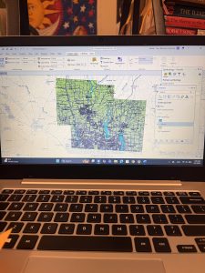
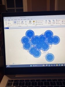
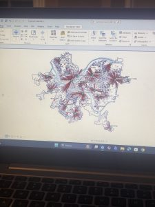
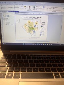
In this chapter I had some issues but it was mostly in relation to the amount of work that I had to do, in relation to the other 2 previous chapters of work. In this chapter, I visualized spatial data so that I and other people can get answers or solutions to problems. I learned about four different spatial buffers including: buffers, service areas, facility location models, and clustering. I also learned about and used another spatial data type, “the network data set”. Which we use to estimate travel distance or time on a street network. We apparently used the free service version in GIS, not that I would have honestly been able to tell the difference between the two in the first place. In the first tutorial, I learned about using buffers for proximity analysis. With a buffer being a polygon surrounding map featured of a feature class. I tough that this first tutorial looked cool, and was fairly easy to do. I will say that I had issues trying to understand what they meant when they said to find the “number and percentage of youths” within a distance after having created a one mile buffer. I was confused because I didn’t really understand how we were supposed to be getting these calculations, or how we were supposed to be comparing them. I was also confused and I believe that I might have done my map wrong because when I compared what I had created to the picture, they had darker shading in the circles then I did. In the third tutorial I also had fun making the map and adding the colors, but my computer kept freezing while I was trying to swap that color out per the instructions so I was getting fairly frustrated.
Chapter 4 (3.4):
In this chapter, I was able to gain more insight into working with File Geodatabases throughout the different exercises and learning modules. I learned more about spatial databases and databases as a general skill and tool used when working with maps and GIS. In the first chapter, I learned more about importing data into a new ArcGIS project as a means to create a map and input data for different skills. I had issues in this section when it came to importing data as well as in some ways following the directions given to me in the book and project manual. Even though I understand both that I need these methods to learn and later create my own maps and images using data, I still get confused. I then learned how to modify attribute tables, with attribute tables being used to portray and display a lot of what is used in GIS ( in columns of data in tables). While doing this chapter, I felt more equipped when dealing with maps, that’s not the say that confusion didn’t arise at different points, especially as I was navigating between the instructions and the actual assignments, trying to get my work to match everything that I was in the readings while not knowing if it was entirely right or not. Later in the chapter, I learned more about carrying out attribute queries which is the use of linking tabular data to the spatial features in feature classes. In the actual lesson, I used SQL criterion with the attribute name as well as other factors. I hadn’t previously realized that coding or script could be use in GIS as a means to symbolize attribute values that are found in maps.
Chapter 5 (3.4)
In this chapter I learned about world map projections and the different map windows that can be used in GIS to display and show information. One of the maps that was demonstrated to me was the “fly to Hammer-Aitoff (world)”. I was initially confused on how this information was resourceful to me but then assessed by situation and again understood that any and all information that I am learning in GIS is useful to me, seeing as I didn’t know anything about GIS or mapping before taking this class. I then started working with US map projections that are used commonly in the United States. Connected to this, I learned about using a projected coordinate system and the subsequent parameters that are associated. Lesson two was one of the easier sections from this chapter, which I was very glad about. I then learned about projected coordinate systems which are used for medium and large sized maps (localized). I personally had issues adding layers and importing data, and came to find out I had been saving and putting data in folders wrong that entire time I was doing these assignments. I didn’t want to restructure my approach to everything after having come so far, so I had to change my approach and understanding of importing and naming data that is being put on my map. When talking about importing data, I also had issues with the fifth lesson in this chapter when I had to export data from an outside source for the first time to then bring it back to the map. In this chapter I also had to work with excel and tables from that which I was confused on, I had a hard time figuring out how to find my data in my files while also trying to properly insert it into my map.
Chapter 6 (3.4)
In the last chapter of this section I was sleep deprived while working on it so I made it harder and more frustrating than it had to be. In the first tutorial, I had issues with understanding the instructions while simultaneously getting error signs and messages saying that the data was not being inserted correctly. In the second tutorial where we were extracting and clipping features, I first had issues with learning how to properly select the areas and regions that I needed from the map to then be used for more information. I will say that it most definitely feels liberating when you understand what you are doing or when you finally get the issue sorted out that you were stressing over for an hour. I will say that I was glad I didn’t have to go out onto the web as much for this chapter while doing the tutorials, that’s not to say that it made the assignments easier or took less time to do. In this chapter, I also had issues when trying to interpret the directions both outwardly and incepted in the “your turn” sections. I’m not sure if it was because I was working on this until 5 am or if I was just extra angry, but every time I couldn’t find a function or feature within the first maybe 15 seconds of reading the instructions, I immediately began clicking harder on my computer and having to take deep breaths. This was especially true for when I was working with the different tools in the tool box and I continued to get error signs while my data and codes were processing because I was inputting something incorrectly.
(I also again forgot to take pictures of my work and I fear its to late to go back and capture pictures of anything, trust and believe I’ll add pictures to next weeks work though 🙂
Chapter 1:
I Learned about a feature class, a raster dataset, a file geodatabase, and a project. I learned more about ArcGIS as a system and what the tutorials that we are doing are helping us understand and determine. For chapter 1 specifically, I worked with finished ArcGIS maps centered around Urgent care clinics in Allegheny, Pennsylvania with a total of 4 tutorials that I had to run through. Starting with tutorial 1, I learned how to do a myriad of skills including understanding what a book mark is, location the contents pane as well as what is means and includes, and learning how to save a project so that the information you started and worked with is collected on your device if needed for future use. I then learned how to add and remove a base map as well as the definition of what a base map is and how it is utilized in ArcGIS. I learned how to turn layers on and off through using the contents pane and subsections within that. In the first tutorial, I had a lot of issues exporting a map layout to my computer because I wasn’t using a desktop. This was my first time using a lot of these skills so a big part of my experience was trial and error as well as annoyance that I think was warranted, whether that be at my computer, the instructions, or honestly myself for choosing this course. A good outcome out of this is that because I figured out different skills and methods to doing things, I was in turn able to help others that were also confused on what to do or how to do something when it came to starting up the app or the assignments. I had issues opening up and using the 3D map on my computer after it had worked perfectly the first time so I had to do that work at a later time throughout the week in the GIS computer lab.
Chapter 2:
In chapter 2, I learned more about map design and specialization through 8 different tutorials. This chapter was centered around thematic maps with some 3D map usage in a chapter that I had trouble opening on my computer. In these tutorials, I worked with classifying data through codes with qualitative values including low, medium, or high, with the values being mutually inclusive. In the first tutorial, I used symbology through colors as a way to show differentiation and detail within the maps. In tutorial 2, I labeled features and used pop-ups as a way to identify graphic elements like the names of neighborhoods or bodies of water. I had to specify font, size, color, and placement through labels that are created from attributes which are an important part of cartography and information in a map. I learned how to filter and create definition queries as well as how Definition Queries differ from Selection By Attribution, with a definition query being used to filter layer features as opposed to selecting a temporary feature to then work with. In tutorial 4, I learned how to create choropleth maps for quantitative attributes which are needed to break a numeric attribute into fewer or less classes. In order to symbolize map features, you only need the maximum set of values (breaking points). In this example, I made a choropleth map showing what households are receiving food stamps. In this chapter, It seemed a little easier to navigate the app and understand where things were and how they were supposed to be used in correlation to what the instructions were telling me to do. I did have issues at times when trying to complete the your turn section and having to relocate all of the information that I was taught, having to look back in the chapters and even resort to google when I couldn’t find the answers I needed. I will say that I am a bit scared or apprehensive about having to make maps of my own after learning about what they entail and all of the steps I will have to take.
Chapter 3:
In this chapter, I learned about how to build layouts and charts, how to share maps in ArcGIS online, how to utilize ArcGIS story map, and how to use the arcGIS dashboards. This chapter seemed pretty full circle through using the knowledge of what I learned in past tutorials in the first tutorial of chapter 3, as a means to make a layout and legend for data that someone else transfigured. This chapter was based around how you format and share data with other people, whether that be simply through your work or what sites you present said work on as a means for others to understand, analyze, and observe. I first learned how to build layouts and charts in chapter 1 through map framing and placement. I didn’t find this particular assignment as hard as I thought I would. When I had read that we could be inserting a map and displaying it on our own, I got scared that maybe ArcGIS pro had loosened the reins a bit too far, especially for someone who still gets confused about the contents pane and how to structure the layout of pictures. In this tutorial I also learned how to structure and place legends that correlate with maps, though I’m pretty sure I messed up on the second map legend because it somehow ended up being vertical instead of horizontal and I had no idea how to fix it. In tutorial 2, I learned how to share and publish maps online through web maps. In tutorial 3, I learned how to create stories that include text, maps, images, videos, and other things. These are intended to be read by individuals. Through using ArcGIS storymaps, you can create briefings that include a series of slides that have short talking points, interactive maps, and other content that is used for showing work to others. It was really interesting to see and understand the work that goes into creating and posting maps with data that you’ve collected (even if for these examples, I was using pre-collected data and maps).
( I accidently skimmed over the fact that I had to add pictures so I only added 1 for the first 2 chapters, and 2 for the 3rd one)
Chapter 4:
In this chapter I learned more about Mapping Density from different aspects starting with why we map density in the first place. Mapping density helps you look at patterns rather than locations in individual features which in turn can be used when mapping areas of different sizes. When we work with areas that contain many features, it can be harder to see which areas have a higher concentration when compared to others, this is when uniform area units are needed which allows for you to clearly see distribution. There are two different ways of mapping density- By defined area, or by density surface with both being comparable. By using a dot density map, you can get a quick sense of density in a place, with the dots representing density graphically with dots being displayed based on smaller areas and drawn boundaries of larger areas. When creating a density surface, GIS calculates density for each cell in layers thus having GIS create a density surface. Calculating density values through cell sizes helps determine how coarse or fine the pattern will be. Larger cells process faster but also have a coarser surface with size equating to the length of a side. I also learned more about search radius with a larger radius meaning more generalized patterns in density surface with GIS considering more features when calculating, and a smaller radius meaning more location variation. Adding to this, if a search radius is too small, the data patterns might not show up when mapping. With units, GIS lets you specify areal units where you want density calculated, if the areal units are different from the cell units, the values in the legend will be extrapolated. Graduated colors allow for classification of values allowing for you to see the pattern. There are different ranges including- natural breaks, quantile, equal interval, and standard deviation.
chapter 5:
In this section, I learned more about why and how people map in order to find what’s inside an area by trying to monitor what’s inside it. This allows for people to compare areas based on findings while summarizing lets people compare areas to see where more or less is. By defining Analysis, you are able to use area bonding which lets you summarize and combine in order to make summary data. You need to consider how many areas you have and what information you need. With this, you can find what’s inside either a single area or several areas through your work. When wondering about discrete or continuous work, discrete is equal to unique identifiable features while continuous is used for seamless geographic phenomena. This both give you the information you need to form a summary, connected with lists, counts, or summaries. There are three different ways of finding out what’s inside- by drawing areas and features, selecting the features inside of an area, or by overlaying areas and features in order to create a new layer with the attributes that you would want to summarize. This is useful for again finding out how much of something there is, with this you will need new data containing areas of a data set with these features. GIS is useful by checking to see which area each feature is in while also assigning the areas Identification and attributes to the features that area read on the data table. When making a map, you are mapping individual locations, similar to mapping location using geographic selection.
Chapter 6:
In chapter 6, I learned more about finding what’s nearby. This helps you see within a distance or travel range of a feature while also letting you monitor events in an area or find the area that is surveyed by a community. This can be connected to features affected by a setting or activity. By mapping nearby, you are finding what’s within a set distance that identifies with the area including a tracing range being measured using distance, time, or cost- this can help define the area surveyed by a facility. When defining your analysis, you are deciding how to advertently measure “realness”. There are different subsections including straight line distance, the measure of distance or cost over a network, and the measure of cost over a surface. When defining and measuring near, you are basing it off of a set distance you specify, and the travel to or from a feature (measuring using distance or travel cost). When creating a buffer, you specify the source feature as well as the buffer distance, you can save the lines as a permanent boundary or use it temporarily when you are finding out how much or something is inside of an area. When selecting features within a distance, you use selection to find what’s nearby- like creating a buffer. GIS helps you out by selecting the surrounding features that are within the distance after you specify the distance from the source. Selecting features can be useful if you were to need a summary of features that are near a source while you don’t need to display or even create a buffer boundary. GIS can also help you with feature to feature if you are finding individual locations that are near a source feature. When calculating cost over a geographic surface, you are able to find out what’s nearby when traveling overland. GIS helps by creating a raster layer where the value of each cell is the total travel cost from the closest source cell.
Chapter 1:
Throughout this first chapter, we get an introduction to the world of GIS through various definitions and skill sets that we will apply when using the arcGIS database later in the course.
GIS is defined as a process of looking at geographic patterns in data as well as the relationship between features. GIS analysis in turn helps you see patterns and relationships in geographic data with results that give you insight into a place, helps focus actions, or helps you choose the best option. We also learn that spatial data is more abundant than ever and even has new sources such as Lidar and drones which were brought upon by Gis being shared more openly leading to advances in Gis software. Through GIS, you are able to employ spatial analysis and address pressing issues throughout the world. You can figure out why things are the way they are through accurate and up-to-date information (GIS allows you to create new information). The information that you find and create then helps you gain a more distinct understanding of a place, make the best choices, or be able to prepare for future events and conditions. In order to do GIS analysis effectively, you need to know how to structure your analysis and you have to be able to understand tools to use for specific tasks. You need to understand how to frame the question, understand your data, choose a method, and process the data. To aid in this there are different types of features including discrete features, continuous phenomena, interpolation, features summarized by data, representing geographic features with sub sections for vectors and rosters. When doing map projections and coordinate systems, all data layers should be in the same projection and coordinate system. This ensures accurate results when combining the layers in order to see relationships. We need to consider geographical attributes such as categories, ranks, counts, amounts, and ratios. Adding to this, when you work with data tables, you need to understand selecting, calculating, and summarizing.
chapter 2:
In the second chapter we learn more about how to look for locations and features and how that helps you begin explaining the cause for the patterns that you found and observed. When deciding what to map, you interpret your information based on the features you need to display and the understanding that you need to display them based on the information you need and how the map is used. You can use GIS to map the location of information like a street sign, address, or latitude/longitude values- these are read by GIS and then appropriately assigned category values. GIS is able to store the location of each feature of geographic coordinates as a set of coordinate pairs that are able to define it’s shape. You can map all features in a data layer ar a subset based on a category value. This is more commonly done for individual locations, sharing a subset of continuous data leaves the feature without a context. Through mapping by category, you can provide an understanding of how a place functions. Connecting with this, you can not display more than seven categories because anything over seven will be confusing and hard to understand when people are interpreting your maps/graphs. If you do use more than seven categories, you can make the graph easier to understand and differentiate by using symbols to display categories. ArcGIS has basemaps that you can use for mapping reference pictures in your own work. When analyzing geographic patterns, you may be able to see patterns in data. In Single categories, features may seem clustered, uniform, or randomly distributed. When mapping the most and least, you map features based on a quantity that is associated with each- this adds an additional level of information.
Chapter 3:
Chapter three is almost a reiteration of information from the past chapters, explaining how to do data processes that we will be doing once we personally begin mapping on GIS. We again learn about mapping most to least and the idea that you need to map features based on a quantity that is associated with each number or group. You can map quantities associated with discrete features, continuous phenomena, or data summarized by area. We also learn again why we need to map and how mapping features and patterns with similar values helps you see where the most and least (as referred to earlier), are. Discrete features can be seen as individual locations, linear features, or areas. With locations and linear features, they are usually represented with graduated symbols with areas shaded to represent quantities. When referring to continuous phenomena, it can be seen as defined areas or a surface of continuous values. These area as portrayed using graduated colors, contours, or even a 3D perspective view. When you are summarizing data by area, it is usually displayed by shaded area based on its value. You can als ouse charts and shows the amount of each category that is in each area. You are able to summarize individual locations, linear features, or areas. While remembering the purpose of your map and what you are intending to show, you need to decide how to present the information that is being displayed on your map. When you map the most and least, you assign symbols to features that are based on a character or attribute containing a quantity. These quantities can be counts, amounts, ratios, or ranks. After deciding the quantities you want, you then need to decide how to represent them on the map.

2. Through reading chapter 1, I was able to get a more clear and concise understanding of what GIS was, and what important role it serves as a means for mapping with the use of technology and science as well as the way different people and groups interpret it. I learned that GIS is a widespread tool used for different fields like public health, urban planning, agriculture, marketing, transportation, environmental planning, and more. The growth of GIS out sees some people’s understanding of it and its social implications. As stated before, GIS means different things to different people: for researchers its used for a scientific approach while for city planners and other people in the field, it’s more of a platform that answers questions like “where”. This makes GIS lack a single defined identity which causes tension and a lack of understanding within the geography field. GIS first appeared in the 1960’s paired with advances in computing and quantitative geography. One word that I learned in the reading was “spatial overlay”, which was defined by Ian McHarg as different layers of spatial information that are analyzed together. Early GIS was disregarded and referred to as the inferior computerized cartography because it didn’t have the same kind of aesthetic quality of hand-drawn maps, overlooking the true power that it had. GIS came from cartography, surveying, landscape architecture, statistics, and computer science. There was the argument between if GIS is, or is not linked to quantitative revolution. Other groups believe that GIS goes beyond quantitative methods because it incorporates institution and visualization. GIs has the ability for people to view spatial patterns which in turn makes analysis more accessible and interpretive as opposed to just being numbers. I also learned about GISystems and GIScience. GISystems is software, hardware, and procedures that are used to collect, store, analyze, and display data. GIScience is seen as the foundation of GIS which examines how spatial data is modeled, classified, analyzed, and visualized.
GIS Application 1:
This map shows tracking and monitoring of animals and farm livestock through sensors attached to the animals used for monitoring herds that are long distance or farther away. This specific study is an experimental trial with a custom-device fit for a collar and took place in two different grazing areas in different zones territorially.
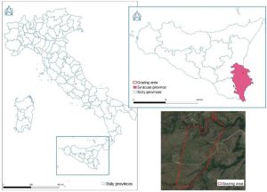
https://www.sciencedirect.com/science/article/pii/S2405844024091977
GIS application 2:
The second GIS map that I chose is related to Tasmanian Devils and the tumor disease that they were, and still are developing, killing a large portion of the population. Through GIS scientists learned that the animals would eat roadkill or other food that gave them the disease, and then would communicate with other animals that would also eat the food and in turn, also get sick. The map helps scientists understand threats to the population that killed the animals which they then investigate, helping to boost the number of Tasmanian Devils while keeping the number of infections low.
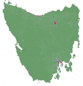
https://science.sandiegozoo.org/science-blog/mapping-devils-playground-boosting-populations-gis
5. I finished the quiz!