Askill 6

9.1- Made first buffer easily. Done. 

9.2- Liked this one because I compared 9.1 and 9.2 together. 

9.3- Got to step 6 but couldn’t complete the tutorial because I couldn’t find the travel settings group button. I looked it up on google and the search bar on GIS. 

9.4- I got all the little green dots on the screen. (INCOMPLETE)

9.5- I liked changing the names and colors of the dots. I was able to do this one. 


10.1- Done. Saw the map shift colors and got different dimensions. 

10.2- Tried. Got done with the first part then couldn’t find the correct layer to symbolize. I tried every layer but couldn’t find one layer with all of the correct things to put in.

10.3- I tried entering the code into the raster calculator and double checked it but it didn’t work. I just entered the names and numbers, but it didn’t really work for the rest of the tutorial. So I just moved on to chapter 11. 


11.1- I liked playing with the different keys and changing the layout of the map. 

11.2- Followed the book but some of my map was cut off. Probably a small mistake I made. But I was able to finish this tutorial. 

11.3- Favorite tutorial yet. Made the trees. 

11.4- The first part of this looked cool with the little dots making up the buildings. I also liked creating the bridge. 

11.5- Done. Interesting to see the different layers in both buildings. 

11.6- Struggled a little bit but finished. I liked looking at the street view. 

11.7- Making the short animation was really cool because you got a mini tour of the city. 


Askill Week 5

4.1- Couldn’t get the tracts to paste inside of maricopatracts. The paste button was not available. 

4.2- Didn’t do the second step (zoom to layer) but got through half of it before encountering more problems. My tracts table did not look like the one in the book. Then arcgis pro crashed and tracts was lost. 

4.3- My dot map didn’t turn blue. It still stayed multicolored. Got the code correctly. 

4.4- Fully completed. Only one page long 

4.5- Simple. 

4.6- Saw the difference in the hierarchy tables. 


***I had problems downloading data.

5.1- Complete. It was cool to see a different perspective on the map. 

5.2-.4- Completed easily. The shorter chapters are easier to understand because there’s not a lot of steps to mess up on. 

5.5- I got the first part downloaded in the folder, but I couldn’t extract the second part from data.census.gov to the folder. It downloaded the table but there was no way to put it inside the folder. 

5.6- I entered the data but it didn’t outline the county. My only options were land use 1 or 2. I added the data for Minneapolis into my drive but when I went into ArcGis Pro it didn’t show up when I hit add data. 


6.1- Struggled to find manhattan neighborhood, but found it eventually. Complete. 

6.2- Complete. 

6.3- Easy. Only had to do one thing. 

6.4- Done.

6.5- Done. 

6.6- Complete.  It was cool to see the different areas on the map. 

6.7- This was probably just a me problem, but I couldn’t find fire company 76. 

*This chapter was mamangable. Most of the tutorials were on the shorter side, which makes it easier. 


7.1- Little confused about this tutorial. 

7.2-  I made my red parking lot in the middle of a field. And then I drew the red over the parking garage. 

7.3- My map didn’t look exactly like the one in the book, but it was very similar. 

7.4- Got the different shapes and colors to match. Complete. 


8.1- Fairly simple. It was nice to see Ohio finally being used in GIS. I liked the street view. 

8.2- Complete. The first thing I did, didn’t change the map at all. So, I probably didn’t do that right. But the end result looked like the photo in the book.


Askill Week 4

Chapter 1- 

This chapter was doable. Starting off was a little rocky but once I got the map pulled up, I was able to start going through the experiments. The first tutorial was really helpful with orienting myself with the main pages in ArcGis Pro. I was able to do most parts of this chapter. 

Chapter 2- 

There were a few times in this chapter where I just got stuck and couldn’t finish the tutorial because I couldn’t find the button. Google helped a little. Especially in tutorial 5 of chapter 4, I couldn’t find the template symbol. But overall, I got most of the tutorials done, they just might be missing a few things. For tutorial 6, when I entered the value of 0.02 or 0.04, it would delete that column and I didn’t know how to stop it from doing that. I manually changed the percentages on the left side of the screen. 

Chapter 3- 

I successfully shared the two maps for tutorial two. But the first tutorial was kind of confusing and challenging. I got the maps labeled but couldn’t find the button for the bar graph. I tried googling and searching on ArcGis on the command search but still couldn’t find it. 

Health Care Clinics.pngHealth Care Clinics.pngHealth Care Clinics.pngNew York City Zoning and Land Use.png

Askill week 3

Chapter 4- 

Mapping density is a good way to create and generate maps. This type of map lets you use different features to clearly see the data the map is trying to portray. Every map at the beginning of this chapter was showing how density maps can be created. They are all showing density, but in different ways. There are two different ways to map density, by defined area or by density surface. But making this type of map also has its drawbacks. Dots being too big on a map may crowd the map so you cant see certain areas or important lines. 

Different shades of the same color is the easiest way for me to see density patterns. Using different colors for population density is a great way to see where the majority of the population is located on the map. This section was full of different types of maps all geared around density. The most important thing to remember when using color is to use the same shade. With the same shade, people can easily decipher what areas are more dense than others, using the shades. If you just use random colors to represent the different densities, people will have to keep looking at the key to try and figure out what density relates to the color. 

It’s interesting to see how each map is so similar, yet different in its own way. This chapter really helped me understand how to demonstrate density in a map. There is no one right way to do it. Each data set needs a different way to construct the map to fit with the data. There were a lot of different ideas coming together in this chapter. 

Chapter 5- 

There are so many different ways of mapping inside of an area. The forest few pages of this chapter kind of go over some examples and how they might look. The second example that the book gives is a great way to look at streams and the environment and try to figure out how water affects certain plant species. The majority of the steam is surrounded by forests. The urban areas are mostly surrounded by agricultural land. This tells the person looking at the map that agricultural land is usually around people’s houses, like urban areas. 

Discrete features of a map are unique and identifiable. They are very easy to list or count. Some of these features are addresses, streams, pipelines, or parcels. These features give clear representation of an area. They are well defined on a map and can be easily spotted and made. Continuous features extend over a continuous area. They are not individual points, but areas. Some examples of continuous features are elevation, temperature, vegetation, or population density. Both of these two types of features are important to determine different types of maps and map needs. 

The comparing methods chart on page 147 of the book was very helpful because it summarized all of the different types of methods in one spot. It’s easy to see the three different methods, and which one to use for a certain type of map. Drawing areas and features is easy, but you can’t get the information from inside. Selecting the features is good for getting information inside an area. Overlaying the areas is good for finding displays within several areas. This chapter gave a different perspective on maps with all of these different features and looking inside. 

Chapter 6- 

Mapping what’s nearby offers many advantages to make the mapping process go easier, as well as looking at the map. Mapping nearby areas adds a separate layer to the map, meaning more information and knowledge can be obtained from looking at the map. The map on page 183 truly needs the streets to be added to the map to determine more information from the map. This map shows a fire station and the nearby streets surrounding the building. Its important to add more streets away from the fire station to determine the best route for a fire truck to get to a certain house, or to see how many streets and houses a certain fire station has to look after. Straight line distance is a good approach for creating a boundary around a certain area. All you need to create this is a layer containing the source feature and a layer containing the surrounding features. This process is pretty easy and quick, but it only gives a rough estimate of travel distance. 

This chapter was helpful in digging down into the details of how to create a perfect map using GIS. Every map is different, so there are different tools to use in order to get your map looking the way you want. Different features and tools do different things, so it’s important to familiarize yourself with the basics before creating a map.

Askill Week 2

Chapter 1- 

The first chapter starts out by saying that more and more people are starting to use this software and spatial analysis. GIS analysis is a certain process that looks at geographic patterns and finds relationships between features. It’s important to ask good questions in order to understand and collect the right set of data. Posing the original questions correctly is the key to correct GIS analysis. Selecting the correct method is also important. There are two different models that GIS can be used with: vector and raster. In my opinion, the raster model is easier to see, but the vector model gives more data for the area. It’s important to mention that maps usually distort what they are portraying. With small areas and towns, the distortion is barely noticeable. Data tables are also very crucial with the use of GIS. Three common methods used with data tables are selecting, calculating, and summarizing. Selecting is just selecting the features you will be working with. Calculating is measuring the data and putting it into certain areas for reference. Summarizing is combining all the data and looking it over. 

Overall, I liked this chapter because it gave a simple intro to GIS and why it’s commonly used. I learned about different features: discrete, continuous phenomena, and summarized. All three of these show different types of information collected. 

I also learned that there are five different ways to describe a feature. The easiest one for me to see is ratios. This attribute value shows the relationship between two quantities.  A commonly used ration is population (density) and proportions. It’s also very easy to see the data collected using ratios because everything is color coordinated and in separate boxes and lines. 

Chapter 2- 

It’s very crucial for us to be able to map where things are so we can navigate, communicate, and educate ourselves about a certain area. Police use maps to be able to look and see where the most amount of crimes are. In those areas, more police officers can be dispatched to help keep the neighborhood safe. Deciding which map to use is also difficult because it needs to portray the information correctly and match the needs of the viewers. A good point the book makes is about an audience that is unfamiliar with the area. If viewers don’t know what kind of map they are looking at, it might cause some confusion or just straight bewilderment. Landmarks or certain roads or boundaries might relieve some of this confusion. Different colors (green for forests, or yellow for cities) might also be a solution. 

This chapter went into more detail about how GIS works in relation to our everyday lives. I liked looking at all of the photos because they gave examples of the different types of maps that can be created by using GIS. A lot of the map examples in this chapter show streets, neighborhoods, and crime rates. The maps about neighborhood location with family size and industry really shows how cities are broken up, and where people tend to live. Office buildings and industries are downtown, with housing being more in the suburb areas. 

Chapter 3: 

I’ve never really thought about this before, but maps are usually mapping most and least data. This is quantity data. Mapping lets people see where the most and least things are, for example, businesses. Discrete features are a good way to determine simple most and least data. How thick the line is or how big the circle is determines how many of something there are in a certain area. Always keeping the purpose of the map in the back of your head is an important way to determine what needs to happen to the data collected. In other terms, is it about the data or presenting a map? 

When constructing a map, patterns are good to look at. Patterns represent different features on a map, such as land use or vegetation. Patterns also aid in visual representation on different areas on the map. This chapter was focusing on how to turn the raw data into a pleasing map for viewers and other scientists. The map needs to be scientifically accurate but also simple to understand. Having a key to explain what the data is, is also a critical part because without a key, then people have no idea what the map is talking about. 


Askill week 1

  1. Hello! My name is Alida Askill and I am a freshman at OWU. I plan to major in environmental science and zoology. I am from Seven Mile, OH, which is a very small 
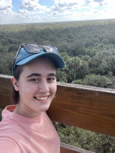
town located in southwest Ohio. I have always been interested in the outdoors and wildlife conservation. 

2. Before starting to read the article and look up answers on google, I didn’t really know much about GIS and how it works. It’s cool how one system can have so many different uses throughout the world and spectrum. Companies from starbucks to police officers are using GIS in order to get their job done. All of these different places need the GIS system to turn spatial data into digital data. I had no idea that the GIS system was being developed back in the 1960’s. GIS is both focused on the hardware and software of the technology, so there’s lot of different components coming together to create GIS. A lot of the different diagrams and maps are similar to the ones I used in my stats class last year. There’s a lot of different types of areas of study that use GIS. In simple terms, GIScience answers the how questions, while GISystems answers the what questions. GIS is truly involved in our lives every single step of the way. 

3. Two examples of GIS applications are within the fields of marine biology and public health. Within the field of marine biology, GIS is used to map floor beds, determine ocean currents, manage oil spills, and so much more. People can use GIS for public health by mapping where certain diseases are more common, or mapping emergencies and coordinating between different emergency responders. There is a map below put out by the CDC with help from GIS relating stroke death rates to the area of the USA. This is very helpful to see where many of the stroke patients are to better understand the disease. 

Mapping marine habitats lets scientists study the relation between species and their fellow organisms. Ecosystems can be determined using this system. The map below shows the same area of Sleeping Bear Dunes located in Michigan. The same area is broken up into four different types of mapping, showing depth of water, geomorphological features, habitat segmentation, and backscatter utilities. All four of these different types of maps can be brought together to see how all of these things affect habitats and the animals that live there. 


This is a link to a site describing how habitat mapping on marine sea beds  are helpful and how they are conducted.

https://www.livingoceansfoundation.org/science/habitat-mapping/