Bzdafka – Week 6

Chapter 7. 7-1. This chapter focuses on polygon data, such as how to make and edit polygons. To move an existing polygon, use the select tool, then go to the edit tap and select move, you can then freely move the polygon around, when it’s in the correct position click the green checkmark. To edit an existing polygon shape use the edit vertices button under the edit tab, then add points where you want to make changes then drag the highlighted areas to create the desired shape. To split a polygon use the split tool.  


7-2. This section teaches us how to create and delete polygon features. To create a polygon use the create feature class tool, and select polygon as the geometry type. To draw the polygon, go to the edit tab and select create and then the layer you want to work with. Using the line function draw the outline of the polygon and double click the last vertices to finish drawing the polygon. To make a polygon transparent select the layer then click feature layer and then in the effects group type in your desired transparency level. As you create polygons it is automatically added into the attribute table for that layer. To delete polygons, use the select feature, click on a polygon and then use the delete button in the edit tab. To snap a polygon to something such as a street use the snap function in the edit tab and then click create to make a polygon. 


7-3. This chapter is about using cartography tools. We used the smooth polygon tool to take away the edges on a polygon. 


7-4. CAD’s or computer aided drawings are often used in conjunction with GIS to display where something is and the interior of it, such as an academic building. CAD drawings cannot be edited directly so the data needs to be exported as a feature class. The new layer that was created converted polygon data to polyline, so the apply symbology from layer tool to import symbology to the polylines. To select the whole CAD layer, right click the feature in the contents pane, then go to selection, and select all. To merge the CAD layer to the actual feature layer, use the modify button in the edit tab. Then select Similarity 2D, then add new links. You then add points on the corners of the CAD layer and then on the corresponding concerns of the actual layer. Then when you are done click transform in the modify features pane. 


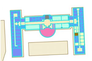
CAD layer on top of the actual feature layer. 

Chapter 8. 8-1. This chapter is about using geocode data. This is in essence features that have been assigned a name or value by a human, it is then matched with data that is present online or from a database. To start creating a geocode of zip codes, use the create locator tool, and import your data, select zip for the role, then for *ZIP select GEIOID10. This creates a locator in the catalog pane. To turn it into a geocode find the locator in the catalog pane, right click it and go to properties, then geocoding options, then match options. Use the geocode address tool to create addresses using your locator, this generates points on the map.  To rematch data, you can go to data for the layer, then click rematch. The collect events tool is useful for counting the number of features in a layer and generating graduated symbols for said feature. 


8-2. When using a geolocator, it is possible to alter the accuracy of the algorithm. In this section we set the min and max values for accuracy to be 10. This resulted in points with low accuracy. 


Chapter 9. 9-1. Chapter 9 focuses on spatial analysis tools. In section one we learned how to use buffers, which is just a polygon surrounding a map feature. To create a buffer around point data use the pairwise buffer tool, then if you want the output features to all be in the same layer set the dissolve type to be into a single feature. To calculate the frequency of points within a buffer select features that intersect the buffers and then calculate the summary of a field within the data table for your class of interest. 


9-2. To create multi-layered rings, use the multipole ring buffer tool, and input your set distances. To measure data within those rings, use the spatial join feature so that the data from one layer can be summarized in the rings. 


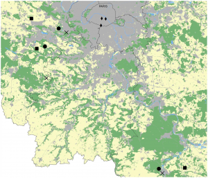
9-3. To determine distance as a function of time in arcpro, create a workflow. This is done by selecting the attributes you wish to work with, then in the analysis tab clicking on workflows, then network analysis, and service area. Once this is done select the class you wish to work with, in our case it was Facilities, then click on the service area layer ribbon, then in the travel settings select towards facility for direction. The cutoffs section is for the travel time. Click the run button on the left side of the tab to run your analysis. 


9-4.  This section teaches us how to use a network to create a model to show which public pools are located so that they achieve the optimal amount of attendance within a given range. This is done by creating location allocation in the network analysis tab. Then in the data group import the facilities that are going to be used, then import demand points. The demand points are essentially people that can potentially use the pool, this is how the model will draw lines later. In the travel settings group, select towards the destination for direction, then include the number of facilities you have in the facilities group. Once all information is entered, click run model (it also helps to hide the demand points). 


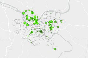
9-5. Performing cluster analysis. Using the multivariate cluster tool, we are able to perform cluster analysis using multiple variables.


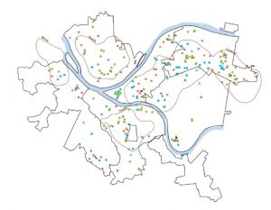
Multivariable analysis of age of arrested individuals 

Bzdafka – week 5

Chapter 4. 4-1. This section is about making a geodatabase. These are useful since you can continuously add data to them, and they have no limit to the amount of feature data that you can add to it. To start, make a new project map, then add the data that you need, in our case it is the Maricopa County folder. To add this navigation to the contents pane and click folders then add folder connection and select the folder you want to import. To accrual use the data in the folder we imported we had to convert a shape file (an old file type) to a feature class. To convert from a shapefile to a feature class go to tools in the analysis pane, then select the export features tool. There are other export tools that can be used to convert different types of files (like CSV) to tables (Export tables). Note that to turn off a layer in a geodatabase you need to delete the feature, you can not simply turn it off like in the contents pane. 


4-2. To create a new column in a data table right click the feature class, go to its attribute table, click options, then fields view. Add a new field, then save. It will likely have no data in it so go back to the attribute table then right click the new column, then calculate the field. In the calculate field pane double click the data you want to be imported to that column then ok. To join tables, right click your desired feature layer, then click joins and relates, then add join. This join is not permanent so in order to make it stick right click the layer you have been using this whole time, then click data and export features. This converts the table that was made into a feature layer. 


4-3. This section has us using attribute queries which allows us to select data rows and spatial features based on the values we tell it. This is similar to the SQL we did in the previous week. We have to use a script to do our query and some key things to know are: text values need to be in “”, number values do not need to be in quotes, most of the time an or statement needs to be in parentheses. To display only features that we want from a class, use select by attribute and use the expression you want, then open the attribute table for said layer, then go to properties for that layer and make a definition query and use the same expression you use to select, then click ok. This displays only the features you want displayed, and this can be verified in the table. To make an “or” expression with the definition query write out your expression and then click the SQL editor button to see the actual script, then add parentheses around the or statement. We used attribute selection to observe the amount of burglaries on weekends vs. weekdays. This was done by using a definition query to select the month of august and the crime type and attribute select to filter the days of the week. We selected Saturday or Sunday, and then in the attribute table we can use the switch button to select all the weekdays and back; allowing us to see the distribution of weekend and weekday crimes


4-4. This section teaches us how to use the spatial join tool. This tool allows you to join the spatial data from 2 feature classes into 1. To do so just locate the spatial join tool and select the layers you would like to join together. 


4-5. Creating central point data for polygons generates a point that is in the middle of a polygon. This is done by using the calculate geometry attributes tool, selecting your input field, then using 2 fields of X and Y with the central point as X, and Y coordinate respectively. This is a good way to generate graduated symbols since they are centred. 


4-6. This section is about creating a table for data that is hard to interpret or understand called one-to-many data, which includes terminology or codes that untrained people likely cannot interpret without a reference (i.e. police or FBI codes). To join the table with the data, right click the point layer with spatial data, then select joins and relates, then add join. 


Chapter 5. 5-1. This chapter is about spatial data, specifically how coordinate data is interpreted and generated. There are different types of spatial data projections that are useful at different scales due to the curvature of the earth. The standard coordinate projection that is used for GIS is GCS WGS1984, but it is not good at showing real spatial distribution, so instead we used Hammer-Aitoff world to show the globe, which shows distribution rather well at a global scale. This is done by right clicking the base map and going to properties, coordinate systems, projected coordinate system, world, and then Hammer-Aifoff. 


Hammer-Aitoff world map projection. 


5-2. It is good practice to visualize projections that show good area, over shapes and angles. A good projection to use for the continental United States is Contiguous Albers Equal Area Conic. 


5-3. When choosing a projection for the United States check the livingatlas website for your study areas code. This helps to choose a projection that is best for your region that has the least amount of distortion. This section also includes how to add data to a map, this is done by clicking add data under the map tab and selecting the data you want to add. 


5-4. There are many ways to store data, and many file types. Some of the most common for shape files are .shp, .dbf, and .shx. Those files are for geometry, attribute tables, and indexes of spatial geometry respectively. To convert a shape file to a table just like with feature classes, use the export features tool, then right click the table and select create points from table, then select current map under coordinate system. To convert KML data to a feature class, use the KML to layer tool. 


5-5. This section has us downloading US census bureau data and using it to make our map. To get started go to census.gov/cgi-bin/geo/shapefiles, choose a year, and layer type. Then further census data can be downloaded from data.census.gov. To format the data in XL we made columns: GEO_ID, MALE_BIKE, and FEMALE_BIKE for our commuter census data. 


5-6. To add data from the living atlas, go to the catalogue pane, then select portal, then living atlas. This allows you to use data from the web, in our case we accessed the NLCD which shows national land cover usage. We then used the extract by mask tool to create a mask that only shows the raster data in Hennepin county. In the extract tool, in the environment under the extent tab I used the current display, and then the extent of layer buttons to select Hennepin county. Contour data and other types of data can be found at apps.nationalmap.gov/downloader


Chapter 6. 6-1. This chapter deals with dissolving block groups and aggregating polygons. To dissolve block groups use the pairwise dissolve tool. 


6-2. This section teaches us how to create a study region using multiple layers with an abundance of features. To display only a region from a layer, use the select by attribute function to select your designated space, then go to data for the layer containing said feature, then click export feature and create a new layer. Then to select data within your exported feature you can use the select by location button to designate the layer you want to select data from and where you want that to be localized. To clip 2 layers together, use the pairwise clip tool, this allows you to select data within a given area. 


6-3. To merge multiple layers into one use the merge tool. 


6-4. To merge points from 2 datasets into one, use the append tool, the target dataset is the one where all the points are going and the input datasets are where the data is coming from. 


6-5. To generate a layer that has lines or points intersecting a given set of data, requires the use of the pairwise intersect tool. 


6-6. To create a layer that has set data that is combined from 2 other layers, use the union tool. 

6-7. The tabulate intersection tool can be used to associate data with different classes, such as assigning a split amount of disabled persons to different fire companies.

Bzdafka – Week 4

Chapter – 1: 1-1. We made a map of Allegheny County, Pennsylvania. We started by highlighting Allegheny county, then we displayed the Urgent care clinics in the area, the FQHC clinics, Poverty risk area, population density, as well as rivers and Pittsburg for context. By looking at this map you can clearly see that the distance between hospitals increases as population decreases.

1-2. Zooming in and out of the map while vector data is being displayed can either mask or display it. Such as if you zoom in to a certain extent then vector data is no longer shown and if you zoom out it is redisplayed. This was shown when we turned off population density and selected poverty density instead, which is raster data and is displayed all the time regardless of magnification. To zoom in on a given area you can use the scroll wheel or you can press shift and draw a rectangle and it will zoom into that specific area on the map. 


We then used SQL (structured query language) which is how we query tabular data. We used it to select McKees Rocks; this was  done by selecting the Select by attribute button in the map tap, then Municipalities was selected under input rows, then in where we selected Name, then is equal to, lastly Mckees Rocks. 


1-3. To look at attribute data for a class, you can right click on it in the contents pane, then select attribute table. When doing this we adjusted where the website was in the table. Data can also be sorted by right clicking on the column and sort either ascending or descending. Data can also be turned off in the display, this is done by opening the attribute table and clicking the menu button (3 stacked lines) this allows you to rearrange features or turn on/off their visibility.  In this window you can also select a number of features, or to exclude features from a selection you can click the select button, click on an amount of featured data displayed on the map, then in the attribute table by selecting switch it will select all of the features besides the ones that were highlighted on the map. 


Descriptive statistics can be generated using GIS. To do so in ARC, navigate to the analysis tab, click tools, expand toolboxes, analysis tools, and summary statistics. 


1-4. To change the appearance of a symbol for a class such as a point, right click that class in the contents pane, click symbology, and then select the current symbol and the new symbol you would like to use. In this pane it is also possible to change the color of the symbol. Similar to symbology you can label and alter the labels of certain classes. We used municipality data, and labeled it. This is done so by right clicking a class and selecting label, then you can alter the text by selecting label properties. 


We were also able to include data that was not previously in the contents pane by going to the catalog pane, opening the database, and dragging parks onto the map. This added a new class to the contents pane. 


Chapter 2: 2-1. This chapter is about using maps to solve or investigate problems. This chapter looks at using different layers to best represent different data or variables, and this is achieved through using thematic maps. This is a type of map that has the subject/variable in full display and uses spatial data to  give context to your subject. 


To highlight land use, go to symbology for a given class and then select unique values for primary symbology. This then generates colors for each feature type, it is possible to select specific colors within this panel. This is done by clicking more and then formatting all symbols.  


2-2. Using the map made in 2-1 we added general and detailed labels. When selecting a class in the contents panel it opens up 3 ribbons, one of which is titled Labeling and this allows you to select the type of field to use, in our case we used zone. Once you’re done making your selection click the large Label icon. To remove redundant labels, right click the layer you want, go to labeling properties, position, conflict resolution, remove duplicate labels, and then select all. 

To remove pop-ups right click a class and then select disable pop-ups. To manage them go to configure pop-ups, double click the fields, deselect the Only Use Visible Fields and Arcade Expressions, along with the Display box, then you can select the features that you want displayed when you click on a polygon. 

2.2 New York city land use map. 


2-3. Some maps have a large number of features, such as point data. In cases where you want to filter what is being displayed, you can do so by going to the properties of that class, selecting Definition query, new definition query, then creating clauses for the features you would like displayed. We then used symbology to change the color and shape of the points for different food facility types. This makes it easy to distinguish between the different facilities and it also makes it easy for those with colorblindness to understand the map. 


2-4. In this section we created a choropleth map which uses colors, and color values to visualize data. This method uses natural breaks as a default setting, but quantile classification can be a suitable alternative for a first time use since it’s easy to understand. To make a choropleth go to the symbology for the layer you want to use, select graduated colors, then your choice of field, your chosen method (quantile or natural break), your number of classes, and your choice of color scheme. You can also make a histogram to observe trends in the data. To convert a 2D to 3D you can do so by going to the view tap, in the view group section click convert and select to local scene. Then drag the layer you want converted to 3D to the top of the layers heading. 


2-5. In this section we create graduated symbols to display data. This is done by changing the symbology to graduated symbols. 


2-6. To use percentage data, create whatever symbology you want to use, then go to advanced symbology, format labels, then change category to percentage, percentage to number represents a fraction, and rounding decimal places to 0. To import the same symbology for a different layer, go to its symbology, go to options, then in the symbology layer, select the layer you are importing the symbology from. To compare layers easily, go to feature layer, and in the compare section click swipe, this allows you to click and drag the screen to reveal the layer underneath without having to turn layers on or off. 


2-7. Dot density can be used to display more than one variable, however when using dot density be sure to use the same general hue for the colors so that it does not emphasize one variable over another. To make a dot density map go to symbology and choose dot density for the primary symbology. The dot value represents the amount of individuals 1 dot represents. 


2-8. When working with visibility ranges it is important to note the ratio that you are using. For instance 1:50,000,000 is considered small scale despite the value being large, this is because 1/50,000,000 is a rather small number. Whereas a ratio of 1:24,000 is considered large scale since 1/24,000>1/50,000,000. To set visibility ranges, select your layer, then labeling at the top of the screen, then if you want it so that if you zoom out any further you wont see the label anymore set the minimum scale to current. This can be done for labels as well as entire feature layers, by repeating the same steps as before in the feature layer tab. 


Chapter 3: 3-1. This chapter focuses on how to share maps with those who have limited experience with GIS or do not have access to Arcpro. This section is about how to make map layouts. To make a layout go to insert, and new layout. To add a map to the layout click map frame and select the map you would like to include. When resizing the maps in the layout, to get the map into full view there is a full extent function in the layout tab. When placing objects in a layout, it is helpful to create guides which can be made by right clicking the rules and selecting add guide, guides allow you to snap objects to them. To add a legend just click one of your maps in the layout to make it active, then click the legend button at the top of the screen. To add a chart right click your data frame, then create a chart, select the elements you need to create your chart, then click export to save it. 


3-2. This section focuses on how to share/publish a map. To do so a map needs to have a base layer, and a property of the map needs to have been changed. To share a map, highlight the map layer in the contents pane, then under the share tab, select web map, then insert any information you need, click everyone for it to be a public map, then click share to publish it. To view your maps, go to arcgis.com, sign in, then go to contents, then my contents and your map will be displayed there. To modify the symbology in the web version, click the layers button, select your layer, then go to styles on the right side of the screen, this is where you can change the symbology. The same can be done for pop-ups by navigating to the pop-ups tab on the right side of the screen. 


3-3. This  section teaches you how to use ArcGIS story maps. This is essentially a better version of google sites. It allows you to create storyboards that include maps and charts. To start working on it insert a picture for the background at the top, by clicking the add cover button and selecting an image. Then you can start typing where it says “add your story”. To insert maps click on the plus button and add a sidecar then select your map. 


3-4. This section teaches us how to make a dashboard, which is a map that has other forms of data accessible such as charts. To make a dashboard start by uploading a map to arc online. Then open the map and click open the dashboard. From here you can add a table by clicking the plus sign button that says “new element” then the middle of the map, and then by selecting table. To add a chart it is the same thing but select the type of chart you want to insert instead of a table. Dashboard – Bzdafka 

Map displaying age of 311 calls to have overgrowth debris removed. Size of point corresponds to age

Bzdafka Week – 3

Mitchell Chapter – 4 is about mapping density. This was mainly shown as population per county/census tract, or businesses per area. Mapping density is useful because it can be a way to display ratio data using either graduated colors, points or contour lines to visualize patterns. As an ecologist it could be useful to look at density maps showing percent logging or percent population in a given area so that I can find good study sites. The chapter covers different ways to display density on a map, and the main two methods are through points or density surface. When planning to map density it is important to think about what it is you are planning to use your map for. If you are planning to just try and visualize a trend and aren’t doing a lot of analysis from the map otherwise, it is best suited to use a large cell size. This is because a large cell generalizes your data, however it also processes a lot faster. It can be refined further to have a smaller cell size if further analysis is required. 


Key words: Defined area density (density based on area of a polygon), Dot density (area mapped by count/amount and each dot is given an amount to represent), Cell size (amount of space that the GIS uses to represent data, smaller is more detailed but takes longer to process).


Mitchell Chapter – 5 is about what is actually represented by the map, and what it can be used to interpret. This can be done by designating an area surrounding a central point or by layering data on top of one another. This chapter also includes different ways to highlight different details about the map, such as by using just an outline of an area, outlining and shading an area, or by screening out the space around the area. Some applications for this that I can see, is by using census data to find out the amount of people living in poverty within a given area, this can be done by defining an area and than using graduated colors or symbols to show the count for the feature data within the defined space. A scientific application that I could use this for would be to map the land use types for a study area, say Delaware county, then I could define my specific study sites within the county and then use the land use map as a sort of base layer to determine what the land use type is for all of my given field sites. 


Key words: Single area (area surrounding a central point), Count (total number of features in an area), Frequency (number of features within a given value or range of values inside the area).


Mitchell Chapter – 6 is about determining distance from a source. This is often expressed as a cost, whether that cost be time, money, or physical distance. To do so you need to define your area, by selecting either a line, network, or a surface. Measuring distance can sometimes be difficult as the earth is curved and depending on the scale of your area it is sometimes necessary to use the geodesic method to account for the earth’s curvature. A few things that can be done by measuring distance or cost induce: generating lists of customers near a given business to give advertisements to, counting the amount of properties near a fire station, or generating summary statistics around your area. A good use of concepts from this chapter would be buffering an area surrounding a tributary with vegetation and planning this out by selecting the tributary and then creating a buffer a set distance away from the tributary. 


Key words: Inclusive rings (creates an area that is a specified distance away from a given point), Distance bands (similar to inclusive rings, but spanning distances incrementally), Straight line distance (the GIS defines an area based on a source feature and a given distance), Cost by Network (a travel cost is designated per each linear feature), Cost over a surface (Surface features of a specified area are given travel costs), Buffer (a zone is marked out a set distance away from a designated area), Spider diagram (lines are drawn connecting features back to a certain point they are close to)

Bzdafka – Week 2

This week I read Geographic Patterns and Relationships 2nd edition by Andy Mitchell

Mitchell Chapter – 1 is a general introduction to GIS and its applications. The beginning  lists a few applications for maps and GIS, for instance It is possible to map where the most or least amount of something is. It is also possible to map density as well as change. A definition/description for GIS is also provided. In this chapter we are given guidance on asking questions using GIS, and we are instructed to be as specific as possible, which leads me to wonder where the line of specificity is? Meaning how general or broad can I be about asking a question so that it still is effective at providing an answer without providing a misleading or useless answer. 

The rest of chapter 1 delves into how to frame a question, and how you can use data generated by your map. For instance you can summarize data generated from the map. It is also possible to use satellite imaging to create continuous data which is good for visualizing patterns such as precipitation, soil characteristics, and temperature. When using continuous data it is sometimes good to use raster data which works well since raster data is a grouping of cells, whereas vector data is based on individual points.   


Key Words: Discrete features (pinpoint data), Continuous phenomena (data that can be found anywhere), Features summarized by area (data found within set boundaries), Vector data (areas defined by points and set polygons), Raster data (data represented as a matrix of cells)


Mitchell Chapter – 2 explains how to create data before using it as well as data storage to display either detailed or general information. It also covers different ways to represent or draw data on a map, either through lines or in a given area designated by points. It also discusses best practices when it comes to data visualization when using maps and spatial data. For instance when using spatial data, it is necessary to have coordinates present so that you are able to plot sites with the GIS, it is also beneficial to have a character or attribute associated with the coordinate data so it is easy to group them together. Then when grouping similar types of data you just graph them all as either the same color or with a distinct shape. Similarly to statistical programs like Rstudios, you can subset data and have only specific values shown. When assigning categories it is best to have as few as possible as this makes it easiest to distinguish patterns (a good amount would be 5-7), however having a larger amount displays more detailed patterns. 


Mitchell Chapter – 3 explains how it can be helpful to use spatial data to represent numerical data, such as how many people work at a specific location by using graduated symbols (using larger points to indicate more people). This type of visualization can help explain where something is as well as give context to what is being displayed. Data can be organized by rations (percentages), or by ranks which order data from least to greatest. When creating all this data it can sometimes be too unwieldy to use and hard to interpret as a viewer so it is best to create classes, which groups data into designated categories. There are many different ways to create data classes and there are also a number of types of classes that can be used, and each one is useful for different things. Some of them are good for seeing generalized patterns, while others are useful for making sure the data is properly displayed if it is not evenly distributed. 

Key words: Ratio (a proportion or percentage), Rank (ordered from greatest to least), Class (Data is grouped into a class representing certain ranges to make a map more concise), Natural breaks (data in a given class are similar, represents natural groupings found in your data), Quantile (each class has an equal number of features), Equal interval (classes are made by grouping a set amount of creatures into each class), Standard deviation (classes are generated by how many standard deviations away from the mean they are), Graduated symbols (points representing counts), Graduated colors (colors used to represent rations and ranks), Charts (graphs generated in the areas they represent), Contours (lines representing counts or rations, most noticeably used for precipitation and barometric pressure), 3D perspective views (3D images used to display magnitude of data).

Bzdafka – week 1 


Hi everyone, my name is Alex Bzdafka. I am a biology and environmental science double major here at OWU. I’m a junior and I’m on the track and field team, my main event is pole vault. I’m excited to be learning GIS because being able to utilize spatial data is something I am unable to do currently and it will be very helpful for my future research and career. I focus my course work on plant ecology, and my research is on plant-pollinator interactions. 

The week started out by reading the syllabus and the schedule, followed by taking the quiz and acing it. After that work I did the reading, which explained some history behind GIS and how it was essentially developed a number of different times and by different individuals and groups. I found it interesting how the book listed a number of uses for GIS and how versatile of a software it truly is. The book also interestingly discussed the differences between GIScience and GISystems. GIScience is more of the computer science and mechanistic study of GIS itself and how the program functions. GIScience also looks into the validity of the program and how it defines polygons when tasked with isolating or grouping spaces. GISystems is more of what we (the students) are, and what we are being trained in; as GISystems is the actual use of GIS in assisting with projects. 


After completing the reading I looked into some of the uses for GIS. The possibilities are seemingly endless as the software is very broad and can be used in many different capacities as long as you are willing to be creative with it. The most basic use case of GIS is to visualize space, however it is also a powerful tool for visualizing data similarly to a graph. The main uses I see for GIS are in agricultural consulting (which I plan to do in the future), as I can display soil conditions on various properties, and track it over time. I can also use it to visualize water movement which can be used as a proxy for soil infiltration rate. I also would likely use GIS to map percent plant coverage (not grass) to show plant diversity, and soil coverage which prevents splash erosion and soil compaction by rain. I have mainly seen GIS used  in literature for categorizing land use types, such as urban/developed, natural, semi-natural, and agricultural (Geslin, et al. 2013). 

Map showing natural status of given areas. In green are natural areas, beige are semi-natural, and grey are urban/impervious areas. 

Geslin, B., Gauzens, B., Thébault, E., & Dajoz, I. (2013, May). Plant pollinator networks along a gradient of Urbanisation. Plant Pollinator Networks along a Gradient of Urbanisation. https://journals.plos.org/plosone/article?id=10.1371%2Fjournal.pone.0063421  

Evers, J., & Editing , E. (2025, June 5). GIS (Geographic Information System). Education. https://education.nationalgeographic.org/resource/geographic-information-system-gis/