7:
In chapter seven, we learned how to edit polygon features as well as how to use specific tools to directly depict these features. I really enjoyed chapter 7 as it reminded me of working with vectors in Adobe Illustrator, where you can adjust shapes using various tools and vertex points. When creating polygon features, I found the trace tool very satisfying to use. Learning how to smooth out the edges of the polygon was also very satisfying. I also found it interesting that when the chapter was teaching us how to transform features, it used an AutoCAD drawing as a base to transform. Until now, I had no clue that AutoCAD could be utilized by ArcGIS, as I am semi-familiar with AutoCAD software. In chapter 7, it also says we can click and hold the wheel button on our mouse in order to pan around the map when in editing mode. This was helpful information that I wish the book had told us when making feature edits earlier.
8:
Chapter eight was more confusing than the previous chapter for me. It has to do with geocoding, which is the ability to convert various geographic data descriptions/addresses into geographic coordinates that can be displayed on a map. To be specific to chapter 8, it taught us to geocode using zip codes and street centerlines. These actions that allow for geocoding are done mostly through the use of specific tools found in the Geoprocessing pane. Throughout the later tutorials, sometimes they dont actually say “run tool” when that step needs to be conducted. I guess it can be assumed that the tool needs to be run, but I prefer tutorials that are very detailed and explicit in their instructions. This was a small detail, but it made the workflow feel slightly less clear and more frustrating at times. It also doesn’t help that you don’t get a visual on what you’re imputing until the very end of the imput.
9:
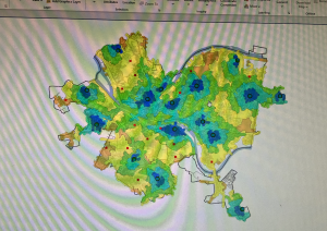
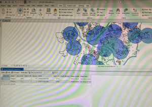
I ended up understanding the concepts from chapter nine much better than in chapter eight. With the concept being how to work with/display spatial data, which is (to my understanding) the area surrounding a data point that can be utilized to answer specific questions. For example, we created service areas to help compare how often a pool is used by youths depending on the travel time to said pool. The travel time is visualized by the service areas as ring boundaries around the pool data point. As expected, the use rate of the pool was decided as travel time went up. I also may have found this chapter easier because, unlike the previous chapter, you could visually see the map changing as you performed each little step.