Chapter 7:
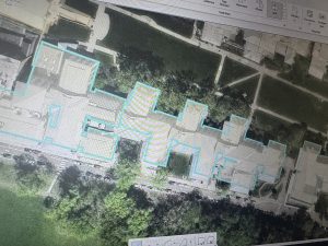
Chapter 7 was one of the most hands-on chapters so far, and I honestly liked that it felt practical instead of just procedural. Learning how to create, edit, and adjust polygon features made GIS feel more interactive. Moving vertices and reshaping buildings took some patience at first, especially when I accidentally selected entire features instead of individual points. Once I got comfortable with snapping and adjusting boundaries, it became much easier and actually kind of satisfying.
Working with CAD drawings and spatial adjustments showed me how GIS isn’t just about viewing data — it’s about improving and updating it. I could see how these tools would be useful in real-world campus planning or city development projects. If a building changes shape or a parking lot is added, these skills would make it possible to update the map accurately.
One thing I noticed, similar to earlier chapters, is that sometimes the wording in the book didn’t perfectly match what I saw in ArcGIS Pro. That caused a little confusion, but I’ve gotten more confident using the search tool to find what I need. Overall, this chapter helped me feel more independent in the software rather than just following instructions step-by-step.
Chapter 8:
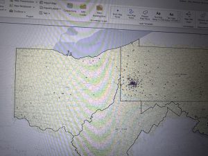
Chapter 8 focused on geocoding, which at first seemed straightforward but actually required more attention than I expected. Learning how ArcGIS matches addresses or zip codes to spatial locations helped me understand how tools like Google Maps might work behind the scenes. The idea that there’s a scoring system for matched and unmatched addresses was really interesting.
Creating the locator and working through matched versus unmatched addresses was probably the most challenging part. At times, I had to go back and double-check fields because one small mismatch would cause errors. However, once I understood what the software was looking for, the process made much more sense.
I also liked seeing how the same data could look different depending on the basemap used. It made me think more critically about presentation and how the background layer affects interpretation. While I’m not sure how heavily I’ll use geocoding in my final project, I do think understanding this process is important because it connects tabular data to real-world spatial patterns.
This chapter definitely required careful reading, but it helped me feel more comfortable working with attribute tables and troubleshooting errors.
Chapter 9:
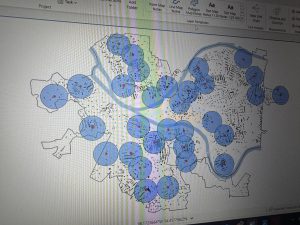
Chapter 9 was probably my favorite of the three. The buffer tools were really cool to visualize. Being able to create proximity zones and adjust the radius made the concept of spatial analysis feel very clear. Seeing the blue buffer circles expand or shrink depending on distance helped me understand how GIS can model real-world impact zones.
Using the Pairwise Buffer tool and creating multiple-ring buffers showed how planners or policymakers might analyze service areas. I started thinking about how this could apply to environmental science, like mapping wildlife hotspots or pollution impact zones. The Network Analyst tools were also interesting because they move beyond simple distance and consider travel routes and accessibility.
One thing I noticed was that changing units (like switching to U.S. Survey Miles) affected the output in ways I didn’t initially expect. That made me realize how important measurement units are in GIS analysis.
Overall, this chapter felt like it tied everything together. Instead of just editing data or matching addresses, we were actually analyzing patterns and relationships. It made GIS feel more powerful and applicable to real-world problem solving.