Chapter 1:
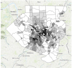
Starting with a completed map and working backwards is an interesting tactic to teach beginners how the system works. That way the maps are already mostly constructed and the learning is very specific/ centered in a certain task within that map. Connecting to that, the “Your Turn” sections of the book is a smart way to ensure the reader is actually grasping the material. It makes you use your own brain to work through what was just done as a tutorial on your own. Also, the textbook including photo examples alongside the tutorial is very helpful in making sure I haven’t messed something up. It’s a good visual guideline. On the contents pane, the way it’s arranged to be from what’s drawn first and “on the bottom of everything” makes a lot of sense in regards to a map and layering. I knew everything had its own layer from reading the earlier chapters, but the tutorial extended that thought even further by having this particular overlay. It makes a lot of sense to me that the layers are drawn on top of one another, it’s almost like altering a physical map by adding marks directly on top of the paper.
A personal connection to the system of GIS that I had thought about when working was the shortcuts. Taking “snapshots” and using Ctrl S to save the project is something I’ve instinctually been drawn to do after spending years working in Photoshop with a similar shortcut interface. I never wanted to lose work, and from that I learned to always save my work, which I’ve found really carries over to this system as well. By having an original base saved/ snapshotted, it lowers the impact a mistake might have on the project, ensuring there is always that beginning point to return to if needed.
Finally, I had a slight moment of frustration at the end of the tutorial when it came to the labeling. The program is such a large system, and it has a crazy amount of buttons, so simply locating where all the different buttons and options are was a lot to process. It was frustrating when I couldn’t figure out where something was hiding in the interface.
Chapter 2:
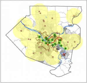
This chapter diverged from the 2D maps, into adjusting them to be seen as a more prominent 3D. I really liked the way that the interpretation of the maps can completely change between 2D and 3D. How some details that may relay a certain type of information isn’t the same linear with the two styles, or how an aspect of the 3D model can bring to light information that couldn’t be seen the other way. This really brings to light the idea of understanding your map. Knowing who/ what the map is for, in order to adjust and label it in a way that will relay the kinds of information needed within its purpose. This chapter really focuses on clarifying the details of the map. By making the subject notable while also adding the necessary context to the background.
Something that I found interesting while working on this chapter, was the mention of color blindness. Which was something I hadn’t actually thought about once when creating all these models of colors. It was neat to see the inclusion of altering how a map is displayed so a person with color blindness could achieve the same aspect of detail when mapping, even without using bunches of colors. It also doubled as a lesson in understanding how to change the symbols of a map, and explaining that a variety of shapes can be used instead of colors to convey the same knowledge of the key.
I will add as a side note, that I absolutely love playing around with the different colors! Obviously the purpose of a map is to convey information, but I find it fun to adjust the colors in an aesthetically pleasing way, or to pair associated colors with the topic of the map.
Chapter 3:
This chapter was interesting because we pivoted even more and went from working within the ArcGIS Pro, to learning the Online system. On that topic, I feel as though in a way, ArcGIS Online is a much smoother/ easier interface to work with. I don’t know exactly how to explain that, but maybe it’s due to the fact that it’s online and available for anyone to access. Perhaps it’s made a bit simpler and cleaner for anyone to play around with and use. Before that section of the tutorial however, I really liked following the detailed explanation of how to create layouts from scratch. This is a very useful skill, in being able to make any style of chart or map view of the project for easy download and display. I liked how the textbook described going about making these layouts. To think about retaining this goal of designing it in a way that anyone could understand it, like you’re sharing the maps to those with no experience in the software. It reminded me of the explanatory mindset of teaching something in a way a child or an alien could grasp.
I have a creative mindset, so I adored the section of the chapter that revolved around storytelling within the StoryMaps. We were giving the map’s their story. In a sense, this is leaning into the analytical aspect of the “Geospatial Analysis.” I appreciated the angle of art, from adding a cover image, to having the potential to completely change the design/ layout. This part, just like creating layouts, is highly important to know how to do. The uses for the completed story and layout are endless. My first thought was using it for a website, or some form of journalism as I thought it resembled an article in a way. It’s returning to the idea in the first textbook of the many everyday uses that GIS has.
The quote from the mathematician, John Tukey, “minimize ink!” is very applicable to mapping on GIS. And I rather enjoyed the idea of never deleting any values even if they don’t add anything to the image. It’s like with art, you might take a hundred photos or create notebooks of sketches, and only a handleful could be things you actually like and will use. You don’t just throw the others out though, because they still hold power in what they don’t show. It’s better to keep something and not use it, then to delete it and realize you really did like it, or did need it after all.