Chapter 1:
-After installing the software and downloading the tutorial files, I imported the first file and began completing the lessons.
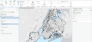
-I learned how to go to a bookmark as well as turn on and off layers by selecting them in the contents page.
-Switching basemaps allows you to overlay the data onto a variety of map backgrounds which can be useful for focusing on specific features.
-By Changing the layer order in the content pane, you can change which layers appear on top of which others
-You can create, save and export specific layouts for your maps in a variety of formats and settings.
-You can see all the attributes for a data type by using the attributes table, and sort the table by ascending or descending values.
-You can select data using the attributes table and generate summaries using different statistical tools.
-I learned how to change and add symbols signifying the location of various data points, as well as how to label data points.
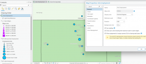
-I also learned how to view and navigate the 3D map projection, and how to switch between map types using the catalog pane.
Chapter 2:
-I learned how to set the color and fill for various features, as well as how to set them based on specific attributes, such as zoning attribute
-By labeling specific features, you can add additional information, in conjunction with using fill colors and borders
-You can also remove these labels for certain features only, or remove those of them that are redundant.
-By performing a search query, you can narrow down the range of a certain data set based on attribute, and using boolean operators add or reduce the selection using other attributes to select only the desired data.
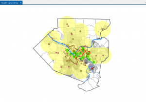
-I learned how to make choropleth maps to summarize numerical data and display the results as easier to understand heatmaps, as well as how to extrude them using the 3D view.
-Using graduated data points can help show the proportional differences in quantities or sizes between different features of the same type on a map.
-Choropleth maps can also be normalized by using percentages, which can more accurately display certain types of data, and by using dot density maps, multiple attributes can be displayed on one map at the same time, using different color dots for each attribute.
-Finally, visibility ranges can be useful for hiding certain features at different zoom amounts, and altering the detail level based on how much of the map is in view.
Chapter 3:
- I learned how to create custom layouts that can be exported to be used in other softwares, or shown to non GIS users.
- Many arrangements, sizes and styles exist for the layouts, and multiple maps, along with legends and other text can be combined in a single layout.
- Various types of charts can be created as well, to illustrate trends in the data in ways that a map could not.
- Maps can also be shared online to be viewed on a different device or by others.
- I learned about making interactive maps using the storymaps feature, and how you can create dashboards, which allows you to interact with the data in a predetermined way, and build toolkits for specific use cases. (Such as the city debris collection one from the tutorial.)