Chapter 1: Introduction to ArcGIS Pro
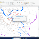
This chapter introduces ArcGIS Pro and its interface, including how to open projects, manage layers, and navigate maps. It explains vector and raster data, essential for working with spatial information. The tutorial covers file geodatabases, which organize data efficiently, and basic map functions like zooming, panning, and exploring attributes. A key takeaway is how GIS helps visualize spatial relationships by layering datasets like population and land use. However, the 3D map failed to open for some reason, which made it difficult to explore certain visualizations. Questions that came up: What’s the best way to manage multiple layers? How does ArcGIS Pro handle large datasets?
Chapter 2: Map Design and Symbology
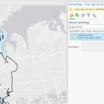
This chapter focuses on making maps clear and visually effective. It covers symbology, which helps represent different data types, and definition queries, which filter datasets. The tutorial walks through adjusting colors, labeling features, and classifying data for better readability. However, symbology is not working the way the tutorial describes, making it challenging to match the expected results. This issue made it harder to properly classify and visualize the data as intended. A key lesson is that good map design balances clarity and information. Some questions: How does symbology impact data interpretation? What are best practices for making maps both useful and visually appealing?
Chapter 3: Sharing and Presenting Maps
This chapter covers how to create layouts and share GIS work. It explains adding legends, scale bars, and titles for clear presentations. The tutorial also introduces static and interactive maps, highlighting when to use each. However, the second map in the tutorial is showing blank for me, which prevented me from completing most of the exercises. Because of this, I continued reading through the chapter instead. A major takeaway is that maps should be designed for their audience, whether in print or online. Key questions: How can layouts be optimized for different users? How can interactive maps be made accessible to beginners?