Chapter 1: In the first tutorial, I focused on learning how to change basemaps and add features to the map. This step was fundamental because selecting the right basemap provides the context needed for effective analysis. By the end of the tutorial, I had successfully completed the tasks and felt more familiar with navigating the interface and working with map layers. The second tutorial expanded on this by teaching me how to explore the map more effectively and adjust its features for better visibility. I learned how to zoom in, pan, and manage map layers to highlight key data while minimizing clutter. A key takeaway was learning how to access and use the attribute table, which made it easier to locate specific areas and quickly filter relevant information. In the third tutorial, I improved my ability to navigate the attribute table and use it to extract useful data. For example, I practiced sorting and filtering entries to identify key patterns, such as areas with high population density. Additionally, I explored the toolbox to generate quick statistics from the data, which helped me better analyze trends. The fourth tutorial introduced customization techniques for map symbols, allowing me to modify colors, shapes, and labels to improve the map’s clarity. I practiced toggling labels and feature classes, which helped reduce visual clutter and made the map easier to interpret. I also explored the 3D view, which was ahighlight of the tutorial. Seeing the data from perspective offered new insights into spatial relationships and made the mapping process more engaging.
Chapter 2: The first tutorial expanded on adjusting symbology by teaching me how to customize map features using different colors, shapes, and symbols. This helped improve the map’s clarity, making it easier to distinguish between various data layers. The second tutorial introduced the labeling tab and showed me how to modify pop-up displays. I practiced configuring labels and adding relevant details to the pop-ups, allowing users to view important information, like names and statistics, by clicking on specific features. In tutorial three, I learned how to create definition queries, which allowed me to filter and display only the data that met specific conditions. This provided additional practice with symbology as I adjusted how the filtered data appeared on the map. Tutorial five covered displaying data using both quantile intervals and defined intervals, which helped me better classify and visualize ranges of data. Tutorial six then focused on importing symbology and adjusting it to make comparisons between different datasets, such as income levels versus population density. In tutorial seven, I created a dot density map, which visually represented quantities by distributing dots across the map based on data values. Finally, tutorial eight taught me how to control labels based on zoom levels. This ensured that labels only appeared when zoomed in, keeping the map clean and free of unnecessary clutter.
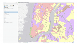
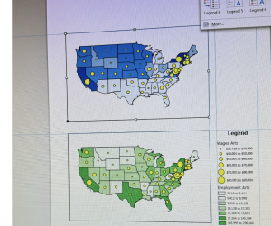
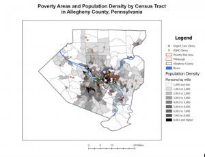
Chapter 3: The first tutorial was extensive but packed with valuable information, giving me a comprehensive introduction to several key features of ArcGIS. One of the highlights was learning how to compare two maps on the same sheet, which allowed me to analyze and contrast data more effectively. This feature was particularly useful for spotting patterns and relationships between different datasets, such as comparing population density with infrastructure distribution. Although I encountered a few challenges during the tutorial, the overall experience was rewarding and gave me a deeper understanding of how multiple layers of information can be visually integrated. In the second tutorial, I learned how to publish maps and view them through ArcGIS. This step was important because it introduced me to the process of sharing my work with others and collaborating on projects. I practiced customizing the map’s visibility settings and explored how to control who could access my published maps. This is especially useful in group projects or when presenting data to others outside of the GIS environment, as it ensures that the information is both accessible and secure. Tutorial four focused on creating dashboards, which I found to be one of the most practical tools in this unit. Dashboards provide a streamlined display of key information using interactive charts, graphs, and maps, making it easy to track and visualize real-time data. I experimented with setting up different widgets and filters, allowing me to tailor the dashboard to specific data queries. This tool will be invaluable for organizing complex data and sharing clear, concise visual summaries with others. For the photo below, there was an error where I couldn’t insert the legend. Overall, this unit significantly improved my understanding of ArcGIS and how to apply its various tools to real-world scenarios. I now feel more confident in managing, analyzing, and presenting geospatial data, and I look forward to incorporating these skills into future projects and assignments.