Chapter 1 – Introducing ArcGIS
Tutorial 1 – Nothing too terribly complicated or difficult. I was able to figure out how to add various base maps through some of the bigger buttons. I had also figured out some of the basics of layers & saving.
Tutorial 2 – This one seemed to not be too difficult either. However I did eventually run into an issue where in the pop-up tab, I was unsuccessful in finding the hyperlink. But I did eventually find out that I had accidentally shrunk the tab and couldn’t find the hyperlink at a glance. To find attributable data to a thing we are looking for, click on it, then look into the popup panel, click on the data under the arrow to find more information about said item. Holding ctrl will shut on/off all of the displayed things under the ‘content’ bar. If I wish to find something very specifically, go to the map tab, find selection group, and then click ‘select by attributes’. Then run the seach for the feature I am looking for.
Tutorial 3 –
To find data regarding a certain part of the map, right click on the entry. When working with FOV. Do not delete things that I need later. In order to only select a certain type of data when I click on the map, I will want to find ‘list by selection’ under the content window. Afterwards I will want so check what I want selectable & uncheck those I do not.
Tutorial 4 – Symbiology is found when you right click on something in the contents tab. It is in a weird place sorta in the bottom of the middle.
Chapter 2 – Map Design
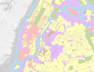
Tutorial 1 – To do unique colors for categorical information provided by departmentalizing the data: use the unique value function within the primary symbology pane within the symbology pane. And change the fields as needed. Afterwards do more -> format all symbols.
Tutorial 2 – To remove duplicate labels; open the label properties page via right clicking the layer. Once this is done, fine ‘position’ and click the conflict resolution button. Then expand the remove duplicate labels area, and click ‘remove all duplicate labels’
Tutorial 3 – “Definition Queries”. To add a definition query begin with… Right clicking the data set under contents and going to properties. And there are many different choices that can be made with the symbology of certain features. It is best to try keeping them consistently different.
Tutorial 4 – I have ran into an issue where the map is telling me that I do not have a valid data source attached. I am going to move onto Tutorial 5 and hope that this error does not happen again.
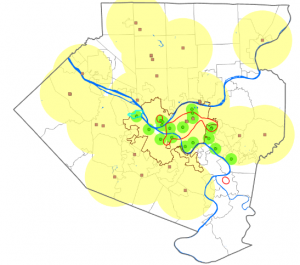
Tutorial 5 – To show symbols over another field of data that is supposed to represent the population of an area. Go into symbiology of the thing you want to overlay, and go with graduated symbols in order to show 2 datasets simutensously. You may do this with 2 sets of similar data to show a comparison.
Tutorial 6 – When making comparative graduated color maps, Do the same thing as tutorial 5, but with graduated colors. Once this is done, Open the symbology pane for the map we want to compare. Then click options & import symbology. Afterwards open the apply symbology from the layer pane and apply settings to say that we are targeting a different field using the same settings from the original symbology layer.
Tutorial 7 – No significant challenges or issues. I guess I should note that the ‘dot value’ means that for every dot it represents X many people when setting up a symbology for population density.
Tutorial 8 – When wanting to make something appear at a certain distance & disappear when further, use the ‘Maximum scale’. And when vice versa, use the ‘minimum scale’
Chapter 3 – Maps for End Users
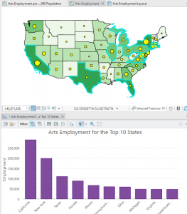
Tutorial 1 – To put my map into like a page, go to insert, then go into new layout. Then select what i want, go to map frame, find the map I want to insert, and then click ‘default extent’. Drag a box from -x,-y to x,y to determine where I want the map on my page. If I want to make suure the maps are of a particular dimensions, right click the image (map), go to properties, and then manually edit the width and length. Full extent is found in the navigate portion of the layout. To make sure the whole map fits in the frame, go to the ‘Map’ section and find the arrows that point out in the form of a box. An issue I ran into was that I could not snap the maps, i had to zoom in and drag very precisely. When trying to create like a chart, I need to go to the data tab once I have selected a map, afterwards there is some somewhat self explanatory stuff to explain the ins and outs of creating said chart, however if I get completely lost it is on pages 65 – 66.
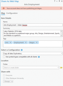
Tutorial 2 – It would not let me share my map, however I understand the gist of sharing things online. If this becomes a bigger issue I will contact professor Kryger and ask for some help.
Tutorial 3 – Minor issue where during the creation of the different headings, there was nothing called ‘subheading’, so I settled on selecting Heading 2. And also due to me being unable to upload my map from Tutorial 2 for some reason, instead of putting a map in the sidecar section, I had put an image of one of my previous maps.
Tutorial 4 – I ran into an issue where i am unable to upload my maps (from 3-2) and I cannot do very much in this tutorial. However fro what I am able to see, it does not seem like a big challenge. Some things for mt to keep in mind to create a dashboard I need to click the upper right of my screen to find the Dashboards. I would then add my map as the core part of this dashboard. On my dashboard I am able to edit the map’s extent, and add various elements & edit my dashboard. This could include various tables, various adjustments to the size, adding charts, and interactions. If I think I am done with my dashboard, in the upper left I will want to click menu, then content. Then share my dashboard, I can find the URL to this dashboard elsewhere easily.