Okay, so that was really fun! I found that it didn’t take long for the steps to become intuitive. Having the step-by-step tutorial took all of the guesswork out of navigation, which was so nice because ArcGIS is chock-full of important features. I also appreciated how the book would explain multiple different ways to access software features. Some were more complicated than others but knowing all of them will be helpful in the long run.
Chapter 1 Tutorial:
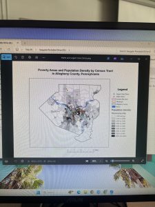
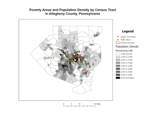
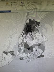
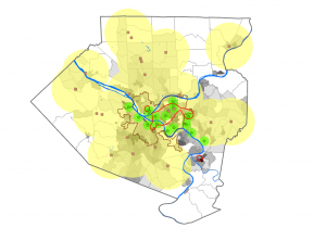
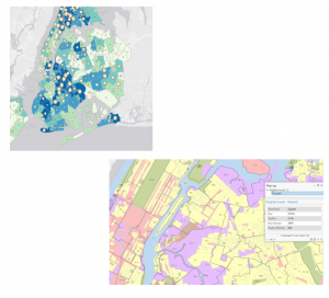
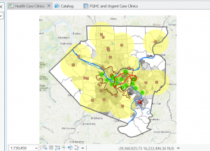
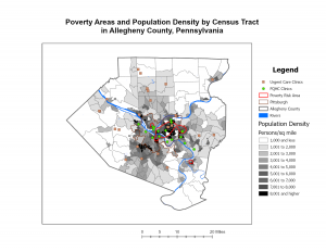
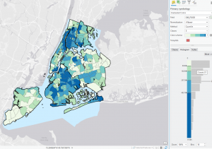
This chapter of the GIS tutorial introduced basic ways to navigate ArcGIS with a map of Allegheny County, Pennsylvania. It spent a lot of time exploring layers showing spatial distribution of FQHC clinics and “urgent care” clinics, and how they relate to population density and poverty risk areas.
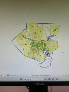
I found myself making conjectures that were then confirmed by steps in the tutorial. For example, after overlaying the poverty risk area boundary with the service radii of both the FQHCs and “urgent care” clinics, I noticed that a small node of high population density and poverty risk was located outside of any health center radius. Then in the following step, the tutorial had me bookmark that area as the McKeesport Poverty Area.
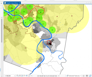
Figure 1: The small red circle outlines the McKeesport Poverty Area.
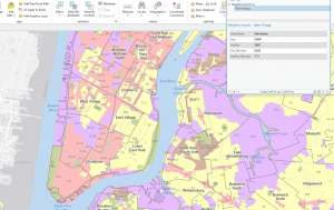
After reading the first six chapters of Mitchell, I was nervous to do work with tables in ArcGIS because they seemed complicated. However, when all the information was supplied, I didn’t think it was difficult at all. I got used to sorting and editing field views quickly.
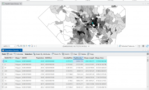
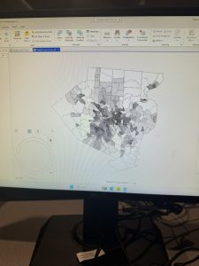
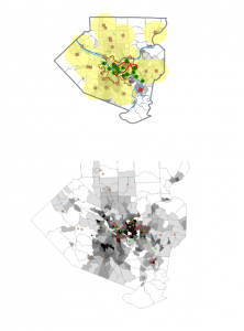
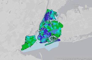
Figure 2: The census tract with the highest density in Allegheny County of 29,493 people per square mile.
I noticed that this area is only 0.075 square miles, which is really small! Looking at the tract area in square miles was helpful, because I initially envisioned 29,000 people living in that small area. I needed to keep in mind that the map measures population DENSITY, not raw population.
Chapter 2 Tutorial:
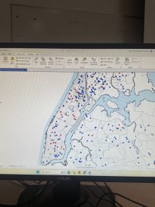
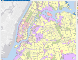
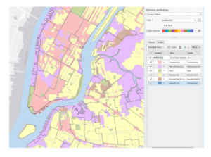
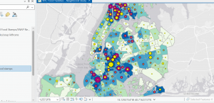
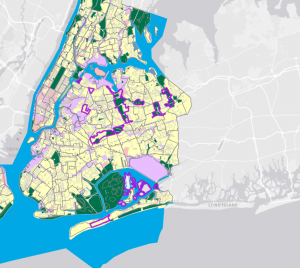
This tutorial chapter focused on a map of New York City and studied distribution of features like food facilities, people reliant on food stamps, and schools. Working with colors in this section was fun! I was able to familiarize myself with symbology with different shapes, graduated sizes, and color shading of map parcels.
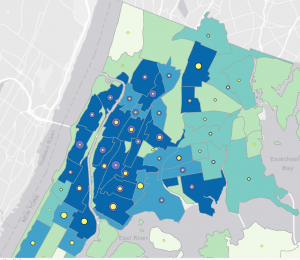
Figure 1: graduated symbols for Number of Food Banks/Soup Kitchens (yellow) and Under 18 Receiving Food Stamps (purple) overlaid on a map of Over Age 60 Receiving Food Stamps in the Bronx.
At first, I was a bit confused during Tutorial 2-5. At first, the purple graduated symbols were overlapping and overshadowing the yellow symbols. So, I moved “Number of Food Banks/Soup Kitchens” to the top of the Contents pane, and now I could see these yellow symbols outlined by the “Under 18 Receiving Food Stamps” purple symbols in the Bronx neighborhood. I noticed that, in the neighborhoods with more than 11,595 people over 60 on food stamps (in dark blue), there are also thousands of people under 18 on food stamps (larger purple symbols). And now that we can see the number of food banks/soup kitchens on top of the purple dots, we notice that there are small proportions of food facilities (in yellow).
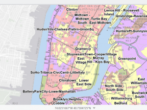
In Tutorial 2-8, I appreciated the emphasis on definitions of large-scale and small-scale maps. Basically, the smaller the ratio, the smaller the scale, and the more zoomed-out the map will be. I’m still kind of developing the intuition for this, but while assigning feature layers visibility ranges, I was able to repeat this process without heavily consulting the tutorial.
Figure 2: A zoomed-out, small-scale view (1:47,409) of Manhattan. Visibility range for schools and neighborhoods is turned off.
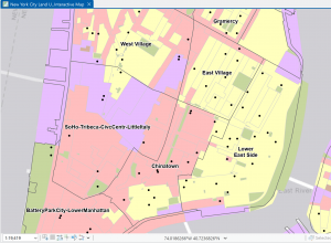
Figure 3: Zoomed in, large-scale (1:19,419) view of Lower Manhattan. Visibility ranges for neighborhoods and schools (black dots) turned on.
Chapter 3 Tutorial:
This chapter focused on developing maps to share with the public on ArcGIS Online, with ArcGIS Story Maps and Dashboards. I have stumbled upon Story Maps before while doing research for other classes, and they seem to be pretty effective ways to present and discuss data!
In Tutorial 3-1, snapping the separate images of maps and legends onto the layout was so satisfying. The Guidelines feature was incredibly helpful, and it is going to inspire me to look for a similar feature in software I use for other classes.
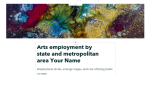
Tutorial 3-3 demonstrated how to build ArcGIS StoryMaps. I found the editing interface of ArcGIS StoryMaps to be very intuitive. I probably made some minor formatting errors—there seemed to be a lot of white space—but for the most part, formatting text, maps, and images was pretty straightforward.
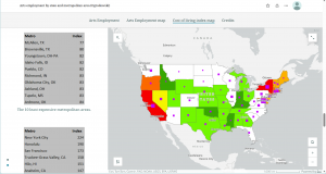
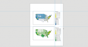
Figure 1: The Cost of Living Index map within the ArcGIS StoryMap.
I liked how the tables and map information scrolled by while the map image remained on the screen. This layout makes comparisons on one screen super easy!
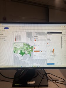
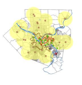
Tutorial 3-4 focused on turning maps and their data into interactive Dashboards. I found this software to be pretty easy to use as well, but I didn’t like it as much as StoryMaps.
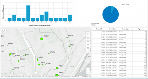
Figure 2: completed Ground Crew Dashboard showing requests for debris and overgrowth removal. It is currently zoomed in on the Spring Hill City view, so the bar graph, pie chart, and table are showing data within this view alone.
The tutorials in this chapter emphasized the importance of creating effective map pop-ups as well. A person who will be using the map is going to want to be able to select areas of interest and receive all the information they need in a pop-up: nothing more, nothing less. The table in Figure contains all the fields that will show up in the pop-up when the user clicks on a specific green circle on the map.