Chapter 4 (3.4):
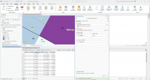
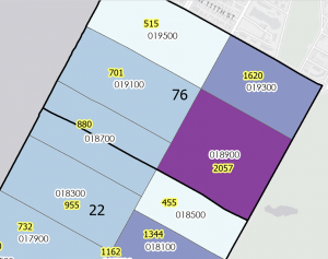
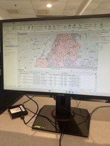
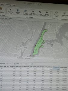
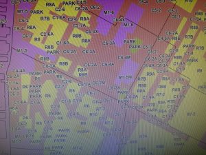
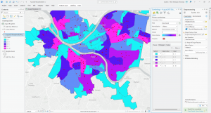
In this chapter, I was able to gain more insight into working with File Geodatabases throughout the different exercises and learning modules. I learned more about spatial databases and databases as a general skill and tool used when working with maps and GIS. In the first chapter, I learned more about importing data into a new ArcGIS project as a means to create a map and input data for different skills. I had issues in this section when it came to importing data as well as in some ways following the directions given to me in the book and project manual. Even though I understand both that I need these methods to learn and later create my own maps and images using data, I still get confused. I then learned how to modify attribute tables, with attribute tables being used to portray and display a lot of what is used in GIS ( in columns of data in tables). While doing this chapter, I felt more equipped when dealing with maps, that’s not the say that confusion didn’t arise at different points, especially as I was navigating between the instructions and the actual assignments, trying to get my work to match everything that I was in the readings while not knowing if it was entirely right or not. Later in the chapter, I learned more about carrying out attribute queries which is the use of linking tabular data to the spatial features in feature classes. In the actual lesson, I used SQL criterion with the attribute name as well as other factors. I hadn’t previously realized that coding or script could be use in GIS as a means to symbolize attribute values that are found in maps.
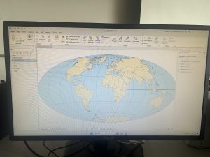
Chapter 5 (3.4)
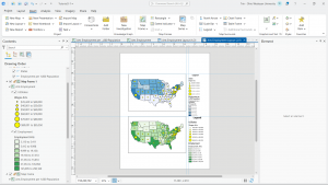
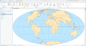
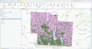
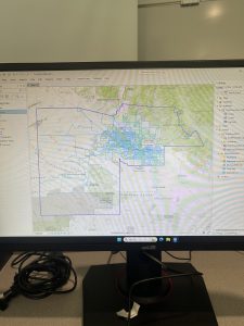
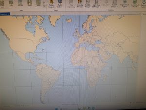
In this chapter I learned about world map projections and the different map windows that can be used in GIS to display and show information. One of the maps that was demonstrated to me was the “fly to Hammer-Aitoff (world)”. I was initially confused on how this information was resourceful to me but then assessed by situation and again understood that any and all information that I am learning in GIS is useful to me, seeing as I didn’t know anything about GIS or mapping before taking this class. I then started working with US map projections that are used commonly in the United States. Connected to this, I learned about using a projected coordinate system and the subsequent parameters that are associated. Lesson two was one of the easier sections from this chapter, which I was very glad about. I then learned about projected coordinate systems which are used for medium and large sized maps (localized). I personally had issues adding layers and importing data, and came to find out I had been saving and putting data in folders wrong that entire time I was doing these assignments. I didn’t want to restructure my approach to everything after having come so far, so I had to change my approach and understanding of importing and naming data that is being put on my map. When talking about importing data, I also had issues with the fifth lesson in this chapter when I had to export data from an outside source for the first time to then bring it back to the map. In this chapter I also had to work with excel and tables from that which I was confused on, I had a hard time figuring out how to find my data in my files while also trying to properly insert it into my map.
Chapter 6 (3.4)
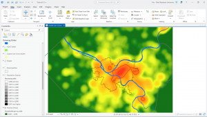
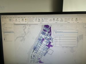
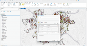
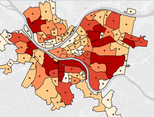
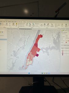
In the last chapter of this section I was sleep deprived while working on it so I made it harder and more frustrating than it had to be. In the first tutorial, I had issues with understanding the instructions while simultaneously getting error signs and messages saying that the data was not being inserted correctly. In the second tutorial where we were extracting and clipping features, I first had issues with learning how to properly select the areas and regions that I needed from the map to then be used for more information. I will say that it most definitely feels liberating when you understand what you are doing or when you finally get the issue sorted out that you were stressing over for an hour. I will say that I was glad I didn’t have to go out onto the web as much for this chapter while doing the tutorials, that’s not to say that it made the assignments easier or took less time to do. In this chapter, I also had issues when trying to interpret the directions both outwardly and incepted in the “your turn” sections. I’m not sure if it was because I was working on this until 5 am or if I was just extra angry, but every time I couldn’t find a function or feature within the first maybe 15 seconds of reading the instructions, I immediately began clicking harder on my computer and having to take deep breaths. This was especially true for when I was working with the different tools in the tool box and I continued to get error signs while my data and codes were processing because I was inputting something incorrectly.
(I also again forgot to take pictures of my work and I fear its to late to go back and capture pictures of anything, trust and believe I’ll add pictures to next weeks work though 🙂

 Chapter 6 was the easiest for me, I had no trouble getting through any of the tutorials and was able to understand the instructions well enough to complete the tutorials in a timely manner.