Chapter 7
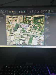
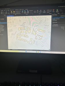
Chapter 7 walks the user through the process of managing a map that contains real imagery. I found this to be a valuable chapter and relatively easy to understand. It taught me how to rotate and move polygons to match the satellite images, as well as create different polygons for new features. The chapter also began to familiarize me with the Edit ribbon, which I feel as though I had not interacted with much in prior chapters. The edit ribbon contained the move and edit vertices buttons. The edit vertices buttons allowed me to add and move vertices to morph a polygon to match the satellite image. There were other ways to edit polygons, though, such as the trace and split buttons. The trace button allowed me to create a selection using the streetpaths as a guide, while the split button allowed me to make two separate polygons out of a single polygon. I had some trouble with the last tutorial of the chapter when asked to import data for a building polygon. I will say that this chapter seemed to easily explain how to change the visual features of a map when needed, which I feel will be quite helpful when building my own maps.
Chapter 8
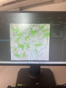
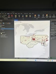
Chapter 8 was shockingly short, with a heavy emphasis on zipcodes and other floating techniques. One technique is the geocode addresses tool, which helps to create dot plots on a map using specific zipcode data. There is also a tool called a collect events tool that does something similar, placing dots, this time with a greater variety of dot sizes. Much of the chapter was a simple walkthrough of different tools, with almost all of them adding or altering points on the map in some way. I find this valuable as it is important to strategize what the most effective way to visualize your data is, and the creators of the GIS platform recognize this by providing the user with many different ways to do this. Additionally, there was some more use of the attribute tables, which is always a good thing to refresh my mind on. I was a bit surprised that ZIP code data points had been covered so late into the textbook, as I would think that this is a form of data that I will be utilizing relatively frequently going forward in my work with the GIS platform.
Chapter 9
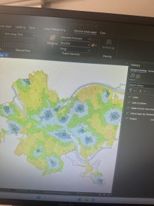
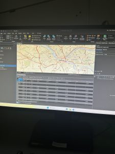
A large aspect of Chapter 9 was to create different types of buffers around different data points on the map. It walked me through how to change the radius of the buffer and what tool to use to create a buffer, which were the pairwise buffer and the multiple ring buffer. The pairwise buffer tool creates a standard radius around the data point, while the multiple ring buffer can create a greater number of buffers, and also provides the option of making them overlap. A lot more was done in the analysis tab within this chapter as well. One of the features from the analysis tab is the service area option, which can change the visual attributes of the data measured within the map. I personally thought that was a cool feature to introduce, and it was interesting to see how different layers of data can be shown in that way. It was also a good way to show how the data can change depending on the distance from a particular point. Another important topic covered within the chapter was the visualization of data in the sense of creating different types of representations, such as tables and dot plots. It felt very appropriate to finish the tutorials off with some additional support in creating tables and such.