Chapter 1
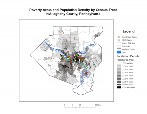
I went into Chapter 1 thinking ArcGIS Pro was just going to be pretty difficult considering I am not a big tech-person. I was wrong, the clear directions made it much easier and the only thing that overwhelmed me was the number of buttons! ArcGIS Pro is less of a “map maker” and more of a massive logic puzzle. What started as a simple view of health clinics in Allegheny County turned into a lesson on how data is actually constructed. It truly did help me understand that a map is simply just data, just in visual form. Seeing population density break down into individual pixels was a reminder that GIS isn’t a perfect mirror of the world, it is an estimate. This statement brought me back to earlier discussions about how GIS users may have too much power, knowing that it can’t be as precise as we thought it could be makes me feel better. When I look at a map now, I think about how we are just looking at a decision someone made about where one pixel ends and another begins. Navigating the interface was also a bit of a learning curve. Features would disappear when I zoomed out, which felt like a bug at first. I eventually realized it’s a design choice to keep the map from looking like a cluttered mess. By the time I had the FQHC clinics layered over the poverty data, the patterns jumped out: specialized care is where the people are, but access to that care is a much more complicated story than just placing a dot on a screen.
Chapter 2
Chapter 2 forced me to rethink my sense of what is truthful in data. I used to think a map was just a factual representation, but this chapter proved that you could take the exact same dataset and tell three different stories just by changing the classification method. In saying that, I take back my statement of a map being a visual representation of data; in a way it is, though in another it is not. I spent way too much time toggling between Quantile and Natural Breaks. It’s mind-boggling how a Quantile map can make a neighborhood look like it’s in a state of emergency, while a Defined Interval map makes that same neighborhood looks perfectly fine. There isn’t always a right way to symbolize data, which is actually kind of terrifying when you think about how these maps influence policy. I am going back to my belief of GIS users having too much power, and this power is definitely being overlooked.
Chapter 3
In this last chapter, I learned how easy it is to get lost in the data and forget that someone who doesn’t know GIS will have to look at this. The shift from the “Analysis” view to the “Layout” view was surprisingly stressful. Suddenly, I’m worried about legend alignment and especially the font sizes (I spent a little too much time messing with that). Working on the layouts showed me that a map is only as good as its delivery. It’s a reminder that GIS is as much about translation as it is about geography. Though, the most interesting part was moving into Story Maps and Dashboards. That’s where the data actually starts to make total sense. Instead of a static PDF, you’re giving the user the power to click around and find their own answers. However, that also feels like losing control. If I set up a pop-up poorly or the zoom level is off, the user might miss the entire point of my work. In a way, it is a semi-risky choice of sharing information, but it definitely feels like the future of how we’ll consume spatial data.