Chapter 1 Tutorials:
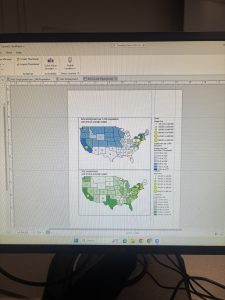
Chapter one focused a lot on how to navigate through the basic aspects of the Arc Gis software such as the contents bar and how the layers are oriented, the various Ribbon tabs and some of their basic functions and how to change details such as Symbology. The next focus of this chapter was introducing how to represent your data in various ways depending on its contexts. This consisted of changing basic aspects of vector data such as line color, changing how raster data can be effectively shown for various data groups, and how changing the orientation of your layers will change what a map represents. This chapter was not too hard to follow along to but it definitely was a lot of material to digest and recall in the your turn sections. I could see myself understanding what we have read about in past weeks better now that I was able to use some of the topics hands on. I also found it way more engaging when the maps were represent real studies and problems that were made more clear as I went through the steps in the chapter.
Chapter 2 Tutorials:
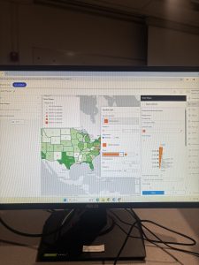
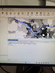
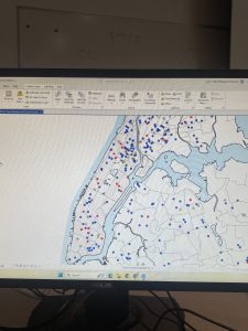
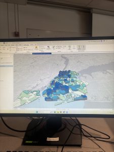
Chapter two focused a lot on how you represent the data on your maps and how this helps you tell an effective story. It discussed how to change the physical aspects of your map so that it is clean and effectively represents each area when you are zoomed in or out along with having your points represented in various icons to give a better visual comparison. This chapter also touched on 3D mapping which I found super interesting once I figured out how to properly do the steps in the program. I never expected this to be an option for representing map data and this chapter really showed me how in depth this program is and how many small things there are within the program to make sure you can effectively represent your data. I did struggle with this chapter a little more and had to redo a few steps and the vast amount of material covered between ch1 & 2 had me a little overwhelmed but as I sat with it longer it all started to click better
. 
Chapter 3 Tutorials:
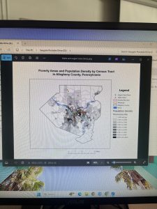
This chapter focused on how you can share your maps and the various ways you can share your data such as charts or graphs, pdf images for presentations, or actual web pages with interactive maps. This ArcGis.com part of this chapter was my favorite because it showed one of the end goals of doing all this work which is sharing your data in a way that you see fit. I didn’t know that Gis had a webpage that integrated with the softwares data which I thought was super cool as it makes it a lot easier to go through the steps necessary to present the info. I struggled a bit when I had to go back in and share my maps on my own but figured it out in the end. Im excited to see how else we use the Gis website with other data that we look at.