Chapter 1 – this chapter shows how GIS maps work and how they work and how to run them. in the first example they show the real basics of the map works as well some of the things we can do the GIS map. At first glance it looks really off putting and but how they set up the tutorials is really simple in how they structure it. They ask us first to look at the population of the Allegheny county. They point out if you move some things in a different order they GIS map dose not work when we move it over we cant see the other things like roads or river that are their. They as us to movie it back so we can add more things to they map. They do as us to put the city of Pittsburgh on their were the greatest part of poverty are. They also tell us we can remove layers so we can get a better view of the things around the city or the population around it . In the second exercise they want us to do is just more around the argpro and get use to doing this in the program. it shows us how to zoom in and how to get really specific to get the best information. shows us how to add date into it and how it should look like when we add it into the software. it also shows how to put symbols on for point like the health centers .it also shows how you can see things like density in a different way. Before reading this chapter i was very worried about doing GIS stuff because i have never done anything like it. After reading this and doing the tutorials it feels like i can do this and it would be to hard.
Chapter 2
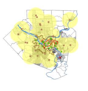
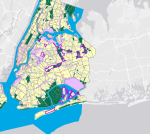
Chapter 2 was a very fun yet somewhat interesting chapter. For the first part, we split the Bros into many different colors to determine exactly what they were, which, in my opinion, was very fun yet somewhat difficult after a long day of classes. It asked us to put multiple of. Each part of the city is a different color which trying to figure that out. Was very interesting because the colors had unusual names and were not the usual ones. In example 2 of Chapter 2, we got to label different parts of the city. Doing this made understanding parts of it much easier and simpler to label, such as the lower part of the east side. Doing this made it much simpler for me to understand and to know exactly what to do with it. Hudson put labels of specific things, such as Soup kitchens or food pantries. This was simpler than I thought it would be, yet it still had some difficult parts. The other examples I found very interesting after splitting up the Manhattan area into. Where certain things are, you can see the graduation size based on the data we received, which I thought was very interesting. It took a lot more time than the other ones, but it was still very helpful and made it easier for me to understand what was going on with this map One of the other examples was that we got to do the population of New York in the small area of Manhattan and you got to see how spread out the population was, specifically in The southeast part, closer to the Jersey area where it was super dense and it was. The last example I taught us was ranges for the Manhattan area and the other areas around New York City.
chapter 3
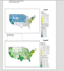
Chapter 3 was a simple, easy-to-understand process. The first part of what we did was create our own map layout. The first part is that we got both maps. Into one page and put it next to both of them. The instructions on this were very simple, making it easy to complete quickly. After you put the two maps on the page, we added guides explaining what each figure meant, population-wise and in monetary terms, for the first map. We did the same things as for the first map, but for the second map. Three put both maps onto the page and made legends for them. We then made charts for each map. We had to enter the X&Y for each state to calculate where they would be pinpointed on an X&Y graph. The second exercise in this chapter was to share our own graph online and explain exactly how to do it. The process was very simple to understand, and it took me very little time to figure this out. Showed us how to share it publicly or privately with specific people so that people from all over can see what we worked on. Also, once we are done sharing this object, we can view it and change how people see it or how they want to view it. They can either zoom in on the feature or adjust multiple layers of the map itself. The last example of Chapter 3 was how to make a Dashboard in GIS Pro. There are a lot of steps to this, but each is very simple and shouldn’t take you long to understand, and it explains exactly what to do for each step. These three chapter have been fun to work on but can be time consuming