Chapter 1
Chapter one introduced us to GIS and how to add projects, work with attribute tables, and change symbols and labels on maps. The chapter also taught us a few terms. A feature class is a “layer” on the map with vector data and corresponding attributes. A raster is an image made of pixels that can only be seen when zoomed in. A file geodatabase is a .gbd that stores feature classes, raster data, and other such files. A project is a .aprx that contains one or more maps and other related items. This chapter used a map with data on health care clinics, namely Urgent Care and FGHC clinics. The first tutorial went over how to apply a basemap, turn on and off and reorder layers, and export a map layout. I thought it was cool that GIS turns the map into a layout for you. The second tutorial taught us how to zoom in and out to specific features, bookmark a feature or location, and search for a specific feature. I am glad this tutorial taught us about zoom to full extent because in the last tutorial of the chapter, my map kept moving off-screen. The third tutorial went over attribute tables and summary statistics. I am still a little confused about these, but the textbook did a good job of teaching how to use them. I wish it had gone over what the acronyms, such as ZIPL, mean and what they are used for. The fourth tutorial taught us how to change symbols and labels. I am glad that the program offered so many different options for symbols, colors, and fonts. This chapter provided a very good introduction to using GIS, and as I went through the tutorials, I was able to find everything faster.
Chapter 2
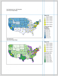
In chapter two, we learned how to color-code features and change the symbols using symbology. I got a lot more comfortable with symbology in this chapter because we used it so much. We also learned how to label and use pop-ups. This chapter focused a lot on choropleth maps, which use color to represent numerical values. They use different methods, such as natural breaks and quantile classification, to display data. I was surprised at how many different colors it provides. The last thing we learned in the chapter was setting maximum and minimum scales. This allows you to only see specific labels at certain zooms, so that the map doesn’t get overcrowded with all the labels. This chapter became more vague with the instructions, which forced me to go back and review how to do certain things that I had forgotten. I am glad it did this because I got a lot more comfortable with doing certain tasks. It was really fun to get into how to make the maps look good and readable. This chapter had a lot more tutorials than the first, but I am glad because it provided a lot of examples. It was very interesting to be able to see and recognize patterns using the techniques from the tutorials, such as the relationship between food banks and people over 60 receiving food stamps.
Chapter 3
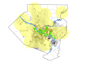
Chapter three was quite different from the first and second chapters. I didn’t enjoy it as much as the others, but it was cool to put what we had made into a format that people can learn from. In this chapter, we learned how to make layouts by putting two maps with a legend and title onto a blank document. It reminded me of Microsoft Word. It was cool to not only design layouts but also a “website” where we could showcase and provide the maps and data. It made me realize how much goes into creating something that the public can use. The debris overgrowth tutorial was really fun. There were so many little steps that went into every part of this chapter, so it was a little overwhelming but also interesting. I had difficulty with the pie chart, graph, and table because they wouldn’t load, so I only saw a spinning circle, but I can imagine that it looked good. Overall, this was an extremely in-depth chapter, and I learned that I definitely enjoy working with the actual data rather than how it looks online.