week 4 Whitfield

Chapter 1 (3.4):

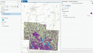
 I Learned about a feature class, a raster dataset, a file geodatabase, and a project. I learned more about ArcGIS as a system and what the tutorials that we are doing are helping us understand and determine. For chapter 1 specifically, I worked with finished ArcGIS maps centered around Urgent care clinics in Allegheny, Pennsylvania with a total of 4 tutorials that I had to run through. Starting with tutorial 1, I learned how to do a myriad of skills including understanding what a book mark is, location the contents pane as well as what is means and includes, and learning how to save a project so that the information you started and worked with is collected on your device if needed for future use. I then learned how to add and remove a base map as well as the definition of what a base map is and how it is utilized in ArcGIS. I learned how to turn layers on and off through using the contents pane and subsections within that. In the first tutorial, I had a lot of issues exporting a map layout to my computer because I wasn’t using a desktop. This was my first time using a lot of these skills so a big part of my experience was trial and error as well as annoyance that I think was warranted, whether that be at my computer, the instructions, or honestly myself for choosing this course. A good outcome out of this is that because I figured out different skills and methods to doing things, I was in turn able to help others that were also confused on what to do or how to do something when it came to starting up the app or the assignments. I had issues opening up and using the 3D map on my computer after it had worked perfectly the first time so I had to do that work at a later time throughout the week in the GIS computer lab. 


Chapter 2 (3.4):


In chapter 2, I learned more about map design and specialization through 8 different tutorials. This chapter was centered around thematic maps with some 3D map usage in a chapter that I had trouble opening on my computer. In these tutorials, I worked with classifying data through codes with qualitative values including low, medium, or high, with the values being mutually inclusive. In the first tutorial, I used symbology through colors as a way to show differentiation and detail within the maps. In tutorial 2, I labeled features and used pop-ups as a way to identify graphic elements like the names of neighborhoods or bodies of water.  I had to specify font, size, color, and placement through labels that are created from attributes which are an important part of cartography and information in a map. I learned how to filter  and create definition queries as well as how Definition Queries differ from Selection By Attribution, with a definition query being used to filter layer features as opposed to selecting a temporary feature to then work with. In tutorial 4, I learned how to create choropleth maps for quantitative attributes which are needed to break a numeric attribute into fewer or less classes. In order to symbolize map features, you only need the maximum set of values (breaking points). In this example, I made a choropleth map showing what households are receiving food stamps. In this chapter, It seemed a little easier to navigate the app and understand where things were and how they were supposed to be used in correlation to what the instructions were telling me to do. I did have issues at times when trying to complete the your turn section and having to relocate all of the information that I was taught, having to look back in the chapters and even resort to google when I couldn’t find the answers I needed. I will say that I am a bit scared or apprehensive about having to make maps of my own after learning about what they entail and all of the steps I will have to take. 


Chapter 3 (3.4): 

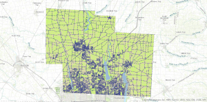
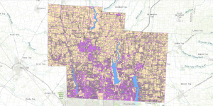
In this chapter, I learned about how to build layouts and charts, how to share maps in ArcGIS online, how to utilize ArcGIS story map, and how to use the arcGIS dashboards. This chapter seemed pretty full circle through using the knowledge of what I learned in past tutorials in the first tutorial of chapter 3, as a means to make a layout and legend for data that someone else transfigured. This chapter was based around how you format and share data with other people, whether that be simply through your work or what sites you present said work on as a means for others to understand, analyze, and observe. I first learned how to build layouts and charts in chapter 1 through map framing and placement. I didn’t find this particular assignment as hard as I thought I would. When I had read that we could be inserting a map and displaying it on our own, I got scared that maybe ArcGIS pro had loosened the reins a bit too far,  especially for someone who still gets confused about the contents pane and how to structure the layout of pictures. In this tutorial I also learned how to structure and place legends that correlate with maps, though I’m pretty sure I messed up on the second map legend because it somehow ended up being vertical instead of horizontal and I had no idea how to fix it. In tutorial 2, I learned how to share and publish maps online through web maps. In tutorial 3, I learned how to create stories that include text, maps, images, videos, and other things. These are intended to be read by individuals. Through using ArcGIS storymaps, you can create briefings that include a series of slides that have short talking points, interactive maps, and other content that is used for showing work to others. It was really interesting to see and understand the work that goes into creating and posting maps with data that you’ve collected (even if for these examples, I was using pre-collected data and maps).

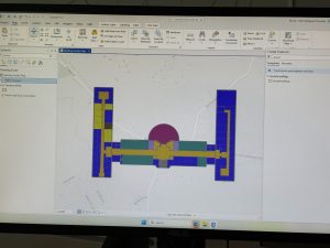
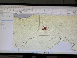
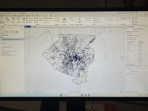
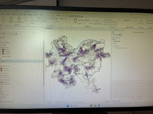
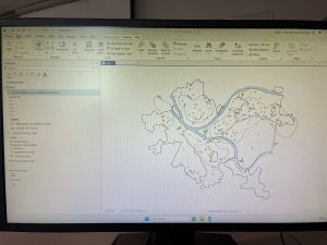
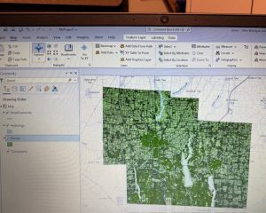
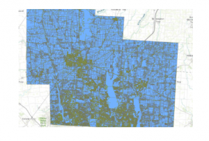
( I accidently skimmed over the fact that I had to add pictures so I only added 1 for the first 2 chapters, and 2 for the 3rd one)

Butte Week 3

Chapter 4:

This chapter gets into the details of mapping the density of a feature. Meaning the map shows the locations of the highest/lowest concentrations of the feature- a mapping style that is very good for observing patterns. Similar to the previous chapters, being aware of the information you’re looking for from the map, and what the features are is a key thing to keep in mind before and when building the map. Chapter four really begins to step out of the correlation aspect between features and tip into a causational mindset of asking questions and developing factual statistics based on an aspect of the map. The textbook goes into detail about all the different ways to map through density, from using points, lines or by area to visualize the map- to measuring specific features, versus their mathematical value. Each method can be placed onto a map in various visual representations, like a dot map or by color blocking areas. I personally find the color blocking to be a much easier, more comprehensible map. Although, I do recognize that there may be specific reasons for conveying a map through a dot map, and appreciate the simpler graphical plotting it takes rather than the area’s calculated steps. This chapter also explains that in relation to a specific location the density and population can be two very different things. The population may be the same, however, the density could be scaled way in or out depending on the size of the area. Think if Texas and California had the same population. Texas is larger, so the density would be more spaced out, while California’s would be a bit more crowded and localized. Chapter four explains how to display density surfaces, which are usually displayed through raster layers, commonly good at representing point/ line concentrations on a map. Continuing off this, the maps can be calculated/ determined through these methods: Cell size (coarse and fine), search radius (generalized vs localized), calculation method (a simple method- only in radius areas, weighted- mathematically), and units (areal units where the density value is calculated). Compared to the next two chapters, this one was relatively basic- and contained an amount of generalization similar to the past chapters, albeit with more depth.

Chapter 5:

Chapter five explains how to make maps within specific areas and to analyze that data from inside areas on a map. Like all the other chapters, it stresses the importance of defining what it is that you are trying to analyse or get information of- if it’s a calculation from single or multiple areas, or from a discrete or continuous feature. The distinction between these two features determines whether you’re making a map with a uniquely identifiable feature or a continuous and seamless geographic feature. Again, it is important to know before you create the map what kind of results you would like to obtain (a list, count, or summary). Knowing this will alter how the map looks at the end of its mapping. I found it interesting that you could decide to manually leave certain features out of the map/ data set. Like, some features can extend outside the area boundary (rivers or roads), so understanding if the information would benefit from keeping those features within the area data, or not is a good skill to develop. It is also good to note that certain results require these partial boundary features to be included in order to complete the data (example being lists and feature counts). The textbook describes three ways to make the calculation of this inside area. These are: Drawing areas on top of features (map contains a strong boundary of the area), selecting features inside an area (a subset of features from within an area, and is good for summaries), and making an overlay area with features (a mixed method, and is good for comparisons). This section contains examples of what each method is good for and their comparisons, which is very helpful in understanding how each one works, and which ones to use in practice. In this chapter, it provides further detail on how to actually create these area maps, with separate explanations between discrete areas and continuous ones. It explains that GIS can create reports (tables or lists) based on the data of the completed map and area. That it can also make statistical summaries like counts (total numbers), frequency (table/ bar/ pie chart, number of features with a given value) and summaries of a numeric attribute (summary, average, median, standard deviation). Chapter 5 provides clear and distinct step by step tutorials on how to use/ analyse the data acquired and other steps within map making. I also appreciate the call backs to previous chapters, instead of just repeating the information, the textbook references where you can find it and moves on. This kept the chapter from being too repetitive and not getting stuck in past information.

Chapter 6:

Chapter six focuses on a different use of GIS, of finding what goes on within an area and distances around that area in a certain range. It also showed an ability to monitor data within a range, to see the changes and develop a continuous data set. A key component of this chapter’s analysis is through traveling range, the calculation of this data through the measurement of distance, time or cost. Ways to measure this is through straight-line distance, measure distance over a network (streets/lines, connected plots) and measure cost over a surface. This cost is most commonly time, but can also represent money (the literal cost), the effort taken, or travel costs- which are the more precise measurements over the other distance measurements. One thing I thought was interesting was mentioning that maps can differ depending on planar/ geodesic methods, aka flat maps vs. curved maps following the earth’s curve. This is something that when you stop to think, would obviously be different from one another, but because most people are so used to planar flat planes, isn’t a big thought. Following this, once again the concept of localized or global maps is something to keep in mind when creating your analysis. Know the basic, groundwork information before beginning on your map. Another call back to the previous chapter is the list of features, counts, and summary statistics. It repeats certain information in further detail, only better ingraining it into my memory. Like the previous chapters, there are a lot of technical things that are actually quite grounded in common sense. For example, the ability to determine cost ranges through singular and several ranges, or visually creating a map with either inclusive rings or distinct bands. It is simply the technicality of engaging the GIS software to make/ calculate the maps with these features that can be confusing, and need solid explanations. I liked the clarity on three main ways to find nearby features, although by the end of the chapter it did feel repetitive between them. Like, by the end I wasn’t fully confident which method or style the textbook was explaining how to map out. A lot of the instructions are more or less similar to one another- or at least have one thing in common, so that’s helpful. One thing I keep thinking of when reading all these chapters is that I’m quite glad that the GISystem does most of the calculations for me… I would for sure mess up the map if I had to do the calculations myself. It makes me think about how people might have worked with maps and calculating features back before the system was built, how they must have had to learn to do all the math themselves and map it by hand! Finally, I said this for chapter 3, but I love how the textbook includes comparisons between the two options. It was relevant to all these chapters. It makes everything very clear- able to distinguish and figure out which mapping method I should use and why. One question I had regarding the ability to set max distances was if you could also specify a minimum distance, and what reasons someone might have to do so?

Downing Week 4

GIS Tutorial for ArcGIS Pro: Chapter 1

The first chapter takes you through step-by-step on how to complete the first tutorial through ArcGIS Pro. Downloading the chapter was easy once you learned how to do it, and I really liked how the process was so thorough. I completed Tutorial 1-1 and felt like I had a decent understanding of the rest of the work we had to do. It seems like the most there is to do is just following the directions, and that will be really helpful in the projects to come. Some parts were a little confusing and I had to go back and make sure I did everything correctly, so it seems like the biggest part of this is just making sure that you’re paying attention. 

I also liked how it gave us examples of what the maps and graphs were supposed to look like! It definitely helped keep me on track. One of the biggest components was recognizing where everything was on the website. For example, the “Ribbon” at the top features most of the main functions, and that is what Chapter 1 seemed to focus on the most. I also liked the “Your Turn” parts of the demonstration as well, that truly helped me find where everything was and helped me remember, even though it simply just had you do the same steps again. 

Tutorial 1 was focused on health clinics and the poverty and population densities, which was a good one to start. It was not overly complicated and the rest of the tutorials throughout the chapter removed different layers, added features, zoomed in on pixels, and things like that. It also told us how to select different FQHC’s using the control button, and that helped a lot. Overall I thought this section was pretty easy once you got into it! It did take a long time to get everything going, but after that it was good. I have attached two screenshots from my work throughout this chapter. 

GIS Tutorial for ArcGIS Pro: Chapter 2

Chapter 2 was focused primarily on how to create a “thematic map”, which is defined as a map that tries to help define or solve a problem. There are a lot of layers that require attention to detail and “symbology”, which is when ArcGIS Pro uses attribute features and drawings to make figures on a map. I completed Tutorial 2-1, where we primarily focused on changing the different colors on a map of Lower Manhattan. I liked this section because it showed us how to change the color many times, and also gave us a shortcut on how to do it. It also gave me a way to check my work with the finished product located at the end of the tutorial. 

I liked this tutorial because it then showed me how to change the different layers when you want one off or if you want a few more combined. We were able to change the Object ID in one of the next tutorials as well. This chapter also included the “Your Turn” sections, which was good to practice with too. Neighborhoods and the surrounding areas were the primary focus of this chapter, and I like how each one focuses on a different section and appearance. It’s cool that there are different maps for each specific problem or experiment that people are working on. 

We also could do charts with this too! Tutorial 2-6 showed me how to make a histogram which was neat. I’m excited about using this for our final project in the future. This chapter did go by faster, I think because I had gone through the first one and kind of learned where everything was at. I was still having trouble locating things on the “Ribbon”, but I think it’ll just take some time to get used to. By the end of it, I was going through pretty well and was able to locate a lot of features. And all the colors were pretty! I attached a screenshot of my first tutorial of this chapter. 

GIS Tutorial for ArcGIS Pro: Chapter 3

The final chapter for this section was a little more in-depth for me, but still went fairly quickly. I was able to easily access the tutorials through the ArcGIS Pro icon on the computer, and luckily I didn’t have any issues downloading the book onto my external hard drive (Hopefully it stays that way). And this tutorial was focused on making different kinds of maps, which was cool! I felt experienced by the end of it, especially in how to make bar graphs. The two maps were fun to play around with in Tutorial 3-1, and I felt like it helped me better understand how to create maps. 

The first tutorial was longer but had a lot of useful steps. We were taught how to make a layout with two maps and two legends on it, which will be helpful for our final project. Again, I liked the “Your Turn” sections and how it let us complete a section without using direct instructions. It was informative on how to create titles and different papers within one project. I was confused at first on how to create another layout page, but I just had to look harder underneath the “Ribbon” and its underlying sections. 

The chart was also a little difficult at first, because some of the instructions were in different numbers and I skipped over them by accident. However, I figured it out! I liked how we could do the Map Viewer on the website itself, and how it’ll eventually be uploaded into that section. It’s also nice how this book is so useful and easy to come back to if you need any help in the future. Learning how to create a briefing was neat, and even though this chapter began to get more in-depth, it was still fairly easy to navigate with the through instructions. I attached two screenshots of my work from this chapter as well.


Aslam Week 3

Chapter 4
This chapter has been helpful in assisting me in understanding how a GIS maps density.  Mitchell discusses how there are various ways in which density is mapped. There is defined area
density and density surfaces. Defined area density includes dot density mapping, in which the number of features represented by the dots is chosen by the analyst, as well as the location of the
dots inside the defined area. I learned that the final product can be greatly impacted by the choices the analyst makes, especially because the dots do not show the exact location of the
features. Shade density mapping is also included in defined area density and is greatly impacted by the classification methods. Quantiles and equal intervals, discussed in the first few chapters,
come into play again in this chapter, as they play an important role in the final product. However, density surfaces display the density differently because they create a surface based on the search radius from each point. I learned that the final product can be affected by the cell size because it can be coarse or smooth depending on the choices the analyst makes. Mitchell discusses how density surfaces can show subtle patterns that defined areas might not show, but they require extra work and care. I learned that the final product can be greatly impacted by the choices the analyst makes and that density surfaces require extra care. I also learned the importance of using the same classification methods when comparing multiple density maps. One thing that caught my attention is the importance that the analyst has in the final product, as their decisions may affect the final product to a large extent.

Questions:
1. When should a dot density map be used over a density surface?
3. How do the classification methods stop or create false density patterns?

Chapter 5
Chapter five discusses what is inside an area.  Mitchell states that if the analysis is done on one area, the goal is usually to summarize or monitor what is going on inside the area. If the
analysis is done on several areas, the goal is to compare the amount or kind of information inside each of the several areas. There are three ways that this can be done: listing what is inside the
area, counting what is inside the area, and summarizing the attributes of what is inside the area. The third method involves adding up or averaging the attributes of the features inside the area.
One problem that Mitchell presents that I had never thought of before is how to determine whether or not to count features that are only partially inside the area. The second problem is
how the boundaries of the areas are represented. In some cases, the boundaries are represented with an outline, and in other cases, the interior of the area is shaded to help identify the area as a
whole. This, in my opinion, affects interpretation because, with the boundaries, the focus is on the separation, and with the shading, the focus is on the area as a whole. What I got from this chapter was the importance of consistency. For example, the boundaries, if one is represented differently from the other, then the two areas are not being compared fairly. Mitchell is able to
connect this chapter to the previous ones by showing the use of the concepts discussed in the future. This chapter has helped me understand that area analysis is simple but detailed, requiring
a lot of decisions.

Questions:
1. How do you determine whether partially included features should be included in an area?
2. What methods of mapping are best suited to represent the results of boundary-based analysis?

Chapter 6
Chapter six of the book discusses how GIS solves the problem of what is near a feature. This is another important problem that occurs in spatial analysis. In this chapter, Mitchell
explains that there are three different ways of measuring what is near a feature. One way is by straight line distance. This is the simplest method to use, but it is not always realistic since it
does not take into consideration any obstacles that may be encountered along the way. The second way is network distance. This is more realistic since it considers what path one has to
follow. The third one is cost over a surface. This is more advanced since it considers many different factors that may influence movement. The path that one has to follow may be difficult
even though it is straight. There are also buffers, which are used to define what is near a feature by creating a buffer around a feature and defining what is a certain distance away. Buffers can
be used to represent distance, time, or cost, depending on the analysis. The reminder about using planar versus geodesic distance was important to me because it is crucial for obtaining accurate results. Smaller areas can be analyzed using planar methods because the curvature of the Earth is insignificant, but as the area gets larger, it is crucial to use distance to obtain results that accurately represent the Earth’s curved surface. Another topic that Mitchell reviews is earlier concepts such as counting or summarizing features within zones, demonstrating how each
chapter builds on the previous one. What stood out to me is how proximity analysis, although simple at first, can become complex depending on the real-world situation. Different issues call
for different approaches, and if the wrong one is used, it could lead to the misrepresentation of the level of nearness of something. This also made me think of how easy it is to misrepresent the
distance between two points on a map if one does not take into consideration the real situation.

Questions:
1. When is straight-line distance sufficient to be used on its own?
2. How do buffers change depending on the units used, such as distance, time, or cost?