Chapter 1:
“GIS analysis is a process for looking at geographic patterns in your data and at relationships between features.”
Chapter one goes through a lot of the basics and general definitions about the methods, systems and steps of GIS analysis. I found it informative but lacking anything beyond the simple overview on the topics, explaining a further “deep dive” in the following chapters.
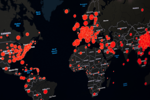
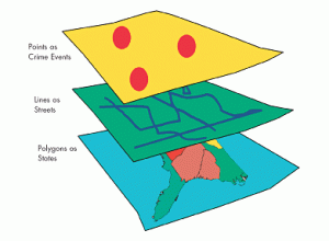
The key ideas/ notes I gathered are: Paying attention to the geographic features are important to figuring out how they’re represented within a map as each feature can vary greatly between one another. Discrete features are specific, pinpointed locations. Continuous features are things that can be found everywhere, all of the time- like the weather. Summarized area explains the density of individual features that are within a boundary and can be categorized through totals and percentages of demographic data. Another important basic explanation was how to represent these geographic features, through vector (specific locations in space) and raster models (continuous space). A major note to remember is that the cell size of the raster layers can change how the image comes out- for example, too large of a cell size can cause the image to lose details. Finally, at the end of the chapter it explains the geographic attributes the features would have. This section was very straightforward and easier to understand, providing a good example of what/how exactly GIS is used to find and convey information.
I will add after reading this chapter that it is a bit confusing to simply read the textbook without putting what it is stating into practice. I think I will probably understand more once we begin working on these systems/ maps through the software. Then I would really be able to come back and connect the dots from the textbook to the software.
Chapter 2:
The second chapter repeats heavily the importance of paying attention to patterns within the maps and data. Stating that identifying patterns are meaningful and can be helpful in deducting why things are located a certain way, or finding the correlation between two features. Chapter two gives a lot of information on the key words and ideas that were discussed in a general sense from chapter one and in the beginning of this chapter. It very clearly explains what GIS does for each map- from storing the location of a geographic feature through coordinates to drawing images/ symbols from those coordinates, creating patterns between them. This chapter also contains a few addditional guidelines for what the created maps should look like, and how to make them. With a key point of making sure the maps are easy for the audience to comprehend, appropriate for the issue being discussed, and contain no unnecessary information. Occasionally including a landmark or reference location depending on the type of map/ data, the audience and reason for being made- the map presentation should vary considering the information being processed within it. How people are directed to perceive a map is a significant detail to keep in mind when creating it. A very important note on the creation of the map to first ensure that all the geographic features have coordinates and are categorized accordingly. That being said another important mapping note is when categorizing and laying features, to keep the map clean and comprehensible there should be no more than 7 categories (aka colors) per map! Finally, it is overall important to understand what the data represents in order to know how to group and display the data on a map when creating it.
I did make a personal connection between the mapping systems and photography while reading. I can envision that the editing and development of layers within the map are similar to the layers in Photoshop. You can remove, alter, swap and hide certain layers to view the end photo/ map in a specific way, creating different patterns on the map with certain overlays. It is also similar to art in the sense that you need to edit the visuals of the map/ project in a particular way in order to make it clear and comprehensive to the viewers.
Chapter 3:
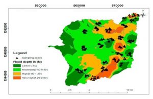
In chapter three, the reading expands upon what the earlier chapters were building up concept wise. It returns to creating maps in further detail, explaining how to show the quantity of features rather than only where they are located. It describes that when mapping quantities, they can be categorized through different types. Those are, counts/ amounts, ratios (one quantity/another) or rankings. Simply defining them: counts/ amounts are the standard quantity number of a feature, ratios represent the relationship between quantities like an average, and ranks are the relative ranking of features from high to low. The text then goes on to explain and guide how to create and use more strategies of grouping (these types are grouped in classes), similar to the many forms of grouping and sub-classing represented in the past chapters. I will add that I found the comparisons of the classification schemes to be very informative, with how it included disadvantages and “how it works” for each classification. Chapter 3 also includes outliers, which is a very normal aspect to scientific research and data. How the outliers are dealt with depends on if it’s an anomaly, error, or valid data point, so it’s imperative that it’s observed carefully.
Chapter three once again emphasizes the importance of interpreting patterns within the map, evolving from the patterns of location into the quantity of a feature- leading to the speculation and discovery of why something has a certain quantity. This chapter also describes the beginning basics of the analysis process of the class/program. Where the previous chapters were basic guides and definitions, chapter three shows readers how to think analytically about all the information learned until this point. It also demonstrates how GIS is actually this analytical process, stating that every decision made when working through a map can impact the final result. Your intention when developing the map matters! Through this point, although chapter two began to show how to create a map, this chapter finishes the job in high detail, along with a ton of helpful example maps/ charts.
I appreciate how all of the chapters continue to include many more examples- through very specific representations of how GIS is used in everyday life. The fact that the examples didn’t stop after the intro of the first chapter is a good decision teaching-wise. Specific examples of certain maps in relation to the section of the chapter it’s talking about. Although the technical definitions and explanations were confusing, this kind of connected everything back to real world use and made it easy to understand what GIS is. The visuals paired with the examples and descriptions are also very helpful when beginning to understand the information.