Inderhees- Week 6

Ch 7:

I learned how to create and edit features on the map. I added vortex points for bus stops and rotated building polygons. The editing tools made it, so I realize how flexible GIS is for changing features.

Ch8:

I learned about geocoding which is what connects data tables to map locations using addresses. I struggled with the locator. I rematched some of the addresses and used graduated symbols to symbolize results. I struggled with aligning the records and this showed me that even with slightly inexact results the system is still very helpful in the big picture. 

Ch 9:

I used spatial analysis tools like buffers and clustering in this chapter. I made a buffer around pools and then with that information found that most kids live within that radius. I used service-area maps, scatterplots, and cluster analysis. 


Wagner Week 6

Chapter 7

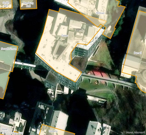
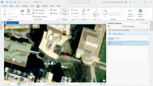
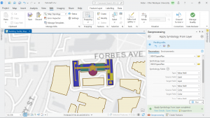
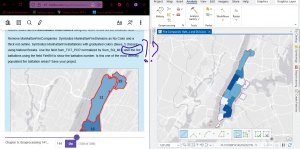
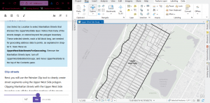
In chapter seven I started with editing, creating, and deleting polygon features. This was very straightforward and easy to understand. Moving and rotating the polygons to the correct location was actually quite enjoyable. I then used cartography tools to smooth out polygon features and make them look much nicer. I also transformed features  with a CAD drawing. I also found this section to be somewhat fun. I am proud to announce that I somehow did not have any problems in this section which has been a first for me so that’s exciting.


Chapter 8

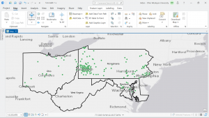
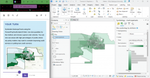
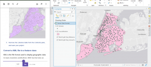
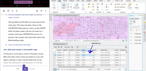
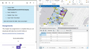
In this chapter I learned a lot about the geocoding process which matches location fields in tabular data. In the first tutorial I geocoded data using zip codes. I built a zip code locator, geocoded data by zip code, rematched data by zip code, and then symbolized using using the collect events tool. This process was pretty quick and simple and I got it done with no issues. In the second tutorial I geocoded street addresses. I messed up the locator tool at first by forgetting a few setting to apply but the second time around I did it correctly. Other than that mistake this also went by pretty quickly.

Chapter 9

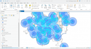
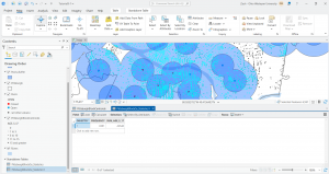
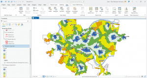
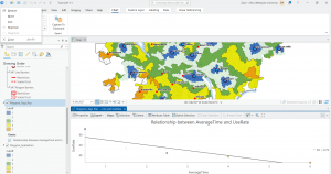
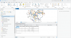
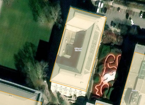
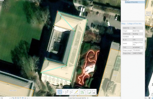
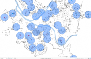
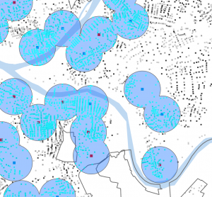
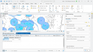
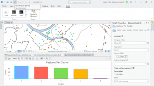
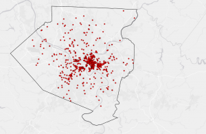
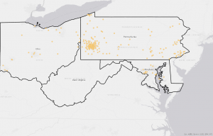
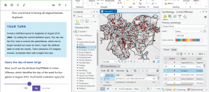
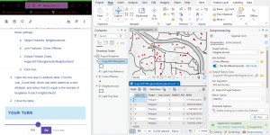
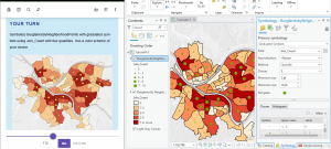
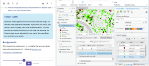
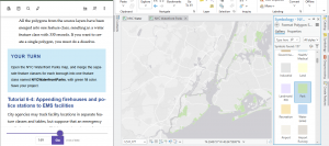
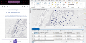
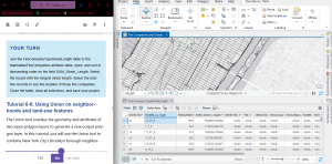
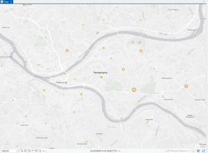
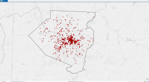
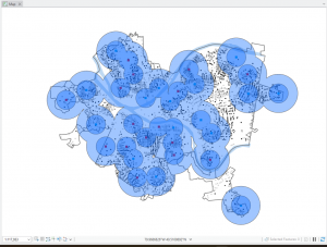
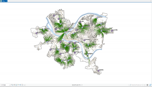
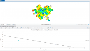
In chapter 9 I started off by learning to use buffers which I really enjoyed. I just like the way they look on the map… I then created multiple-ring service areas for calibrating a gravity model and polygons for them. This was really interesting to see travel time to pools and the colors relating to “quality” like poor or excellent. When it came to using the spatial join tool in this chapter I was struggling at first because I couldn’t find the output fields and merge rule but I think I figured it out by just clicking the specific output field and then finding a sum button. I’m not sure if that was correct but I did it anyway. I also optimally located facilities using ArcGIS Network Analyst and performed cluster analysis to explore multidimensional data. This chapter took a bit longer because of some small random problems but I got it all figured out.

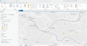
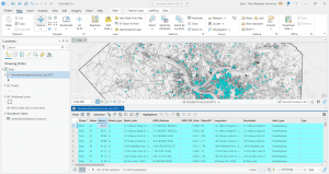
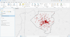
Work I was supposed to start last week for Final

Zip Code- Contains all zip codes within Delaware county

Street centerline- The center of pavement of public and private roads within Delaware county. It was developed from data collected by field observation of existing address locations and by adding addresses using building permit information.

Recorded Document- points that represent recorded documents in the Delaware County Recorder’s Plat Books, Cabinet/Slides and Instruments Records which are not represented by subdivision plats that are active. (vacations, subdivisions, centerline surveys, surveys, annexations, and miscellaneous documents within Delaware County, Ohio)

Survey- a shape file of a point coverage that represents surveys of land within Delaware County, Ohio.

GPS- This dataset identifes all GPS monuments that were established in 1991 and 1997. This dataset updated on an as-needed basis, and is published monthly.

Parcel- consists of polygons that represent all cadastral parcel lines within Delaware County, Ohio.

Subdivision- consists of all subdivisions and condos recorded in the Delaware County Recorder’s office. This dataset is updated on a daily basis and is published monthly.

School Districts- all School Districts within Delaware County, Ohio.

Tax Districts- consists of all tax districts within Delaware County, Ohio. The data is defined by the Delaware County Auditor’s Real Estate Office.

Township- consists of 19 different townships that make up Delaware County, Ohio. This dataset is updated on an as-needed basis and is published monthly.

Annexation- contains Delaware County’s annexations and conforming boundaries from 1853 to present.

Address Point- a spatially accurate representation of all certified addresses within Delaware County Ohio.

PLSS-consists of all the Public Land Survey System (PLSS) polygons in both the US Military and the Virginia Military Survey Districts of Delaware County.

Condo- consists of all condominium polygons within Delaware County, Ohio that have been recorded with the Delaware County Recorders Office.

Farm Lot- consists of all the farmlots in both the US Military and the Virginia Military Survey Districts of Delaware County.

Precincts- consists of Voting Precincts within Delaware County, Ohio.

Building Outline 2023- all it says it building outline 2023

Delaware County E911 Data- For some reason this summary had the same summary as Address points and I dont think thats right.

Original Township-consists of the original boundaries of the townships in Delaware County, Ohio before tax district changes affected their shapes.

Building Outline 2021- consists of building outlines for all structures in Delaware County, Ohio. The layer was updated in 2021.

Dedicated ROW- consists of all lines that are designated Right-of-Way within Delaware County, Ohio. This data is line data that is created through the daily updates of Delaware County’s Parcel data.

Map Sheets- consists of all map sheets within Delaware County, Ohio

Hydrology- consists of all major waterways within Delaware County, Ohio. This data was enhanced in 2018 with LIDAR based data.

ROW- consists of all lines that are designated Right-of-Way within Delaware County, Ohio. This data is line data that is created through the daily updates of Delaware County’s Parcel data.

Address Points DXF- a spatially accurate placement of addresses within a given parcel in Delaware County.

2024 Ariel Imagery- 2024 3in Aerial Imagery. Flown Spring 2024.

Delaware County Contours- 2018 Two Foot Contours

2022 Leaf-On Imagery (SID file)- 2022 Imagery 12in Resolution

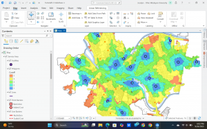
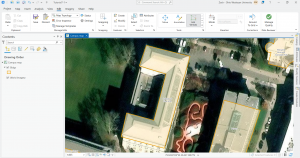
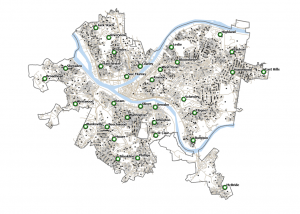
Here is my ArcGis Pro project with the Parcel, Street Centerline, and Hydrology layers. Okay so never mind I can’t find the screenshot on my hard drive but I did it and it was very purple.


White Week 6

Chapter 7).

In this tutorial I practiced the skills of creating and editing GIS features. We learned about the implementation of GPS receivers and applications. We worked with current features as well as to develop new features for the CMU campus of Pittsburgh. 

This first screenshot shows me adding and moving vertex points. The tutorial told me to add 4 to get the right shape, but I added about 6 and still got the same end result, it just took some time. 

I added a feature class and created a point feature for bus stops. I have a screenshot of this:

At the end of tutorial 7, I worked to rotate buildings, and transform polygons. There is a lot that can be done through the edit tab and I think it was super cool to be able to align the polygons of the floor plan with the actual building on the map. The building we worked with was Hamburg Hall in color on the map. I included two sequential screenshots of this process. Overall this chapter went pretty smoothly.

Chapter 8). 

Tutorial 8 was all about geocoding which connects location fields and the rows and columns of the data to the relative fields in feature classes. This maps the data from the data table. This process has many real life applications and uses. There are some limitations to geocoding in that not all matches will be accurate and so a rule-based expert system software is used by ArcGIS pro to facilitate as much correlation and precision as possible. I made sure not to use the World Geocoding Service within ArcGIS pro. 

For the 8-1 your turn exercise, I was able to add a new point to the map via the rematch addresses pane but in the table it was showing coordinates under the match address column whereas the other unmatched records showed as zip codes not coordinates. I can’t seem to find the slight error that is causing this but I still was able to do it. I think maybe the issue was that I corrected the zip code for that last record when I was just supposed to choose an approximate point.  

Once the survey data was geocoded to zip code center points, I symbolized the attendees feature class using graduated symbols, with symbol size increasing as the number of attendees increases:

In 8-2 I worked to geocode the street addresses. I ran into some bumps with the locator tool but I think I figured things out. I built a street locator and set its geocoding option, geocoded attendee data by street address, and then selected minimum candidate and matching scores. For the your turn exercises for 8-2, I found that 872 matched. The tutorial says 873 is supposed to be the number but I don’t think this matters too much. I included a screenshot where you can see the selected records through the attribute and on the map. In order to identify the number of matched records with a minimum score of 90, I used the select by attributes tool to build a query that expressed for the score to be greater than or equal to 90. The results showed a good geocoding performance. 

At the end of chapter 8, I symbolized and produced final geocoding results:

Chapter 9).

In this tutorial we learned the second part of the visualization of spatial data is the analysis of the data. Engaging in spatial analysis helps us to answer profound real life questions raised and displayed by the data. For instance, a map may show patterns or reveal an issue, but the analysis part allows for work towards solutions to that issue or recurring negative trend. The four fundamental spatial analytical methods we explored are buffers, service areas, facility location models, and clustering. I started off by using buffers for the purpose of proximity analysis. A buffer is simply a polygon that encompasses map features of a feature class. 

Here is a screenshot of the first your turn exercise in 9-1. We created a buffer of the pools feature class, particularly a one mile buffer. Then I performed some analysis, calculating the number and percentage of youths within that distance. I found that 42,548 youths are within that distance. About 87 percent of all youths in the city are close to a pool. 

This next screenshot is from tutorial 9-3 in which I created multiple-ring service-area polygons, spatially joined service areas and pool tags, calculated pool use statistics for service areas, and finally created a scatter plot.  I had some issues with the spatial join tool but I got through things it just took much longer than expected. 

For the very last part of 9-3, involving fitting a curve to the gravity model data points, I was able to open the excel spreadsheet but the beta values were already entered. Thus, the resulting average absolute error values were already there as well. And I’m not sure if we were supposed to just take a look at this stuff or actually do something. It seemed like we were just exploring the spreadsheet and noting those things so I moved on. 

For the 9-4 tutorial your turn exercise, I was able to do the first model run and create the first map but when I tried to do the second model run I kept getting Solve errors. I was able to work with using Network Analyst to locate facilities and see what this looks like, but when I kept getting errors for the second model I tried to figure out the issue but it kept occurring. I included a screenshot of what I produced and I learned that this sort of map is used for visualization. You can see the lines and essentially the lines show the demand relationship between pools and block centroids.

For the your turn exercise of tutorial 9-5, I was able to run the summary statistics tool and create the table with the mean values, but there were a few rows that were in different places then what arcGIS pro showed. I got all the exact same values, things were just in varying positions. Below is my work from 9-5 with performing a cluster analysis. 

Datta – Week 6

CHAP 7:

  •  Shows us how to edit polygons, adding or subtracting features deleting and tracing them
  • Shows us how to use cartography tools to smooth features
  • How to export a CAD drawing


CHAP 8:

  • Talks about geocoding
  • shows us how to use ZIP locators to find Zip codes and then how to geocode them
  • Shows us how to rematch data
  • Also shows similar traits for street address stuff


CHAP 9:

  • Shows us how to turn buffers into pairwise buffers, removing the overlapping lines
  • Shows us how to build centroids to buffers
  • Shows how to make multiring buffers
  • Allows us to make a “clipping group” of sorts with buffers
  • Allows us to make “pools”, shows us how to make scatterplots,
  • shows us how to table data cluster data

Fox – Week 6

Week 6:

Chapter 7: In this chapter, we were editing, creating, and deleting polygon features, creating and digitizing point features. Use cartography tools to smooth features. Work with CAD drawings. And spatially adjust features. I was doing good, however, in the 7-1 tutorial, I was really struggling to do a few things. I could easily move and rotate the polygon features, but when it came time to split features, I really struggled with that. I did eventually just move onto 7-2. 

Chapter 8: In this chapter, we worked with importing data from zip codes and addresses. We dealt with how to geocode and process them. 

Chapter 9: In this chapter, we worked on creating buffers. We also looked at proximity within our data to a certain area. 

Walz – Week 6

Chapter 7:

Chapter 7 went over mostly edit, creating, deleting, and modifying polygon features. Cartography tools were used to smooth the edges, points were created for easier access to edit these polygons, and this chapter had us work with CAD drawings to insert them into the map and edit them.


Chapter 8:

Chapter 8 dealt a lot with geocoding tools and the process. We learnt about how geocoding can select and pinpoint specific attributes and show them. We did this with zip codes and addresses. It then went over what happens if there are non-matches and how to address them.

Chapter 9:

Chapter 9 went over using buffers for spatial analysis and proximity analysis. We learned how to do multiple ring buffers and did a gravity model of demand versus distance from a nearby facility, and then made a scatterplot of it. We then did a cluster analysis of various crimes and explored its data.

Tadokoro, Week6

Chapter 7

In Chapter 7, I learned how to edit, create, and delete polygon features, create and digitize point features, smooth features using cartography tools, utilize CAD drawings, and perform spatial adjustments of features.  It was difficult to rotate and place them on the map, but I found it interesting to realize that bus stops we often see on maps are created in this way.

Chapter 8


In Chapter 8, I learned to understand the geocoding process, perform geocoding using ZIP codes and street addresses, and I was surprised that approximate matches could be made even when the data did not match perfectly.

Chapter 9

In Chapter 9, I learned about proximity analysis using buffers, the use of multiple-ring buffers, creating service areas to estimate a gravity model of demand based on distance to the nearest facility, optimal facility location using ArcGIS Network Analyst™, and exploring multidimensional data through cluster analysis, and I was able to learn this chapter smoothly.

Patel-Week 6

T: 1-1 Introductions


Saving Project Name


Project (next to map,insert, analysis, etc tab) → save project as


Name Tutorial number Name.aprx


Displaying a Map


Bookmarks→map of choice


Basemaps


Basemaps = layers for what you wish to represent (rivers, topography, etc)


Contents Pane


View + Pane = select contents 


Contents = selector for what layers you wish to eliminate and keep 


Catalog Pane


 View tab → windows group → Catalog Pane


Allows for easy access to all project components


Export Layer tool


Share tab (after project, map, insert, etc under the logo in left top corner) → export layer


Saving Images


  1. On the File Type drop-down menu, click PNG.


  1. For Name, click the Browse button, browse to save the file to your top, and rename it FQHCAndUrgentCareClinics.png.


  1. For Resolution, type 150.


  1. On the Color Depth drop-down menu, click 24-bit True Color.


  1. Click Export to run the tool.


T: 1-2 Navigating Map Display


Navigation of Map


Map tab→full extent→explore button = center map/info on features


Bottom right buttons do things


Wheel button Zooms in 


Map Back button


Map tab→Navigate→ arrows


Turing all Feature classes on/off = ctrl on press hold + check box click = on/off for all


Bookmarks


Bookmarks = zooms to thing you select


Creating new bookmarks = bookmarks (navigate) + new bookmark + name


Manage bookmarks = bookmarks (navigate) + manage bookmarks


Selecting Attributes data = Right clicking + attribute table + select by attribute = where + Name + is equal to + location 


Stephens Week 5

Technical things turn me into a zombie…  my eyes just glaze over after a while. I know I’m missing things in these chapters and it’s led to a lot of confusion! Definitely going to look over these tutorials and the previous ones as well before the final, because I keep getting to parts of the tutorials especially in chapters 5 and 6 where it will ask me to do something but the data is missing or the function doesn’t make sense. I gotta say it would be nice if some of the references to past tutorials would direct me towards the specific function that was used, not a refresher but a better reminder (that might just be my lack of working memory talking though).

Anyways chapter 4 wasn’t TOO too bad. Importing and exporting things are pretty self explanatory.(i did forget to choose colors for the outlines but it still works)Altering attribute tables was pretty simple too.

Some of the parts with symbology were what I needed a refresher on. Also the joining part was feasible, if not comprehensible.

In 4-3, I had to mess with the queries a little but i think I got it?

Spatial joins were mentioned later on only for me to forget them and looking back is reminding me what those were. Also Krygier pointed out that one error in the set can throw the whole thing off and lead to a bunch of null data. I guess I have to make sure everything is lined up and the same!

I had to fiddle around again to get the center points to work because x and y weren’t filling in on the tool (and then I failed to take a screenshot of that but I can’t replicate it not working so thats good?)

Finally 4-6 wasn’t too bad either, still pretty intuitive. (I could have chosen more effective symbols though)

Now I’m on to chapter 5, posting this late because I need to redo a few parts. Like I said, there were definitely a few things I glossed over. Changing projection systems was pretty ok though.

The local and state plane coordinates were pretty intuitive as well

This took more messing around with but I did figure out the coordinates.

The census data site is kind of confusingly laid out… i definitely need to be told exactly which map is needed. Also the bike data is where I really screwed it up and didn’t clean up the tables properly. This is the best I could do… moving on!

The pairwise dissolve tool was cool!

But I didn’t get the label part.

Then I did something weird trying to select the west block groups in the Upper West Side.

Pairwise clip tool is kind of like a layer mask. The above image is from before I did it but it worked fine. Merging layers was similar!

Here’s another bad join!

So yeah. Mostly ok, still pretty confused but I’m just gonna keep powering my way through and review things as needed.