Chapter 7).
In this tutorial I practiced the skills of creating and editing GIS features. We learned about the implementation of GPS receivers and applications. We worked with current features as well as to develop new features for the CMU campus of Pittsburgh.
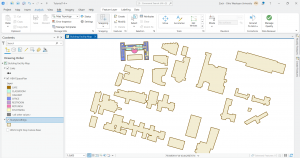
This first screenshot shows me adding and moving vertex points. The tutorial told me to add 4 to get the right shape, but I added about 6 and still got the same end result, it just took some time.
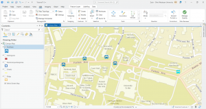
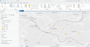
I added a feature class and created a point feature for bus stops. I have a screenshot of this:
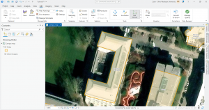
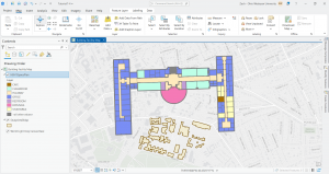
At the end of tutorial 7, I worked to rotate buildings, and transform polygons. There is a lot that can be done through the edit tab and I think it was super cool to be able to align the polygons of the floor plan with the actual building on the map. The building we worked with was Hamburg Hall in color on the map. I included two sequential screenshots of this process. Overall this chapter went pretty smoothly.
Chapter 8).
Tutorial 8 was all about geocoding which connects location fields and the rows and columns of the data to the relative fields in feature classes. This maps the data from the data table. This process has many real life applications and uses. There are some limitations to geocoding in that not all matches will be accurate and so a rule-based expert system software is used by ArcGIS pro to facilitate as much correlation and precision as possible. I made sure not to use the World Geocoding Service within ArcGIS pro.
For the 8-1 your turn exercise, I was able to add a new point to the map via the rematch addresses pane but in the table it was showing coordinates under the match address column whereas the other unmatched records showed as zip codes not coordinates. I can’t seem to find the slight error that is causing this but I still was able to do it. I think maybe the issue was that I corrected the zip code for that last record when I was just supposed to choose an approximate point.
Once the survey data was geocoded to zip code center points, I symbolized the attendees feature class using graduated symbols, with symbol size increasing as the number of attendees increases:
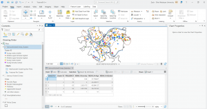
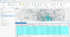
In 8-2 I worked to geocode the street addresses. I ran into some bumps with the locator tool but I think I figured things out. I built a street locator and set its geocoding option, geocoded attendee data by street address, and then selected minimum candidate and matching scores. For the your turn exercises for 8-2, I found that 872 matched. The tutorial says 873 is supposed to be the number but I don’t think this matters too much. I included a screenshot where you can see the selected records through the attribute and on the map. In order to identify the number of matched records with a minimum score of 90, I used the select by attributes tool to build a query that expressed for the score to be greater than or equal to 90. The results showed a good geocoding performance.
At the end of chapter 8, I symbolized and produced final geocoding results:
Chapter 9).
In this tutorial we learned the second part of the visualization of spatial data is the analysis of the data. Engaging in spatial analysis helps us to answer profound real life questions raised and displayed by the data. For instance, a map may show patterns or reveal an issue, but the analysis part allows for work towards solutions to that issue or recurring negative trend. The four fundamental spatial analytical methods we explored are buffers, service areas, facility location models, and clustering. I started off by using buffers for the purpose of proximity analysis. A buffer is simply a polygon that encompasses map features of a feature class.
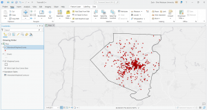
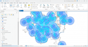
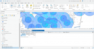
Here is a screenshot of the first your turn exercise in 9-1. We created a buffer of the pools feature class, particularly a one mile buffer. Then I performed some analysis, calculating the number and percentage of youths within that distance. I found that 42,548 youths are within that distance. About 87 percent of all youths in the city are close to a pool.
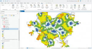
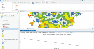
This next screenshot is from tutorial 9-3 in which I created multiple-ring service-area polygons, spatially joined service areas and pool tags, calculated pool use statistics for service areas, and finally created a scatter plot. I had some issues with the spatial join tool but I got through things it just took much longer than expected.
For the very last part of 9-3, involving fitting a curve to the gravity model data points, I was able to open the excel spreadsheet but the beta values were already entered. Thus, the resulting average absolute error values were already there as well. And I’m not sure if we were supposed to just take a look at this stuff or actually do something. It seemed like we were just exploring the spreadsheet and noting those things so I moved on.
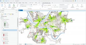
For the 9-4 tutorial your turn exercise, I was able to do the first model run and create the first map but when I tried to do the second model run I kept getting Solve errors. I was able to work with using Network Analyst to locate facilities and see what this looks like, but when I kept getting errors for the second model I tried to figure out the issue but it kept occurring. I included a screenshot of what I produced and I learned that this sort of map is used for visualization. You can see the lines and essentially the lines show the demand relationship between pools and block centroids.
For the your turn exercise of tutorial 9-5, I was able to run the summary statistics tool and create the table with the mean values, but there were a few rows that were in different places then what arcGIS pro showed. I got all the exact same values, things were just in varying positions. Below is my work from 9-5 with performing a cluster analysis.