Chapter 1-
- I logged into ArcGIS, downloaded the tutorials, and created a new project. I also learned how to save my projects.
- I learned how to add and remove basemaps, like a street basemap, for example, and I learned what layers are and how to add and remove them (located in the contents pane).
- I learned how to share and export files/maps and I familiarized myself with creating and removing pop ups, as well as zooming in and out.
- I practiced making bookmarks.
- Every vector feature class has an attribute table, and each feature (point, line, or polygon) of a feature class has a record or row of data. You right click on a feature class and select “attribute table.” In the map tab, choose “select by attribute.” On the attribute table, click “show selected records.”
- Right clicking on feature classes, attributes, etc. gives you lots of options to choose. You can sort data in different ways (like ascending and descending), deleting data, etc..
- Analysis tab -> tools button -> geoprocessing plane -> toolboxes -> expand analysis tools -> statistics -> summary statistics
- Symbolize features classes by right clicking on one and selecting symbology. Then choose the desired symbol.
- You can label feature classes on a map by choosing a feature class and clicking on the labeling tab at the top of the screen.
- In the Catalog pane, expand Maps, double-click the desired 3-D feature. Use the right and left buttons to navigate, or the scroll wheel. You can also press V and the down arrow key to tilt the map and see the 3-D view.
Chapter 2-
- In this chapter, I worked on adding and changing more symbols, like in chapter 1, specifically changing things like color, color scheme, and text size.
- To remove duplicate labels, follow these steps: 1) Right click the layer under concern and click Labeling Properties. 2) Click Position, then Conflict Resolution. 3) Expand “Remove Duplicate Labels”, then click Remove All. This removes duplicate labels.
- Why did we use the numbers 4901, 4902, and 4903 for creating a definition query instead of any other ascending numbers?
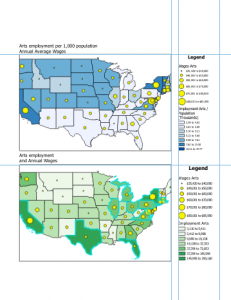
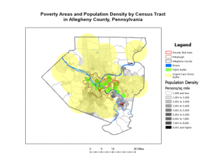
- A choropleth map is a thematic map that uses varying shades or colors to represent data values across different geographic regions, making it easier to visualize and compare data distributions.
- View tab -> convert -> to local scene -> contents pane -> drag feature class in question to above 3D layers heading -> feature layer tab -> extrusion group -> type -> base height -> extrusion group -> field -> select the relevant field.
- Importing symbology: symbology pane -> import symbology
- Dot density map: go to symbology and set dot density as primary symbology
- Go to the feature layer tab to utilize the visibility range tool. This changes what distance you can see labels at (zoom in and labels disappear, zoom out and they reappear, and vice versa).
Chapter 3-
- You can use guides in order to place features of a map precisely. Right click on the space you want to add a feature, and make sure that ruler and guides are selected. Then, you can click on the ruler once you close out of that screen and choose “add guide.”
- On the insert tab, you select legend to add a legend. When one legend is selected, you can choose legend items and show properties to display more information on the legend.
- You can add text for a title and many other things under the insert tab.
- Data tab -> visual group -> create chart. At the top of the chart properties plane, choose general, and then add a chart title and x and y axis labels. You can adjust color, size, and thickness on these charts.
- Sharing a map online: Share tab -> share A’s -> web map -> add your name in name field -> fill in other summary info -> under share, choose with everyone -> analyze -> share.
- I logged into ArcGIS Online and found the map that I just shared under my content. On ArcGIS Online, I was able to change features and symbology.
- The story maps on ArcGIS were pretty cool, I really liked the format of them and getting to create my own. All of the steps were pretty self explanatory and something that I could have done without the tutorial.
- To create a dashboard on ArcGIS Online, go to the app launcher (9 dots) and select dashboards. You have to apply the settings relevant to the work that you’re doing.
- On the dashboard toolbar (left side of screen) you can add different elements, like tables. This didn’t work well for me because after I created the tables, I couldn’t get them to show up on the map at all, but they showed up as a separate tab. As I was following along with the tutorial, I should have been able to accomplish this but it did not work.