I definitely struggled with this section more than previous chapters. I felt some sections were really good at explaining the content and others brushed through it or had us doing something that was previously gone over but I couldn’t quite remember how to do it without having to flip through a bunch of pages to find the explanation.
Chapter 4:
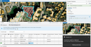
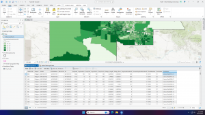
Chapter four focused on file geodatabases. The various sections went over importing data into a new ArcGIS pro project, modifying attribute tables, carrying out attribute queries, aggregating data with spatial joints, using central point features for polygons, and creating a new table for a one-to – many join. In section 4.5, I was having trouble figuring out how to use calculated geometry attributes. X and y coordinates weren’t showing up.
Chapter 5:
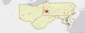
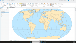
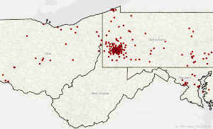
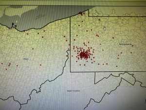
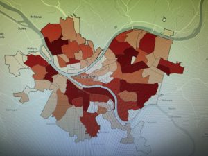
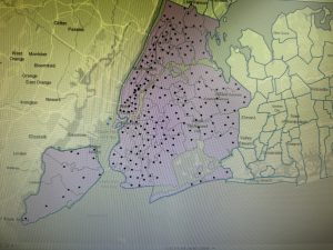
Chapter five’s focus was on spatial data. In this chapter we learned how to work with world map projections, work with US map projections, setting projected coordinate systems, work with vector data formats, work with US Census map layers and data tables, and download geospatial data. I definitely had the most trouble with downloading the geospatial data and getting the data to present how I wanted. I also had trouble with the csv file and getting the data to upload but I eventually worked it out.
Chapter 6:
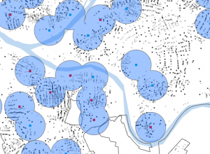
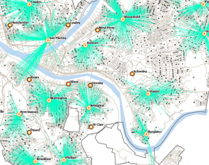
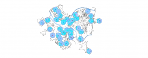
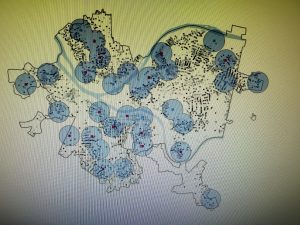
Chapter 6 was all about geoprocessing. The topics discussed were dissolving features to create neighborhoods and fire divisions and battalions, extracting data and clipping features for a study area, merging water features, appending firehouses and police stations to EMS facilities, intersecting features to determine streets in fore company zones, using Union on neighborhoods and land-use features, and using the tabulate intersection tool. This chapter felt less difficult than the previous two. The merging of feature classes ran smoothly and I felt like I understood these sections better.
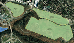
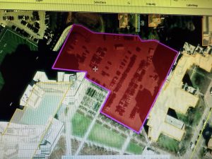
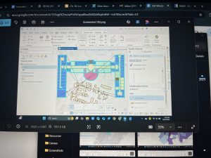
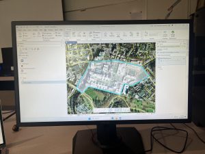
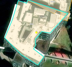
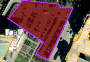
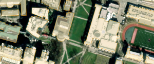
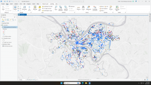
 Chapter 7: This chapter briefly went over how to modify and edit maps. While this chapter didn’t provide super important information, it was still very helpful. It gave me background on how to scale and move polygons within the map. Essentially, this chapter helped me design my maps to be more visually appealing. I only ran into a few problems within this chapter. One of them is my inability to split the buildings. I drew my shape around the building and double-clicked as instructed, but the two buildings in 7-1 didn’t split. It was interesting to apply polygons to not just buildings, but parking lots, and other features as well. This taught me how useful creating a digital version of it on the map can be. Another issue that I ran into was my inability to find the bus stop marker. I don’t think this is a big problem at all because I was able to use another symbol to mark the bus stop, but I thought I would note it. For future reference, it was good to learn that I have to import features from a downloaded building so that I can modify them.