Tooill – Week 2

This week, I read chapters 1-3 of the Esri Guide to GIS Analysis by Andy Mitchell. Here are some of the key takeaways from each chapter:

Chapter 1-

-GIS analysis looks at geographic patterns and relationships between features.
-Start analysis by deciding what information you need. How will the analysis be used and by who?
-The type of data and features present determines what method of analysis you use. You may need to create more data depending on what information you already possess.
-By looking at the results of your analysis, you may decide that you need different parameters than the ones you started with because the information they provide may or may not be useful.
-Discrete features- “For discrete locations and lines, the actual location can be pinpointed. At any given spot, the feature is either present or not.”
-Continuous phenomena- like precipitation or temperature. Can be measured anywhere. They happen across the entire area being observed.
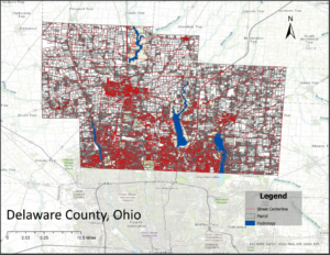
-Features summarized by area- “represents the counts or density of individual features within area boundaries.” Examples include the number of businesses in each zip code, the total length of streams in each watershed, or the number of households in each county (obtained by summing the number of households in each census tract). The data applies to an area, but with no specific location.
-Geographic features can be represented by either vectors or rasters. A row in a table with x and y locations demonstrates a vector, while a raster is represented by a matrix of cells in a continuous space.
-Discrete features and features summarized by area are typically represented using vectors and continuous phenomena are usually represented by both, and continuous numeric values by raster.
-Types of attribute values- categories, ranks, counts, amounts, ratios.
-Categories are types of similar things like roads or crimes. Not continuous
-Ranks put features in order, like when direct measures are hard to quantify (when several things factor in), such as scenic value. Not continuous
-Counts and amounts show total numbers. A count shows the actual number of features and amount can be any measurable quantity within the represented feature. For example, a count would be the number of businesses and the amount would be the number of employees each business has. continuous
-Ratios show the relationship between two quantities, such as the average number of people per household. Continuous
-When working with data tables, you are commonly summarizing values of attributes, calculating attribute values, and selecting features.

Chapter 2-

-Preparing data- make sure that coordinates have been given to each feature you are mapping and make sure that you have a category attribute with a value for each feature as well.
-If you have data that is already in the GIS database, then you do not need to assign coordinates because they are already given to you. However, if you have brought in data from another program or if you are entering it by hand, then you need to assign geographic coordinates by filling in information such as a street address, or latitude–longitude values, which will allow the system to assign geographic coordinates.
-You may need to add information (code) to each feature that identifies its type.
-In order to add a category, a new attribute must be created in the layer’s data table. Then, you have to assign values to each feature.
-“In some cases, a single code indicates both the major type and subtype. For example, all crimes with a value between 500 and 599 are burglaries, but the type of burglary is indicated by the specific value.”
-Mapping a single type- draw all features as the same symbol.
-Using a subset of features- Book uses the example of mapping all crimes, as well as specifically all burglaries, or only commercial burglaries.
-Mapping by category- draw features using different symbols. The book gives an example of mapping all major roads by road type.
-Displaying features by type- Book uses the example of mapping burglaries by the type of building entered (residential or commercial) or by the type of entry (forced or non-forced).
-Do not display more than 7 categories. Most people can distinguish up to seven colors or patterns on a map. Displaying any more than 7 makes a map harder to read and patterns harder to find.
-Grouping categories- If you have more than 7 categories, group them.
-When using symbols, colors are easier to distinguish than shapes.
-Mapping reference features also make a map easier to understand and read.
-Zooming out may help you distinguish patterns.

Chapter 3-

-Mapping patterns of features with similar values shows where the most and least are. This is important for finding places that are in critical need of action.
-Continuous phenomena are typically mapped as shaded areas to show quantity.
-A count is the actual number of features on the map.
-An amount is the total of a value associated with each feature.
-Using counts and amounts when summarizing areas can mess up patterns that you’re trying to discover.
-Ratios show the relationship between quantities. They are created by dividing one quantity over another. (most common are densities, proportions, and averages).
-Ranks put features in order (high to low). They give relative values instead of precise ones.
-Grouping values into classes helps audiences to compare features quickly.
-To create classes, you can do so manually or by using a standard classification scheme. These methods assign the same symbol to different features to group them.
-A class break is where there is a jump in values (between bars).
-Understand quantiles, standard deviation, and natural breaks, and equal intervals.
-Using natural breaks can isolate outliers and avoid skewing your patterns.
-GIS gives these methods for creating maps to show quantities: Graduated symbols, graduated colors, charts, contours, and 3D perspective views.
-Discrete locations or lines, use- Graduated colors or symbols to show value ranges, charts to show both categories and quantities, and a 3D view to show relative magnitude.
-Discrete areas or data summarized by area, use: Graduated colors or symbols to show value ranges, charts to show both categories and quantities, and a 3D view to show relative magnitude.
-Spatially continuous phenomenon, use: Graduated colors to show value ranges, contours to show the rate of change, and a 3D view to show relative magnitude.

Tadokoro, Week 1

Hello! My name is Haruno Tadokoro. I am from Tokyo, Japan.  I am a junior, majoring in Environmental Science and minoring in Politics & Governance. My mother got COVID the day before my departure to the U.S., so I missed the first week and just got back yesterday. 


I did the quiz for this class Geography 291. While reading the first Chapter by Schuurman I was surprised to learn that Geographic Information Systems (GIS), which are instrumental to technologies like car navigation and Google Maps that we use almost every day, actually began to be developed back in the 1960s. I had always assumed that these systems were more recent innovations because they certainly seem so new and high-tech. Reading about where it all came from helped me appreciate how long ago humans started developing digital mapping and spatial analysis, even when computers were far more rudimentary than they are now.
Personally, I have utilized GIS-related tools in my travels. For example, I like to research where I am headed, how high it is, or use web-based maps to explore land and distance. Previously, I imagined that GIS was mostly for personal convenience, like taking the best route or discovering new places. But I learned GIS is far more than that and it’s used differently depending on whom is using it and why. It’s used by urban planners to design cities, environmental scientists to research climate change, and emergency responders to use in times of crisis.
This made me think of the way that technology itself is value-neutral, but we can use it in ways that give it meaning and purpose. GIS can be used to create communities that are safer, more efficient, and more sustainable, but it also raises concerns of data control and privacy. As a user who has been mostly at the surface level, I find myself now curious about learning more about what goes on behind the scenes with GIS and how it might further develop in the future. It is incredible to think that something created over 60 years ago still forms the basis for so many of the tools we utilize today.

I found Female researchers are using GIS to visualize gender inequality geographically. In Image 1, disparities and burdens based on gender are layered onto a map, visually representing factors such as the degree of impact on women across different regions.

Thompson – week 1

Hi! My name is Sky. I’m from right here in Delaware and I’m a junior majoring in Environmental Studies.

Yes, I know my submission is late.. I was having major technical difficulties :/


After going over both the quiz and reading, it made me realize how much about GIS I really didn’t know. I’m coming into this class not knowing much at all about GIS systems and what they are capable of. One thing I thought was really interesting was how widespread GIS is. It isn’t something that is specific to one major or one group of people, GIS is open to really anyone (like how it can be used for police officers, students, and even starbucks shops). The reading goes over mostly history (dating back all the way to the 1960s) and the understanding/role of GIS systems. The reading was intended to demonstrate how GIS can fit into normal day tasks for a wide range of people. It’s really intriguing that coincidentally, the start of GIS actually didn’t involve computers. This is weird to think about because our world pretty much revolves around technology. The two different “faces” of GIS I think is something important to think about and that GIScience is basically the underlying theory of GISystems. GIS has more to it than just data and maps so I’m excited to get to learn more about it and what I could use it for. 

One of the GIS applications that I found and thought was really interesting was the use of GIS to track animal movements in marine environments. The reading goes over a bit about how GIS tracking isn’t used within water ecosystems as much as terrestrial areas. They kind of combined general GIS software with analysis tools that are specific to animal movement. There are a bunch of different functions that the paper goes over as well to show what types of animal movements and other things you can get out of using the software. The reason that studying animal movement is so important is because it can help with a lot of different research including fishing management, migration, and habitat management. The figure goes over location of the halibut being studied between different areas like pacific locations, rocky locations, and just randomly selected areas. I liked reading over this study and think that any of them having to do with tracking animals and their habitats is fun and interesting. 


Source: Hooge, P. N., Eichenlaub, W. M., & Solomon, E. K. (2001). Using GIS to analyze animal movements in the marine environment(pp. 37–51). http://www.bio.davidson.edu/people/midorcas/GISclass/GISprojects/hartman/Anim_Mov_UseMe.pdf

Bzdafka – Week 2

This week I read Geographic Patterns and Relationships 2nd edition by Andy Mitchell

Mitchell Chapter – 1 is a general introduction to GIS and its applications. The beginning  lists a few applications for maps and GIS, for instance It is possible to map where the most or least amount of something is. It is also possible to map density as well as change. A definition/description for GIS is also provided. In this chapter we are given guidance on asking questions using GIS, and we are instructed to be as specific as possible, which leads me to wonder where the line of specificity is? Meaning how general or broad can I be about asking a question so that it still is effective at providing an answer without providing a misleading or useless answer. 

The rest of chapter 1 delves into how to frame a question, and how you can use data generated by your map. For instance you can summarize data generated from the map. It is also possible to use satellite imaging to create continuous data which is good for visualizing patterns such as precipitation, soil characteristics, and temperature. When using continuous data it is sometimes good to use raster data which works well since raster data is a grouping of cells, whereas vector data is based on individual points.   


Key Words: Discrete features (pinpoint data), Continuous phenomena (data that can be found anywhere), Features summarized by area (data found within set boundaries), Vector data (areas defined by points and set polygons), Raster data (data represented as a matrix of cells)


Mitchell Chapter – 2 explains how to create data before using it as well as data storage to display either detailed or general information. It also covers different ways to represent or draw data on a map, either through lines or in a given area designated by points. It also discusses best practices when it comes to data visualization when using maps and spatial data. For instance when using spatial data, it is necessary to have coordinates present so that you are able to plot sites with the GIS, it is also beneficial to have a character or attribute associated with the coordinate data so it is easy to group them together. Then when grouping similar types of data you just graph them all as either the same color or with a distinct shape. Similarly to statistical programs like Rstudios, you can subset data and have only specific values shown. When assigning categories it is best to have as few as possible as this makes it easiest to distinguish patterns (a good amount would be 5-7), however having a larger amount displays more detailed patterns. 


Mitchell Chapter – 3 explains how it can be helpful to use spatial data to represent numerical data, such as how many people work at a specific location by using graduated symbols (using larger points to indicate more people). This type of visualization can help explain where something is as well as give context to what is being displayed. Data can be organized by rations (percentages), or by ranks which order data from least to greatest. When creating all this data it can sometimes be too unwieldy to use and hard to interpret as a viewer so it is best to create classes, which groups data into designated categories. There are many different ways to create data classes and there are also a number of types of classes that can be used, and each one is useful for different things. Some of them are good for seeing generalized patterns, while others are useful for making sure the data is properly displayed if it is not evenly distributed. 

Key words: Ratio (a proportion or percentage), Rank (ordered from greatest to least), Class (Data is grouped into a class representing certain ranges to make a map more concise), Natural breaks (data in a given class are similar, represents natural groupings found in your data), Quantile (each class has an equal number of features), Equal interval (classes are made by grouping a set amount of creatures into each class), Standard deviation (classes are generated by how many standard deviations away from the mean they are), Graduated symbols (points representing counts), Graduated colors (colors used to represent rations and ranks), Charts (graphs generated in the areas they represent), Contours (lines representing counts or rations, most noticeably used for precipitation and barometric pressure), 3D perspective views (3D images used to display magnitude of data).

Tomlin – Week 1

Hi, my name is Parker Tomlin, and I am a senior this year. I’m majoring in Exercise Science,

I did the quiz for GEO 291. While reading Chapter One of Schuurman’s text, I gained a deeper understanding of the history of Geographic Information Systems (GIS) and how they have evolved over time. I was especially intrigued by the wide range of applications GIS has today and the ongoing debates within the field of geography about its use and implications. Schuurman draws an important distinction between understanding how GIS is applied (GISystems) and the deeper theoretical understanding of how and why these systems work (GIScience). This differentiation helps frame the conversation around GIS not just as a tool, but as a field of study in itself. The origins of GIS date back to the 1960s, when Ian McHarg used spatial analysis to determine the best possible route for a highway. His work laid the foundation for computerized spatial analysis, which at the time was largely undervalued. However, pioneers like Harold McCarty and William Garrison began to recognize its potential, followed by Roger Tomlinson and Lee Pratt, who were instrumental in developing computerized cartography systems in Canada. These early contributions helped GIS become what it is today—a powerful and evolving field. As GIS has advanced, it has been categorized into two branches: GISystems, which focuses on the tools and technology, and GIScience, which explores the methods, ethics, and implications behind those tools. While GIS has practical applications in areas like agriculture, urban planning, and even e-commerce, GIScience plays a crucial role in ensuring these systems are accurate, ethical, and free from bias. It also raises important questions about who controls GIS data, how it is collected, and how it might impact individual privacy.

Application 1

For my first application, I wanted to look at grizzly bear populations and compare them to salmon populations in the same area.

The yellow, orange, and red areas on the map indicate an area of concern for grizzly bear populations. The map of the salmon population made it easy to see that the areas where the grizzly bear population was healthy were also where the salmon population was the most dense.

Sources:

https://www.arcgis.com/apps/mapviewer/index.html?layers=856c6b542ede4815a14be63bd5e261cc

https://www.arcgis.com/apps/mapviewer/index.html?layers=fbe6f9687c90440a9aef0194c8f0f2e6

Buco, Week2

Chapter 1 

Comments/Notes

Since the time Esri Press first published the book in 1999, GIS has become more popular. There have been major advances in GIS software, like incorporating intuitive interfaces as well as more advanced mapping and analytical tools. Some of the most common geographic analysis tasks people do while doing their jobs are mapping where things are. One common task involves mapping the locations of the most and least common objects. Mapping the density. Finding what’s inside and nearby. Mapping changes.  GIS analysis is a process for looking at the geographic patterns in the data you collect and at the relationships between features. To do this, you start by framing the question, and an example of this is, “How many people moved to Delaware, Ohio, in the past 5 years?” Some factors that influence the data are how it will be used and who will use it. When working with GIS, the type of data and features you are working with will help determine what method you will use. When collecting data, there are almost always two or three ways that you can collect the data. Some of the types of features that you can see on GIS are discrete features, continuous phenomena, and features summarized by area. Discrete features are when the actual location can be pinpointed. At any given spot, whether you can see the feature or not. Continuous phenomena like precipitation or temperature can be found or measured anywhere. Features summarized by area represent the counts of individual features within a certain area’s boundaries. There are two ways that the GIS can be represented: vector and raster. Vector is when each feature is in a row or table, and feature shapes are defined by x,y locations in space. Raster is when features are represented as closed polygons. There are types of attribute values: categories, ranks, counts, amounts, and ratios. 

Questions:

How did spatial data scientists discover that GIS can be used for much more than building geodatabases and making maps?


Chapter 2

Comments/Notes:

People use maps to see where and what an individual’s feature is located. When looking at the map, you can see the distribution of features on the map. Rather than at individual features, you can see different patterns that can help you better understand the area you are mapping. Mapping is important because mapping where certain things are can allow you to see where you need to take action or different areas that meet your criteria. Also, by looking at the different location features, you can begin to explore causes for the patterns you are seeing. Before you create the map, you need to make sure the features you are mapping have geographical coordinates assigned and optionally have a category attribute with a value for each feature. When assigning location, you need to make sure each feature has a location in the geographic location. When assigning category values, you need to make sure that each feature has a code that can identify its type. Many categories are hierarchical, with major types divided into subtypes. The GIS stores the location of each feature as a pair of geographic coordinates or a certain set of coordinate pairs that define its shape, like a line or area. When you make a map, the GIS uses the coordinates you input to draw the features using symbols you specify. Most of the time, mapping a subset is more commonly done for individual locations. When you are mapping an area that is large relative to the size of the features, using more than categories can make patterns harder to see. But when smaller areas are mapped, individual features are easier to see, so more categories will also be easier to see. 

Questions:

When you are making maps or looking at a map, can you overlay two maps of similar areas to compare them both if made by two different people?


Chapter 3 

Comments/Notes:

When mapping, people map the most and least because it is to find places that meet their criteria and take action, or it is to see the relationships between the different places. To be able to map the most and the least, you need to map features based on a quantity associated with each other. Mapping features based on the quantities adds an additional level of information that is beyond simply mapping the locations of features. When mapping, you need to know the type of features you are mapping as well as the purpose of your map, which will help you decide how best to present the quantities to see the patterns on your map. When mapping discrete features, they can be individual locations, linear features, or areas. Locations and linear features are most likely to be represented with graduated symbols, while areas are often shaded to represent quantities. Continuous phenomena can be defined as areas or surfaces of continuous values. Areas are often displayed using graduated colors, while surfaces are displayed using graduated colors, contours, or a 3D perspective view. Data summaries by area are usually displayed by shading each area based on its value or using charts to show the amount of each category in each of the areas. Once you have decided on how to classify the data values of your map, you will want to create a map that presents the information you have found to the map readers as easily or clearly as possible. Since GIS makes it easy to create maps and the database often has so much information, the temptation is to show more information than you actually need on your map. 

Questions:

N/A

Duncan – Week 1

Hi my name is Braidy Duncan and I am a sophomore this year, and am majoring in Environmental Science.

I did the quiz for this class Geography 291. While reading the first Chapter by Schuurman, I learned some things about GIS that I have never really thought about before today. For instance I never thought about the applications of GIS in anything other than an agricultural sense. So seeing that GIS is used in super niche ways was something very interesting to me. The optimization portion where Ian Mcharg was trying to find the best way to route a highway was something that really peaked my interest as optimization is something that has always intrigued me whether it be the optimization of space or time if you can optimize something it is an amazing feeling. I really like the idea of the first waves of GIS being done without computers and it is something that really baffles me that it can be done in the first place. The map of the Cholera outbreak is really cool to see. Seeing the correlations between the number of cases of Cholera and the water pumps associated to those areas was really cool, and in application it probably allowed the researchers to help put a stop to the outbreak way faster than it would have been stopped without the GIS systems. Something else that I have never thought about was that GIS systems are used everyday.  The different ways in which geographic information can be utilized to help world processes is something that I really look forward to exploring within this class. So having read this chapter I am really excited to see all of the different maps that are out there and really see how far GIS imaging can go and personally I can’t wait.

For my interest in soils I wanted to get to know where I am on a deeper level so I looked for a GIS image of Delaware Ohio.

Source:Delaware County Ohio. (2024, June 27). Cities, Villages & Townships – Delaware County. Delaware County. https://co.delaware.oh.us/cities

White Week 1

My name is Zach White. I am an environmental studies major with a minor in Spanish and politics and government. I love basketball, fishing, and music. 


I took the GEOG 291 quiz and it went smoothly. I wasn’t too particularly pumped about taking GIS but that was mostly likely in part due to the lack of involvement or familiarity I’ve had with it thus far. Coming in with little to no exposure, I would definitely not have thought that specialty doctors use GIS to discover or explore disease. If anything, I’ve kind of correlated it in my mind to GPS up until last year lol. Turns out GIS and GPS are indeed different. I like that the reading doesn’t target a technically minded audience but rather a more representative audience. This is helpful because as Schuurman points out, ordinary people use or are impacted by GIS daily without even knowing it’s at play. 

When a problem emerges, it is fundamental to consider both the social context of the issue and the historical significance. It is critical to look into this because problems develop, go away, and reemerge through history, and problems are tightly connected to the societal conditions of when that problem persists. I learned this in my sociology course today and so I can appreciate the discussion of the identity of GIS and its pervasive relevance now in comparison to the historical implications. This also reminded me of the interdisciplinary nature of our liberal arts education through a GIS course in which different types of people use GIS in completely different ways with distinctive objectives. The history of how overlay became spatial analysis is intriguing. It is this historical advancement of technology that bolstered this transition and that continues to have an effect today.

I was a bit confused at the start of the reading when Schuurman explained that Geographers kind of opposed GIS. It became much more clear after reading about the history of GIS and how the analysis side of it differs from the physically visual and geographically based creations that are maps. Cartographers were familiar with their maps and not the information extraction and more detailed exploration that GIS offered. Maybe this is why I was not jumping out of my seat to learn GIS.  

The following discussion of the visuality of GIS kind of contradicts why geographers may have opposed it, highlighting that GIS actually enhances this visual component by making this newer development more meaningful and more widely accessible. I like this because I definitely fall into the category of those who gain more information through visual arrangements than from a table with numbers or text. This idea that GIS goes beyond traditional analysis through its visuality is something that has made my interest in the course overall go up a bit. 

The conversation of GIS as a software and GIS as a science is interesting. I never thought of the idea of a GIScientist but this seems cool. From my understanding, a GIScientist is more focused on the output and the evaluation of GIS input work while still considering the conditions of input and if that serves the output in one way or another. Through the connections that emerge through the inputs, my understanding of the main point for GIScience is that this process can then be justified and or contradicted based on its means of implementation. Through the investigation of input relationships, there then is this component of presentation that applies to GIScientists and researchers for which the diffusion of accessibly interpreted results is the goal. I think the increasing understanding of the importance of social influence on GIScience and GISsystems is vital in a world that is progressively dictated by the current society and its direction. 

GIS application 1:

I’ve always been interested in sharks and their behavior as the apex predator of the oceans. I’ve also had experience tagging sharks when I was younger and I did research on the shark sanctuary conflict in the Maldives last year. There are various sites that show the movement of sharks along with other ocean ecosystem indicator species. GPS is used in terms of pinpointing shark locations and data is transmitted from the tag to a satellite. GIS is also used and like we read in the reading GPS and GIS are utilized by combining GPS with GIS. I found this one site  that centers a non profit working to expel data that has been unattained or unexplored in an effort to assist scientists and other sectors like education and policymaking. 

Tracking, M.-W. (n.d.). Ocearch Shark tracker. Retrieved from https://www.ocearch.org/tracker/

While in this first display, GPS is largely at play, the next depiction from the same organization shows more clearly their implementation of GIS to go beyond a location and explore spatial patterns and relationships across layers:

https://www.ocearch.org/tracker/

GIS application 2:

For my interest in politics and government I wanted to look into the role of GIS in politics, particularly elections. I found a really cool study done by Harvard University that investigated how GIS can assist in understanding the conditions of elections and how things like jurisdictional complexities impact elections and the people at the core of these processes.  

The role of GIS in Fair and transparent elections: Data-Smart City Solutions. (n.d.). Retrieved from https://datasmart.hks.harvard.edu/role-gis-fair-and-transparent-elections


Becker Week 1

Hello everyone! My name is Bret Becker, and I am a junior at Ohio Wesleyan. I am a physics and environmental science double major with a minor in social justice. I love to play sports and be outside. Also, you might see me working at the Pulp right off campus if you ever stop in. I’ll just mention that I took the quiz right here because I’m not sure where else to.

While reading chapter one from Schuurman, I learned a lot more about the history of GIS and how it is continuing to evolve. The wide variety of uses for GIS were fascinating to read about, and it was interesting to learn about the disputes among geographers about GIS. A large part of the text discussed the distinction between understanding the potential uses for GIS and understanding how GISystems work. GIS started to develop in the 1960s with Ian McHarg and his goal to develop the optimal route for a highway. McHarg’s work paved the way for the development of spatial analysis, and spatial analysis being done on the computer was undervalued until Harold McCarty and William Garrison started to pioneer it, later followed by the formation of computerized cartography systems in Canada by Roger Tomlinson and Lee Pratt. As GIS has continued to evolve, it has been understood to form into two different categories: GISystems and GIScience. GISystems focuses on the actual systems developed whereas GIScience focuses on how these systems work. GIS can be used for a wide variety of things, like food production and even e-commerce as mentioned in the book. But GIScience is an important part of making sure the systems work properly and without bias. It is important to not what data is collected as well as how it is collected. Not only that, but it is important to note who produces and controls these systems, as well as the potential harms that could become prevalent when it comes to individual data privacy. GIS is an important, new, and emerging tool that can be useful to help us better get visual representations of data to then analyze, but it is also important to make sure we are ethically using and setting these systems up. Schuurman does a good job mixing the hopefulness and power of GIS with the precautionary tones we must have to proceed.

An interesting application of GIS I found in the environmental justice realm was using it to investigate areas of higher noise level and the demographics of people that live there. One study using this method found that a buffer area with high amounts of noise near US Highway 63 had disproportionate amounts of nonwhite and low-income people living there in proportion to the rest of the city.

GIS can also be applied to resource management strategies. This could potentially be used to track water flow and to help fine tune water management in areas.

Sources

Crenganiş, M., L. & Telişcă, M. GIS application in water resources management and environmental engineering, Global Journal on Advances in Pure & Applied Sciences [Online]. 2013, 01, pp 657-664. Available from: http://www.world-education-center.org/index.php/paas

Chakraborty, J., Schweitzer, L.A. and Forkenbrock, D.J. (1999), Using GIS to Assess the Environmental Justice Consequences of Transportation System Changes. Transactions in GIS, 3: 239-258. https://doi.org/10.1111/1467-9671.00020

Kozak Week 1

My name is Halle Kozak. I am a senior and I’m studying zoology and botany. I’m from a small town in central New Hampshire.

I took the quiz and read the assigned text which introduced what GIS is and how it can be used in different ways. I found it interesting how many different uses of GIS there are and how similar processes are used to explore so many different problems. One thing I found helpful in this text as someone who is unfamiliar with GIS was the distinction between spatial analysis and mapping. I learned that spatial analysis generates more information that can be taken from maps alone while mapping is a representation of geographical data in a visual form. It was found that the success of GIS is credited to a combination of social and technological developments. GIScientists have complex jobs that reach further than just data analysis. Some of their jobs include, figuring out how spatial objects become digital entities and showing how to model different relationships within spatial analysis. It is also important for GIScietists to manipulate data in order to ensure that GIS visualization is consistent with the human capacity for visualization. I thought this was really interesting to read about because it helps to explain the complexity behind the human aspect of GIS analysis. When it comes to computational science, sometimes the prep work and behind the scenes can go overlooked when people are only expecting results so I liked that this included the human side of things. I think it is interesting to understand the differences and relationships between GIScience and GISystems. GISystems are the processing aspect of GIS and incorporate classification, digital encoding, spatial analysis, and output into software while GIScience covers the theoretical bases and justification for the way that these processes are executed. Essentially, GISystems are what it does and how it works, and GIScience is why it does what it does. It was interesting to read about the real life example of John Snow’s work on the relation of Cholera and use of public water wells in London and how he was able to prove the spread of cholera related to water pumps. Overall I think this chapter provides good background knowledge and a strong foundation for learning the ins and outs of GIS during this class.

One GIS application I looked into was a spatial evaluation of forest biomass in Yasuhara, Japan. This map shows quantities of material in different areas of forest aged for 40 years. It is related to biomass usage and the thinning of forests due to lack of cultivation. 


Kinoshita, T., Inoue, K., Iwao, K., Kagemoto, H., & Yamagata, Y. (2009). A spatial evaluation of forest biomass usage using GIS. Applied Energy, 86(1), 1-8.

Another application I looked into was the evaluation of Forest fire risk and the use of fire towers for monitoring. This map shows the visibility of the forest area from the Bereket Tower in Kahramanmaras, Turkey. It highlights the lack of coverage for a large area of forest that is at risk for forest fire. I find this application especially interesting as I like learning about forest fire prevention.

Sivrikaya, N. U. R. İ., Saglam, B., Akay, A., & Bozali, N. (2014). Evaluation of forest fire risk with GIS. Polish Journal of Environmental Studies, 23.