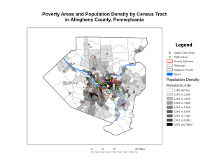
Bahrey Week 4

GIS Tutorial for ArcGIS Pro

Chapter 1

Tutorial 1-1

Tutorial 1-4

I really appreciate how explicitly detailed the instructions are for each tutorial. Once I got familiar with how things are saved and such it was pretty smooth sails. I think the only hiccup I had was accessing the hyperlinks for individual urgent care clinics. I tried to poke around figure out why they weren’t showing up in my pop-up window but I ended up just moving on.

Chapter 2

Tutorial 2-4

Tutorial 2-5

Things went well for this chapter too. I wasn’t able to drag the Over Age 60 Receiving Food Stamps layer above the 3D layer heading in Tutorial 2-4 despite my efforts to trouble shoot, but I still ended up with something that looks similar to the map in the book. For Tutorial 2-8, I couldn’t find “Out Beyond” in the Visibility Range group of the Labeling tab, so I selected <Current> as the maximum scale and the minimum scale because I speculated that doing so would also cause the ZoningLandUse labels to disappear when I zoom in or out. I repeated this with the Lower Manhattan bookmark and it seemed to also achieve the goal of removing the school points and borough labels when zooming in and out.

Chapter 3

Tutorial 3-1

I had a pretty easy time following along with the instructions for this chapter as well. I wasn’t able to find how to enable the pie chart in the map configurations for Tutorial 3-4, but I was able to enable the serial chart and table. Overall, minimal bumps in the road and I feel somewhat comfortable navigating the program and ArcGIS web maps.

White Week 4

Chapter 1: In the first tutorial, I focused on learning how to change basemaps and add features to the map. This step was fundamental because selecting the right basemap provides the context needed for effective analysis. By the end of the tutorial, I had successfully completed the tasks and felt more familiar with navigating the interface and working with map layers. The second tutorial expanded on this by teaching me how to explore the map more effectively and adjust its features for better visibility. I learned how to zoom in, pan, and manage map layers to highlight key data while minimizing clutter. A key takeaway was learning how to access and use the attribute table, which made it easier to locate specific areas and quickly filter relevant information. In the third tutorial, I improved my ability to navigate the attribute table and use it to extract useful data. For example, I practiced sorting and filtering entries to identify key patterns, such as areas with high population density. Additionally, I explored the toolbox to generate quick statistics from the data, which helped me better analyze trends. The fourth tutorial introduced customization techniques for map symbols, allowing me to modify colors, shapes, and labels to improve the map’s clarity. I practiced toggling labels and feature classes, which helped reduce visual clutter and made the map easier to interpret. I also explored the 3D view, which was ahighlight of the tutorial. Seeing the data from perspective offered new insights into spatial relationships and made the mapping process more engaging. 


Chapter 2: The first tutorial expanded on adjusting symbology by teaching me how to customize map features using different colors, shapes, and symbols. This helped improve the map’s clarity, making it easier to distinguish between various data layers. The second tutorial introduced the labeling tab and showed me how to modify pop-up displays. I practiced configuring labels and adding relevant details to the pop-ups, allowing users to view important information, like names and statistics, by clicking on specific features. In tutorial three, I learned how to create definition queries, which allowed me to filter and display only the data that met specific conditions. This provided additional practice with symbology as I adjusted how the filtered data appeared on the map. Tutorial five covered displaying data using both quantile intervals and defined intervals, which helped me better classify and visualize ranges of data. Tutorial six then focused on importing symbology and adjusting it to make comparisons between different datasets, such as income levels versus population density. In tutorial seven, I created a dot density map, which visually represented quantities by distributing dots across the map based on data values. Finally, tutorial eight taught me how to control labels based on zoom levels. This ensured that labels only appeared when zoomed in, keeping the map clean and free of unnecessary clutter.


Chapter 3: The first tutorial was extensive but packed with valuable information, giving me a comprehensive introduction to several key features of ArcGIS. One of the highlights was learning how to compare two maps on the same sheet, which allowed me to analyze and contrast data more effectively. This feature was particularly useful for spotting patterns and relationships between different datasets, such as comparing population density with infrastructure distribution. Although I encountered a few challenges during the tutorial, the overall experience was rewarding and gave me a deeper understanding of how multiple layers of information can be visually integrated. In the second tutorial, I learned how to publish maps and view them through ArcGIS. This step was important because it introduced me to the process of sharing my work with others and collaborating on projects. I practiced customizing the map’s visibility settings and explored how to control who could access my published maps. This is especially useful in group projects or when presenting data to others outside of the GIS environment, as it ensures that the information is both accessible and secure. Tutorial four focused on creating dashboards, which I found to be one of the most practical tools in this unit. Dashboards provide a streamlined display of key information using interactive charts, graphs, and maps, making it easy to track and visualize real-time data. I experimented with setting up different widgets and filters, allowing me to tailor the dashboard to specific data queries. This tool will be invaluable for organizing complex data and sharing clear, concise visual summaries with others. For the photo below, there was an error where I couldn’t insert the legend.  Overall, this unit significantly improved my understanding of ArcGIS and how to apply its various tools to real-world scenarios. I now feel more confident in managing, analyzing, and presenting geospatial data, and I look forward to incorporating these skills into future projects and assignments. 


Weber Week 4

Chapter 1: 

In the first tutorial, I learned how to change base maps and add features to a map. This was an important first step because choosing the right basemap helps give context to the data. By the end, I felt more comfortable navigating the interface and working with maplayers. It then showed me how to explore the map more efficiently and adjust its features for better visibility. I got the hang of zooming, panning, and managing layers to highlight key data without making the map look too cluttered. One of the most useful things I learned was how to access and use the attribute table, it made it easier to find specific locations and filter information quickly. I got better at using the attribute table to pull out useful data. I practiced sorting and filtering to spot patterns, like areas with high population density. I also learned about customizing map symbols. I learned how to change colors, shapes, and labels to make the map easier to read. I also experimented with toggling labels and feature classes to reduce clutter. 

Chapter 2: 

In this tutorial, I learned how to adjust symbology by customizing map features with different colors, shapes, and symbols, making it easier to distinguish between data layers. I also explored the labeling tab and practiced modifying pop-ups, allowing users to click on features to see important details like names and statistics. I worked with definition queries to filter and display only the data that met specific conditions, which helped refine the map’s appearance. I also experimented with different ways to classify and display data, such as using quantile and defined intervals. Additionally, I practiced importing symbology and adjusting it to compare datasets, like income levels versus population density. Other key skills I learned included creating a dot density map to visually represent data and controlling when labels appear based on zoom levels. This helped keep the map clean while still showing important details when needed.

Chapter 3:

This tutorial was packed with valuable information and gave me a solid introduction to several key ArcGIS features. One of the most useful things I learned was how to compare two maps on the same sheet, which made it easier to analyze and contrast data. This was especially helpful for spotting patterns, like comparing population density with infrastructure distribution. There were a few challenges along the way, but overall, it was a great experience that helped me understand how different layers of information can be visually connected.  I ran into an issue with inserting the legend in the map below and the program crashed multiple times. I was not able to work through some of the final steps, but I feel I know how to do them just from the reading. Overall, this unit gave me a much stronger grasp of ArcGIS. I feel more confident in managing, analyzing, and presenting geospatial data.

Week 3 Marzulli

In Chapter 4 of Mitchell’s book, the focus is on understanding human cognition. Cognition encompasses the mental processes involved in gaining knowledge and understanding through thought, experience, and the senses. Perception, a key aspect of cognition, involves how we interpret sensory information to understand our environment. Memory, another crucial component, refers to the processes of encoding, storing, and retrieving information. Mitchell delves into these cognitive processes, highlighting the complexities of how our brains interpret and sometimes misinterpret sensory information. The chapter emphasizes the significance of memory in shaping our understanding and future decisions, providing a comprehensive overview of how cognition influences human behavior.

Chapter 5 explores the role of learning in human development, presenting various theories that shed light on how we acquire new knowledge and skills. Learning is defined as the process of acquiring new knowledge, behaviors, skills, values, or preferences. The chapter contrasts behaviorism, which shows that all behaviors are acquired through conditioning, with constructivism, which suggests that learners construct their own understanding and knowledge of the world through experiences. By examining these theories, Mitchell provides valuable insights into educational practices and developmental psychology. The chapter underscores the importance of both environmental influences and the active role of learners in constructing knowledge, offering a balanced perspective on the learning process.

Chapter 6 addresses language and communication, emphasizing their complexity and richness. Language acquisition, the process by which humans learn to understand, produce, and use words to communicate, is a central theme. Syntax, or the arrangement of words and phrases to create well-formed sentences, plays a crucial role in constructing meaning. Additionally, pragmatics, the study of how context influences language use and understanding, is explored. Mitchell’s examination of these concepts highlights the intricacies of human language and communication. The chapter provides insights into how children acquire language, the significance of syntax, and the role of pragmatics in contextual understanding, making it a valuable resource for those interested in linguistics, psychology, or communication studies.

Yates Week 4

The preface is making me very excited to get started using GIS. There are so many potential applications for it, in both my field and in others. The start of chapter one explains the basic terminology for ArcGIS, which is especially useful as I did not know some of it beforehand. The most important part was explaining the difference between the gbs extension, which stands for a file geodatabase with feature classes and raster data, and an aprx extension, which contains a project, also known as the map or maps.

Chapter 1:

I got to the first turn section and tried to add the first base map, and the software froze. I rebooted the computer. It worked after this. The 1.1 tutorial was mostly focused on teaching me how to change basemaps and add features. I successfully completed this tutorial. The second tutorial focused on how to explore the map, and adjust the features of the map to see things more clearly. I also learned how to find the attribute table to find specific areas. In the third tutorial, I learned more about the attribute table, how to navigate it. For instance,I used the table to determine that object 204 had the largest population density. I also learned how to use the toolbox to get statistics. In the fourth tutorial, I learned how to adjust and change the symbols on the map. I also learned how to toggle labels and feature classes, and how to see a 3D version of the map, which was especially cool.

Chapter 2:

Tutorial one taught me more about adjusting symbology. The colors it had me choose for the map weren’t great, though. Not a lot of contrast. Tutorial two taught me more about the labelling tab, as well as how to change the information in the pop-up display. However, I couldn’t actually see any information in the pop-up beside the name of the neighborhood, even after I went back and triple checked that I did everything. Tutorial three taught me how to make definition queries, and let me practice adjusting symbology more. I attempted tutorial four, however, I could not adjust symbology due to an error, in which there was no data associated with the neighborhood, later renamed over age 60 receiving food stamps. I will try again later, when I can ask for advice. Tutorial five taught me how to display data in two different ways, quantile intervals and defined intervals. In tutorial six, I learned how to adjust and import symbology data, allowing for data comparisons. In tutorial seven, I learned how to create a dot map. In tutorial eight, I learned how to adjust labels, so that they can be seen only at certain levels of zoom. This is especially useful for keeping the map uncluttered.

Chapter 3:

Tutorial one was very big, but covered a lot of very interesting information. I enjoyed learning how to compare two maps on the same sheet. The create chart part did not work. The second tutorial taught me how to publish maps, and how to view published maps through ArcGIS. This is especially useful to know. Tutorial three is really useful for me, because one of my classes gives the option of making a story map for on the assignments, and now I know how! I’ll definitely be using this in the future. Finally, tutorial four taught me how to make a dashboard, which makes it easy to view information and share information with others. All in all, this unit has improved my understanding of arcGIS a lot.

Cooper Week 4

Week 4

Chapter 1 

To be honest, I think my first hurdle here was just figuring out how to open the tutorial and in the ArcGIS Program. Once I got there and things were starting to look like what was actually in the book, I started to feel a lot better. The steps in the book have been very useful because there are so many tools I barely know where to look. The first tutorial was very helpful in getting to understand where everything was located within the system. Tutorial 1-2 was also helpful with navigating different tutorials. Overall, lots of hovering over random icons to find what I was looking for from the book. For some reason, the Tutorial 1-3 section on attribution tables tripped me up a little bit. I was a little confused on what I was doing but I think I got it figured out. I really enjoyed playing with the attribution tables and can really see how they would be useful when comparing data and such. Locating the statistics tool was a little bit different than what was in the book but I was able to get the Summary Statistics to come up! Section 1-4 felt a little silly at times but I also know it will be very useful when making modifications to future projects to really customize them. In this section, the book had different directions for removing the halo tab. It said to go to the ‘symbol tab’ but I had to go to expressions first and the was able to find the section for halos. Could not get the park symbology to open the gallery to find the park symbol but I could find other symbols. When trying to open the 3-D view of the Health Care Clinics it kepts saying “failed to open map view”


Chapter 2

In 2-1 I had a very hard time getting the symbols to change for Manhattan but I eventually got something similar to what the book was saying to work. I was able to get the colors pretty close on this activity but I did not spend a lot of time getting the exact ones specified. In Section 2-2 the pop-ups were really cool and will definitely be useful. I think they were a little hard and confusing to use at first but then I caught on. In section 2-3, I can see how useful creating quarries would be when trying to pick locations for things, especially for those in need! In 2-4, it kept telling me that I couldn’t complete the steps for the section “Over age 60 receiving food stamps” because it did not have a valid data source, I tried to troubleshoot this to get it to work and some how found how to do it? I think I just stumbled up getting it to use the right data set but I honestly probably couldn’t do it again (used this for one of my pics for this chapter because I was really proud that I got it to work). 2-5 went very quickly, not sure if it was just that simple or if I am really starting to get a hang of the program. In 2-6, I had a hard time making adjustments for the histograms and feel like I could not fully figure out changing the values because it seemed to keep completing one of the values, so I am not entirely sure about that. I did figure out the whole swipe tool thing and that was pretty nifty. 2-7 was also super simple and not a lot of steps or confusion. I will be honest, I like to choose different colors than it says in the book to make the map prettier. 2-8 was slightly confusing because I don’t think the book fully matched the program, but I was able to get the burrows to disappear when I zoomed in so I think it worked!

Chapter 3 

For some reason, in 3-1, the regular Art Employment map always showed up blank but the Art Employment per 1,000 was fine. I ended up completely just closing and redoing this tutorial and it worked this time around. I can see why this section would be very useful when preparing maps for presentations, especially with the chart features. In 3-2, I am not exactly sure what I was doing wrong because once I got on the web version as per instructions, the metropolitan layer was always grayed out and I could not do anything with it. I was still able to enable pop-ups though! Section 3-3 was also very helpful and I think that this app feature could be used for a lot of cool projects within my public health major. Section 3-4, I had a very hard time with this section because it seemed like nothing was where it was supposed to be according to the book so I had to dig through places to find things. Also did not have the pie chart option for me when configuring the map. I was able to get a pretty good dashboard put together though!

Storyboard Link

3-2 Link

Dashboard link


Week 4 Kopelcheck

This was the first time I have used ArcGIS and it was very easy for me to navigate. I found the tutorials extremely useful and easy to follow. There were some points where I did skip as I could not locate what they were asking of me, so that will most likely have to be something I look back on incase it is useful for future assignments. Overall I had fun exploring ArcGIS and seeing the cool features it has. My favorite is the 3d models they look really cool and I like also how you are able to explore with your mouse. Below I have attached some photos I took from each chapter (1,2 and 3).

O’Neill Week 3

Chapter 4, “Mapping Density,” got me thinking about how we present information, especially when you’re dealing with varying areas. It’s not enough to just count things up, sometimes we need a bit more context, like how spread out something is. I think that’s why the book dives into density mapping, the distribution of features or values per unit area. There’s a difference between saying “there are 100 houses in this neighborhood” and “there are 100 houses per square mile in this neighborhood.” What I found particularly interesting was how you can map density in a few different ways. The book highlights two methods: mapping density for defined areas, like census tracts, which is where you calculate density within existing boundaries. Then, there’s creating a density surface, which involves creating a continuous surface that shows how density changes across an entire area, even without defined boundaries. It’s like taking something that’s usually summarized by area, and making it a landscape you can view. It seems to me that these two methods would be used for different purposes and I’m wondering which gets used for what application and why? Mapping density is about more than just visualizing data. It’s about taking into account the context of the data and how it’s distributed. It’s a really valuable tool to see the patterns that might be hidden at first glance. I wonder if density mapping could be applied to research in neuroscience, since it deals with location based data sometimes.

Chapter 5 seems to build off the idea that location matters, but in a different way. Now instead of looking at where things are, we’re looking at what things are contained by. The book’s main question here is, Why map what’s inside? and, in my understanding, it’s because it allows us to explore relationships between features. The book outlines three approaches for this: drawing areas and features (where we manually create areas to select features), selecting features inside an area (where we use existing boundaries), and overlaying areas and features, which sounds like the most complex one. The overlay method, as I understand it, combines two layers of features to see how they interact spatially. I’m starting to think this is where GIS really shines because it creates new relationships between features that wouldn’t exist in the real world otherwise. I’m curious how you all go about choosing which of these three methods to use? I imagine that using drawn areas is more appropriate when you need to be more precise with your selection, and that using existing boundaries is better for broader analysis. How do you decide which features to overlay, if that makes sense?

Chapter 6 seems to add a layer of complexity to our spatial analysis by focusing on closeness. I think the main idea is that we can learn a lot from the distance and relationships between features. The book asks, Why map what’s nearby?, and the answer I think is that it allows us to explore how features interact, or how they might influence one another. Three ways of exploring this include using straight line distance, measuring distance or cost over a network, and calculating cost over a geographic surface. It seems like the first one is the most basic, just measuring distance as the crow flies, so to speak, while the second one takes into account that movement is often confined to networks, like roads. The last one, where you calculate cost over a geographic surface, is a bit more abstract, where you take into account the “cost” of travel, which is interesting. I’m realizing that “cost” doesn’t always mean money, and that different types of cost can be included in research. It seems to me that GIS is very useful for understanding and calculating all these different types of distance. I’m also thinking about the different applications for these analyses. It seems that you could use straight line distance to do quick analyses, or when the network isn’t important. You could use network analyses to find optimal routes, and surface analysis to calculate the cost of travelling across different topographies. I am wondering if there are times when you would use a network analysis to find straight line distance, or is that redundant?

Keckler Week 3

Chapter 4

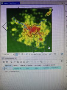
Often, GIS can be used to map density as a manner in which to clearly represent areas of highest concentration- such as with feral cats or oversized rats- for the purpose of seeking out various patterns. For example, oversized rat phenomena could be located in large urban centers due to the access of food, adaptations, etc, but maybe their oversized rats can be found in a rural area that is coincidentally near a nuclear waste site. Things such as the United States Census records data that can be used for density mapping for population, income, family size, etc. There are also two different options of representing density as density of features or feature values. As an example, density of features would show the areas with oversized rats while feature values would show the number of oversized rates in the areas. In addition, there are two manners of mapping density either by area or by surface, each with their own uses and drawbacks depending on the type of data you have and what you want to do with it. Some data can be best represented using individual points while other data is best represented using shades of color. For example, for relatively isolated incidents of the oversized rat phenomena, a dotted map could be used to examine relationships between rat outbreaks. However, if incidents of oversized rats become a prevalently explored and recorded phenomena, then a shaded map would become better suited to facilitate pattern recognition. GIS has the computing power to be able to make calculations with density data to generalize and present density data in a manner conducive for seeking out patterns within the data.

Chapter 5

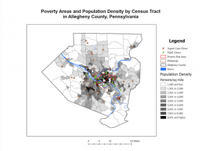
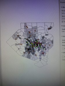
When mapping a subject within the boundaries of an area, patterns within the area may be assessed or internal patterns can be compared to the patterns within other areas. Using feral cats as an example, feral cat information could be tracked with Delaware City’s Township and compared with other townships- within or outside of the county- to track patterns in where feral cats are the most prevalent. With that information, trap, neuter, vaccinate, and release programs can be sent out to places with the most need in order to manage cat populations. This information could also be used to find cats or kittens that could possibly be integrated into human households. The power of GIS allows users to use pre-established boundaries- i.e. counties, townships, zip codes, etc., or created boundaries to assess data depending on the intended span and use for the data. Determining whether the features are continuous or discrete is important when mapping data within. Discrete data would be the number of feral cat colonies whereas continuous data encompasses things such as elevation, vegetation types, temperatures, precipitation, etc. that are continuously present. GIS can be used for lists of features, the numbers of features, and for summaries, and GIS can be used to cut off certain data that is outside of a drawn boundary. From that point, there are three methods of finding what’s inside: drawing boundaries to show features outside and within, specifying an area, or to create a new layer that overlays the original. Each method, like the others, has its own uses depending on your goals for your data and analysis. Summaries for numerical data can also be implemented such as sum, mean, median, and standard deviation depending on the relevance of each for the best representation of data. To best express the need for managing feral cat populations within the city of Delaware,  I may want to use the sum of cats or average number of feral cats per square mile to stress the gravity of the problem. 

Chapter 6

As a counterpart to Chapter 5’s finding what’s inside is Chapter 6’s finding what’s nearby within a certain distance or range. An example of using range would be notifying people within a ten-mile radius of a colony of rabid bats. This can be used for distance but also cost through time, money, or effort. Maybe I wanted to let everyone know about the rabid bats that are a breezy five-minute walk away from their community park. With this knowledge of the proximity of rabid bats, I could better raise community awareness and issue warnings for pets, children, and nighttime park-dwellers to be wary of the rabid bats and remind them of the mortality rate of rabies. An alternative would be to determine the travelling pattern of my rabid bats to best alarm those in the path of rabidity. GIS has the power to draw my ten-mile bat radius and measure my five-minute walking time. Depending on my goals for rabid bat analysis, I could calculate distance if the Earth was flat, using the planar method, or incorporate the Earth’s curvature, using the geodesic method. The planar method would be ideal for a smaller area of interest- a city, county, or state, but the geodesic method would be necessary for any larger analyses- such as if my rabid bats spread from my little town to all contiguous US states. Just as with mapping what’s inside, data can be represented using lists, counts, or summaries depending on need. I would like a list of the addresses within a ten-mile radius of my rabid bat colony to ensure their awareness of the bats and to ensure that they have not yet gone rabid. In the aftermath, I would perhaps seek a count of the rabies cases in a post-rabid bat town, and perhaps I would seek statistics or graphs to easily review the impact of my rabid bats on pets, children, and those nighttime park-dwellers. The three manners of finding what’s nearby include straight-line distance- such as a ten-mile radius, distance or cost over a network- such as sidewalks, and cost over a surface- such as for the travel cost to reach my rabid bats.

Jolliff Week 3

Chapter 4

Chapter 4 “Mapping Density” explains how mapping density allows you to see “patterns of where things are concentrated”. While some maps emphasize specific locations of features, Density maps focus on the patterns of certain features. I thought this was interesting because in the previous chapters we were looking at specific features, like individual crime scenes. With a density map it is more of a broad way of showing where for example the most crimes occur, and through this type of map you can see patterns of where the most crime is located or where there isn’t as much of a concentration of crimes occurring. Density maps can provide you with a density measurement per area. Raster layers are used to create density surfaces. Based on the reading the raster layers allow us to see concentrated features. I think if I’m understanding this correctly, you can have a cell of a map and if you take a radius around that cell you can figure out the  amount of features within that radius and that number is assigned to the cell and after you do that with all of the cells that is where you get your smoothed area of concentrations. Search radius can be large or small. Larger search radiuses show more generalized patterns, while smaller search radiuses show more local variation.

Chapter 5

I am having trouble understanding how all of these maps are different. I think they are different based on the features and also how the features are being analyzed. This chapter seems to be talking about what is going on in an area. You can monitor what’s happening this way, or you can use this information to compare different areas based on what is happening to them. They give the example of potentially mapping the affected area of a toxic plume. If not for this information appropriate action could be taken by the public or those with the ability to handle the situation. You can show boundaries of certain things such as buffers around streams, soil types in a parcel of land, and floodplains. I think that this is an interesting thing that I haven’t thought about before while looking at maps. On the topic of discrete or continuous features, discrete features are features that you can easily identify and they are unique. They are locations, addresses, crimes, etc. With continuous features you can summarize the features for each area.

Chapter6

In the chapter, Finding What’s Nearby, I learned that you can set distances and you can figure out what is going on within these distances of the certain feature you are looking at. You can label the nearness of a feature using distance or travel cost. I have gathered that it is important to know what information you will need because that will help you choose the best way to carry out your analysis. There are three ways of finding out what is nearby. Straight line distance, distance or cost over a network or, cost over a surface. Straight line distance is what you choose a specific source feature and the distance and then the area is found within the distance that you specified. When it comes to layers you need the source feature and then a layer with the distance to form what you are desiring. Straight line distance allows you to create boundaries around a source.  With Distance or cost over a network, I see this as when you put an address in your google maps and it shows you all of the routes and which one is the fastest. At least this is what I have gathered from the reading. Cost over a surface is when you have locations of source features and a travel cost. Adn from that “ “The GIS creates a new layer showing the travel cost from each source feature.” Cost over surface is more for overland travel, while cost or distance over a network is if you are traveling in fixed infrastructure. And for straight line distance this would be used for estimates of travel range.