Chapter 1
This chapter introduced the fundamentals of ArcGIS, focusing on changing basemaps, adding features, and understanding how to manage map layers. A major takeaway was the importance of selecting the right basemap to provide context for spatial data. As I progressed, I learned how to zoom, pan, and adjust layers to highlight key information while reducing unnecessary clutter. Accessing and working with the attribute table was especially useful, as it allowed me to filter and sort data efficiently, making it easier to identify patterns like areas with high population density. I also explored how to customize map symbols, adjusting colors, shapes, and labels to improve map clarity. The introduction of the 3D view was a highlight, as it provided a new way to visualize spatial relationships and added depth to the mapping process. While there were some challenges, such as software crashes and missing features, the overall experience helped me gain confidence in using ArcGIS for basic data visualization and organization.
Chapter 2
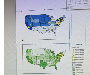
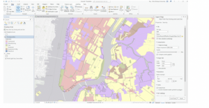
The second chapter expanded on symbology customization and refining how data is displayed on the map. I practiced adjusting colors, shapes, and symbols to better distinguish between data layers, which improved overall clarity. Learning how to configure labels and pop-ups made the maps more interactive by allowing users to see important details, such as names and statistics, when clicking on specific features. I also experimented with definition queries, which allowed me to filter and display only specific data that met certain conditions. This helped refine the map’s presentation and ensured that only the most relevant information was visible. Additionally, I explored different classification methods, such as quantile intervals and defined intervals, to better visualize data ranges. Importing and adjusting symbology for comparisons, like income levels versus population density, was another key skill I developed. Creating dot density maps helped me visually represent quantities more effectively, and learning how to control labels based on zoom levels ensured that the map remained uncluttered.
Chapter 3
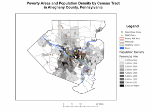
This chapter introduced more advanced ArcGIS features, such as comparing maps on the same sheet, publishing maps, and creating dashboards. The ability to view and contrast multiple datasets side by side was particularly useful for identifying spatial patterns, like how population density relates to infrastructure distribution. Publishing maps was another key skill, as it allowed for sharing data with others while managing visibility settings. This is especially important when presenting projects or collaborating with teams. One of the most practical tools covered was creating dashboards, which provide interactive visualizations using charts, graphs, and maps. Dashboards make it easier to track real-time data and present findings in a clear and concise format. While I encountered some technical challenges, such as missing legends and occasional software errors, this chapter significantly improved my understanding of how to manage, analyze, and present geospatial data effectively. I now feel more confident in using ArcGIS tools and look forward to applying these skills in future projects.