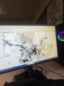
Chapter 1: This chapter was like a basic “GIS for Dummies” intro. It introduced the main concepts and vocabulary, which was helpful. I learned the difference between a feature class (like a layer on a map, showing things like streets or buildings) and a raster dataset (images made up of pixels, like satellite photos). It’s the difference between drawing lines and coloring in squares, I think. The tutorials were pretty straightforward. Tutorial 1-1 was just about opening a project and messing around with the interface. Turning layers on and off, zooming in and out, that kind of thing. The book told me to add a basemap (the “Streets” one), then told me it was getting in the way, so I should remove it. I also played around with the order of the layers in the Contents pane. Tutorial 1-2 focused on navigating the map. Panning, zooming, using bookmarks (which are like saved views and are super useful). I even learned how to use the “Explore” tool to click on features and get info about them in a pop-up. I clicked on a random urgent care clinic and saw its address and website. Tutorial 1-3 got into attribute data – the information behind the map features. Every feature (like a point representing a clinic) has a table with details about it. I learned how to open the attribute table, sort the data, and even mess with the columns (like rearranging them). I also started to get a glimpse of how powerful this can be – you can search for specific features based on their attributes. Tutorial 1-4 was about symbolizing maps. I changed the FQHC clinics to green circles and made them a bit smaller.I also played with labeling, so that, the name of things appeared, the names of the municipalities.
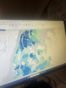
Chapter 2: The main idea of this chapter is thematic maps – maps that focus on a specific topic or theme. Like, in Chapter 1, we were looking at the locations of health clinics relative to poverty areas. That’s a theme. The chapter stressed the importance of making the subject of your map (the “figure”) stand out, while the background information (the “ground”) should be less prominent. It’s about visual hierarchy. The tutorials were all about symbolizing different kinds of data. Tutorial 2-1 dealt with qualitative attributes – things like categories or types (e.g. land use types: residential, commercial, industrial). I learned how to use “unique values” symbology to give each land use type a different color. Tutorial 2-2 was about labels and pop-ups. I learned how to customize labels (font, size, color) and how to configure pop-ups to show specific information. Tutorials 2-4 and 2-5 were about mapping quantitative attributes – numbers. 2-4 was doing Choropleth maps that is how you use different shades of a color to represent different values (like population density). 2-5 did the same, but with dots. There were different ways to classify the data (like “quantiles” and “natural breaks”), I found this a bit confusing. The way the data is divided up can change how the map looks. 2-6 was about “normalizing” data. This is where it got a bit more mathematical. Basically, you’re adjusting the data to make it comparable. Like, instead of just showing the number of people in poverty, you might show the percentage of people in poverty. This is way more meaningful because areas have differing total number of people. Tutorial 2-7 was about dot density maps. It shows the number of people under 18 who are on food stamps in each neighborhood using dots. Tutorial 2-8 got me adding visibility ranges, I could make things appear and disappear based on how far you zoom in.
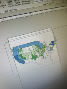
Chapter 3: This chapter was all about sharing maps. Tutorial 3-1 was about creating layouts. A layout is like a page where you can arrange your map, add a title, a legend, a scale bar, and other stuff. It’s like putting together a poster. I made a layout with two maps showing arts employment in different states. I also created a chart showing the number of arts jobs. Tutorial 3-2 was about sharing maps online using ArcGIS Online. This was pretty cool, and I already have some experience with this from GEOG 292. You can publish your maps so that other people can view them in a web browser. Tutorial 3-3 introduced ArcGIS StoryMaps, another thing introduced to me by GEOG 292. These are like interactive reports or presentations that combine maps with text, images, and videos. It’s a way to tell a story with your data. Tutorial 3-4 was about ArcGIS Dashboards. In them, you can see maps, charts, and other information all in one place. These would be useful for monitoring things that change quickly, like traffic or weather.
I’m starting to see how powerful GIS can be, but it’s also a bit overwhelming. There are so many tools and options! I feel I’m going to need to keep practicing, else I’m going to forget.